Facebook World
The goal of this session is to predict success of a branding campaign on social media using techniques of logistic regression. We will explore the use of logistic regression to predict Facebook comment activity information about posts from previous campaigns to help inform ad placement decisions.
An analysis of this data set was first presented in Moro, S., Rita, P., & Vala, B. (2016). Predicting social media performance metrics and evaluation of the impact on brand building: A data mining approach. Journal of Business Research, 69(9),3341-3351.
A pre-print of the article is available [here].
Part 1: Exploring the data
For this exercise, you'll work with the dataset facebook.csv stored here: https://www.warin.ca/datalake/courses_data/qmibr/session10/facebook.csv.
The dataset facebook.csv contains one row for each unique ad post. The following variables were recorded:
| Variables | Description |
|---|---|
| Page.total.likes | Number of people who indicated that they liked the company’s page |
| Category | Category |
| Type of ad | Action (special offers and contests); Product (direct advertisement, explicit brand content); Inspiration (non-explicit brand related content) |
| Type | Type of content (Link, Photo, Status, Video) |
| Post.Month | Month the post was published (1=January, 2=February, . . . , 12=December) |
| Post.Hour | Hour the post was published (0, 1, 2, 3, 4, . . . , 23) |
| Post.Weekday | Weekday the post was published (1=Sunday, 2=Monday, . . . , 7=Saturday) |
| Paid | If the company paid Facebook for this advertisement (0=no, 1=yes) |
| Comment | 0 if there were no comments on the post and 1 if there was at least one comment |
Read the file into a data frame called facebook and show the first 6 rows. The main goal of this exercise is to learn which predictor variables are important for modeling the probability of at least one comment made on a post with an ad.
facebook = readr::read_csv("https://www.warin.ca/datalake/courses_data/qmibr/session10/facebook.csv")
head(facebook)
Question Set 1
- How many total posts are in the data set?
nrow(facebook)- How many ad posts of each Category (Action, Product, Inspiration) are in the data set?
table(facebook$Category)- Examine side-by-side boxplots of the number of people who liked the company’s page by whether a comment was posted. Describe the difference in the distribution of the number of likes.
boxplot(Page.total.likes ~ comment, data = facebook, col="red", xlab="Comment", ylab="Tal Likes")- Run the command prop.table(table(facebook$comment, facebook$Category), margin=2) to see the proportion of comments given by ad type. What can you say about the proportion of comments by ad type?
prop.table(table(facebook$comment, facebook$Category), margin=2)Part 2: Paying for attention
Does paying for the ad correspond to an increase in the probability of receiving at least one comment? We explore this question by examining the relationship between Paid and comment.
Question Set 2
- What is the distribution of the binary comment variable? What fraction of posts received at least one comment? Use the
prop.table()function to answer this latter question.
table(facebook$comment)
prop.table(table(facebook$comment))- What fraction of posts were paid? Again, use the table command.
table(facebook$Paid)
prop.table(table(facebook$Paid))- As in Part 1, run the command
prop.table(table(facebook$comment,facebook$Paid),margin=2)to see the fraction of comments posted to ads according to whether they were paid. What fraction of paid ads received comments? What fraction of unpaid ads received comments?
table(facebook$comment,facebook$Paid)
prop.table(table(facebook$comment,facebook$Paid),margin=2)
prop.table(table(facebook$comment, facebook$Paid), margin = 2)- How might you perform a hypothesis test to check whether the fractions are significantly different?
prop.test(table(facebook$Paid, facebook$comment), correct = F)
prop.test(c(274,120),c(360,140), correct=F)
Part 3: Simple logistic regression
The analysis in Part 2 can be cast as a logistic regression. We explore how logistic regression can be used to model the probability of a post receiving a comment based on whether the ad was paid versus unpaid.
Question Set 3
- Run a simple logistic regression predicting comment from the Paid predictor. Interpret the sign of the coefficient. Is whether the ad was paid a significant predictor? How does this compare with the last question in the previous question set?
facebook1.glm <- facebook1.glm <- glm(comment ~ Paid , family = binomial, data = facebook)
summary(facebook1.glm)- Using the
predict()function, predict the probability of a post receiving a comment for a paid ad. Do the same for an unpaid ad. How do these probability predictions compare to the fractions you computed inthe previous question set? What do you make of these comparisons?
p =
out =


p2 =
out2 =
p = predict(facebook1.glm, newdata = data.frame(Paid=1), type = "response", se.fit=T)
out = c(p$fit, p$fit-2*p$se.fit, p$fit+2*p$se.fit)
names(out)=c("Fit", "Lower", "Upper")
out
p2 = predict(facebook1.glm, newdata = data.frame(Paid=0), type = "response", se.fit=T)
out2=c(p2$fit, p2$fit-2*p$se.fit, p2$fit+2*p$se.fit)
names(out2)=c("Fit", "Lower", "Upper")
out2- Run a simple logistic regression ofcommentonPost.Hour. Using the
confint()function, obtain a 95% confidence interval for the coefficient ofPost.Hour. Interpret this interval.
facebook2.glm <- facebook2.glm <- glm(comment ~ Post.Hour, family = binomial, data = facebook)
summary(facebook2.glm)
confint(facebook2.glm, "Post.Hour")
c.ph[1]
summary(facebook$Post.Hour)
plot(facebook$Post.Hour, facebook$comment)- Why might the logistic regression analysis including
Post.Houras a quantitative predictor variable be problematic?
Part 4: Multiple logistic regression
We can expect to obtain better and more precise predictions for whether a post received a comment by including more predictor variables.
Question Set 4
- Convert the variables
Post.Month,Post.WeekdayandPost.Hourinto categorical variables (factors) in the data frame. Call these new variablesPost.Month.factor,Post.Weekday.factor, andPost.Hour.factor. You can use thefactor()function to do so.
For example, if facebook was the name of the data frame, you can run the following code to create Post.Month.factor as the factor version of Post.Month:
facebook$Post.Month.factor = factor(facebook$Post.Month,levels = 1:12, labels = c("Jan", "Feb", "Mar", "Apr", "May", "Jun","Jul", "Aug", "Sep", "Oct", "Nov", "Dec"))table(fb$Post.Hour)
facebook$Post.Month.factor = factor(facebook$Post.Month, levels= 1:12, labels = c("Jan", "Feb", "Mar", "Apr", "May", "Jun","Jul", "Aug", "Sep", "Oct", "Nov", "Dec"))
facebook$Post.Weekday.factor = factor(facebook$Post.Weekday, levels= 1:7, labels = c("Sun", "Mon", "Tue", "Wed", "Thu", "Fri", "Sat"))
facebook$Post.Hour.factor = factor(facebook$Post.Hour, levels= 1:24)
head(facebook)Given that these variables will be used as predictors in a logistic regression, why does it make sense to include them as categorical variables?
- Run a multiple logistic regression with the predictors
Page.total.likes,Type,Category,Post.Month.factor,Post.Weekday.factor,Post.Hour.factor, andPaid. How does the coefficient forPaidcorrespond to the value in the simple logistic regression? What about the p-value for its significance?
facebook3.glm <- facebook3.glm <- glm(comment ~ Page.total.likes + Type + Category + Post.Month.factor + Post.Weekday.factor + Post.Hour.factor, family = binomial, data = facebook)
summary(facebook3.glm)- Perform a chi-squared test for assessing whether
Post.Weekday.factor,Post.Month.factorandPost.Hour.factorare simultaneously significant predictors of the probability of a post receiving a comment.
facebook4.glm <-

facebook5.glm <-
facebook4.glm <- glm(comment~Paid+Page.total.likes+Type+Category, data=facebook, family="binomial")
anova(facebook4.glm, facebook3.glm, test = "Chisq")
facebook5.glm <- glm(comment ~ Post.Month.factor + Post.Weekday.factor + Post.Hour.factor + Paid, family =binomial, data=facebook)
summary(facebook4.glm)
anova(facebook1.glm, facebook4.glm, test="Chisq")Hint: The model in question 2 is the alternative hypothesis, but what is the model in the null hypothesis? Based on your analysis, should we include these three variables?
References
Kleinbaum, D. G., & Klein, M. (2010). Logistic regression: a self-learning text. Springer Science & Business Media. Can be downloaded here.
Faraway, J. J. (2016). Extending the linear model with R: generalized linear, mixed effects and non parametric regression models (Vol. 124). CRC press
Part 5: Model selection and prediction
The model fit in Part 4 may contain variables that are not predictive of the probability of leaving a comment.We examine here whether we can reduce the number of predictors prior to making predictions.
Question Set 5
- Perform backward stepwise model selection on the full model you fit in the previous question. Which predictor variables remain in the final model?
facebook.glm.reduced <-facebook.glm.reduced <- step(facebook3.glm, direction="backward")
summary(facebook.glm.reduced)How does the significance of Paid in the reduced model compare to that in the model with all of the predictors? What do you make of the difference?
It appears that none of the individual
Post.Month.factormonth variables are statistically significant, yetPost.Month.factorwas retained as a predictive variable. Why might this be?Construct a 95% confidence interval for the probability of a comment on a post where the ad was a photograph, the category was a product, the month was May, and the ad was unpaid. How do you interpret this interval? Does the width of the interval seem large? Further exposure to logistic regression.
newdata <-
p <-
out <-
newdata = data.frame(Type="Photo", Category="Product", Post.Month.factor="May", Paid=0)
p = predict(facebook.glm.reduced, newdata, type="response", se.fit=T)
out=c(p$fit, p$fit-2*p$se.fit, p$fit+2*p$se.fit)
names(out)=c("Fit", "Lower", "Upper")
outLinkedIn World
Follow this link: https://www.linkedin.com/psettings/member-data
There you will find a section labeled Get a copy of your data. Select the second option and within it the connections option. After you click request archive and waiting some minutes, you should receive an email that you may download the data.
After the download, rename the file to: Connections.csv.
When you open the Connections.csv you will see that LinkedIn allowed for the following data fields:
- First Name,
- Last Name,
- Email Address,
- Company,
- Position,
- Connected On
Part 1: Data Cleansing
The goal of data cleansing is the following:
- Read the file
Connections.csvinto a data frame calledli_cons. Use theread_csv()function from thereadrpackage.
li_cons <- readr::read_csv("./data/Connections.csv", skip = 2) # skip = 2 since there is some text above the data- Get rid of the data fields that we will not need, i.e. name and email information. Use the
select()function from thedplyrpackage.
library(dplyr)
li_cons <-
library(dplyr)
li_cons <- li_cons %>%
select("Company", "Position", "Connected On")- Expand the date information. First, transform the
Connected Onvariable into a date format in a new variable calledconnectedOn, using thelubridatepackage. Then, by using this new variableconnectedOn, create 4 new variables:- Year:
connectedOnYear - Year Quarter:
connectedOnYearQuarter - Year Month:
connectedOnYearMonth - Day of week (DOW):
connectedOnDOW
- Year:
# Fix the date (change type from <chr> to <date>)
li_cons$connectedOn  <-

# Generate columns for year, quarter, month, and day of the week
li_cons <-
# Fix the date (change type from <chr> to <date>)
li_cons$connectedOn <- lubridate::dmy(li_cons$`Connected On`)
# Generate columns for year, quarter, month, and day of the week
li_cons <- li_cons %>%
mutate(
connectedOnYear = lubridate::year(connectedOn),
connectedOnYearQuarter = lubridate::quarter(connectedOn, with_year = T),
connectedOnYearMonth = lubridate::format_ISO8601(connectedOn, precision = "ym"),
connectedOnDOW = lubridate::wday(connectedOn, label = TRUE, abbr = TRUE)
)- Write the cleaned data into a new csv file called
cleansed_Connections.csv. Use thewrite_csv()function from thedplyrpackage.
readr::write_csv(li_cons, "./cleansed_Connections.csv")Part 2: Data Wrangling
Company information is provided by LinkedIn users themselves. Hence, it should not be a surprise that this information is not necessary consistent and ready-to-use for at-once analysis. One might write Google, another Google Inc. or Google LLC.
Let's count the number of occurrences of each company by using the dplyr package.
library(dplyr)
li_cons %>%
  count(Company) %>%
  arrange(desc(n))
The above code groups the company field and tells you the number of connections working for that company. Now you could make a decision to clean some of the data. You can have a look at your data and see possible different spellings.
# Introduce a new variable for the cleaned company names
li_cons$comp_clean <- li_cons$Company

library(stringr)

# Your magic here:
li_cons <- li_cons %>%
  mutate(
    comp_clean = if_else(str_detect(Company, "Deloitte"), "Deloitte", comp_clean), # Whenever a company contain "Deloitte", write it to just "Deloitte"
    comp_clean = if_else(str_detect(Company, "Université"), "University", comp_clean), # Whenever a company info contains the word "Université" change it to "University"
    comp_clean = if_else(str_detect(Company, "University"), "University", comp_clean) # Whenever a company info contains the word "University" change it to "University"
  )
And so on. Make as many or few consolidations as you see fit.
The same holds true for the Position data field. Let's count the number of occurrences of each positions by using the dplyr package.
library(dplyr)
li_cons %>%
  count(Company) %>%
  arrange(desc(n))
You can have a look at your data and see possible different spellings.
# Introduce a new variable
li_cons$pos_clean <- li_cons$Position

library(stringr)

# Your magic here:
li_cons <- li_cons %>%
  mutate(
    pos_clean = if_else(str_detect(Position, "Director"), "Director", pos_clean), # Look for positions that contain the word "Director" and change it to just "Director"
    pos_clean = if_else(str_detect(Position, "Analyst"), "Analyst", pos_clean), # Look for positions that contain the word "Analyst" and change it to "Analyst"
    pos_clean = if_else(str_detect(Position, "Consultant"), "Consultant", pos_clean) # Look for positions that contain the word "Consultant" and change it to "Consultant"
  )
And so on.
Part 3: Playing with the data
Let's create a color palette.
library(ggplot2)
# My color palette
c_col <- c("#264653", "#2a9d8f", "#e9c46a", "#f4a261", "#e76f51")
# Theme information for ggplot2 graphs
theme_set(
theme(
text = element_text(size = 10, family = "Optima"),
plot.title = element_text(
size = 20,
hjust = 0,
margin = margin(t = 10, r = 0, b = 10, l = 0, unit = "pt"),
color = c_col[1],
face = "bold"
),
axis.title = element_text(
size = 12,
margin = margin(t = 10, r = 10, b = 10, l = 10, unit = "pt"),
color = c_col[1],
face = "bold"
)
)
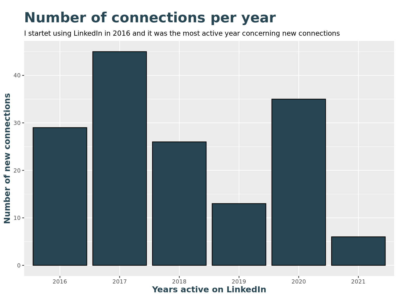
)How many new connections have I made every year?
library(ggplot2)

# Show a bar chart with frequencies by year
li_cons %>%
  ggplot() +
  geom_bar(aes(as.factor(connectedOnYear)), fill = c_col[1], color = "Black") +
  labs(title = "Number of connections per year",
       subtitle = paste("I startet using LinkedIn in", min(li_cons$connectedOnYear), "and it was the most active year concerning new connections"),
       x = "Years active on LinkedIn",
       y = "Number of new connections"
) 
How many new connections have I made every month?
# Show a bar chart with frequencies by year and quarter
li_cons %>%
  ggplot() +
  geom_bar(
    aes(connectedOnYearQuarter),
    fill = c_col[1], color = "Black"
  ) +
  labs(
    title = "Number of connections per year and quarter",
    subtitle = paste("In the first month I connected to", count(li_cons, connectedOnYearQuarter)[1,2], "contacts"),
    x = "Years and quarters active on LinkedIn",
    y = "Number of new connections"
  ) +
  theme(axis.text.x = element_text(angle = 90, vjust = 0.5, hjust = 1, size = 12))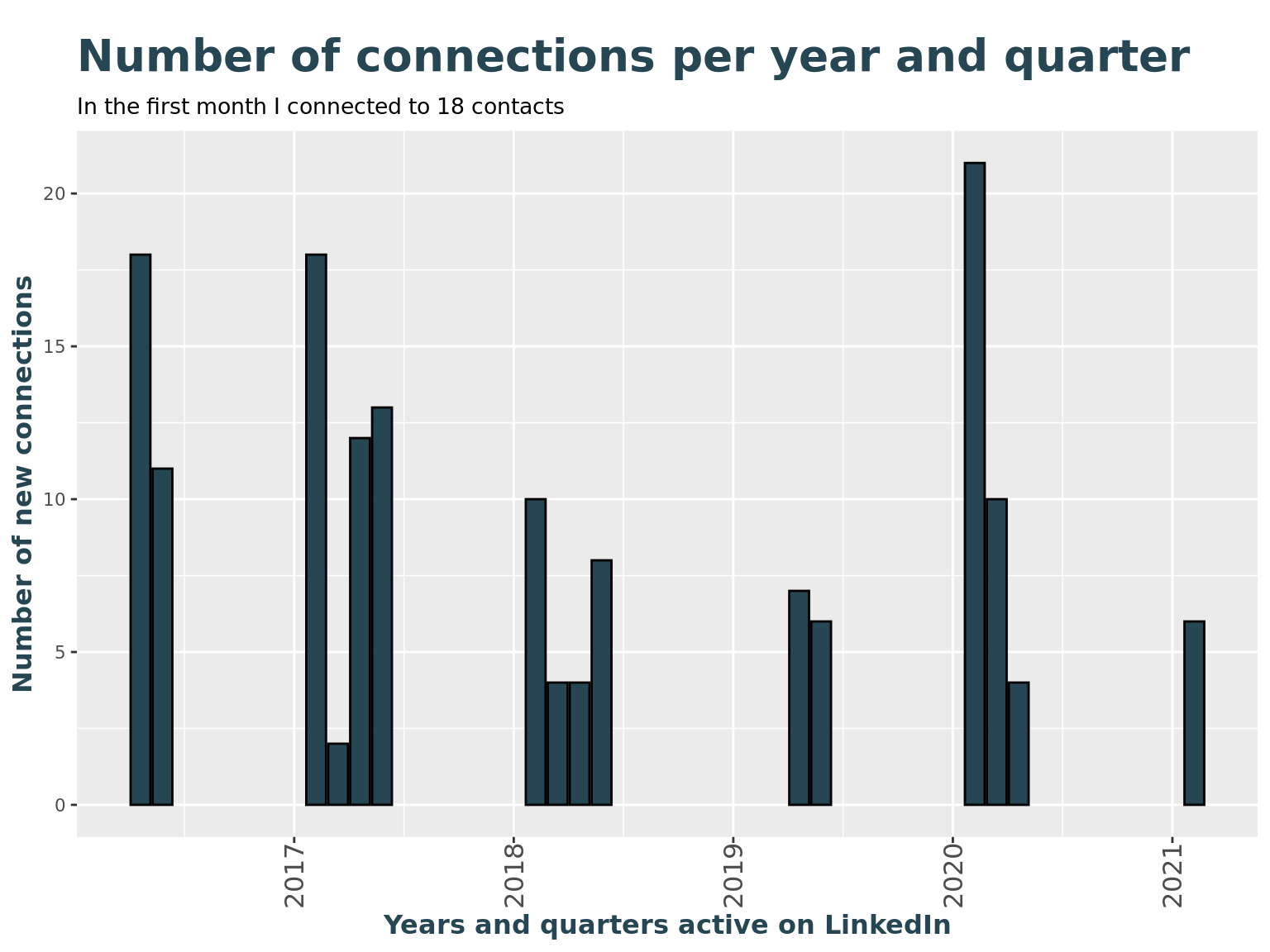
How many new connections have I made every month disregarding the first month after joining?
peak <- count(li_cons, connectedOnYearQuarter)%>%top_n(1)

# Show a bar chart with frequencies by year and quarter
li_cons %>%
  filter(connectedOnYearMonth != min(li_cons$connectedOnYearMonth)) %>%
  ggplot() +
  geom_bar(
    aes(connectedOnYearQuarter),
    fill = c_col[1], color = "Black"
  ) +
  labs(
    title = "Number of connections per year and quarter \n(without March 2012)",
    subtitle = paste("Disregarding the initial month, there is a connection peak in", zoo::as.yearqtr(peak$connectedOnYearQuarter)),
    x = "Years and quarters active on LinkedIn",
    y = "Number of new connections"
  ) +
  theme(axis.text.x = element_text(angle = 90, vjust = 0.5, hjust = 1, size = 12))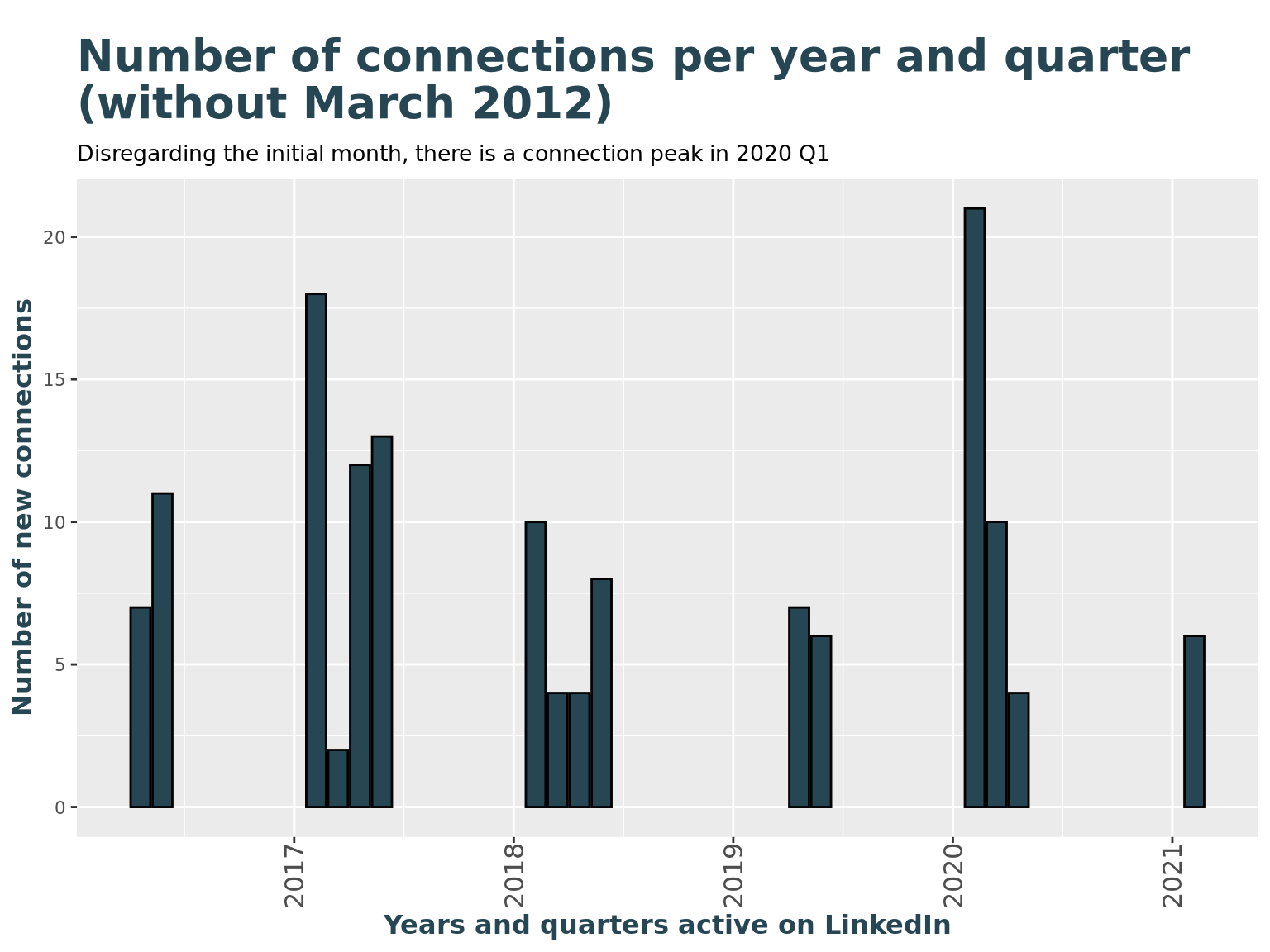
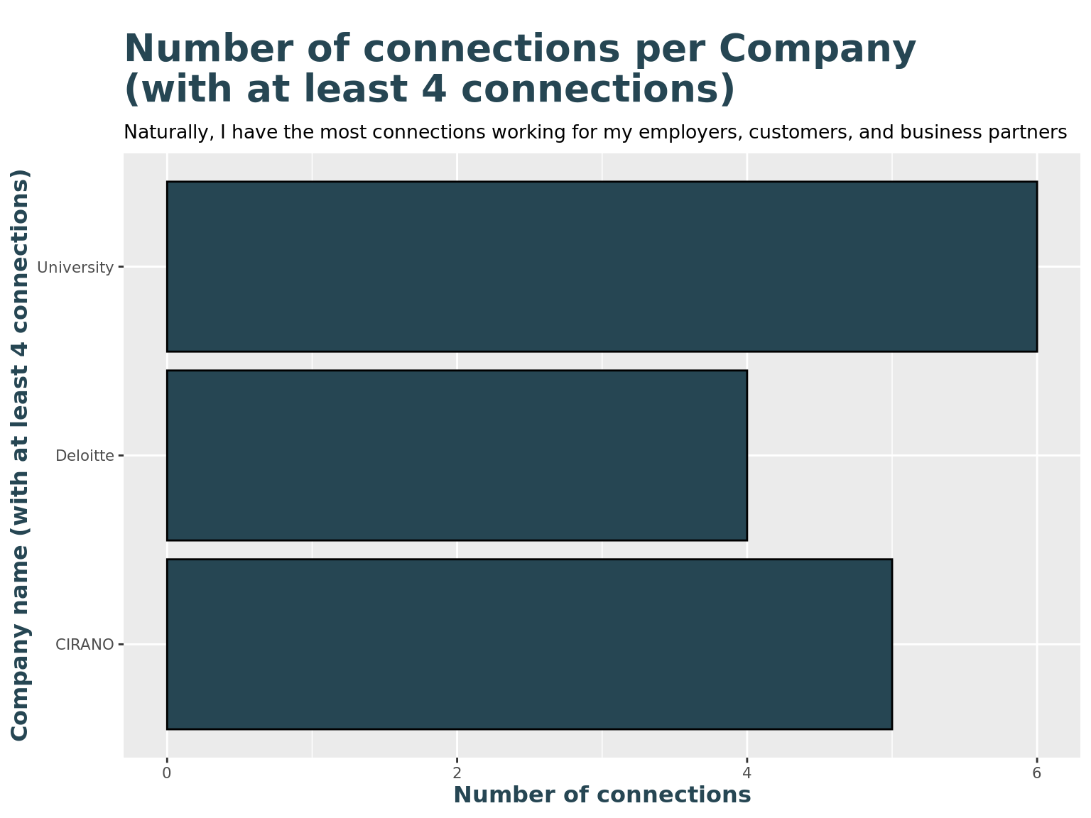
For which companies are my connections working for?
library(tidyr)
# Show frequencies of top-most companies
li_cons %>%
  group_by(comp_clean) %>%
  summarise(n = n()) %>%
  drop_na() %>%
  filter(n > 3) %>%
  arrange(-n)  %>%
  ggplot() +
  geom_col(
    aes(n, comp_clean),
    fill = c_col[1], color = "Black"
  ) +
  labs(
    title = "Number of connections per Company \n(with at least 4 connections)",
    subtitle = "Naturally, I have the most connections working for my employers, customers, and business partners",
    y = "Company name (with at least 4 connections)",
    x = "Number of connections"
) 
Are there any peak moments with top-companies?
# list of top companies, with at least 4 connections
li_top_companies <- li_cons %>%
  group_by(comp_clean) %>%
  summarise(n = n()) %>%
  arrange(n) %>%
  drop_na() %>%
  filter(n > 5) %>%
  pull(comp_clean)

li_top_companies
## [1] "University"li_cons <- li_cons %>%
mutate(
is_top_company = ifelse(comp_clean %in% li_top_companies, TRUE, FALSE),
top_company = ifelse(comp_clean %in% li_top_companies, comp_clean, "Other")
)
li_cons %>%
#filter(is_top_company) %>%
ggplot() +
geom_jitter(
aes(connectedOnYear, top_company, color = top_company),
size = 3,
height = 0.2
) +
labs(
title = "Number of connections per company \n(with at least 6 connections per company)",
subtitle = "Company information reflect my connections' actual employer and not the employer at the time \nwhen we connected",
y = "Company name (with at least 6 connections)",
x = "Years active on LinkedIn"
) +
theme(legend.position = "none") +
scale_color_manual(values=c(c_col[1], c_col[2]))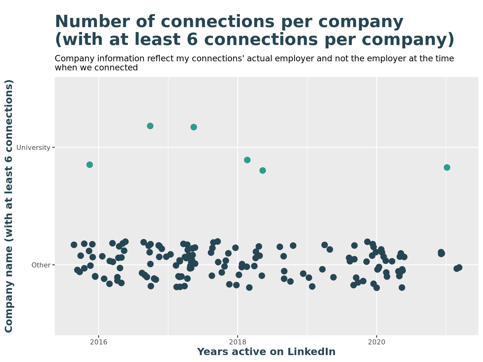
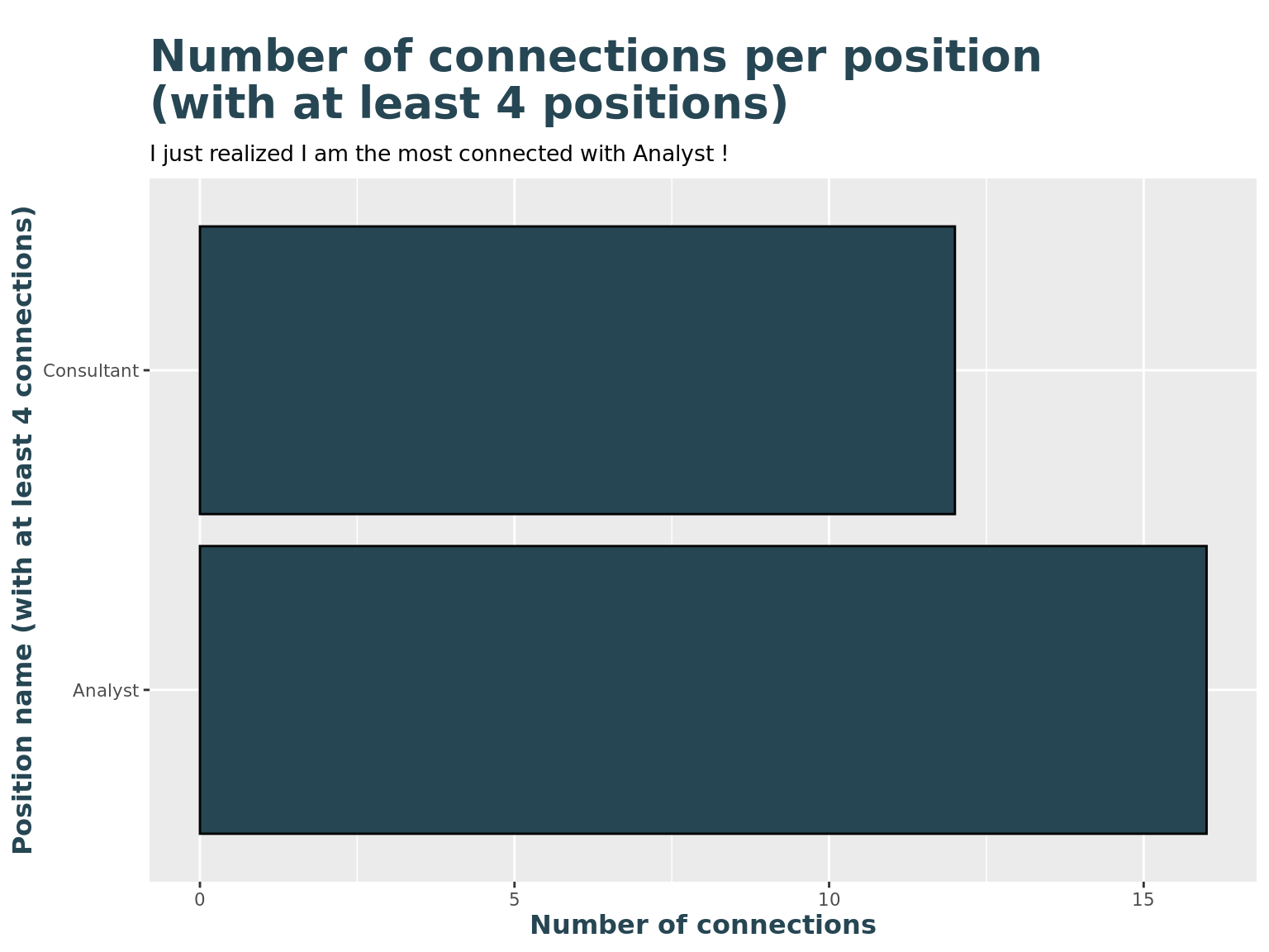
What are my connections' positions?
# Show frequencies of top-most positions

# some reording based on frequency
levels4sorting <- li_cons %>%
  group_by(pos_clean) %>%
  summarise(n = n()) %>%
  arrange(desc(n)) %>%
  drop_na() %>%
  top_n(2) %>%
  pull(pos_clean)

li_cons_topPositions <- li_cons %>%
  filter(pos_clean %in% levels4sorting)

li_cons_topPositions$pos_clean <- factor(li_cons_topPositions$pos_clean, levels = levels4sorting)

li_cons_topPositions %>%
  group_by(pos_clean) %>%
  summarise(
    n = n()
  ) %>%
  ggplot() +
  geom_col(
    aes(n, pos_clean),
    fill = c_col[1], color = "Black"
  ) +
  labs(
    title = "Number of connections per position \n(with at least 4 positions)",
    subtitle = paste("I just realized I am the most connected with", levels4sorting,"!"),
    y = "Position name (with at least 4 connections)",
    x = "Number of connections"
) 
Are there any peak moments with top-positions?
# list of top positions, with at least 4 connections
li_top_pos <- li_cons %>%
  group_by(pos_clean) %>%
  summarise(n = n()) %>%
  arrange(n) %>%
  drop_na() %>%
  filter(n >= 10) %>%
  pull(pos_clean)

li_top_pos
## [1] "Consultant" "Analyst"li_cons <- li_cons %>%
mutate(
is_top_pos = ifelse(pos_clean %in% li_top_pos, TRUE, FALSE),
top_pos = ifelse(pos_clean %in% li_top_pos, pos_clean, "Other")
)
li_cons %>%
ggplot() +
geom_jitter(
aes(connectedOnYear, top_pos, color = top_pos),
height = 0.2
) +
labs(
title = "Number of connections per position \n(with at least 10 connections per position)",
subtitle = "Position information reflect my connections' actual positions and not the positions at the time \nwhen we connected",
y = "Position (with at least 10 connections)",
x = "Years active on LinkedIn"
) +
theme(legend.position = "none") +
scale_color_manual(values=c(c_col[1], c_col[2], c_col[3]))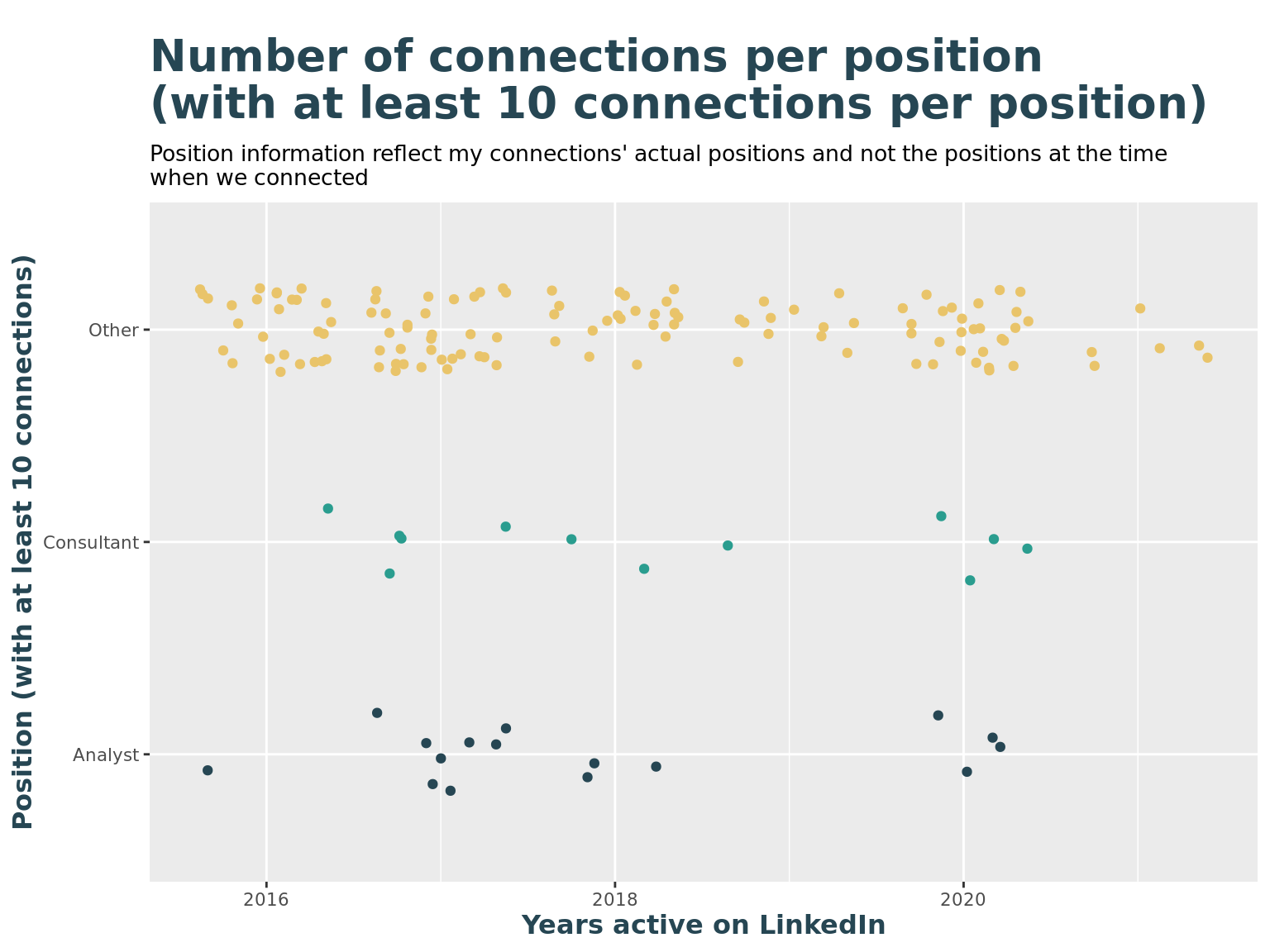
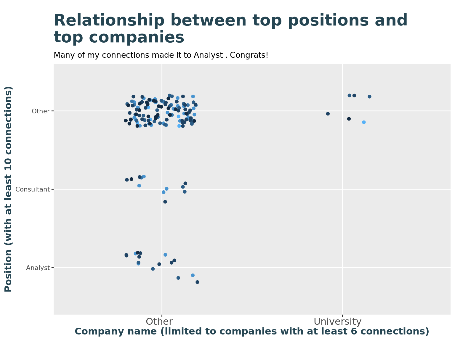
Where are the top-positions working at the moment?
# Show relationship of top positions and top companies

li_cons %>%
  ggplot() +
  geom_jitter(
    aes(top_company, top_pos, color = connectedOnYear),
    height = 0.2, width = 0.2
  ) +
  labs(
    title = "Relationship between top positions and \ntop companies",
    subtitle = paste("Many of my connections made it to", levels4sorting,". Congrats!"),
    y = "Position (with at least 10 connections)",
    x = "Company name (limited to companies with at least 6 connections)"
  ) +
  theme(legend.position = "none") +
  theme(axis.text.x = element_text(angle = 0, vjust = 0.5, hjust = 0.6, size = 12))