Installation
In your Rstudio Console run the following code.
library(devtools)

install_github('plotly/dashR', upgrade = TRUE) # It installs dashHtmlComponents, dashCoreComponents, and dashTable
Ready? Now, let's make your first Dash app.
Dash Layout
A fundamental aspect of Dash apps is the app layout.
Dash apps are composed of two parts:
- The first part is the
layoutof the app and it describes what the application looks like. - The second part describes the interactivity of the application.
To get started, create a file named app.R containing the following code:
library(dash)
library(dashCoreComponents)
library(dashHtmlComponents)
app <- Dash$new()
app$layout(
htmlDiv(
list(
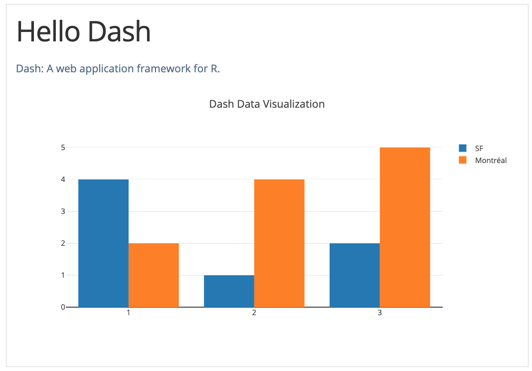
htmlH1('Hello Dash'),
htmlDiv(children = "Dash: A web application framework for R."),
dccGraph(
figure=list(
data=list(
list(
x=list(1, 2, 3),
y=list(4, 1, 2),
type='bar',
name='SF'
),
list(
x=list(1, 2, 3),
y=list(2, 4, 5),
type='bar',
name='Montr\U{00E9}al'
)
),
layout = list(title='Dash Data Visualization')
)
)
)
)
)
app$run_server()Run the app with and visit http:127.0.0.1:8050/ in your web browser. You should see an app that looks like this.
Note:
- The
layoutis composed of a tree of "components" likehtmlDivanddccGraph. - The
dashHtmlComponentspackage has a component for every HTML tag. ThehtmlH1(children='Hello Dash')component generates a<h1>Hello Dash</h1>HTML element in your application. - Not all components are pure HTML. The
dashCoreComponentsdescribe higher-level components that are interactive and are generated with JavaScript, HTML, and CSS through the React.js library. - Each component is described entirely through keyword attributes. Dash is declarative: you will primarily describe your application through these attributes.
- The
childrenproperty is special. By convention, it's always the first attribute which means that you can omit it:htmlH1(children='Hello Dash')is the same ashtmlH1('Hello Dash'). Also, it can contain a string, a number, a single component, or a list of components. - The fonts in your application will look a little bit different than what is displayed here. This application is using a custom CSS stylesheet to modify the default styles of the elements.
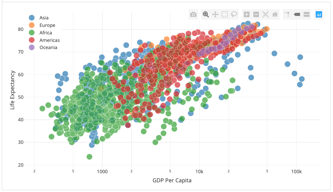
Dash Visuals
The dashCoreComponents package includes a component called dccGraph. dccGraph renders interactive data visualizations using the open source plotly.js JavaScript graphing library. Plotly.js supports over 35 chart types and renders charts in both vector-quality SVG and high-performance WebGL. The figure argument in the dccGraph component is the same figure argument that is used by plotly.R, Plotly's open source R graphing package. Check out the plotly.r documentation and gallery to learn more.
library(dash)
library(dashCoreComponents)
library(dashHtmlComponents)

app <- Dash$new()

df <- read.csv(
  file = "https://raw.githubusercontent.com/plotly/datasets/master/gapminderDataFiveYear.csv",
  stringsAsFactor=FALSE,
  check.names=FALSE
)

continents <- unique(df$continent)

data_gdp_life_exp_2007 <- with(df,
  lapply(continents,
         function(cont) {
           list(
             x = gdpPercap[continent == cont],
             y = lifeExp[continent == cont],
             opacity=0.7,
             text = country[continent == cont],
             mode = 'markers',
             name = cont,
             marker = list(size = 15,
                           line = list(width = 0.5, color = 'white'))
           )
         }
  )
)

app$layout(
  htmlDiv(
    list(
      dccGraph(
        id = 'life-exp-vs-gdp',
        figure = list(
          data =  data_gdp_life_exp_2007,
          layout = list(
            xaxis = list('type' = 'log', 'title' = 'GDP Per Capita'),
            yaxis = list('title' = 'Life Expectancy'),
            margin = list('l' = 40, 'b' = 40, 't' = 10, 'r' = 10),
            legend = list('x' = 0, 'y' = 1),
            hovermode = 'closest'
          )
        )
      )
    )
  )
)

app$run_server()
Run the app with and visit http:127.0.0.1:8050/ in your web browser. You should see an app that looks like this.
Dash Callbacks
In the previous section, we learned that the app$layout() describes what the app looks like and is a hierarchical tree of components. The dashHtmlComponents package provides classes for all of the HTML tags, and the keyword arguments describe the HTML attributes like style, className, and id. The dashCoreComponents package generates higher-level components like controls and graphs.
This section describes how to make your Dash apps interactive.
Let's take a look at this example where a dccSlider updates a dccGraph.
library(dash)
library(dashCoreComponents)
library(dashHtmlComponents)

app <- Dash$new()

df <- read.csv(
  file = "https://raw.githubusercontent.com/plotly/datasets/master/gapminderDataFiveYear.csv",
  stringsAsFactor=FALSE,
  check.names=FALSE
)

continents <- unique(df$continent)
years <- unique(df$year)

# dccSlider starts from 0;
app$layout(
  htmlDiv(
    list(
      dccGraph(id = 'graph-with-slider'),
      dccSlider(
        id = 'year-slider',
        min = 0,
        max = length(years) - 1,
        marks = years,
        value = 0
      )
    )
  )
)

app$callback(
  output = list(id='graph-with-slider', property='figure'),
  params = list(input(id='year-slider', property='value')),

  function(selected_year_index) {

    which_year_is_selected <- which(df$year == years[selected_year_index + 1])

    traces <- lapply(continents,
                     function(cont) {

                       which_continent_is_selected <- which(df$continent == cont)

                       df_sub <- df[intersect(which_year_is_selected, which_continent_is_selected), ]

                       with(
                         df_sub,
                         list(
                           x = gdpPercap,
                           y = lifeExp,
                           opacity=0.5,
                           text = country,
                           mode = 'markers',
                           marker = list(
                             size = 15,
                             line = list(width = 0.5, color = 'white')
                           ),
                           name = cont
                         )
                       )
                     }
    )

    list(
      data = traces,
      layout= list(
        xaxis = list(type = 'log', title = 'GDP Per Capita'),
        yaxis = list(title = 'Life Expectancy', range = c(20,90)),
        margin = list(l = 40, b = 40, t = 10, r = 10),
        legend = list(x = 0, y = 1),
        hovermode = 'closest'
      )
    )
  }
)

app$run_server()
Run the app with and visit http:127.0.0.1:8050/ in your web browser. You should see an app that looks like this.
In this example, the value property of the dccSlider is the input of the app and the output of the app is the figure property of the dccGraph. Whenever the value of the dccSlider changes, Dash calls the callback function update_figure with the new value. The function filters the dataframe with this new value, constructs a figure object, and returns it to the Dash application.
Note:
- We load our dataframe at the start of the app:
df <- read.csv('...'). This dataframedfis in the global state of the app and can be read inside the callback functions. - Load data into memory can be expensive. By loading querying data at the start of the app instead of inside the callback functions, we ensure that this operation is only done when the app server starts. When a user visits the app or interacts with the app, that data (
df) is already in memory. If possible, expensive initialization (like downloading or querying data) should be done in the global scope of the app instead of within the callback functions. - The callback does not modify the original data, it just creates copies of the dataframe. This is important: your callbacks should never mutate variables outside of their scope. If your callbacks modify global states, then one user's session might affect the next user's session and when the app is deployed on multiple processes or threads, those modifications will not be shared across sessions.
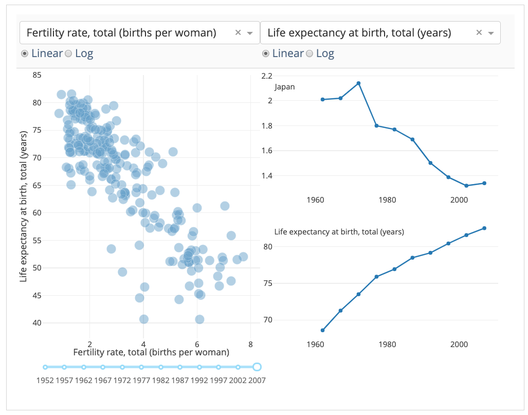
Interactive Dash
Let's update our world indicators example from the previous chapter by updating time series when we hover over points in our scatter plot.
library(dash)
library(dashCoreComponents)
library(dashHtmlComponents)

app <- Dash$new()

df <- read.csv('dashr/chapters/callbacks/examples/indicators.csv', header = TRUE, sep = ",")
available_indicators <- unique(df$Indicator_Name)
option_indicator <- lapply(available_indicators, function(x) list(label = x, value = x))

app$layout(
  htmlDiv(list(
    htmlDiv(list(
      htmlDiv(list(
        dccDropdown(
          id = 'crossfilter-xaxis-column',
          options = option_indicator,
          value = 'Fertility rate, total (births per woman)'
        ),
        dccRadioItems(
          id = 'crossfilter-xaxis-type',
          options = list(list(label = 'Linear', value = 'linear'),
                         list(label = 'Log', value = 'log')),
          value = 'linear',
          labelStyle = list(display = 'inline-block')
        )
      ), style = list(width = '49%', display = 'inline-block')),

      htmlDiv(list(
        dccDropdown(
          id = 'crossfilter-yaxis-column',
          options = option_indicator,
          value = 'Life expectancy at birth, total (years)'
        ),
        dccRadioItems(
          id = 'crossfilter-yaxis-type',
          options = list(list(label = 'Linear', value = 'linear'),
                         list(label = 'Log', value = 'log')),
          value = 'linear',
          labelStyle = list(display = 'inline-block')
        )
      ), style = list(width = '49%', flaot = 'display', display = 'inline-block'))
    ), style = list(
      borderBottom = 'thin lightgrey solid',
      backgroundColor = 'rgb(250, 250, 250)',
      padding = '10px 5px')
    ),

    htmlDiv(list(
      dccGraph(
        id = 'crossfilter-indicator-scatter',
        hoverData = list(points = list(list(customdata = 'Japan')))
      )), style = list(
        width ='49%',
        display = 'inline-block',
        padding = '0 20')
    ),

    htmlDiv(list(
      dccGraph(id='x-time-series'),
      dccGraph(id='y-time-series')
    ), style = list(display = 'inline-block', width = '49%')),

    htmlDiv(list(
      dccSlider(
        id = 'crossfilter-year--slider',
        min = 0,
        max = length(unique(df$Year))-1,
        marks = unique(df$Year),
        value = length(unique(df$Year))-1
      )
    ), style = list(width = '49%', padding = '0px 20px 20px 20px'))
  ))
)

app$callback(
  output = list(id='crossfilter-indicator-scatter', property='figure'),
  params = list(input(id='crossfilter-xaxis-column', property='value'),
                input(id='crossfilter-yaxis-column', property='value'),
                input(id='crossfilter-xaxis-type', property='value'),
                input(id='crossfilter-yaxis-type', property='value'),
                input(id='crossfilter-year--slider', property='value')),
  function(xaxis_column_name, yaxis_column_name, xaxis_type, yaxis_type, year_value) {
    selected_year <- unique(df$Year)[year_value]
    dff <- selected_year
    traces <- list()
    if (selected_year %in% unique(df$Year)){
      filtered_df <- df[df[["Year"]] %in% selected_year, ]
      traces[[1]] <- list(
        x = filtered_df[filtered_df$Indicator_Name %in% xaxis_column_name, "Value"],
        y = filtered_df[filtered_df$Indicator_Name %in% yaxis_column_name, "Value"],
        opacity=0.7,
        text = filtered_df[filtered_df$Indicator_Name %in% yaxis_column_name, "Country_Name"],
        customdata = filtered_df[filtered_df$Indicator_Name %in% yaxis_column_name, "Country_Name"],
        mode = 'markers',
        marker = list(
          'size'= 15,
          'opacity' = 0.5,
          'line' = list('width' = 0.5, 'color' = 'white')
        )
      )

      return (list(
        'data' = traces,
        'layout'= list(
          xaxis = list('title' = xaxis_column_name, 'type' = xaxis_type),
          yaxis = list('title' = yaxis_column_name, 'type' = yaxis_type),
          margin = list('l' = 40, 'b' = 30, 't' = 10, 'r' = 0),
          height = 450,
          hovermode = 'closest'
        )
      ))
    }
  }
)

create_time_series <- function(dff, axis_type, title){
  return(list(
    'data' = list(list(
      x = dff[['Year']],
      y = dff[['Value']],
      mode = 'lines+markers'
    )),
    'layout' = list(
      height = 225,
      margin = list('l' = 20, 'b' = 30, 'r' = 10, 't' = 10),
      'annotations' = list(list(
        x = 0, 'y' = 0.85, xanchor = 'left', yanchor = 'bottom',
        xref = 'paper', yref = 'paper', showarrow = FALSE,
        align = 'left', bgcolor = 'rgba(255, 255, 255, 0.5)',
        text = title[1]
      )),
      yaxis = list(type = axis_type),
      xaxis = list(showgrid = FALSE)
    )
  ))
}

app$callback(
  output = list(id='x-time-series', property='figure'),
  params = list(input(id='crossfilter-indicator-scatter', property='hoverData'),
                input(id='crossfilter-xaxis-column', property='value'),
                input(id='crossfilter-xaxis-type', property='value')),
  function(hoverData, xaxis_column_name, axis_type) {
    country_name = hoverData$points[[1]]$customdata
    dff <- df[df[["Country_Name"]] %in% country_name, ]
    dff <- dff[dff[["Indicator_Name"]] %in% xaxis_column_name, ]
    title = paste(c(country_name, xaxis_column_name), sep = '<br>')
    return(create_time_series(dff, axis_type, title))
  }
)

app$callback(
  output = list(id='y-time-series', property='figure'),
  params = list(input(id='crossfilter-indicator-scatter', property='hoverData'),
                input(id='crossfilter-yaxis-column', property='value'),
                input(id='crossfilter-yaxis-type', property='value')),
  function(hoverData, yaxis_column_name, axis_type) {
    dff <- df[df[["Country_Name"]] %in% hoverData$points[[1]]$customdata, ]
    dff <- dff[dff[["Indicator_Name"]] %in% yaxis_column_name, ]
    return(create_time_series(dff, axis_type, yaxis_column_name))
  }
)

app$run_server()
Run the app with and visit http:127.0.0.1:8050/ in your web browser. You should see an app that looks like this.
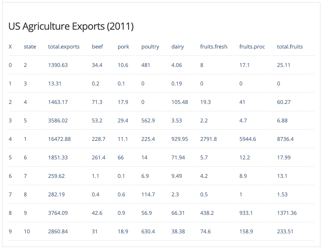
Dash Table
Here's a quick example that generates a Table.
library(dash)
library(dashCoreComponents)
library(dashHtmlComponents)

df <- read.csv(url("https://gist.githubusercontent.com/chriddyp/c78bf172206ce24f77d6363a2d754b59/raw/c353e8ef842413cae56ae3920b8fd78468aa4cb2/usa-agricultural-exports-2011.csv"))

generate_table <- function(df, nrows=10) {

  rows <- lapply(1: min(nrows, nrow(df)),
                 function(i) {
                   htmlTr(children = lapply(as.character(df[i,]), htmlTd))
                 }
  )
  header <- htmlTr(children = lapply(names(df), htmlTh))
  htmlTable(
    children = c(list(header), rows)
  )
}

app <- Dash$new()

app$layout(
  htmlDiv(
    list(
      htmlH4(children='US Agriculture Exports (2011)'),
      generate_table(df)
    ), style = list("overflow-x" = "scroll")
  )
)

app$run_server()
Run the app with and visit http:127.0.0.1:8050/ in your web browser. You should see an app that looks like this.
If you wish to customize your Table, you can ckeck the Dash DataTable guide.
References
This course uses the Dash R User Guide.
Acknowledgments
To cite this course:
Warin, Thierry. 2019. “Bootcamp in R: The Fundamentals.” doi:10.6084/m9.figshare.9956315.v1.