Introduction
When it comes to data science, we basically do three important things:
- we collect the relevant data (from a .csv file, from a Google Sheets document, or from an API - Application Programming Interface);
- we visualize the data;
- we analyze the data using statistical and econometric methods.
In short, we do the C-V-A approach.
In this second document, we will focus on collecting data and creating graphs using these data. You will realize what reproductible research is all about!
Goals
At the end of the lab, you should be able to:
- import data from a .csv file as well as from a Google Sheets document;
- visualize the data in a reproductible way.
Keywords: RStudio; importing data; data visualization; reproducible research
Packages
During this nanocourse, you will learn how to use the R language by creating R Markdown documents in order to do reproductible research. You will use snipets of code to test and verify your hypothesis. The R programming language is a powerful and simple language for data science. You are not starting from scratch since it relies on packages developed by scholars and programmers.
At the beggining of your document, you need to call these packages in order to be able to use the algorithms developed. In order to do so, you need to insert inside a R chunk (see R nanocourse #1) the following command:
library(package)In this nanocourse, you will learn how to use a few of them.
Importing data
From a .csv file
First, upload your document in the lower right-hand panel of your console by pressing the upload button in the Files tab. The document will appear in the list of documents that you can use for your project.
Second, you need to load your data into your environment (top right-hand panel). You need to create a new variable that will hold all information from your .csv file. This way, you will be able to interact with your data. For a .csv file, you need to write the following command inside a R chunk:
# Loading the dataset into a variable named variableName
variableName <- read.csv("rNanocourse2DataForGraph.csv", header = TRUE, sep = ";")
With:
variableNamethe name of your new variable that will hold all information from a dataset;"rNanocourse2DataForGraph.csv"corresponding to the name of the files you previously imported;header = TRUEif the first line of your dataset contains the names of all columns,header = FALSEotherwise;sep = ";"if the separation between columns is set to be a semicolon (could be "," depending on your dataset thensep = ",").
Now, you can interact with your dataset by using the name of your variable. We will go in details during the third laboratory dedicated to data manipulation. For example:
# Show first 6 lines of the dataset
head(variableName)
# Summary of the dataset
summary(variableName)## date.country.variable.value
## Length:18
## Class :character
## Mode :characterFrom a Google sheet
A second way to import data is to go through Google Drive, by using Google Sheets. RStudio is able to connect to any spreadsheet in a Google Drive account, which helps any work involving multiple people. A third and optimal option will be presented in the next session, using the gsheet package.
You need to create a new Google Sheets document. After naming your spreadsheet, you need to configure the sharing options. In order to do so, click on the Share button in the corner of your spreadsheet. A panel will appear and you need to select the following setting:
- Anyone with the link can edit
Copy the link you will obtain after this step. The link will be somewhat like this:
https://docs.google.com/spreadsheets/d/1DNvPgCJvKRzUwVigrj7NLgbvJ00isL4j4zYMYuI0Ya0/edit?usp=sharing
First, you need to load a package in your document, the gsheet package and then use the gsheet2tbl() function. You have to copy the link between parenthesis and quotation marks as following:
# Loading the gsheet package
library(gsheet)

# Read data from the URL
data2 <- gsheet2tbl("https://docs.google.com/spreadsheets/d/1DNvPgCJvKRzUwVigrj7NLgbvJ00isL4j4zYMYuI0Ya0/edit?usp=sharing")

# Delete the line with a missing value
data2 <- na.omit(data2)
# Show first 6 lines of the dataset
head(data2)# Summary of the dataset
summary(data2)## RD2014 rdGrowth RDGrowth3yr RDintensity
## Min. : 28.8 Min. :-44.70 Min. :-53.500 Min. : 0.20
## 1st Qu.: 36.4 1st Qu.: -2.55 1st Qu.: -4.750 1st Qu.: 3.80
## Median : 63.1 Median : 8.90 Median : 3.300 Median : 9.10
## Mean : 201.6 Mean : 23.79 Mean : 5.463 Mean :11.86
## 3rd Qu.: 182.2 3rd Qu.: 40.05 3rd Qu.: 18.800 3rd Qu.:14.20
## Max. :1508.1 Max. :208.90 Max. : 48.600 Max. :58.70Now you should be able to fullfil the first task of this laboratory, i.e. loading data from a .csv file or from a Google Sheets document.
Data visualizations
One of the most powerful aspect of R is the ability to visualize data. Several packages have been developed to do so. We will focus on three visualizations, namely a bar chart, a line chart and a bubble chart. A second laboratory at the end of the semester will be dedicated to complex visualizations.
Two new packages are introduced:
ggplot2: data visualization
ggthemes: complementary color themes for ggplot2 graphics
Bar charts
First, you need to load the different packages used for your graphics.
# Loading the ggplot2 and the ggthemes packages
library(ggplot2)
library(ggthemes)
After that, we will load a dataset that will be used for the three different graphics.
# Loading data
dataGraph <- read.csv("rNanocourse2DataForGraph.csv", header = TRUE, sep = ",")

# Reading the first 10 lines of the dataset
head(dataGraph, n = 10)
# Bar chart elements
ggplot(data = dataGraph, aes(x = date, y = value, fill = country)) +
geom_bar(stat = "identity", width = 0.5, position = "dodge") +
ylab("") +
xlab("") +
guides(col = guide_legend(row = 1)) +
theme_hc() +
scale_fill_brewer(direction = -1)## Warning in guide_legend(row = 1): Arguments in `...` must be used.
## ✖ Problematic argument:
## • row = 1
## ℹ Did you misspell an argument name?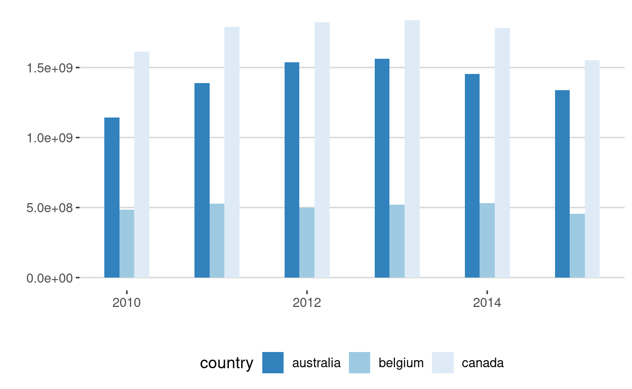
Lines
# Loading the ggplot2 and the ggthemes packages
library(ggplot2)
library(ggthemes)
# Line chart elements
ggplot(data = dataGraph, aes(x = date, y = value, color = country)) +
geom_line() +
ylab("") +
xlab("") +
geom_smooth(span = 0.8) +
ggtitle("") +
theme_hc() +
scale_color_brewer(direction = -1) +
guides(fill=FALSE) +
geom_point(colour = "blue", size = 2,shape = 22)## `geom_smooth()` using method = 'loess' and formula = 'y ~ x'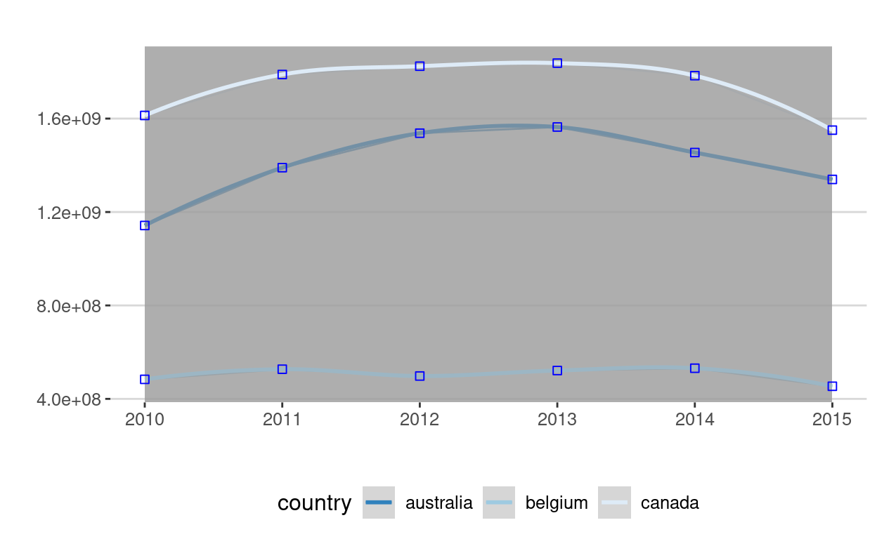
Bubble chart
# Loading the ggplot2 and the ggthemes packages
library(ggplot2)
library(ggthemes)
# Bubble chart elements
ggplot(data = dataGraph, aes(x = date, y = value, color = country)) +
geom_point(aes(size = value)) +
scale_size_continuous(range = c(2,15)) +
ggtitle("") +
theme_hc() +
scale_color_brewer(direction = -1) +
theme(axis.title.x = element_blank()) +
guides(fill=FALSE)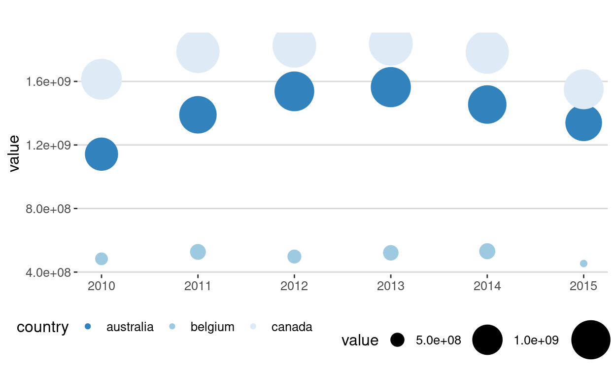
Now, you are able to:
- load any data from a .csv file and a Google Sheets document;
- visualize your data in a simple and efficient manner.
Quiz
Import a google sheet with enough information to make a graph. To make it easier, we've create one for you:
https://docs.google.com/spreadsheets/d/139I7t-22g7g24RVY2aniCqte8B7ZltGCPnODkNXBHOY/edit?usp=sharing
Create a graph, any graph, using this sheet, or any sheet you'd like.
library(gsheet)
sheet<-gsheet2tbl("https://docs.google.com/spreadsheets/d/139I7t-22g7g24RVY2aniCqte8B7ZltGCPnODkNXBHOY/edit?usp=sharing")
library(ggplot2)
ggplot(data=sheet, aes(x=Student, y=Results, color=Sex))+
geom_point()+
geom_line()
References
This first data visualization laboratory kept things simple. You can dive into complexity depending on the datasets that you will collect during the semester. We will explore other ways to showcase your results during the nanocourse
Resources
For more on ggplot2, please refer to:
- https://www.rstudio.com/wp-content/uploads/2015/02/rmarkdown-cheatsheet.pdf
- http://docs.ggplot2.org/current/
For some tips on bar and line graphs using ggplot2:
Packages
- ggplot2: H. Wickham & W. Chang
- XML: D. Temple Lang et al.
- ggthemes: J. Arnold et al.
Acknowledgments
To cite this course:
Warin, Thierry. 2020. “Nüance-R: R Nanocourses.” doi:10.6084/m9.figshare.11842416.v2.