Introduction
After the three first parts of the nanocourse, you have learned the basics of manipulating R and the Markdown language in the context of International Business. This session will consolidate all previous steps in order to create dynamic documents from an initial RMarkdown document.
Goals
At the end of the lab, you should be able to:
- explore the YAML options;
- understand the details of the R chunk settings;
- {import | transform | visualize} your data in a reproducible process.
- export your RMarkdown document in a {PDF | .html | .doc} file;
- transform your RMarkdown document into a ioslide format (powerpoint-like);
The goal of this session is to create a RMarkdown document regarding the analysis of a specific industrial sector in Russia. This RMarkdown document will produce both a PDF file and an ioslide presentation.
Keywords: RMarkdown; ioslide; beamer; RStudio; reproducible research
List of all commands studied so far
Throughout the last three Nanocourses, we have seen a total of 28 different commands. With these commands, you will be able to perform your analysis.
| Command | Detail | R nanocourse |
|---|---|---|
 |
Embedding an image | Nanocourse 1 |
 |
Text in bold | Nanocourse 1 |
 |
Text in italic | Nanocourse 1 |
 |
URL link | Nanocourse 1 |
 |
First level title | Nanocourse 1 |
 |
Second level title | Nanocourse 1 |
 |
Third level title | Nanocourse 1 |
 |
Equation in LaTeX format | Nanocourse 1 |
| library() | Loading library in the environment | Nanocourse 2 |
| read.csv() | Reading .csv file | Nanocourse 2 |
| readGoogleSheet() | Reading Google Sheet document | Nanocourse 2 |
| cleanGoogleTable() | Cleaning Google Sheet document | Nanocourse 2 |
| head() | Show first lines of a dataframe | Nanocourse 2 |
| summary() | Description of the dataframe | Nanocourse 2 |
| as.numeric() | Treat data as numeric | Nanocourse 2 |
| as.factor() | Treat data as factor | Nanocourse 2 |
| geom_bar() | Bar chart | Nanocourse 2 |
| geom_line() | Line chart | Nanocourse 2 |
| geom_point() | Point chart | Nanocourse 2 |
| gsheet2tbl() | Load Google Sheet document | Nanocourse 3 |
| dataframe$newColumn | Create new column in dataframe | Nanocourse 3 |
| $newColumn <- NULL | Erase column | Nanocourse 3 |
| dim() | Size of the dataframe | Nanocourse 3 |
| filter() | Subset of a dataframe | Nanocourse 3 |
| arrange() | Sort by ascending value | Nanocourse 3 |
| arrange(,desc()) | Sort by descending value | Nanocourse 3 |
| dcast() | Long to wide format | Nanocourse 3 |
| melt() | Wide to long format | Nanocourse 3 |
| full_join() | Merge 2 dataframes based on common columns | Nanocourse 3 |
Syntax options
YAML
The YAML is the first lines of code telling how your document will be rendered. It lies in the top of your document between 3 dashed lines.
---
title: "R nanocourse 4: Dynamic Documents"
author: "Thierry Warin"
date: "12/02/2020"
output:
  html_document:
    toc: yes
    toc_depth:3
  pdf_document:
    toc: yes
    toc_depth:3
---
In the output section, you have several options:
- toc: yes/no, which enable/disable the table of content
- toc_depth: number, which set the depth of the table of content
You can set a specific date to your document, but also change it so that it will render the actual date of rendering. For example, you are writing a document that will be compiled in three months, the date that will be shown will be the actual date. To do so, you can enter a command in R code that will seek for the actual date of your console, using the format() function.
date: `r format(Sys.time(), '%d %B, %Y')`Task:
- Create a new document (.Rmd): File > New File > R Markdown...
- Set your YAML settings according to the date of knitting
R chunk settings
Every line of R code has to be confined between dashed lines for the RStudio console to interpret them.
However, it is possible to set different parameters in order to render different outputs for each R chunk. These settings have to specified in the first line of the R chunk, such as:
echo = FALSE/TRUE: if FALSE, the code will not been shownwarning = FALSE/TRUE: if FALSE, warnings will not been shownmessage = FALSE/TRUE: if FALSE, messages generated by the code will not been shownfig.align = 'center'/'left'/'right': will align the figure generated depending on the setting

Analysis of an industrial sector
With your previous nanocourses, you have in hand all the algorithms (see first section of this nanocourse: List of all command lines studied so far) needed for your analysis. Let's take the UNIDO database and focus on a particular industrial sector (sugar industry - ISIC1542) to reveal interesting insights. For the details of each line of code, please refer to the Laboratory Nanocourse 3.
Task:
- Load the UNIDO database regarding the overall industrial sector (gs15x)
- Subset the dataframe in order to keep only data appropriate (IsicCode = 1542)
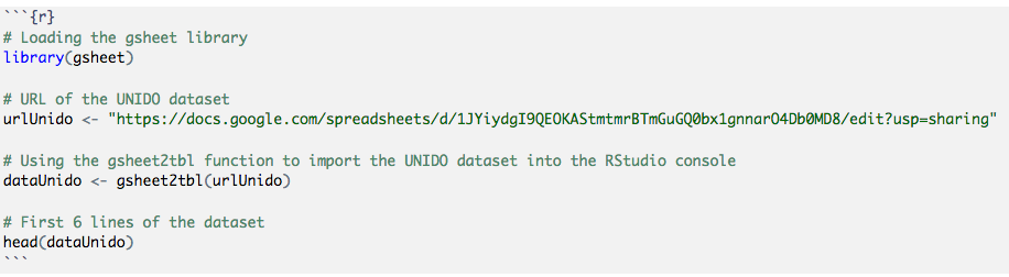
# Loading packages
library(gsheet)
library(dplyr)

# URL of the UNIDO dataset
gs15x <- "https://docs.google.com/spreadsheets/d/1aTJFKmkH2oxYcg0aiWeMAttGWKdM1u2KS5OyIlUkI6Q/edit?usp=sharing"

# Using the gsheet2tbl function to import the UNIDO dataset into the RStudio console
dataUnido <- gsheet2tbl(gs15x)

# Transform variables into numeric values
dataUnido$Value <- as.numeric(dataUnido$Value)
dataUnido$Tablecode <- as.numeric(dataUnido$Tablecode)
dataUnido$CountryCode <- as.numeric(dataUnido$CountryCode)
dataUnido$Year <- as.numeric(dataUnido$Year)
dataUnido$IsicCode <- as.numeric(dataUnido$IsicCode)
dataUnido$Unit <- NULL

# Subset concerning only data for the IsicCode = 1542
dataUnidoSubset <- filter(dataUnido, IsicCode == 1542)
Number of employees
Task:
- Select a subset of the dataset regarding only the number of employees (Tablecode == 04)
- Provide for 2010 a ranking of the country with the most important number of employees
- Visualize and compare the top 7 countries in terms of employees
# Data regarding the number of employees
dataEmployees <- filter(dataUnidoSubset, Tablecode == 4)

# Data regarding 2010
dataEmployees2010 <- filter(dataEmployees, Year == 2010)

# List the 10 most important countries in terms of employees in 2010
ranking <- arrange(dataEmployees2010, desc(Value))
The list of the top 7 countries in terms of employees in the Sugar industry in 2010 are :
head(ranking, n=7)Now, let's visualize these data in a bar chart.
library(ggplot2)
library(ggthemes)
library(reshape2)

# Transform the column 'CountryCode' in a factor type
ranking$CountryCode <- as.factor(ranking$CountryCode)

# Produce a bar chart
ggplot(data = ranking[1:7,], aes(x = CountryCode, y = Value, fill = CountryCode)) +
  geom_bar(stat = "identity", width = 0.5, position = "dodge")  +
  ylab("Number of employees")  +
  xlab("") +
  guides(col = guide_legend(row = 1)) +
  theme_hc() +
  scale_fill_brewer(direction = -1)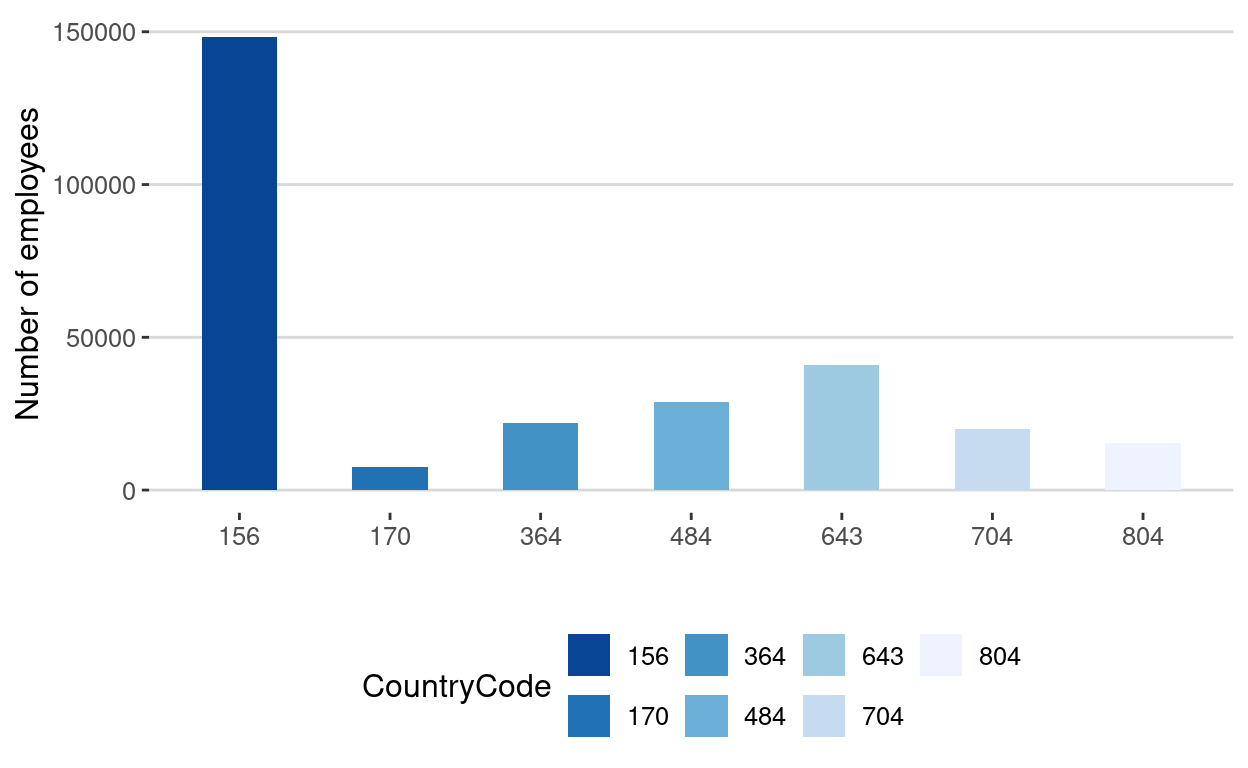
So the most important countries in terms of employees in the sugar industry in 2010 are:
- China
- Russia
- Mexico
- Iran
- Vietnam
- Ukraine
- Colombia
Number of establishments
Based on previous results, we would like to observe the evolution of the number of establishments in the top 3 countries as of 2010 in terms of employees (i.e. China, Russia, Mexico).
Task:
- From the sugar industry dataset, select data corresponding to these 3 countries for all available years
- Visualize the evolution of the number of establishments through time
# Subset of the dataEmployees dataframe concerning only the three selected countries
dataEmployeesCountries <- filter(dataEmployees, CountryCode == 156 | CountryCode == 643 | CountryCode == 484)

# Transform the column 'CountryCode' in a factor type
dataEmployeesCountries$CountryCode <- as.factor(dataEmployeesCountries$CountryCode)

# Produce a line chart
ggplot(data = dataEmployeesCountries, aes(x = Year, y = Value, color = CountryCode)) +
  geom_line()  +
  ylab("")  +
  xlab("") +
  geom_smooth(span = 0.8) +
  ggtitle("") +
  theme_hc() +
  scale_color_brewer(direction = -1) +
  guides(fill=FALSE) +
  geom_point(colour = "blue", size = 2,shape = 22)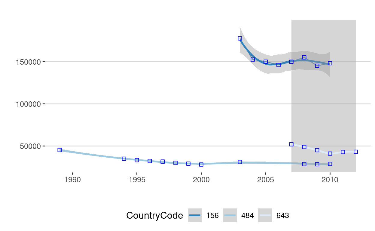
File format
PDF / HTML / doc
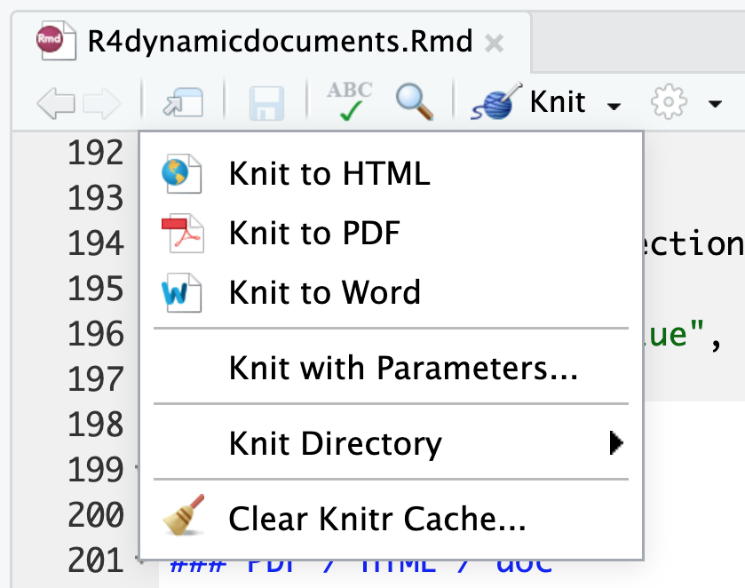
Now that your analysis has been completed, you can export your document in different format from the same RMarkdown file. To do so, click on the arrow on the right of the "Knit HTML" buttom and select the appropriate format (HTML, PDF, doc).
Task:
- Render your RMarkdown document into a PDF file
- Render your RMarkdown document into a HTML file
Ioslide / Beamer presentation
From the same RMarkdown file, it is possible to generate a "powerpoint" presentation. To do so, please consider the following instructions. First, you have to change the YAML options: in the output field, insert:
output: beamer_presentation(powerpoint)
output: ioslides_presentation(interactive presentation)
Secondly, a proper typology has to be adopted:
- For a first-level slide, insert "#" before the title
- For a second-level slide, insert "##" before the title
Task:
- Open a new RMarkdown document
- Select the code corresponding to the industrial analysis
- Create an ioslide/beamer document
- Showcase your results in the two different formats
References
Resources
For more on the RMarkdown syntax, please refer to:
Packages
- ggplot2: H. Wickham & W. Chang
- ggthemes: J. Arnold et al.
- reshape2: H. Wickham
- gsheet: M. Conway
- dplyr: H. Wickham & R. Francois
- tidyr: H. Wickham
Acknowledgments
To cite this course:
Warin, Thierry. 2020. “Nüance-R: R Nanocourses.” doi:10.6084/m9.figshare.11842416.v2.