dataCanadaFullLong <- readr::read_csv("./data/dataCanadaFullLong.csv")5 Creating Beautiful Visuals
In this chapter, we learn to create several types of data visualizations in R: bar charts, line charts, bubble charts, and maps. We will also explore some options to improve your graphics, including an introduction to using D3 (a powerful JavaScript visualization library) through its R wrapper. By the end of the chapter, you should be able to:
- Create bar charts
- Produce line charts
- Generate bubble charts
- Create maps
- Integrate D3 visualizations in R for interactive graphics
Data visualization is broadly defined as the act of conveying information through graphical representations of data. But why do we visualize data? One reason is the sheer volume and complexity of data in the modern world. According to a Forbes report, 2.5 quintillion bytes of data are created each day, and an estimated 90% of the world’s data was generated in just the last two years. This explosion of data calls for better tools and techniques to understand, analyze, and communicate information effectively. As Google’s chief economist Hal Varian famously said, “The ability to take data – to be able to understand it, to process it, to extract value from it, to visualize it, to communicate it – that’s going to be a hugely important skill in the next decades…”. Data visualization is a cornerstone of that skillset, because it leverages our visual perception to make sense of complex information.
We can identify several goals of data visualization:
- Record: Visualizations can be used to record information (for example, ancient maps or scientific illustrations documented knowledge for future reference).
- Analyze and Explore: We use visualizations to explore data, find patterns, and gain insights (often called exploratory data analysis).
- Communicate: Perhaps most importantly, visualizations help communicate data and findings to others in a clear and compelling way.
To illustrate these goals, consider some historical examples. In the era of exploration, maps were a crucial form of data visualization to record geographical information. One famous example is Alfred E. Pease’s “Road Map” (1901) of regions in East Africa (countries of Jidda, Jeelé, Liban, Adda, Choré, Wata, Wargi, Arusi, and Koreyu Gallas), which recorded travel routes and geographic features in great detail. Similarly, the missionary-explorer David Livingstone created maps of central and southern Africa in the mid-19th century; his surveys enabled large regions to be mapped that had previously been blank on European maps, thus recording new geographical data and aiding future exploration. Another example of recording information visually is the famous notebooks of Leonardo da Vinci. Leonardo’s meticulous sketches of human anatomy and designs of machines are early data visualizations – he used drawings to document observations from nature and engineering. These historical cases show how visualization has long been used to capture and preserve knowledge.
Visualization is also fundamental for analysis and invention. In 1786, William Playfair, a Scottish engineer and economist, introduced some of the first statistical graphics. He is credited with inventing the line graph, bar chart, and pie chart – basic visual forms that we still use to analyze data today. Playfair’s charts allowed people to see economic data (such as imports and exports) over time and compare values at a glance, something not easily done with raw tables of numbers. By translating data into visuals, Playfair essentially created a new language for analyzing statistical information.
Visualizations are extremely effective at communicating ideas to an audience. A great modern example is the work of Hans Rosling, who became famous for turning global statistics into animated visual stories. In his 2006 TED Talk “The Best Stats You’ve Ever Seen”, Rosling used interactive bubble charts (through the Gapminder software) to debunk myths about global development. It was “the first time [many had] seen somebody tell such a compelling story based on numbers… using visualization to present, to educate, and to entertain”. Rosling’s lively presentations — described as having “the drama and urgency of a sportscaster” — showed how powerful a well-designed visualization can be in communicating data-driven insights to the general public.
Why else is visualization so important? Human beings are highly visual creatures: a significant portion of our brain is devoted to processing visual information. A well-designed chart can convey a message more clearly and quickly than a table of numbers or a dense paragraph of text. For example, consider a simple data comparison like cholesterol levels over time. You could present the numbers in a table (see Figure 1 below), or you could plot them as a line chart (Figure 2). The line chart immediately reveals the trend — perhaps cholesterol spiking and then falling — far more intuitively than scanning through rows of figures. In general, graphs often reveal patterns that might be difficult to discern from raw data alone, as demonstrated in this cholesterol example.
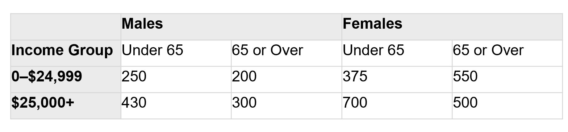 Figure 1: Cholesterol measurements presented as a table of numbers.
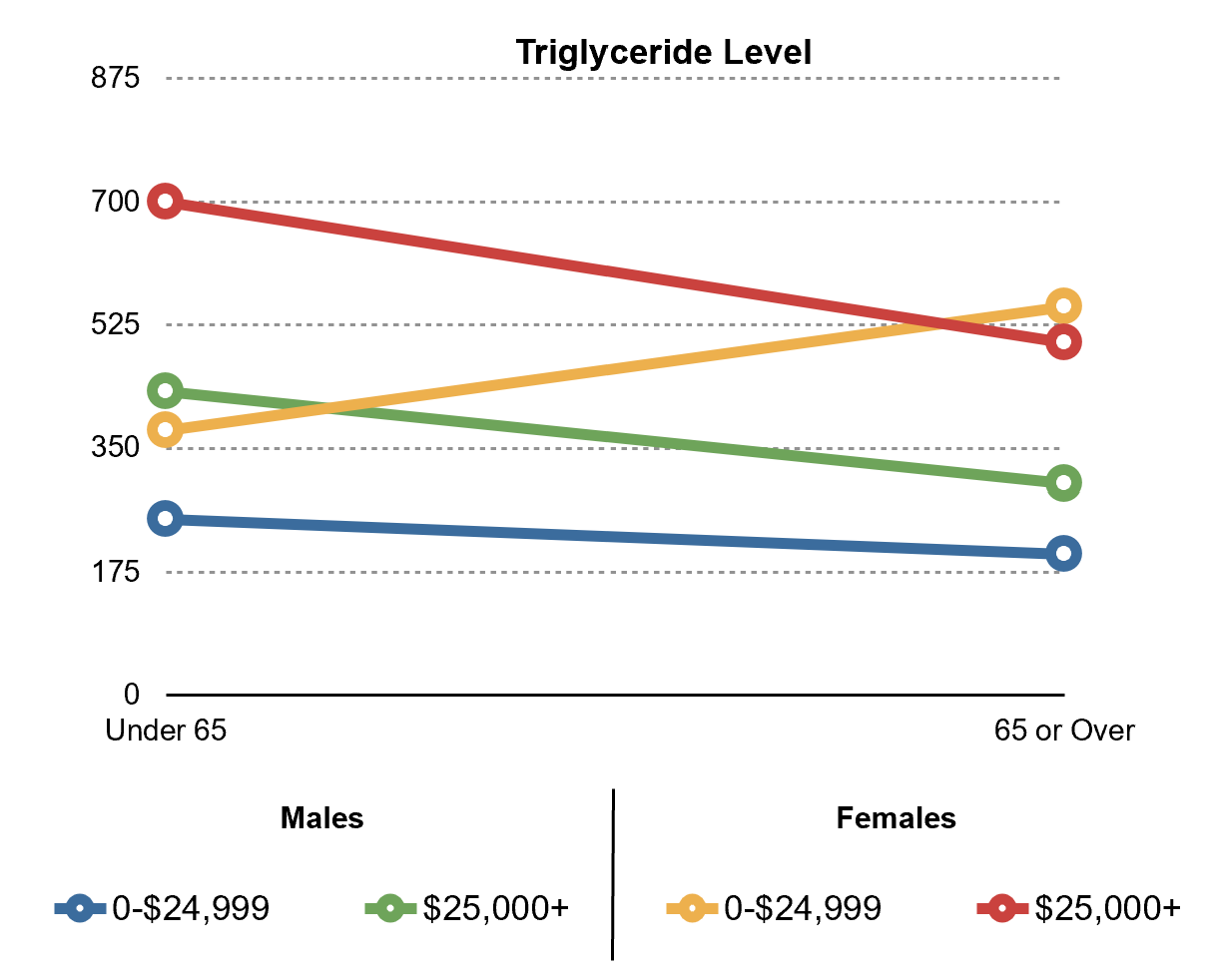 Figure 2: The same cholesterol data presented as a line graph. The visual format makes it easier to spot trends, such as the rise and fall of cholesterol level over time.
Visualization leverages the concept of external cognition – using resources outside our mind to enhance our thinking. As cognitive scientist Don Norman aptly put it, “It is things that make us smart.” By creating external visual representations (graphs, maps, diagrams), we offload some cognitive work to these artifacts, effectively augmenting our cognitive capabilities. In the words of information visualization researcher Stuart Card, “Visualization is really about external cognition, that is, how resources outside the mind can be used to boost the cognitive capabilities of the mind.”. In practice, this means a chart or diagram can help us think through a problem by revealing patterns and relationships in the data, freeing us from having to imagine everything in our head.
In summary, data visualization serves as a bridge between data and understanding. Next, we’ll discuss what makes a visualization effective or ineffective, and outline some key principles to guide us in creating our own charts.
5.1 Foundations
For further reference on the concepts in this section, you may consult the Data Pipeline with R book (Warin, 2023). In this chapter, we will get hands-on with creating graphics while also keeping in mind some of the latest thinking in data visualization. There are a few fundamental principles to remember:
- Graphical Integrity: The visualization should tell the truth about the data.
- Use the Right Display: Choose an appropriate type of chart for the data and message.
- Keep It Simple: Avoid unnecessary clutter so the data stands out.
- Use Color Strategically: Use color purposefully to highlight or group data, not to decorate.
- Tell a Story: Aim to convey a message or insight; don’t just show data for data’s sake.
We will expand on each of these principles shortly. In essence, an effective visualization reveals patterns and communicates ideas clearly, taking advantage of human perception to offload cognitive effort. A poor visualization, by contrast, can obscure the data or even mislead the viewer. Let’s explore what makes visualizations effective, then look at some common pitfalls.
What makes an effective visualization?
Effective visualizations adhere to the principles listed above, and they leverage our perceptual strengths. They maximize the information communicated, while minimizing distractions or distortions. Here are some guidelines and concepts that help define effective data graphics:
Show the data clearly: As Edward Tufte famously emphasized, “Above all else show the data.” Every element in a graph should serve a purpose in presenting the data or supporting interpretation. This leads to the idea of the data-ink ratio – the proportion of ink (or pixels) in the graphic that actually represents data. An effective chart maximizes the data-ink ratio, meaning most of what you see corresponds to actual data, and very little is non-essential decoration. For example, heavy gridlines, bold borders, or cute background images usually add no new information; they are “non-data ink” that can be removed to let the data shine through. Good visualizations aim for a high data-ink ratio (ideally close to 1.0) without sacrificing clarity.
Avoid distortion: The visual representation must accurately reflect the data. This is part of “graphical integrity.” For instance, if one value is twice as large as another, it should appear twice as large on the graph (length of a bar, position on an axis, etc.). Using inconsistent scales or truncated axes can mislead the audience about the true magnitudes. Tufte introduced the concept of the Lie Factor to measure distortion: it’s the ratio of the effect shown in the graphic to the actual effect in the data. A Lie Factor far from 1.0 indicates a discrepancy between the visualization and reality. Effective visualizations strive for a Lie Factor of 1 — in other words, no distortion of the data’s message.
Choose the right chart for the data: Different displays are suited for different data and questions. For example, if you want to show parts of a whole, a pie chart might be appropriate; to show trends over time, a line chart is usually better. There are many types of charts (bar, line, scatter, histogram, map, etc.), and using the wrong one can confuse the audience. An effective visualization matches the data and the message to an appropriate visual form. A classic mistake, for instance, is using 3D pie charts or fancy donut charts when a simple bar chart would be clearer. Simpler is often better. A good rule of thumb is show data variation, not design variation — meaning the visualization’s form should be dictated by the data, not by decorative whims.
Keep it simple and focus on what matters: This principle encompasses Tufte’s advice to eliminate chartjunk. Chartjunk refers to all the extra visual elements that do not improve understanding, such as unnecessary illustrations, overly heavy or decorative fonts, gratuitous 3D effects, and the like. Such elements can distract or even mislead the viewer. An effective visualization usually has a clean, minimalistic design: just enough visual elements to communicate the data clearly, and no more. Minimalism for its own sake isn’t the goal; the goal is clarity. For example, you might lighten or remove grid lines if they aren’t needed, or avoid elaborate textures and icons that don’t convey new information. Every pixel on the chart should earn its keep. When you look at an excellent chart, your attention should go immediately to the data patterns, not to flashy graphics or irrelevant embellishments.
Use color and styling with purpose: Color is a powerful tool in visualization – it can group related items, highlight important points, or represent additional variables. However, color should be used strategically. Too many colors or ill-chosen colors can confuse or distort the message (for instance, using very similar colors for different categories, or choosing colors with unintended emotional connotations). Effective visualizations often use a limited, harmonious color palette and leverage color to guide the eye. For example, using a bold color to highlight one key series in a line chart, while keeping other series in muted tones, can emphasize the story you want to tell. Use color to encode data (categorical or sequential palettes as appropriate) and to draw attention, not just to decorate. The same goes for other stylistic choices like fonts or line widths – they should enhance readability and comprehension. Simpler fonts and clear labels typically work better than ornate designs.
Tell a story with the data: The best visualizations often have a narrative or message. They are opinionated in the sense that the designer has a point they want to communicate (while still being truthful to the data). This could be a trend, a comparison, a correlation, or an outlier that forms the “story” of the chart. For example, in a time series of economic data, the story might be that a particular policy change coincided with a rise in employment. A neutral presentation would just show the line, but a storytelling approach might annotate the chart with the date of the policy change and perhaps use a highlight color to mark the post-policy period. Another example: if you’re visualizing population growth, you might structure the graphic to build up to a surprising finding (this is analogous to a story’s climax). As story expert Robert McKee wrote, “A story is not an accumulation of information strung into a narrative, but a design of events to carry us to a meaningful climax.” In visualization, this means designing the graphic (and any accompanying text or animation) to make a meaningful point, rather than just plotting data without context.
Let’s consider an example of storytelling in visualization versus a neutral approach. The figure below (Figure 3) shows two charts of the same data (annual fatalities in a certain conflict), taken from a blog discussion by data visualization expert Andy Cotgreave. The left chart is titled “Iraq’s Bloody Toll” and uses bold red coloring and an inverted y-axis (bars falling from the top), whereas the right chart has a neutral title and uses a calm blue color. Both charts plot the same numbers, but they evoke very different emotional responses and even suggest different narratives. The left one, with its alarming red downward bars and dramatic title, emphasizes the magnitude of deaths and gives a sense of tragedy. The right one, with blue upward bars and a more neutral framing (focusing on decline of violence), conveys a more subdued or even optimistic view. Cotgreave’s point was that by simply changing the title, color, and orientation of a chart, you can tell very different stories with the same data. Neither version is lying — they both show the data accurately — but each is opinionated in its own way. This example underscores the importance of being mindful of how design choices (like color and wording) influence the message of a visualization.
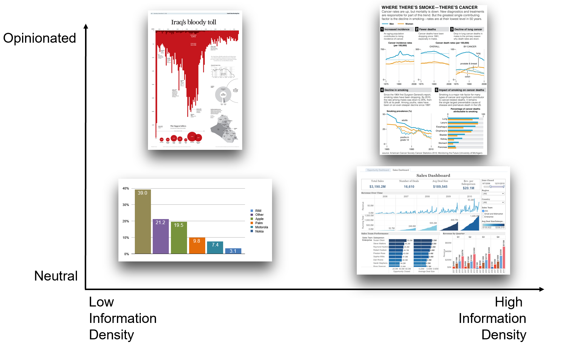 Figure 3: Two visualizations of the same data (annual fatalities in a conflict) leading to different impressions. The left uses red bars dropping downward from the title “Iraq’s Bloody Toll,” creating a dramatic, alarming narrative. The right uses blue bars rising upward and a neutral title highlighting the decrease in fatalities, creating a calmer, more optimistic impression. This demonstrates how color, orientation, and titling can be used strategically to tell different stories with the same underlying data.
In designing visualizations, always consider your audience. An effective visualization for a group of domain experts might look different from one aimed at the general public. Experts might appreciate more detail, precise annotations, or novel visualization forms, whereas non-experts might need clearer labeling, more context, or simpler chart types. Think about what background knowledge your audience has, and what you want them to take away from the chart. Adapt the level of complexity and the framing of the story accordingly. For instance, if you’re showing a chart of financial data to an audience of economists, you might include inflation-adjusted values and detailed axis labels; but if you’re showing it to a general audience, you might use a straightforward nominal trend line and a brief note in plain language about what happened in certain years. In all cases, the visualization should aim to engage the audience – through clarity, through visuals that draw interest (perhaps using color or interactivity) – and to communicate the intended insight effectively.
Aesthetics do play a role in engagement. Research in design suggests that attractive things are often perceived as more useful and can make users more tolerant of minor difficulties. A visually appealing chart (one that is clean, nicely formatted, with a good use of color and layout) can invite the audience in. Elements of style communicate subtle messages: they reflect the tone (professional, playful, academic, etc.), and can even signal the identity or brand of the creator. For example, a tech company’s data dashboard might use a sleek modern design with the company’s branding colors, whereas a data journalism piece might use a design that matches the style of the publication. Playfulness in design – such as interactive features or imaginative illustrations – can encourage exploration and keep viewers engaged. Vividness (using a striking visual metaphor or memorable imagery) can make a visualization more memorable. These aesthetic considerations should complement, not overshadow, the data. The ultimate judge of an effective visualization is whether it successfully communicates the intended information and leaves a clear impression with the audience.
To recap the characteristics of effective visualizations:
- They have graphical integrity (no misleading representations; faithful to the data).
- They use an appropriate and simple display (right chart type, minimal extraneous elements).
- They have a high data-ink ratio and minimal chartjunk (no unnecessary clutter).
- They use color and design thoughtfully to enhance understanding (grouping, highlighting, consistent styles).
- They often tell a story or highlight an insight, guiding the viewer to the important points.
Now that we’ve seen what makes a visualization good, let’s consider how they can go wrong.
What makes an ineffective visualization?
Just as good visualizations can enlighten, bad ones can confuse or mislead. Here are some common pitfalls that lead to ineffective (or even infamous) visualizations:
Misleading scales or proportions: One of the worst sins is manipulating the axes or visual proportions to exaggerate or downplay changes. For example, starting a bar chart’s y-axis at a high value (instead of zero) can make differences look much larger than they are, violating the proportionality principle of graphical integrity. Another example is using pictograms or 3D objects where the area or volume doesn’t match the data (e.g., drawing people icons to represent quantities but scaling their height in a way that also changes their width, thus visually inflating the difference). These practices distort the viewer’s perception of the data.
Excessive chartjunk and clutter: When a graph is loaded with unnecessary elements, the core message gets lost. Busy backgrounds, too many grid lines, decorative illustrations, or overly complex legends can overwhelm the viewer. Ineffective visuals often try to be too fancy, using 3D effects, shadows, or bright clashing colors that add no value (or even impede comprehension). Remember that chartjunk consists of all visual elements not necessary to comprehend the information. A cluttered chart forces the reader to spend extra mental effort filtering out noise, which is frustrating and counterproductive.
Wrong choice of visualization: If the visual form doesn’t fit the data, the result can be confusing. Imagine using a pie chart to show a trend over time (pie charts are not meant for time series), or using a line chart for categorical comparisons that have no inherent order. The viewer might struggle to grasp the point because the visualization isn’t suited to the message. Each type of chart has strengths and limitations; using them inappropriately is a recipe for an ineffective graphic.
Lack of context or labeling: A chart without clear labels, title, or explanation can be misleading or meaningless. If viewers have to guess what the axes represent or what units are used, the visualization fails to communicate. An ineffective visualization might show data but omit important context (such as labeling a spike in a time series with the event that caused it), leaving the audience puzzled about significance. Always include enough context (titles, axis labels, legends, annotations) to make the data understandable.
Overcomplicating when simplicity would do: Sometimes designers make a chart overly complex by introducing too many variables or combining too many chart types, when splitting it into multiple simpler charts would communicate more clearly. Stacking too much information into one visual can overload the reader’s working memory.
A notorious example of an ineffective visualization was a chart once aired on a news network that showed a non-sensical y-axis (with percentages that added up to far above 100%, for instance) or distorted scaling to exaggerate a political point. This chart became an internet meme for how blatantly it violated basic principles of bar chart design. In general, any chart that makes a reader say “Wait, that doesn’t look right…” is likely ineffective.
For a dose of humor (and caution), you can visit the website viz.wtf, which curates real-world examples of “bad” visualizations. These include gems like bar charts where the bars have been rotated or reordered in bizarre ways, pie charts with too many slices and garish colors, maps with meaningless coloring, and other mishaps. Such examples serve as a reminder of what not to do. They underscore how easy it is to be misled by poor design, and why adhering to the principles of integrity and simplicity is so important. When designing your own visualizations, keep these pitfalls in mind and always ask yourself: Is my chart clear? Is it truthful? Is it necessary and focused on the data? If so, you’re on the right track.
Having covered the theoretical foundation, we will now get our hands dirty with practical visualization in R. We’ll start with some basic chart types (bar, line, bubble) using the popular ggplot2 package, then look at creating maps, and later explore an interactive visualization with D3. Throughout, remember the principles we discussed and try to apply them in your plotting choices.
5.2 Bar chart
Let’s begin with a simple bar chart in R using ggplot2 (a powerful visualization package based on the Grammar of Graphics). Recall that in Lab 2 we created a dataset called dataCanadaFull (containing, say, number of employees by industry and year in Canada). We also transformed it into a “long” format suitable for ggplot2. Here we’ll use that long-form dataset, dataCanadaFullLong. (If you have the data in wide format, with separate columns for each industry or category, you would first need to reshape it into a long format, but in our case we already did that in the previous lab.)
First, load the data (assuming it’s stored as a CSV file):
Our dataset has columns such as year, isicCode (an industry code), and value (number of employees). We should ensure that isicCode is treated as a categorical variable (factor or character) rather than numeric, otherwise ggplot might treat it as a continuous variable. We can convert isicCode from numeric to character:
dataCanadaFullLong$isicCode <- as.character(dataCanadaFullLong$isicCode)Now, let’s produce a bar chart of the number of employees by year, with different bars for each industry (identified by ISIC code). We will map year to the x-axis and value (number of employees) to the y-axis. Different industries will be indicated by different colors (fill) of the bars. We’ll use a grouped bar chart (also known as side-by-side bars) so that for each year, we see a cluster of bars (one per industry). Here is the ggplot2 code to do this:
# Produce a bar chart
library(ggplot2)
library(ggthemes)
ggplot(data = dataCanadaFullLong, aes(x = year, y = value, fill = isicCode)) +
  geom_bar(stat = "identity", width = 0.5, position = "dodge") +
  xlab("") +
  ylab("Number of employees") +
  labs(fill = "Industry (ISIC Code)") +
  theme_minimal() +
  scale_fill_brewer(palette = "Set1", direction = -1)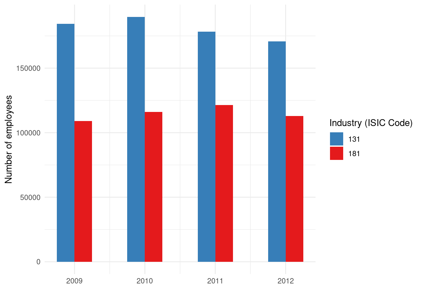
Let’s break down this code:
-
ggplot(data = dataCanadaFullLong, aes(...))initializes the plot with our dataset and specifies the aesthetic mappings. We mapx = year,y = value, andfill = isicCode. This means year will determine the horizontal position of bars, value will determine their height, and the fill color will correspond to the industry code. -
geom_bar(stat = "identity", ...)adds the bar geometry. By default,geom_barin ggplot usesstat="count"(which counts rows), but here we already have a numeric value to plot, so we usestat="identity"to tell ggplot to use the values as they are. We setwidth = 0.5to make the bars a bit thinner (half the default width), andposition = "dodge"to place bars for different industries side by side rather than stacked. “Dodge” separates the bars along the x-axis so that within each year, bars for each industry are next to each other. -
xlab("")andylab("Number of employees")set the x-axis label and y-axis label. We leave the x-axis label blank in this case (since “year” might be self-evident or we might rely on the axis tick labels). -
labs(fill = "Industry (ISIC Code)")changes the legend title for the fill aesthetic to something more descriptive (instead of the default “isicCode”). -
theme_minimal()applies a clean minimal theme to remove distractions like background grids. This theme gives a nice, uncluttered look by default. -
scale_fill_brewer(palette = "Set1", direction = -1)applies a ColorBrewer palette for the fill colors. “Set1” is a qualitative palette with distinct colors, anddirection = -1reverses the palette (this is optional). ColorBrewer palettes are well-designed sets of colors for categorical data, ensuring enough contrast and aesthetic appeal.
The result should be a bar chart where the x-axis has years, y-axis shows the number of employees, and within each year there are multiple colored bars (each color corresponding to an industry code). The legend indicates which color corresponds to which industry code. This bar chart allows us to compare values across industries for each year, and also see trends for each industry over the years by comparing the bars of the same color across the x-axis.
(If the bars appear cluttered or labels overlap, one can adjust the width or use position_dodge(width = 0.7) for fine control, or maybe rotate x-axis labels if they are long. In our simple example with year, that likely isn’t an issue.)
5.3 Line chart
Bar charts are great for discrete comparisons, but if we want to emphasize trends over time, a line chart is often more appropriate. Let’s visualize the same data with a line chart, where each industry will be a separate line over the years.
We use a similar ggplot structure, but now use geom_line() instead of bars:
library(ggplot2)
library(ggthemes)
ggplot(data = dataCanadaFullLong, aes(x = year, y = value, color = isicCode)) +
  geom_line(size = 1.2) +
  xlab("") +
  ylab("Number of employees") +
  labs(color = "Industry (ISIC Code)") +
  theme_minimal() +
  scale_color_brewer(palette = "Set1", direction = -1)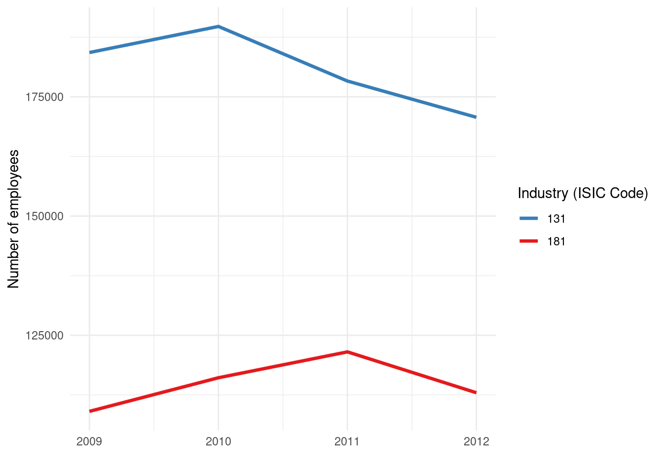
Here, we map color = isicCode (instead of fill) since lines are typically distinguished by color (and/or line type). Each industry code will produce a line of a different color. We increased size = 1.2 to make the lines a bit thicker for visibility. We used labs(color = ...) to label the legend appropriately.
This plot will have the years on the x-axis and number of employees on the y-axis, with multiple lines (one per industry). It’s excellent for seeing how each industry’s employment changed over time, and for comparing their trends. For instance, you might observe that some industries have an upward trend, others downward, and some might intersect or diverge at certain points in time.
We can further improve this line chart by adding points to each year, to emphasize the data points and make the lines easier to read at specific values. To do so, we can add another geometry layer: geom_point(). For example:
ggplot(data = dataCanadaFullLong, aes(x = year, y = value, color = isicCode)) +
  geom_line(size = 1.2) +
  geom_point(size = 3) +
  xlab("") +
  ylab("Number of employees") +
  labs(color = "Industry (ISIC Code)") +
  theme_minimal() +
  scale_color_brewer(palette = "Set1", direction = -1)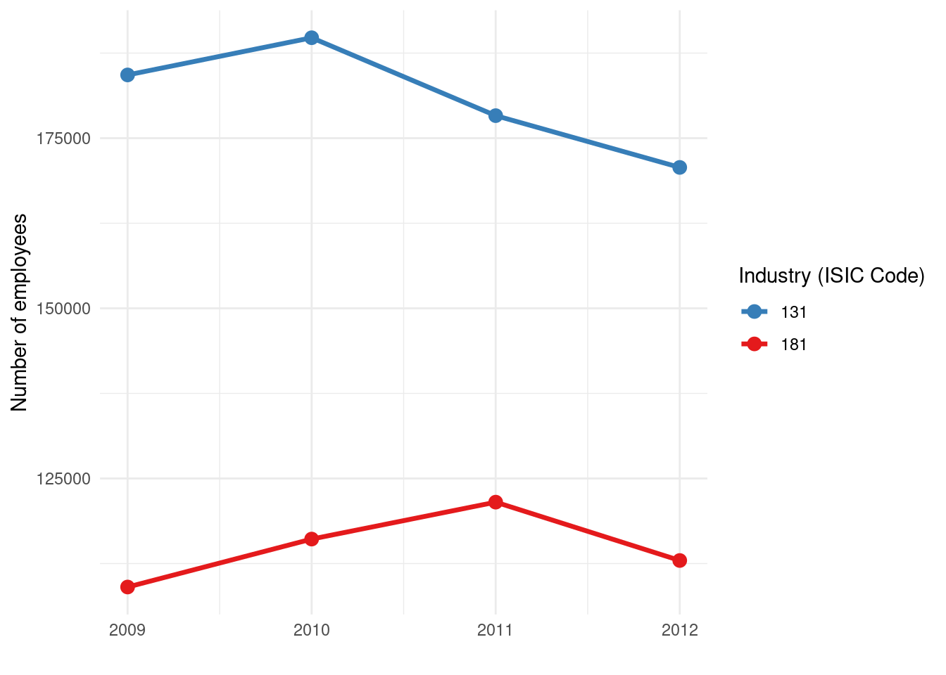
We simply added geom_point(size = 3) which puts a point at each data point (year, value). The size 3 makes the points reasonably visible. Now each yearly observation is marked with a dot, and the dots are connected by lines for each industry. This combination can be helpful to see exact values (the points) and the overall trend (the connecting lines). It also helps if there are missing years in the data – the line would skip, but points would still mark the individual observations.
Line charts with multiple categories can get busy, so ensure the colors are distinct (ColorBrewer’s Set1 is usually good up to about 6-8 categories). If you have more categories, you might use different line types or facets, but that’s beyond our current scope.
5.4 Bubble chart
Next, let’s create a bubble chart. In data visualization, “bubble chart” often refers to a scatter plot where the points are sized (and sometimes colored) according to a third variable. In our dataset, we could treat year as one variable (x-axis) and value (employees) as another (y-axis), and use the size of the point to also represent the value (which is a bit redundant in this case) or perhaps another variable if we had one. A classic use of bubble charts is to plot (x, y) for different categories and use the bubble size to indicate magnitude of some third measure, and color to indicate a category.
Our dataCanadaFullLong essentially has year and value for different industries. Plotting year vs value with points colored by industry is basically a scatter/line chart as above. To demonstrate the bubble concept, we’ll map the same value to the size of points. This will make points (bubbles) larger when the number of employees is larger. This is somewhat redundant with the y-axis (which already shows the magnitude), but it’s just for practice. In real use, you might have something like x = GDP per capita, y = life expectancy, size = population (that would be a typical bubble chart scenario, a la Hans Rosling’s examples).
Here’s how to create a bubble chart using ggplot2:
library(ggplot2)
library(ggthemes)
ggplot(data = dataCanadaFullLong, aes(x = year, y = value, color = isicCode)) +
  geom_point(aes(size = value), alpha = 0.7) +
  xlab("") +
  ylab("Number of employees") +
  theme_minimal() +
  scale_color_brewer(palette = "Set1", direction = -1) +
  scale_size_continuous(range = c(3, 10)) +
  guides(size = FALSE)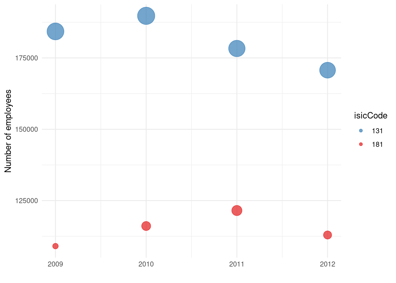
A few things to note in this code:
- We still map
color = isicCodeto differentiate industries by color. - Inside
geom_point()we addaes(size = value). This means each point’s size will correspond to the value (number of employees). Higher values produce larger points. - We set
alpha = 0.7to make the points semi-transparent. This can help with overplotting (if points overlap, transparency makes overlaps visible and less dominant). -
scale_size_continuous(range = c(3, 10))is used to adjust the range of point sizes. By default, ggplot might choose a range, but we specify that the smallest value will have size 3 and the largest will have size 10 (and intermediate values scaled in between). This keeps bubbles within a reasonable visible range. -
guides(size = FALSE)is used to turn off the legend for the size aesthetic. In this case, a size legend isn’t very useful (it would show a continuum or a few example sizes). Since the y-axis already gives a sense of the values, we decide to omit a redundant legend for bubble size. The color legend remains to identify industries.
The resulting chart would show points at positions (year, value) for each industry, color-coded by industry. Additionally, the points are drawn as bubbles whose area (technically diameter in ggplot’s sizing) reflects the value. In years where an industry had a particularly large number of employees, that data point will appear as a larger bubble. This kind of chart is more eye-catching and can emphasize where “big” values are, though when using size to encode data, one must be careful: human perception of area is not linear, and smaller differences can be hard to see. Nonetheless, it’s a fun and informative visualization when used appropriately (especially if the third variable adds new information).
Now you are able to produce basic bar charts, line charts, and bubble charts in R using ggplot2. Each of these chart types can be further refined and customized (with titles, annotations, theme adjustments, etc.), but this gives a solid starting point for visualizing data in a simple and effective manner.
Before moving on, think about which type of chart best suits the message you want to convey in your data. Bar charts are great for comparing discrete categories, line charts for trends over continuous variables (like time), and bubble charts for adding a third dimension of data to two-dimensional plots (especially when that third dimension can be thought of as a magnitude or weight of each point).
5.5 Maps
In addition to standard statistical charts, maps are an important class of visualization, especially for any data that has a geographical component. Creating maps in R can be done in many ways; here we will show a very basic approach using ggplot2’s ability to draw polygons. We will start with a simple world map, then see how to zoom into a region.
To draw maps, we need geographical data (coordinates for borders). The maps package (and its ggplot2-friendly interface) provides map data frames for various regions. We can use map_data("world") to get a dataframe of world map coordinates (this comes from the maps package and is made easily accessible via ggplot2).
First, ensure you have ggplot2 loaded (we already did). Then retrieve the world map data:
world <- map_data("world")The world object now contains a data frame with columns like long (longitude), lat (latitude), group (an identifier for each polygon, since world map consists of many polygon pieces for countries and islands), and region (the country name for each polygon).
Now, to plot this as a map, we use geom_polygon() layer in ggplot, mapping longitude and latitude appropriately and grouping by the polygon group. We can fill each country with some color (or leave blank) and draw borders. A very basic world map (with countries outlined) can be drawn as:
ggplot(data = world, aes(x = long, y = lat, group = group)) +
  geom_polygon(fill = "white", color = "black") +
  theme_void()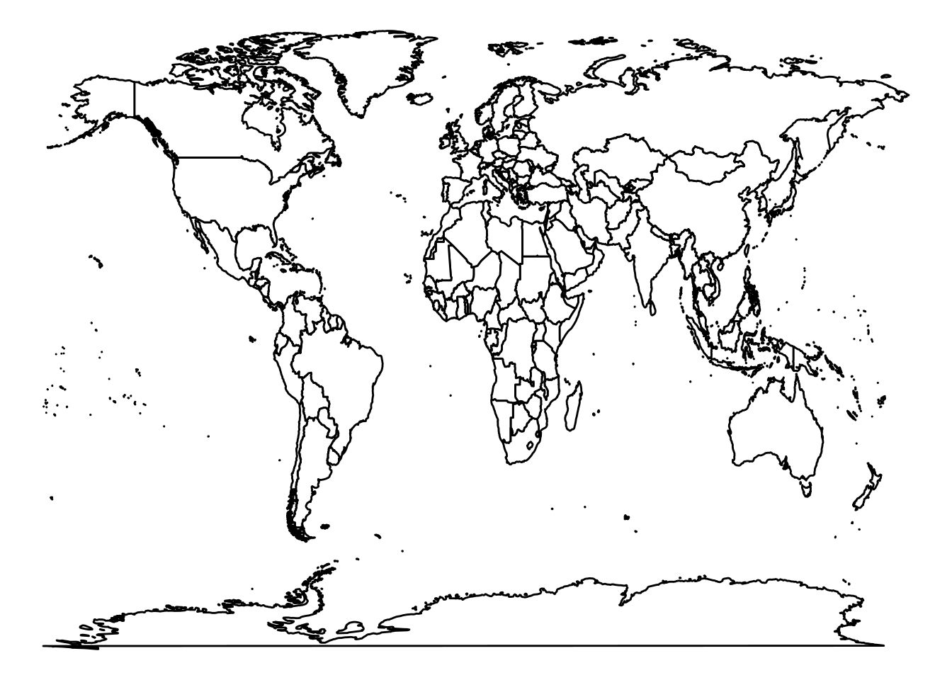
Let’s explain this:
- We use
ggplot(data = world, aes(x = long, y = lat, group = group)). We map longitude to x-axis and latitude to y-axis. We also specifygroup = groupso that ggplot knows which points belong to the same polygon (country). Themap_datafunction already provided agroupvariable that ensures the polygon drawing for each country (and sub-polygon) is correct. -
geom_polygon(fill = "white", color = "black")draws the polygons. We choosefill = "white"to make each country’s interior white (you could also choose another color or even map a variable to fill for a choropleth map, but here we’re just making a blank map). We setcolor = "black"to draw the border of each polygon in black (these are country boundary lines). -
theme_void()is a ggplot theme that produces a blank background with no axes, grid, or other decorations – perfect for maps. We don’t need coordinate axes or tick marks for a basic world outline, sotheme_voidgives a clean map.
The result is a simple world map outline. You should see all the continents and countries in white with black outlines on a gray (or white) background. This kind of base map is useful if you want to overlay data on it (for example, coloring countries by some value, or placing points at certain coordinates).
Often, we are interested in a specific region rather than the entire world. To focus on a region (say a continent or a set of countries), one approach is to filter the world map data to only those regions. For example, suppose we want a map of the Americas. We can filter the world data to include only countries in North and South America. The region column in world contains country names. We can use a subset of those names.
For demonstration, let’s create a map of (most of) the Americas: we’ll include North, Central, and South American countries. We can make a vector of country names we want, or use %in% for a range. For simplicity, let’s use a selection of countries from Canada at the top to Argentina at the bottom. (We have to be mindful that map_data("world") might use some abbreviations or specific names; for example, USA is “USA”, not “United States”, etc.)
We’ll do:
# Retrieve world map data if not done already
world <- map_data("world")

# Filter for Americas region countries
americas <- subset(world, region %in% c("Canada", "USA", "Mexico", "Brazil", "Colombia",
                                       "Argentina", "Peru", "Venezuela", "Chile", "Guatemala",
                                       "Ecuador", "Bolivia", "Cuba", "Honduras", "Paraguay",
                                       "Nicaragua", "El Salvador", "Costa Rica", "Panama",
                                       "Uruguay", "Jamaica", "Trinidad and Tobago", "Guyana",
                                       "Suriname", "Belize", "Barbados", "Saint Lucia",
                                       "Grenada", "Saint Vincent and the Grenadines",
                                       "Antigua and Barbuda", "Saint Kitts and Nevis"))
The subset command filters the world data frame to only rows where the region is one of those listed (a selection of countries in the Western Hemisphere). Now americas contains map data for those countries.
We can plot this similarly:
ggplot(data = americas, aes(x = long, y = lat, group = group)) +
  geom_polygon(fill = "white", color = "black") +
  coord_fixed(xlim = c(-180, -35), ylim = c(-60, 90), ratio = 1.1) +
  theme_void()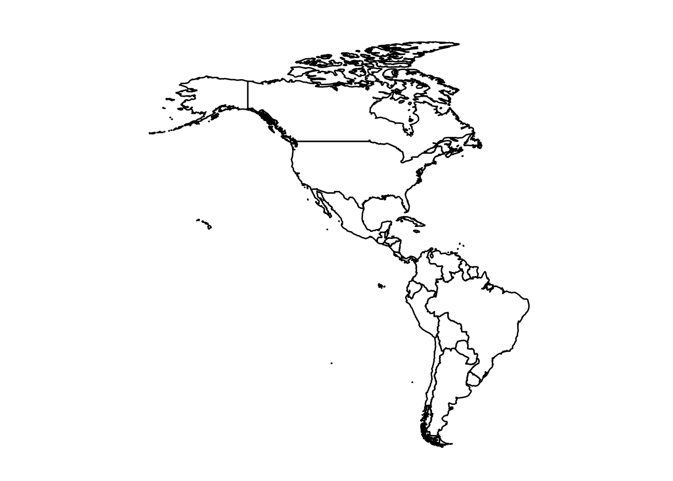
New here is the coord_fixed() function. coord_fixed fixes the aspect ratio of the coordinates, which is important for maps to not look stretched. By specifying ratio = 1.1 (which roughly corresponds to lat/long degree aspect for that region) and giving xlim and ylim, we zoom the view to the Americas. In this case, we set xlim = c(-180, -35) (longitude from 180°W to 35°W roughly covers Alaska to the eastern tip of Brazil) and ylim = c(-60, 90) (latitude from 60°S to 90°N covers from the tip of South America up to the Arctic). Adjusting these limits and ratio can center the map nicely. The result should be a map of the Americas (North and South America) in the same style: countries outlined.
Again, we used theme_void() to keep the map clean. If we were making a more detailed thematic map, we might add titles or a legend (for example, if coloring countries by a data variable). But here our goal is just to demonstrate creating maps.
Note: The functions
map_data("world")andgeom_polygonapproach is simple but not the most robust for serious mapping tasks. There are dedicated packages like sf (simple features) for handling spatial data, which integrate well with ggplot2 for more complex maps (and projections, etc.). However, usingmap_datais quick and fine for basic world or country maps in a pinch.
With what we’ve covered so far, you can load data from a CSV and visualize it with several basic chart types, as well as draw simple maps. Next, we will introduce a tool that can help you build ggplot2 graphs using a graphical interface, which can be handy if you are not yet comfortable with the code or want to explore different designs quickly.
5.6 Esquisse
Now that you know the “grammar of graphics” and have seen how to create plots with ggplot2 code, let’s look at an R add-in called esquisse. Esquisse provides a drag-and-drop interface for building ggplot2 plots. It can be a great way to experiment with different plots or to quickly generate the code for a plot without writing it manually. Essentially, it’s a GUI layer on top of ggplot2.
To use esquisse, you need to have the package installed and be running RStudio (because it’s provided as an RStudio Addin). Assuming it’s installed, follow these steps:
Step 1: In RStudio, click on the Addins menu button. In the dropdown, look for “ggplot2 builder” or something referencing esquisse. (It might be listed as “Esquisse” or “ggplot2 builder”.) Click on that option.
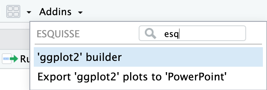
This will open the esquisse GUI in a new window or pane.
Step 2: You should see the Esquisse interface pop up, which is divided into sections. On the left, you’ll have a panel to select a dataset and variables; on the right, an empty plotting area that will show a preview of your plot, and at the bottom, tabs including one for code.
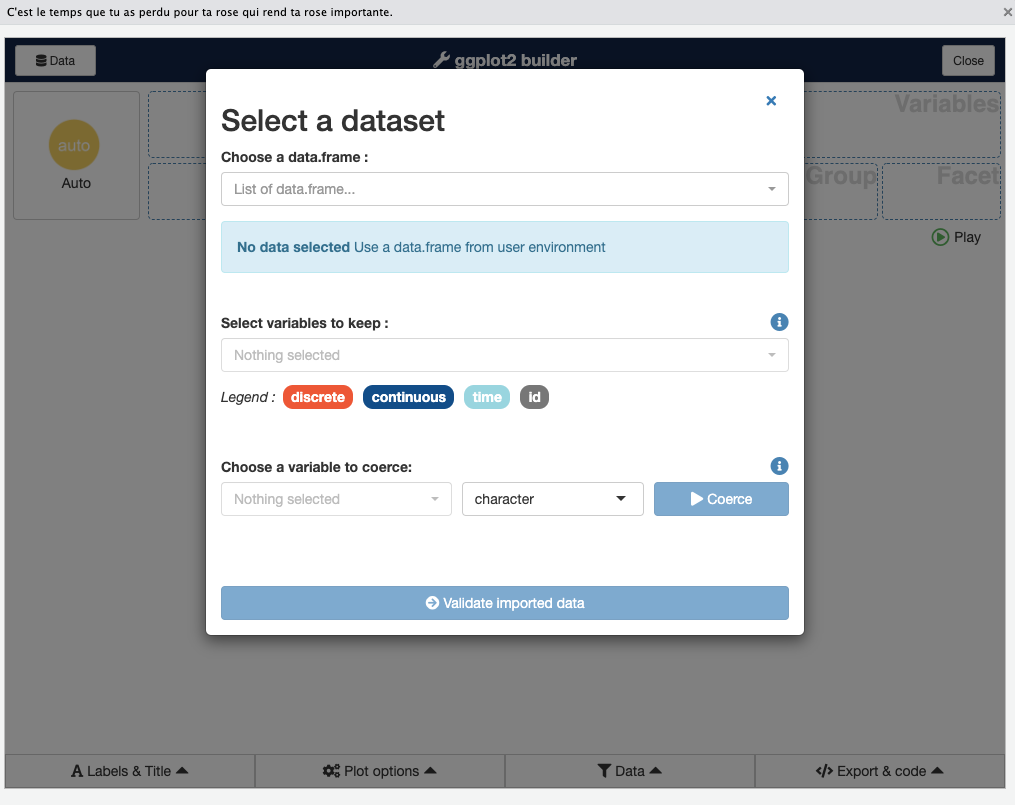
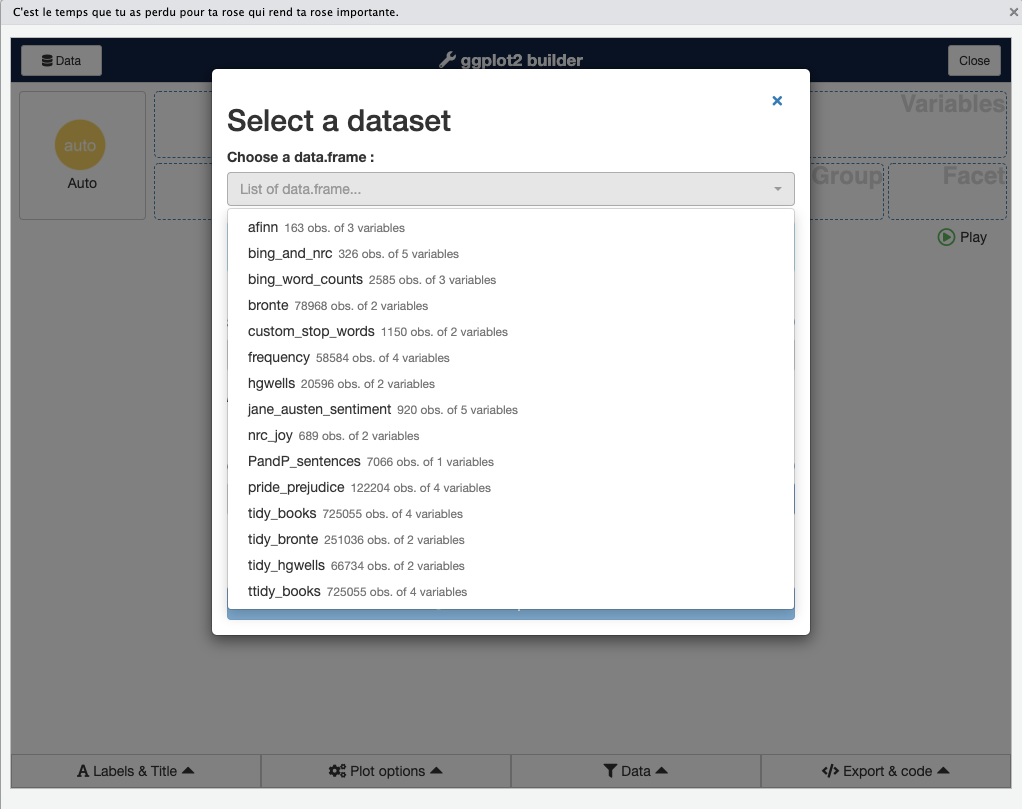
Step 3: At the top of the Esquisse interface, there is a dropdown that says “List of data frames…”. Click that and you will see the data frames currently available in your R session. Choose one (for example, choose the dataCanadaFullLong dataset we have been using, if it’s loaded in your environment).
Step 4: After selecting the dataset, Esquisse will allow you to select which columns to use. By default, all columns are selected. If you want to limit which variables appear for drag-and-drop (for example, if your dataset has many columns and you only care about a few), you can click the “Choose variables” button (often labeled “Pick variables”) and select only the ones you plan to use. Otherwise, just keep all.
Step 5: Now you will see the main drag-and-drop interface. There will be boxes or drop zones labeled X, Y, Color, Fill, Size, etc., corresponding to aesthetic mappings, and a list of your variables to the left. You can now drag a variable name into one of these aesthetic boxes. For example, drag year into the X box, and value into the Y box. If you want a certain variable to define color groups, drag it into Color or Fill (for points/lines use Color, for bars either can work but typically Fill is used). For a bar chart, you might drag isicCode into Fill. You also have a dropdown to select the geom (geometry) type (e.g., bar, line, point).

For example, to replicate the bar chart we coded earlier:
- Drag
yearto X, - Drag
valueto Y, - Drag
isicCodeto Fill. - Then find where it says Geom or Visualization type and select “Bar” (and ensure it’s set to not count automatically; Esquisse usually handles setting
stat="identity"if you put a numeric on Y). - You might also set the position to “dodge” if multiple fill categories (there may be an option for position adjustments).
- On the right side, a preview of the plot will appear.
- You can further tweak things like adding labels or changing palette under the Plot Options in esquisse.
The Esquisse interface also has panels for Data (to apply filters to your dataset within the GUI), Labels & Title (to set axis labels, plot title, etc.), and Plot Options (to change themes, color palettes, legends). For instance, you can easily switch the color palette to one of the ColorBrewer sets or a viridis palette, or change the theme from minimal to classic, all with a click, and see the effect immediately. This is a convenient way to try out different looks without writing code.
As you make selections and adjustments, Esquisse is generating the corresponding ggplot2 code in the background. You can click on the Code tab (often at the bottom of the Esquisse window) to see the ggplot code. This is very useful for learning ggplot: you can literally copy the code from here and use it in your script. It will include all the mappings, layers, and theme settings you specified through the GUI.
Once you are happy with the plot (or at least have a good starting point), you can close the Esquisse addin. If you copied the code, you can paste it into your R script or RMarkdown document and further refine or reuse it. Even if you’re comfortable writing ggplot code from scratch, Esquisse can be a great way to quickly prototype a visualization or discover how to implement a certain option (for example, you might not remember the exact code to remove a legend or change a palette, but Esquisse will show it in the generated code).
In summary, Esquisse provides an interactive way to build ggplot2 graphs:
- It’s helpful for beginners to learn the syntax by seeing code generated.
- It’s also a time-saver for experienced users to test different themes or aesthetics quickly.
- Remember that it’s generating ggplot2 code, so everything is reproducible – you’re not stuck with a manual process; you can take the code and integrate it into your project.
Now we have covered a range of visualization techniques in R, from basic charts to maps, and even a GUI tool for plotting. In the next section, we’ll step into the realm of interactive and advanced visualizations with D3, a JavaScript library, and see how we can use it from R.
5.7 Interactive Visualizations with D3
So far, we have focused on static visualizations using ggplot2. Static charts are excellent for many purposes (reports, papers, etc.), but sometimes we want interactive graphics that allow zooming, hovering, or other dynamic behaviors. One of the most powerful libraries for interactive visualization is D3.js (Data-Driven Documents), a JavaScript library that can create complex, interactive SVG visualizations in web browsers. D3 is behind many impressive data visualizations on the web.
Using D3 directly requires writing JavaScript code, which can be challenging if you’re not familiar with it. However, R provides ways to integrate D3 visualizations into an R workflow. One such tool is the r2d3 package – essentially an R interface to D3. The r2d3 package allows you to write D3 code and render it within R (for example, in RStudio’s Viewer, in R Markdown documents, or in Shiny apps). It acts as a bridge: you supply data from R, and r2d3 passes it to your D3 script and displays the result. In fact, r2d3 can embed any D3 visualization into an R context.
According to the documentation, “the r2d3 package provides a suite of tools for using D3 visualizations with R”, including translating R objects to D3-friendly data, rendering D3 scripts in RStudio, and integrating into RMarkdown and Shiny. In short, it lets you create highly custom, interactive visuals by tapping into the full power of D3, while still working within R.
Let’s go through a simple example to illustrate how r2d3 works. Imagine we want to create a basic bar chart using D3 (similar to what we did in ggplot2, but now in pure D3 for the sake of learning).
There are two parts to an r2d3 visualization:
- A D3 JavaScript script that describes how to draw the visualization (using D3 syntax).
- An R call to
r2d3()that supplies the data (and points to the script, if it’s in an external file).
For the example, let’s create a D3 script that takes a numeric vector and draws a simple horizontal bar chart. We will assume the data is an array of numbers between 0 and 1 (just for simplicity).
D3 Script (JavaScript) – let’s call it barchart.js:
// !preview r2d3 data=c(0.3, 0.6, 0.8, 0.95, 0.40, 0.20)

// This D3 script expects an array of numeric values (between 0 and 1).
// It will create a bar chart with one bar per value.

// Define bar height based on total height available and number of data points
var barHeight = Math.floor(height / data.length);

// Select all 'rect' (rectangle) elements in the SVG, bind data
svg.selectAll("rect")
   .data(data)
   .enter()
   .append("rect")
   .attr("width", function(d) { return d * width; })  // bar width proportional to data value
   .attr("height", barHeight - 2)                    // bar height (minus some padding for visual separation)
   .attr("y", function(d, i) { return i * barHeight; }) // vertical position of bar
   .attr("fill", "steelblue");
A breakdown of this D3 code:
- The first line
// !preview r2d3 data=c(...is a special comment that RStudio uses to allow previewing this script with the given data. It won’t affect the actual rendering when we callr2d3()from R (it’s just for convenience in RStudio IDE). - We calculate
barHeightby dividing the total SVG height (heightvariable is provided by r2d3 environment) by the number of data points. This will space the bars evenly vertically. - We then use typical D3 pattern:
svg.selectAll("rect")starts a selection of all rect elements (initially none, but this is how D3 works), then.data(data)binds our data array to this selection,.enter().append("rect")creates a new<rect>for each data point. - For each rectangle (bar), we set the
widthattribute based on the data valued. Ifdis between 0 and 1, multiplying bywidth(the total SVG width provided by r2d3) gives a length proportional to full width. This effectively scales the bar length to the data (assuming the data is a fraction of some maximum). - The
heightof each bar is set tobarHeight - 2. We subtract 2 pixels just to give a tiny gap between bars (so they are not flush against each other vertically). - The
yattribute is set by a function that takes the indexiof the data point and multiplies it bybarHeight– this stacks the bars vertically one after the other. - We fill all bars with color “steelblue”. (This is a fixed color; in a more elaborate example, you might color based on value or category).
This D3 code by itself doesn’t produce anything until we provide data and render it via R.
Now the R side: to render this D3 visualization from R, we would call the r2d3() function with our data and the script. For example:
When this r2d3() call is executed (in an interactive R session or in an RMarkdown document), it will load the barchart.js script, send the numeric vector as data to that script, and display the resulting bar chart (for example, in the RStudio Viewer or inlined in an HTML output). The result would be a series of horizontal blue bars of varying lengths corresponding to the values provided.
A few important notes about r2d3:
- It automatically provides some special variables to the D3 context:
data(the R data translated to JavaScript – it could be an array, or an object if you pass in a data frame),svg(a pre-created SVG container element where you draw your chart),widthandheight(dimensions of that SVG, which you can also set in the r2d3 call if needed), and others likeoptionsandthemefor advanced use. - This means in your D3 code, you don’t need to create the base
<svg>or load data via AJAX; r2d3 handles that. Your script should assume ansvgis ready to use anddatais already available as a JS variable. - r2d3 is great for custom visualizations that ggplot2 or other high-level packages can’t easily do. For example, interactive animations, custom network diagrams, etc. However, it does require knowledge of D3 (which has a learning curve).
- If you don’t want to write D3 from scratch, there are many R packages built on htmlwidgets that wrap popular JS libraries (including many built with D3 under the hood) into easy R functions. For instance,
plotly(for interactive charts),leaflet(for maps),DT(for interactive tables),networkD3(for network graphs) and so on. These provide high-level interfaces in R to generate interactive visualizations without manual JavaScript coding. As the r2d3 documentation suggests, if you need a pre-fabricated visualization, an htmlwidget might already exist for it. Use r2d3 when you truly need a custom visualization or want to directly leverage D3’s flexibility.
In this chapter, we won’t go deeper into writing complex D3 code, but it’s good to be aware that tools like r2d3 exist. They allow you to extend R’s visualization capabilities beyond static plots: you can embed interactive D3 graphics in RMarkdown reports or Shiny web applications. For instance, you could create an interactive bubble chart where hovering over a bubble shows details, or a map where clicking zooms into regions, all defined in D3 but driven by R data.
Recap: To use D3 in R via r2d3, you would:
- Install and load the
r2d3package. - Write a D3 JavaScript script that uses the provided
dataandsvg. - Call
r2d3(data = yourdata, script = "yourScript.js")to render it. (Optionally, you can inline a script with thescriptargument or user2d3(data=..., script = system.file("...path...", package="mypkg"))if part of a package.) - Enjoy the interactive visualization in your R environment.
This adds an advanced tool to your arsenal. However, even without diving into D3, you can create a wide range of plots using ggplot2 and related packages. Interactive visualization can also be done through packages like plotly (which can convert ggplot graphs to interactive ones), Shiny (for building interactive dashboards in R), and others. The choice of tool depends on your needs and audience (interactive visualizations are great for web and exploratory analysis, while static ones are preferred for print or static reports).
Now that we’ve covered the theory, basic plotting, and even touched on interactive visuals, let’s consolidate what we’ve learned and then try a hands-on exercise.
TL;DR – Below is a summary of the code used in this chapter for quick reference:
# Load data (assuming CSV file in working directory)
dataCanadaFullLong <- readr::read_csv("./data/lab3/dataCanadaFullLong.csv")
dataCanadaFullLong$isicCode <- as.character(dataCanadaFullLong$isicCode)

# Produce a bar chart (employees by year and industry)
library(ggplot2)
library(ggthemes)
ggplot(data = dataCanadaFullLong, aes(x = year, y = value, fill = isicCode)) +
  geom_bar(stat = "identity", width = 0.5, position = "dodge") +
  xlab("") +
  ylab("Number of employees") +
  labs(fill = "Isic Code") +
  theme_minimal() +
  scale_fill_brewer(direction = -1)

# Line chart (with multiple industries)
ggplot(data = dataCanadaFullLong, aes(x = year, y = value, color = isicCode)) +
  geom_line(size = 1.5) +
  xlab("") +
  ylab("Number of employees") +
  labs(color = "Isic Code") +
  theme_minimal() +
  scale_color_brewer(direction = -1)

# Line chart with points
ggplot(data = dataCanadaFullLong, aes(x = year, y = value, color = isicCode)) +
  geom_line(size = 1.5) +
  geom_point(size = 2.5) +
  xlab("") +
  ylab("Number of employees") +
  labs(color = "Isic Code") +
  theme_minimal() +
  scale_color_brewer(direction = -1)

# Bubble chart (scatter plot with size mapped to value)
ggplot(data = dataCanadaFullLong, aes(x = year, y = value, color = isicCode)) +
  geom_point(aes(size = value)) +
  xlab("") +
  ylab("Number of employees") +
  theme_minimal() +
  scale_color_brewer(direction = -1) +
  scale_size_continuous(range = c(3, 11)) +
  guides(size = FALSE)

# World map
library(ggplot2)
world <- map_data("world")
ggplot(data = world, aes(x = long, y = lat, group = group)) +
  geom_polygon(fill = "white", color = "black") +
  theme_void()

# Map of the Americas
americas <- subset(world, region %in% c("USA","Brazil","Mexico", "Colombia", "Argentina", "Canada",
                                       "Peru","Venezuela","Chile","Guatemala","Ecuador", "Bolivia",
                                       "Cuba","Honduras", "Paraguay", "Nicaragua","El Salvador",
                                       "Costa Rica", "Panama","Uruguay", "Jamaica",
                                       "Trinidad and Tobago", "Guyana", "Suriname", "Belize",
                                       "Barbados", "Saint Lucia", "Grenada",
                                       "Saint Vincent and the Grenadines", "Antigua and Barbuda",
                                       "Saint Kitts and Nevis"))
ggplot(data = americas, aes(x = long, y = lat, group = group)) +
  geom_polygon(fill = "white", color = "black") +
  coord_fixed(ratio = 1.1, xlim = c(-180, -35)) +
  theme_void()

# Using r2d3 (assuming r2d3 library loaded and barchart.js exists)
library(r2d3)
r2d3(data = c(0.3, 0.6, 0.8, 0.95, 0.40, 0.20), script = "barchart.js")
(In the above TL;DR code, eval=FALSE is used because these lines are for reference and not meant to be executed in one go in the book context.)
5.8 Code learned in this chapter
| Function/Command | Description |
|---|---|
read_csv() |
Read a CSV file into a data frame (from readr package). |
as.character() |
Convert a variable to character type. |
ggplot() |
Initialize a ggplot object (specify data and aesthetic mappings). |
geom_bar() |
Add a bar geometry (for bar charts). |
geom_line() |
Add a line geometry (for line charts). |
geom_point() |
Add points (for scatter plots or to annotate lines). |
xlab() / ylab()
|
Set the x-axis or y-axis label (single axis label). |
labs() |
Set labels for axes, legends, and title in one function call. |
theme_minimal() |
Apply the “minimal” ggplot theme (clean, no background). |
theme_void() |
Apply an empty theme (no axes, good for maps). |
scale_fill_brewer() |
Use a ColorBrewer palette for fill colors (for discrete variables). |
scale_color_brewer() |
Use a ColorBrewer palette for line/point colors. |
scale_size_continuous() |
Adjust the scale for point sizes (continuous variable mapping to size). |
guides() |
Customize legend guides (e.g., turn off a legend for a specific aesthetic). |
map_data() |
Get map data (coordinates) for a given map (e.g., “world”). |
subset() |
Subset a data frame based on a condition (used to filter map data for certain regions). |
geom_polygon() |
Draw polygons (filled shapes) which we used for maps. |
coord_fixed() |
Fix aspect ratio of coordinate system (useful for maps to avoid distortion). |
esquisse (Addin) |
RStudio addin (GUI) for building ggplot2 graphs interactively. |
(Interactive) r2d3()
|
Render a D3 script with given data (for interactive custom visualizations). |
(Note: esquisse is used via the RStudio GUI; there’s also a function call esquisse::esquisser() that launches it, but typically one uses the Addin menu. It’s listed here as a concept rather than a function you put in script.)
5.9 Getting your hands dirty
Now it’s time to practice what you’ve learned. For this exercise, we will use a dataset available on the course GitHub (in the Chapter 10 directory, file named chapter10data.csv). The data contains some economic indicators (for example, GDP values) for a selection of countries over time. Your tasks:
Step 1: Import the data Use read_csv() to read chapter10data.csv into a data frame (hint: assign it to a variable, e.g., gdp5). This dataset likely has columns for Country, Year, and GDP (possibly multiple series). Make sure to inspect the data and understand its structure.
library(readr)
gdp5 <-
Fill in the code to read the CSV. The path might be './data/chapter10data.csv' or similar depending on where you’ve saved it.
Step 2: Create a line chart Recreate the line chart shown below (Figure 4). This chart plots GDP over time for a few countries (it looks like five countries). Each country should be a line, with different colors. The x-axis is year, y-axis is GDP (probably in billions or some unit), and there’s a legend for countries. Use geom_line() and possibly scale_color_* for a nice palette. Label the axes appropriately and use a clean theme.
Fill in the ggplot code to produce the line chart. You will need to map Year to x, GDP to y, color to Country. Choose a palette or use the default. Use theme_minimal() or another theme for a clean look. Add geom_point() if you want points on the lines (optional).
Step 3: Subset the data For the next plot, we only want data for the year 2017 (to compare GDP across countries in that single year). Create a new data frame gdp6 that filters gdp5 to only include rows where Year is 2017. You can use the dplyr package for a convenient syntax (filter()), or use base R subsetting.
library(dplyr)
gdp6 <-
Fill in the code to filter the dataset for Year == 2017. If using dplyr, gdp5 %>% filter(Year == 2017) would be typical, or assign the result to gdp6. Alternatively, use subset(gdp5, Year == 2017) or gdp5[gdp5$Year == 2017, ].
Step 4: Create a bar chart Using gdp6 (which should have one row per country, GDP for 2017), create a bar chart showing the GDP of these countries for that year. The bar chart (Figure 5 below) has country names on the x-axis (or as categories) and GDP on the y-axis (height of bars). Each bar can be in a different color (for example, you might map Country to fill, or just set a single fill if you prefer monochrome bars with labels). The example image shows colored bars with no legend, which suggests the colors might have been set manually or just to be visually distinct (since a legend for country is redundant if country names are on x-axis). You can choose to map fill to country (which will give a legend by default; you can then use guides(fill=FALSE) to suppress the legend). Or simply assign a fill color palette without mapping if you know how to do that.
Fill in the ggplot code to produce the bar chart. You will set x = Country, y = GDP, and likely geom_bar(stat="identity") since you have the values. Use coord_flip() if you want horizontal bars (the sample image shows vertical bars, but either could work; the image text might be rotated, it’s a bit hard to tell). Ensure country names are readable (if long, maybe use theme(axis.text.x = element_text(angle=45, hjust=1)) to tilt them).
Once you complete these steps, you should have two plots: a multi-line chart of GDP over time for several countries, and a bar chart comparing their GDP in 2017. These mirror what you learned in this chapter (line chart and bar chart). Congratulations – you’ve applied data visualization principles and code to a new dataset!