Table of Contents
Pedagogical Material
As part of the Hacking Health Covid-19, the SKEMA Global Lab in AI provided to SKEMA’ students a fully developped data science environment to realize their project. See [here].
For this specific module, this team used these following courses:
- Module 1: Data Visualizations
- Module 2: Data Warehouse
- Module 11: Covid-19 and Public Policies
Project Presentation
As we all know, Italy was one of the most affected countries at the beginning of the Covid-19 epidemic. Through covid19italy R package, we analyzed the distribution of cases in Italy on a daily basis and per region.
Technical Process
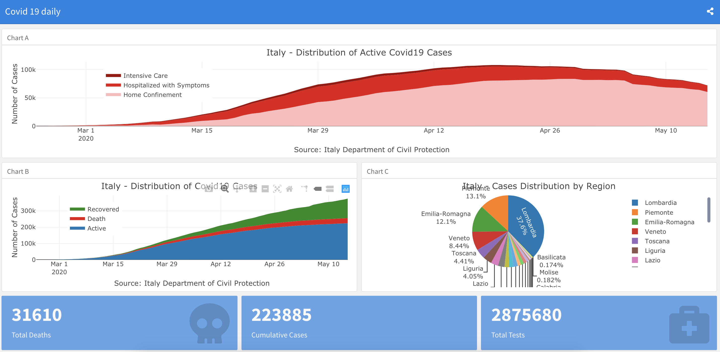
Dashboard 1: Evolution of Italy Covid-19
---
title: "Covid 19 daily "
output:
  flexdashboard::flex_dashboard:
    orientation: rows
    social: menu
    output: html_document
---


Column {data-width=650}
-----------------------------------------------------------------------

### Chart A

<div class="layout-chunk" data-layout="l-body">

```r
plot_ly(data = italy_total,
        x = ~ date,
        y = ~home_confinement,
        name = 'Home Confinement',
        fillcolor = '#FDBBBC',
        type = 'scatter',
        mode = 'none',
        stackgroup = 'one') %>%
  add_trace( y = ~ hospitalized_with_symptoms,
             name = "Hospitalized with Symptoms",
             fillcolor = '#E41317') %>%
  add_trace(y = ~intensive_care,
            name = 'Intensive Care',
            fillcolor = '#9E0003') %>%
  layout(title = "Italy - Distribution of Active Covid19 Cases",
         legend = list(x = 0.1, y = 0.9),
         yaxis = list(title = "Number of Cases"),
         xaxis = list(title = "Source: Italy Department of Civil Protection"))
```

</div>


Column {data-width=350}
-----------------------------------------------------------------------

### Chart B

<div class="layout-chunk" data-layout="l-body">

```r
plot_ly(data = italy_total,
        x = ~ date,
        y = ~ cumulative_cases,
        name = 'Active',
        fillcolor = '#1f77b4',
        type = 'scatter',
        mode = 'none',
        stackgroup = 'one') %>%
  add_trace( y = ~ death,
             name = "Death",
             fillcolor = '#E41317') %>%
  add_trace(y = ~recovered,
            name = 'Recovered',
            fillcolor = 'forestgreen') %>%
  layout(title = "Italy - Distribution of Covid19 Cases",
         legend = list(x = 0.1, y = 0.9),
         yaxis = list(title = "Number of Cases"),
         xaxis = list(title = "Source: Italy Department of Civil Protection"))
```

</div>


### Chart C

<div class="layout-chunk" data-layout="l-body">

```r
italy_region %>%
  filter(date == max(date)) %>%
  plot_ly(labels = ~region_name, values = ~ cumulative_cases,
          textinfo="label+percent",
          type = 'pie') %>%
  layout(title = "Italy - Cases Distribution by Region")
```

</div>


\newpage

Row
-----------------------------------------------------------------------

### Total Deaths

<div class="layout-chunk" data-layout="l-body">

```r
  valueBox(max(italy_total$death),
           icon = "fa-skull")
```

</div>


### Cumulative Cases

<div class="layout-chunk" data-layout="l-body">

```r
  valueBox(max(italy_total$cumulative_cases),
           icon = "fa-virus-slash")
```

</div>


### Total Tests

<div class="layout-chunk" data-layout="l-body">

```r
  valueBox(max(italy_total$total_tests),
           icon = "fa-briefcase-medical")
```

</div>
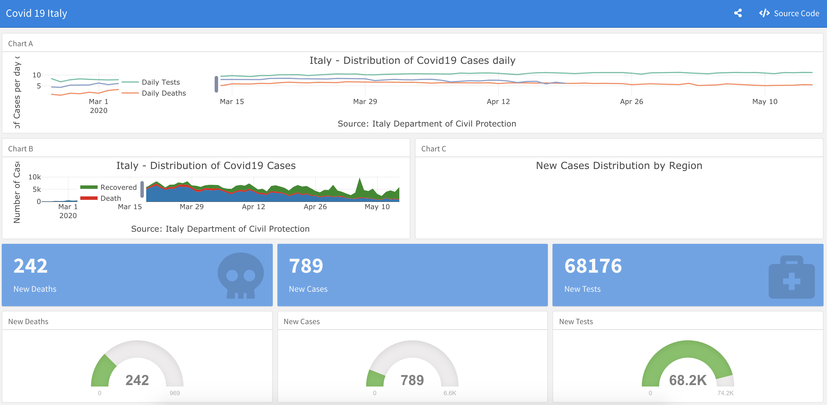
Dashboard 2: Italy Covid-19 Daily
---
title: "Covid 19 Italy"
output:
  flexdashboard::flex_dashboard:
    orientation: rows
    social: menu
    source_code: embed
---


Column {data-width=650}
-----------------------------------------------------------------------

### Chart A

<div class="layout-chunk" data-layout="l-body">

```r
plot_ly(data = italy_total2,
        x = ~ date,
        y = ~ log(diff_total_test),
        name = 'Daily Tests',
        color = '#1f77b4',
        type = 'scatter',
        mode = '‘lines') %>%
  add_trace( y = ~ log(diff_death),
             name = "Daily Deaths",
             color = '#E41317') %>%
  add_trace(y = ~ log(diff_cumulative_positive_cases),
            name = 'Daily Positive Cases',
            color = 'forestgreen') %>%
  layout(title = "Italy - Distribution of Covid19 Cases daily",
         legend = list(x = 0.1, y = 0.9),
         yaxis = list(title = "Number of Cases per day on a log scale"),
         xaxis = list(title = "Source: Italy Department of Civil Protection"))
```

</div>


Column {data-width=350}
-----------------------------------------------------------------------

### Chart B

<div class="layout-chunk" data-layout="l-body">

```r
plot_ly(data = italy_total2,
        x = ~ date,
        y = ~ diff_cumulative_cases,
        name = 'Active',
        fillcolor = '#1f77b4',
        type = 'scatter',
        mode = 'none',
        stackgroup = 'one') %>%
  add_trace( y = ~ diff_death,
             name = "Death",
             fillcolor = '#E41317') %>%
  add_trace(y = ~ diff_recovered,
            name = 'Recovered',
            fillcolor = 'forestgreen') %>%
  layout(title = "Italy - Distribution of Covid19 Cases",
         legend = list(x = 0.1, y = 0.9),
         yaxis = list(title = "Number of Cases"),
         xaxis = list(title = "Source: Italy Department of Civil Protection"))
```

</div>


### Chart C

<div class="layout-chunk" data-layout="l-body">

```r
italy_region %>%
  filter(date == max(date)) %>%
  plot_ly(labels = ~region_name, values = ~daily_positive_cases,
          textinfo="label+percent",
          type = 'pie') %>%
  layout(title = "New Cases Distribution by Region")
```

</div>


\newpage

Row
-----------------------------------------------------------------------

### New Deaths

<div class="layout-chunk" data-layout="l-body">

```r
  valueBox(tail(italy_total2$diff_death, n = 1),
           icon = "fa-skull")
```

</div>


### New Cases

<div class="layout-chunk" data-layout="l-body">

```r
  valueBox(tail(italy_total2$diff_cumulative_cases, n = 1),
           icon = "fa-virus-slash")
```

</div>


### New Tests

<div class="layout-chunk" data-layout="l-body">

```r
  valueBox(tail(italy_total2$diff_total_test, n = 1),
           icon = "fa-briefcase-medical")
```

</div>


Row
-----------------------------------------------------------------------

### New Deaths

<div class="layout-chunk" data-layout="l-body">

```r
gauge(tail(italy_total2$diff_death, n = 1), min = 0, max = max(italy_total2$diff_death),
symbol = ' ', gaugeSectors( success = c(0, 300), warning = c(301, 600),
danger = c(601, max(italy_total2$diff_death))
))
```

</div>


### New Cases

<div class="layout-chunk" data-layout="l-body">

```r
gauge(tail(italy_total2$diff_cumulative_cases, n = 1), min = 0,
max = max(italy_total2$diff_cumulative_cases), symbol = ' ', gaugeSectors( success = c(0, 1000),
warning = c(1001, 4000), danger = c(4001, max(italy_total2$diff_cumulative_positive_cases))
))
```

</div>


### New Tests

<div class="layout-chunk" data-layout="l-body">

```r
gauge(tail(italy_total2$diff_total_test, n = 1), min = 0,
max = max(italy_total2$diff_total_test), symbol = ' ', gaugeSectors(success = c(40001,
max(italy_total2$diff_total_test) ), warning = c(20001, 40000), danger = c(0, 20000))
)
```

</div>
Dashboard 3: Region Distribution of Covid 19 Cases in Italy
---
title: "Region Distribution of Covid 19 Cases Italy"
output: flexdashboard::flex_dashboard
---


Column
-------------------------------------

### Lombardia

<div class="layout-chunk" data-layout="l-body">

```r
italy_province %>%
  filter(date == max(date), region_name == "Lombardia") %>%
  plot_ly(labels = ~province_name, values = ~total_cases,
          textinfo="label+percent",
          type = 'pie') %>%
  layout(title = "Lombardia - Cases Distribution by Province")
```

</div>


Column {.tabset}
-------------------------------------

### Emilia-Romagna

<div class="layout-chunk" data-layout="l-body">

```r
italy_province %>%
  filter(date == max(date), region_name == "Emilia-Romagna") %>%
  plot_ly(labels = ~province_name, values = ~total_cases,
          textinfo="label+percent",
          type = 'pie') %>%
  layout(title = "Emilia-Romagna - Cases Distribution by Province")
```

</div>


### Piemonte

<div class="layout-chunk" data-layout="l-body">

```r
italy_province %>%
  filter(date == max(date), region_name == "Piemonte") %>%
  plot_ly(labels = ~province_name, values = ~total_cases,
          textinfo="label+percent",
          type = 'pie') %>%
  layout(title = "Piemonte - Cases Distribution by Province")
```

</div>


### Abruzzo

<div class="layout-chunk" data-layout="l-body">

```r
italy_province %>%
  filter(date == max(date), region_name == "Abruzzo") %>%
  plot_ly(labels = ~province_name, values = ~total_cases,
          textinfo="label+percent",
          type = 'pie') %>%
  layout(title = "Abruzzo - Cases Distribution by Province")
```

</div>


### Basilicata

<div class="layout-chunk" data-layout="l-body">

```r
italy_province %>%
  filter(date == max(date), region_name == "Basilicata") %>%
  plot_ly(labels = ~province_name, values = ~total_cases,
          textinfo="label+percent",
          type = 'pie') %>%
  layout(title = "Basilicata - Cases Distribution by Province")
```

</div>


### Calabria

<div class="layout-chunk" data-layout="l-body">

```r
italy_province %>%
  filter(date == max(date), region_name == "Calabria") %>%
  plot_ly(labels = ~province_name, values = ~total_cases,
          textinfo="label+percent",
          type = 'pie') %>%
  layout(title = "Calabria - Cases Distribution by Province")
```

</div>


### Campania

<div class="layout-chunk" data-layout="l-body">

```r
italy_province %>%
  filter(date == max(date), region_name == "Campania") %>%
  plot_ly(labels = ~province_name, values = ~total_cases,
          textinfo="label+percent",
          type = 'pie') %>%
  layout(title = "Campania - Cases Distribution by Province")
```

</div>


### Friuli Venezia Giulia

<div class="layout-chunk" data-layout="l-body">

```r
italy_province %>%
  filter(date == max(date), region_name == "Friuli Venezia Giulia") %>%
  plot_ly(labels = ~province_name, values = ~total_cases,
          textinfo="label+percent",
          type = 'pie') %>%
  layout(title = "Friuli Venezia Giulia - Cases Distribution by Province")
```

</div>


### Lazio

<div class="layout-chunk" data-layout="l-body">

```r
italy_province %>%
  filter(date == max(date), region_name == "Lazio") %>%
  plot_ly(labels = ~province_name, values = ~total_cases,
          textinfo="label+percent",
          type = 'pie') %>%
  layout(title = "Lazio - Cases Distribution by Province")
```

</div>


### Liguria

<div class="layout-chunk" data-layout="l-body">

```r
italy_province %>%
  filter(date == max(date), region_name == "Liguria") %>%
  plot_ly(labels = ~province_name, values = ~total_cases,
          textinfo="label+percent",
          type = 'pie') %>%
  layout(title = "Liguria - Cases Distribution by Province")
```

</div>


### Marche

<div class="layout-chunk" data-layout="l-body">

```r
italy_province %>%
  filter(date == max(date), region_name == "Marche") %>%
  plot_ly(labels = ~province_name, values = ~total_cases,
          textinfo="label+percent",
          type = 'pie') %>%
  layout(title = "Marche - Cases Distribution by Province")
```

</div>


### Molise

<div class="layout-chunk" data-layout="l-body">

```r
italy_province %>%
  filter(date == max(date), region_name == "Molise") %>%
  plot_ly(labels = ~province_name, values = ~total_cases,
          textinfo="label+percent",
          type = 'pie') %>%
  layout(title = "Molise - Cases Distribution by Province")
```

</div>


### Puglia

<div class="layout-chunk" data-layout="l-body">

```r
italy_province %>%
  filter(date == max(date), region_name == "Puglia") %>%
  plot_ly(labels = ~province_name, values = ~total_cases,
          textinfo="label+percent",
          type = 'pie') %>%
  layout(title = "Puglia - Cases Distribution by Province")
```

</div>


### Sardegna
<div class="layout-chunk" data-layout="l-body">

```r
italy_province %>%
  filter(date == max(date), region_name == "Sardegna") %>%
  plot_ly(labels = ~province_name, values = ~total_cases,
          textinfo="label+percent",
          type = 'pie') %>%
  layout(title = "Sardegna - Cases Distribution by Province")
```

</div>


### Sicilia

<div class="layout-chunk" data-layout="l-body">

```r
italy_province %>%
  filter(date == max(date), region_name == "Sicilia") %>%
  plot_ly(labels = ~province_name, values = ~total_cases,
          textinfo="label+percent",
          type = 'pie') %>%
  layout(title = "Sicilia - Cases Distribution by Province")
```

</div>


### Toscana
<div class="layout-chunk" data-layout="l-body">

```r
italy_province %>%
  filter(date == max(date), region_name == "Toscana") %>%
  plot_ly(labels = ~province_name, values = ~total_cases,
          textinfo="label+percent",
          type = 'pie') %>%
  layout(title = "Toscana - Cases Distribution by Province")
```

</div>


### Umbria

<div class="layout-chunk" data-layout="l-body">

```r
italy_province %>%
  filter(date == max(date), region_name == "Umbria") %>%
  plot_ly(labels = ~province_name, values = ~total_cases,
          textinfo="label+percent",
          type = 'pie') %>%
  layout(title = "Umbria - Cases Distribution by Province")
```

</div>

To go further with our pedagogical platform
- Our Coding School
- Our Potential Modules
- Module 1: Data Visualizations
- Module 2: Data Warehouse
- Module 3: News Collection and Analysis
- Module 4: Predictive Modelling
- Module 5: Social Media Collection and Analysis
- Module 6: Mapping
- Module 7: Bibliometrics
- Module 8: Topic Modelling
- Module 9: Covid-19 and International Flows
- Module 10: Covid-19 and Finance
- Module 11: Covid-19 and Public Policies
- Module 12: Covid-19 and Ethics
- Our Databases and APIs