This course will teach you how to create line charts with ggplot2.
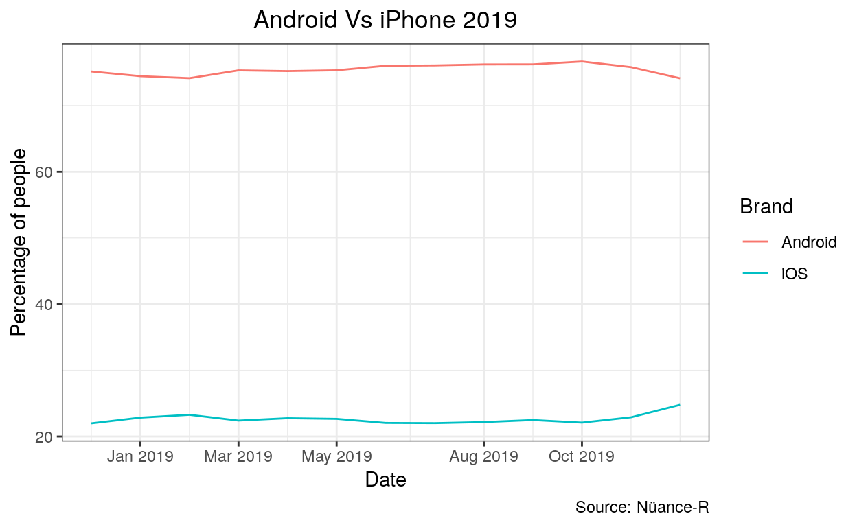
The percentage of people who bought android versus iphone in 2019 worldwide
Loading data
# Open the following packages
library(ggplot2)
library(dplyr)
library(gsheet)
library(kableExtra)

# Open your data frame
MobileVendor2019 <- read.csv("android_vs_iphone_2019.csv")

# The kable package is an optional step. It makes your table look nicer :)
kable(MobileVendor2019)%>%
scroll_box(width = "100%", height = "400px")
| Date | Android | iOS | KaiOS | Unknown | Samsung | Windows | Series.40 | Nokia.Unknown | Tizen | Linux | SymbianOS | BlackBerry.OS | Other |
|---|---|---|---|---|---|---|---|---|---|---|---|---|---|
| 2018-12 | 75.16 | 21.98 | 1.13 | 0.46 | 0.29 | 0.33 | 0.19 | 0.15 | 0.11 | 0.05 | 0.06 | 0.05 | 0.04 |
| 2019-01 | 74.45 | 22.85 | 1.10 | 0.41 | 0.28 | 0.30 | 0.18 | 0.14 | 0.10 | 0.05 | 0.06 | 0.05 | 0.03 |
| 2019-02 | 74.15 | 23.28 | 0.96 | 0.42 | 0.29 | 0.29 | 0.18 | 0.14 | 0.09 | 0.06 | 0.06 | 0.05 | 0.03 |
| 2019-03 | 75.33 | 22.40 | 0.84 | 0.36 | 0.26 | 0.28 | 0.14 | 0.13 | 0.07 | 0.06 | 0.05 | 0.04 | 0.03 |
| 2019-04 | 75.22 | 22.76 | 0.73 | 0.32 | 0.24 | 0.26 | 0.12 | 0.11 | 0.07 | 0.04 | 0.05 | 0.05 | 0.03 |
| 2019-05 | 75.34 | 22.66 | 0.77 | 0.32 | 0.22 | 0.24 | 0.12 | 0.11 | 0.08 | 0.04 | 0.04 | 0.04 | 0.02 |
| 2019-06 | 76.03 | 22.04 | 0.79 | 0.32 | 0.21 | 0.21 | 0.10 | 0.10 | 0.07 | 0.04 | 0.04 | 0.03 | 0.02 |
| 2019-07 | 76.08 | 22.01 | 0.81 | 0.31 | 0.21 | 0.20 | 0.10 | 0.10 | 0.07 | 0.04 | 0.03 | 0.03 | 0.02 |
| 2019-08 | 76.23 | 22.17 | 0.59 | 0.26 | 0.21 | 0.20 | 0.09 | 0.09 | 0.07 | 0.03 | 0.02 | 0.03 | 0.02 |
| 2019-09 | 76.24 | 22.48 | 0.38 | 0.23 | 0.18 | 0.17 | 0.08 | 0.08 | 0.06 | 0.04 | 0.02 | 0.02 | 0.01 |
| 2019-10 | 76.67 | 22.09 | 0.42 | 0.21 | 0.17 | 0.15 | 0.07 | 0.07 | 0.05 | 0.03 | 0.02 | 0.02 | 0.01 |
| 2019-11 | 75.82 | 22.90 | 0.49 | 0.19 | 0.18 | 0.15 | 0.06 | 0.07 | 0.05 | 0.03 | 0.02 | 0.02 | 0.01 |
| 2019-12 | 74.13 | 24.79 | 0.35 | 0.19 | 0.18 | 0.13 | 0.06 | 0.06 | 0.04 | 0.03 | 0.02 | 0.02 | 0.01 |
Data Wrangling
# Data Wrangling
MobileVendor2019 <- dplyr::select(MobileVendor2019, Date, Android, iOS)

MobileVendor2019 <- tidyr::gather(MobileVendor2019,"brand", "value", 2:3)

library(zoo)
MobileVendor2019$Date <- as.yearmon(MobileVendor2019$Date)

kable(MobileVendor2019)%>%
scroll_box(width = "100%", height = "400px")
| Date | brand | value |
|---|---|---|
| Dec 2018 | Android | 75.16 |
| Jan 2019 | Android | 74.45 |
| Feb 2019 | Android | 74.15 |
| Mar 2019 | Android | 75.33 |
| Apr 2019 | Android | 75.22 |
| May 2019 | Android | 75.34 |
| Jun 2019 | Android | 76.03 |
| Jul 2019 | Android | 76.08 |
| Aug 2019 | Android | 76.23 |
| Sep 2019 | Android | 76.24 |
| Oct 2019 | Android | 76.67 |
| Nov 2019 | Android | 75.82 |
| Dec 2019 | Android | 74.13 |
| Dec 2018 | iOS | 21.98 |
| Jan 2019 | iOS | 22.85 |
| Feb 2019 | iOS | 23.28 |
| Mar 2019 | iOS | 22.40 |
| Apr 2019 | iOS | 22.76 |
| May 2019 | iOS | 22.66 |
| Jun 2019 | iOS | 22.04 |
| Jul 2019 | iOS | 22.01 |
| Aug 2019 | iOS | 22.17 |
| Sep 2019 | iOS | 22.48 |
| Oct 2019 | iOS | 22.09 |
| Nov 2019 | iOS | 22.90 |
| Dec 2019 | iOS | 24.79 |
Creating visual
# Create your visual
ggplot(data = MobileVendor2019, aes(x = Date, y = value, color = brand)) +
  geom_line() +
  theme_bw() +
  theme(plot.title = element_text(hjust = 0.5)) +
  labs(title = "Android Vs iPhone 2019",
       x = "Date",
       y = "Percentage of people",
       colour = "Brand",
       caption = "Source: Nüance-R")
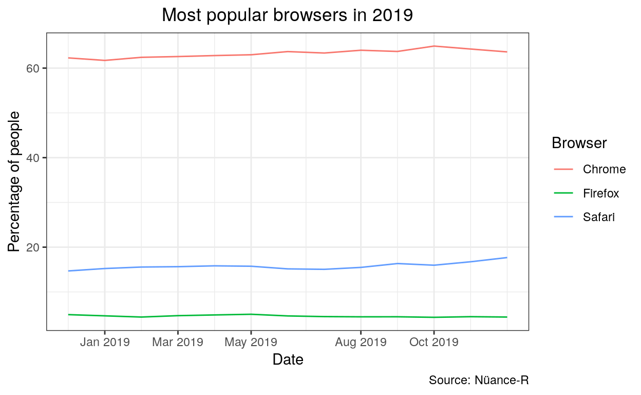
The most popular browsers used in 2019 worldwide
library(ggplot2)
library(dplyr)
library(gsheet)

browser2019 <- read.csv("browser_2019.csv")

browser2019 <- dplyr::select(browser2019, Date, Chrome, Safari, Firefox)

kable(browser2019)%>%
scroll_box(width = "100%", height = "400px")
| Date | Chrome | Safari | Firefox |
|---|---|---|---|
| 2018-12 | 62.28 | 14.69 | 4.93 |
| 2019-01 | 61.72 | 15.23 | 4.66 |
| 2019-02 | 62.41 | 15.56 | 4.39 |
| 2019-03 | 62.58 | 15.64 | 4.70 |
| 2019-04 | 62.80 | 15.83 | 4.86 |
| 2019-05 | 62.98 | 15.74 | 5.01 |
| 2019-06 | 63.69 | 15.15 | 4.64 |
| 2019-07 | 63.37 | 15.05 | 4.49 |
| 2019-08 | 63.99 | 15.48 | 4.44 |
| 2019-09 | 63.72 | 16.34 | 4.45 |
| 2019-10 | 64.92 | 15.97 | 4.33 |
| 2019-11 | 64.26 | 16.74 | 4.47 |
| 2019-12 | 63.62 | 17.68 | 4.39 |
browser2019 <- tidyr::gather(browser2019, "browser", "value", 2:4)

library(zoo)
browser2019$Date <- as.yearmon(browser2019$Date)

kable(browser2019)%>%
scroll_box(width = "100%", height = "400px")
| Date | browser | value |
|---|---|---|
| Dec 2018 | Chrome | 62.28 |
| Jan 2019 | Chrome | 61.72 |
| Feb 2019 | Chrome | 62.41 |
| Mar 2019 | Chrome | 62.58 |
| Apr 2019 | Chrome | 62.80 |
| May 2019 | Chrome | 62.98 |
| Jun 2019 | Chrome | 63.69 |
| Jul 2019 | Chrome | 63.37 |
| Aug 2019 | Chrome | 63.99 |
| Sep 2019 | Chrome | 63.72 |
| Oct 2019 | Chrome | 64.92 |
| Nov 2019 | Chrome | 64.26 |
| Dec 2019 | Chrome | 63.62 |
| Dec 2018 | Safari | 14.69 |
| Jan 2019 | Safari | 15.23 |
| Feb 2019 | Safari | 15.56 |
| Mar 2019 | Safari | 15.64 |
| Apr 2019 | Safari | 15.83 |
| May 2019 | Safari | 15.74 |
| Jun 2019 | Safari | 15.15 |
| Jul 2019 | Safari | 15.05 |
| Aug 2019 | Safari | 15.48 |
| Sep 2019 | Safari | 16.34 |
| Oct 2019 | Safari | 15.97 |
| Nov 2019 | Safari | 16.74 |
| Dec 2019 | Safari | 17.68 |
| Dec 2018 | Firefox | 4.93 |
| Jan 2019 | Firefox | 4.66 |
| Feb 2019 | Firefox | 4.39 |
| Mar 2019 | Firefox | 4.70 |
| Apr 2019 | Firefox | 4.86 |
| May 2019 | Firefox | 5.01 |
| Jun 2019 | Firefox | 4.64 |
| Jul 2019 | Firefox | 4.49 |
| Aug 2019 | Firefox | 4.44 |
| Sep 2019 | Firefox | 4.45 |
| Oct 2019 | Firefox | 4.33 |
| Nov 2019 | Firefox | 4.47 |
| Dec 2019 | Firefox | 4.39 |
ggplot(data = browser2019, aes(x = Date, y = value, color = browser)) +
  geom_line() +
  theme_bw() +
  theme(plot.title = element_text(hjust = 0.5)) +
  labs(title = "Most popular browsers in 2019",
       x = "Date",
       y = "Percentage of people",
       colour = "Browser",
       caption = "Source: Nüance-R")
You have now learned how to create visuals. Congratulations !
The data used in this article was collected from GS stat counter