There is a multitude ways of getting data to create maps. In the Data Visualization with R course, you’ve seen some of them.
As you know, the ggplot2 package allows you to produce maps. It also provides data for maps, like longitude and latitude of each countries. It will be easy to turn these data into a data frame suitable for plotting with ggplot2.
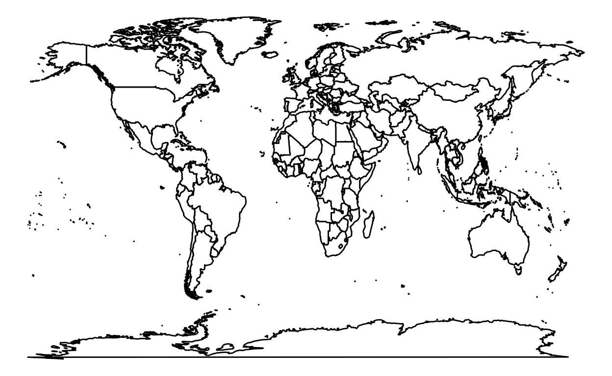
World
Let’s start with a basic map of the world.
Step 1: Load packages
Step 2: Retrieve data
For now, we only use the data of the world to create a map of the world. Later, we’ll see maps for particular region of the world like continents, countries, states or even county!
world <- map_data("world")
Step 3: Create maps
ggplot(data = world, aes(x = long, y = lat, group = group)) +
  geom_polygon(fill = "white", color = "black") +
  theme_void()
Continents
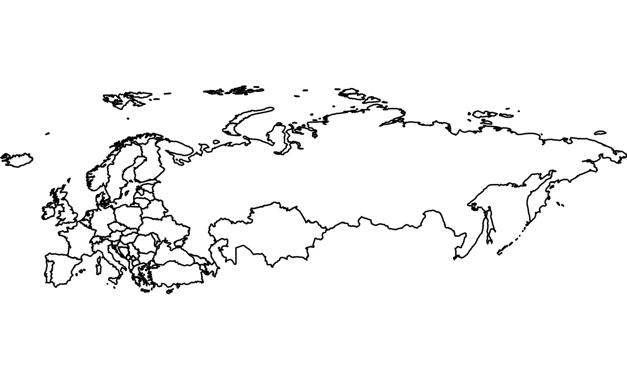
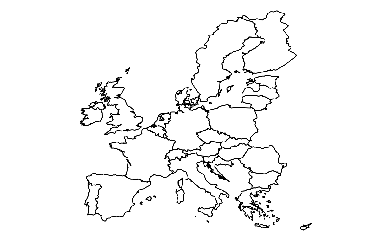
Europe
Step 1: Load packages
Step 2: Retrieve data
Getting the world data as in the previous World section.
world <- map_data("world")
As you may have guessed, we want to produce a map of Europe. We listed Europe countries to create a map of Europe.
europe <- subset(world, region %in% c("Albania", "Andorra", "Armenia", "Austria", "Azerbaijan",
                                      "Belarus", "Belgium", "Bosnia and Herzegovina", "Bulgaria",
                                      "Croatia", "Cyprus", "Czechia","Denmark","Estonia","Finland",
                                      "France","Georgia", "Germany", "Greece","Hungary","Iceland",
                                      "Ireland", "Italy","Kazakhstan", "Kosovo", "Latvia","Liechtenstein",
                                      "Lithuania", "Luxembourg","Malta","Moldova","Monaco","Montenegro",
                                      "Macedonia", "Netherlands","Norway","Poland","Portugal","Romania",
                                      "Russia","San Marino","Serbia","Slovakia","Slovenia","Spain",
                                      "Sweden","Switzerland","Turkey","Ukraine","UK","Vatican"))
Step 3: Create maps
ggplot(data = europe, aes(x = long, y = lat, group = group)) +
  geom_polygon(fill = "white", color = "black") +
  theme_void()
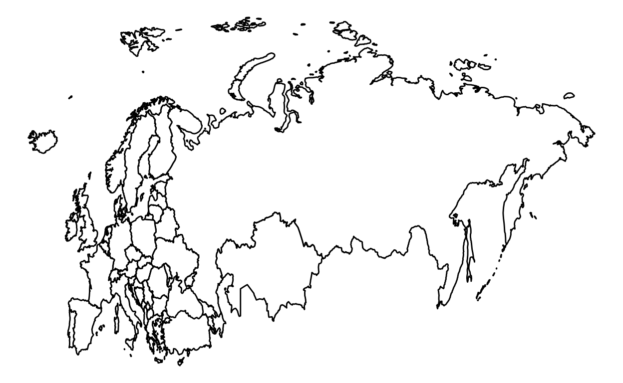
The map is too focused on the eastern part. We added some options to refocus the map.
ggplot(data = europe, aes(x = long, y = lat, group = group)) +
  geom_polygon(fill = "white", color = "black") +
  theme_void() +
  coord_fixed(ratio=1.6, xlim = c(-50, 80))
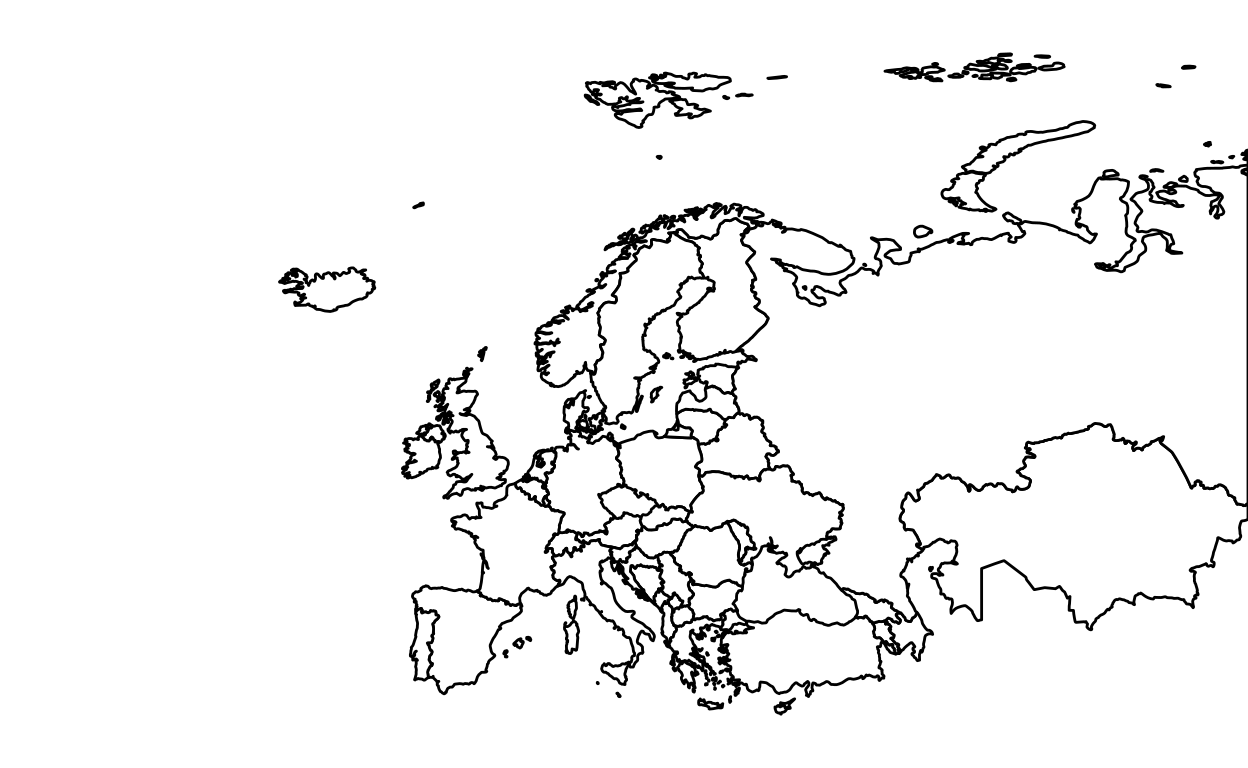
We used the coord_fixed() function to adjust the plot. The default ratio is 1. We used 1.6 as the ration. Honestly, it’s just a “try and error” method. The xlim option allows to cut the map horizontally (To cut the map vertically use the ylim option). The number -50 cut the map on the left part of the map. The number 80 cut the map on the right part of the map. Of course, you can cut more or less than 50 on the left side and more or less than 80 for the right side. To see the details of the function.
To keep the entire map without cutting the eastern part like the map above, but with a better focus, here the following code:
ggplot(data = europe, aes(x = long, y = lat, group = group)) +
  geom_polygon(fill = "white", color = "black") +
  theme_void() +
  coord_fixed(ratio=1.5, xlim = c(-15,180), ylim = c(35,80))
Americas
Step 1: Load packages
Step 2: Retrieve data
world <- map_data("world")
americas <- subset(world, region %in% c("USA","Brazil","Mexico", "Colombia", "Argentina", "Canada",
                                      "Peru","Venezuela","Chile","Guatemala","Ecuador", "Bolivia", "Cuba",
                                      "Honduras", "Paraguay", "Nicaragua","El Salvador", "Costa Rica", "Panama",
                                      "Uruguay",  "Jamaica",  "Trinidad and Tobago", "Guyana", "Suriname", "Belize",
                                      "Barbados", "Saint Lucia", "Grenada", "Saint Vincent and the Grenadines",
                                      "Antigua and Barbuda", "Saint Kitts and Nevis"))
Step 3: Create maps
ggplot(data = americas, aes(x = long, y = lat, group = group)) +
  geom_polygon(fill = "white", color = "black") +
  coord_fixed(ratio=1.1, xlim = c(-180, -35))  +
  theme_void()
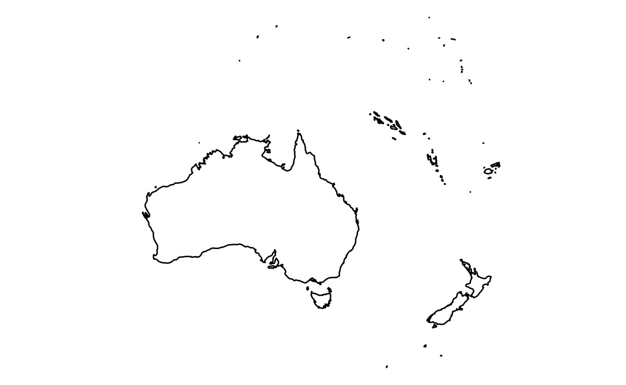
Oceania
Step 1: Load packages
Step 2: Retrieve data
Step 3: Create maps
ggplot(data = oceania, aes(x = long, y = lat, group = group)) +
  geom_polygon(fill = "white", color = "black") +
  coord_fixed(xlim = c(110,180)) +
  theme_void()
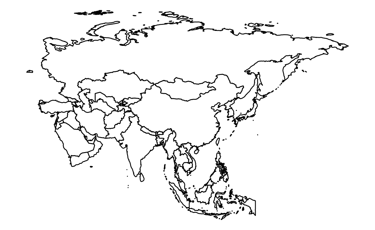
Asia
Step 1: Load packages
Step 2: Retrieve data
world <- map_data("world")
asia <- subset(world, region %in% c("Afghanistan", "Armenia", "Azerbaijan", "Bahrain", "Bangladesh", "Bhutan",
                                    "Brunei", "Cambodia", "China", "Cyprus", "Georgia", "India", "Indonesia",
                                    "Iran", "Iraq", "Israel", "Japan", "Jordan", "Kazakhstan", "Kuwait",
                                    "Kyrgyzstan", "Laos", "Lebanon", "Malaysia", "Maldives", "Mongolia", "Myanmar",
                                    "Nepal", "North Korea", "Oman", "Pakistan", "Palestine", "Philippines", "Qatar",
                                    "Russia", "Saudi Arabia", "Singapore", "South Korea", "Sri Lanka", "Syria",
                                    "Taiwan", "Tajikistan", "Thailand", "Timor-Leste", "Turkey", "Turkmenistan",
                                    "United Arab Emirates", "Uzbekistan", "Vietnam", "Yemen"))
Step 3: Create maps
ggplot(data = asia, aes(x = long, y = lat, group = group)) +
  geom_polygon(fill = "white", color = "black") +
  coord_fixed(1.2) +
  theme_void()
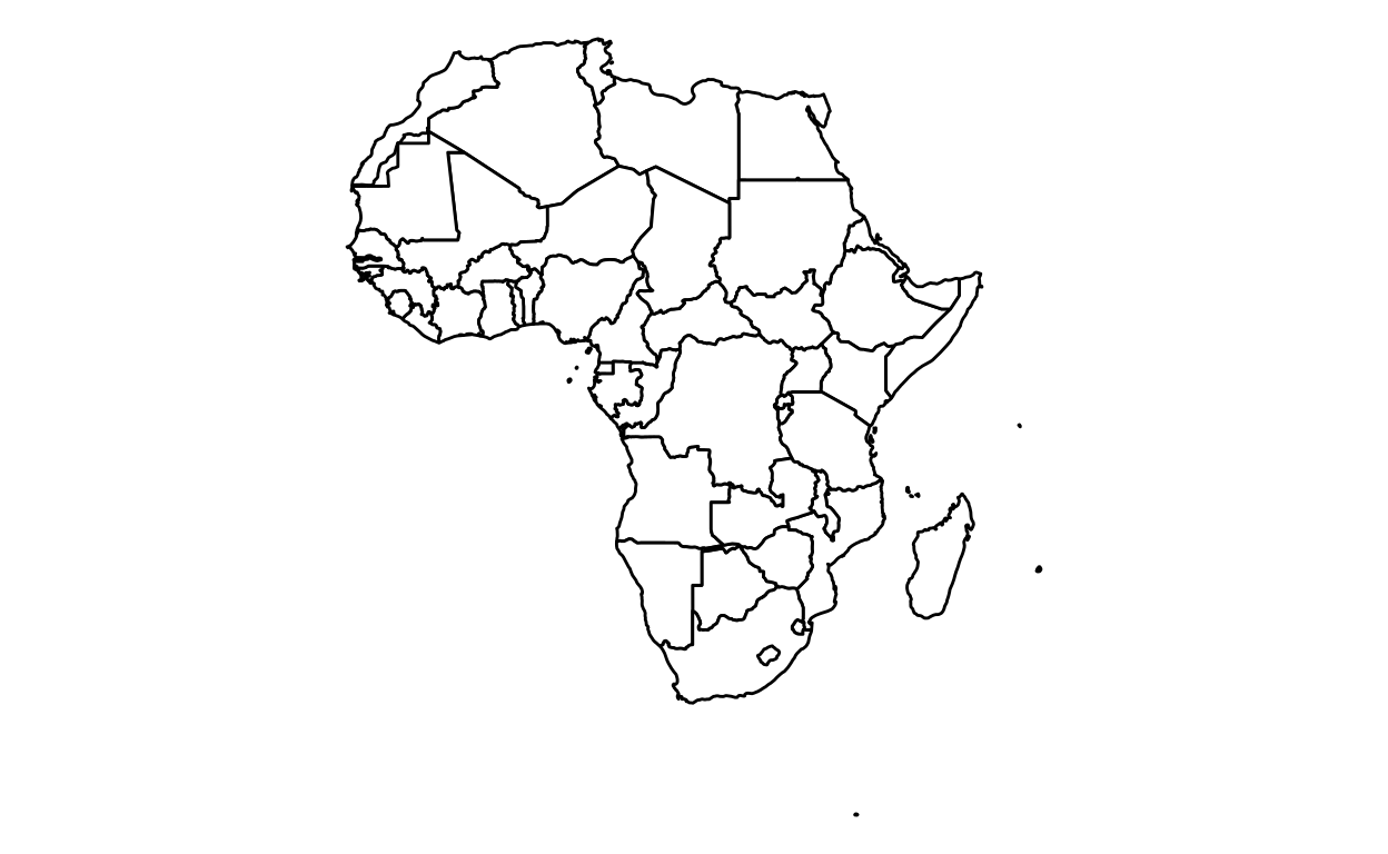
Africa
Step 1: Load packages
Step 2: Retrieve data
world <- map_data("world")
africa <- subset(world, region %in% c("Algeria","Angola","Benin","Botswana","Burkina Faso","Burundi",
                                      "Cabo Verde","Cameroon","Central African Republic","Chad","Comoros",
                                      "Democratic Republic of the Congo","Republic of Congo","Ivory Coast",
                                      "Djibouti","Egypt","Equatorial Guinea","Eritrea","Swaziland","Ethiopia",
                                      "Gabon","Gambia","Ghana","Guinea","Guinea-Bissau","Kenya","Lesotho","Liberia",
                                      "Libya","Madagascar","Malawi","Mali","Mauritania","Mauritius","Morocco",
                                      "Mozambique","Namibia","Niger","Nigeria","Rwanda","Sao Tome and Principe",
                                      "Senegal","Seychelles","Sierra Leone","Somalia","South Africa","South Sudan",
                                      "Sudan","Tanzania","Togo","Tunisia","Uganda","Zambia","Zimbabwe"))
Step 3: Create maps
ggplot(data = africa, aes(x = long, y = lat, group = group)) +
  geom_polygon(fill = "white", color = "black") +
  coord_fixed() +
  theme_void()
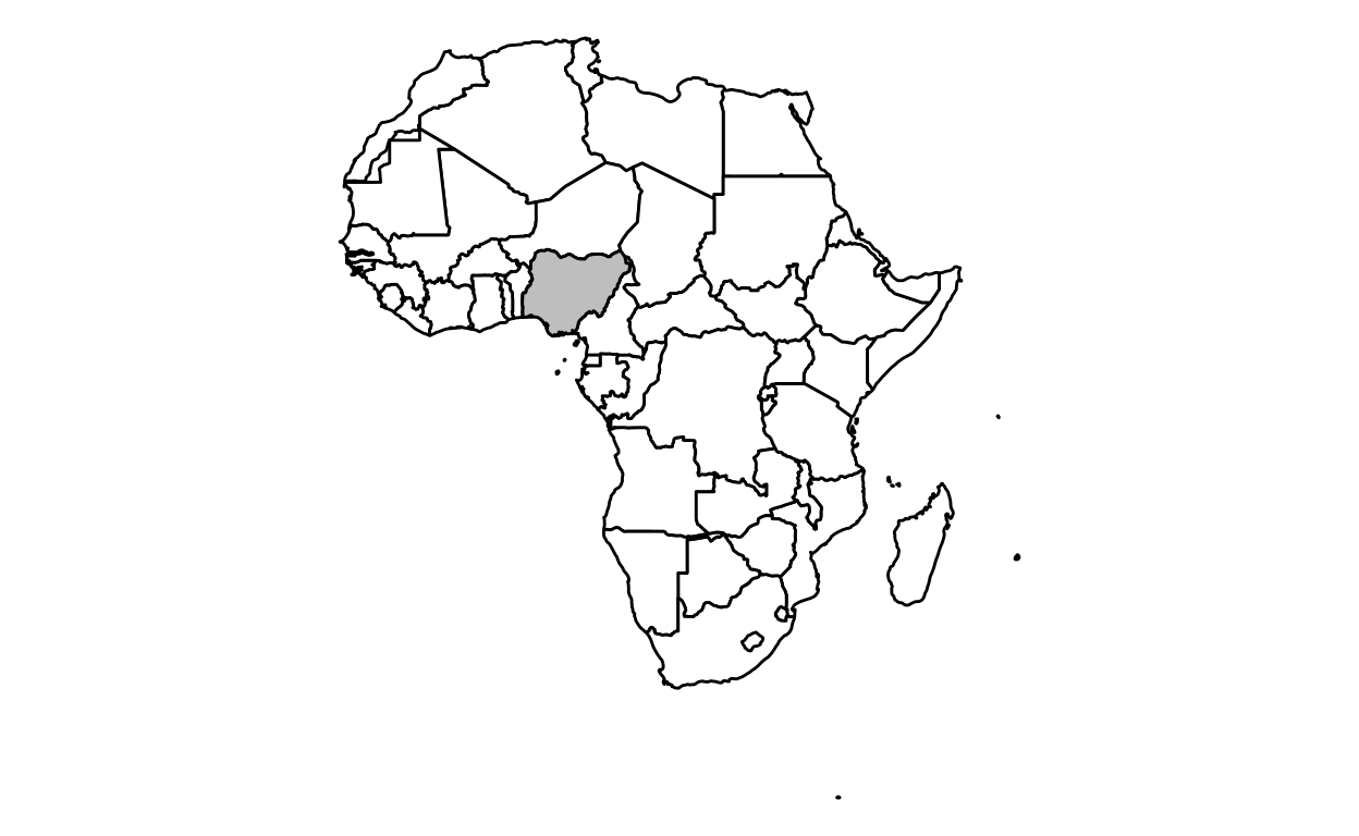
To color a country (in this case Nigeria):
ggplot(data = africa, aes(x = long, y = lat, group = group)) +
  geom_polygon(data = africa, fill = "white", color = "black") +
  geom_polygon(data = nigeria, fill = "gray", color = "black") +
  coord_fixed() +
  theme_void()
Countries
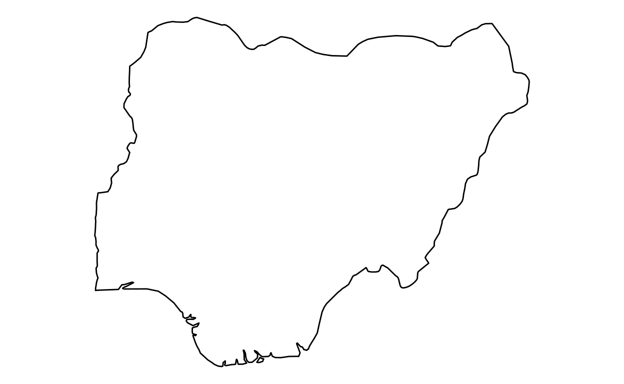
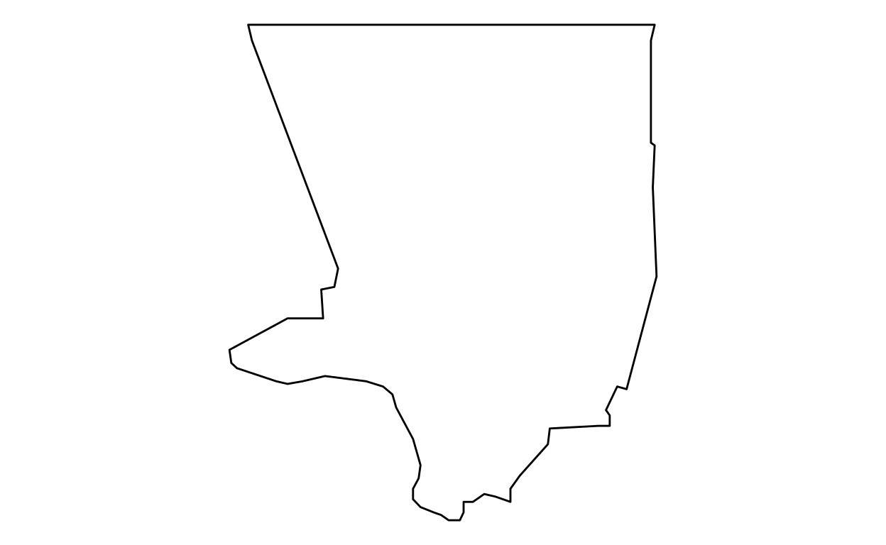
Nigeria
Step 1: Load packages
To color a specific country in a map, here how to do it:
Step 2: Retrieve data
nigeria <- map_data("world", region = "Nigeria")
Step 3: Create maps
To only keep the map of Nigeria:
ggplot(data = nigeria, aes(x = long, y = lat, group = group)) +
  geom_polygon(fill = "white", color = "black") +
  coord_fixed() +
  theme_void()
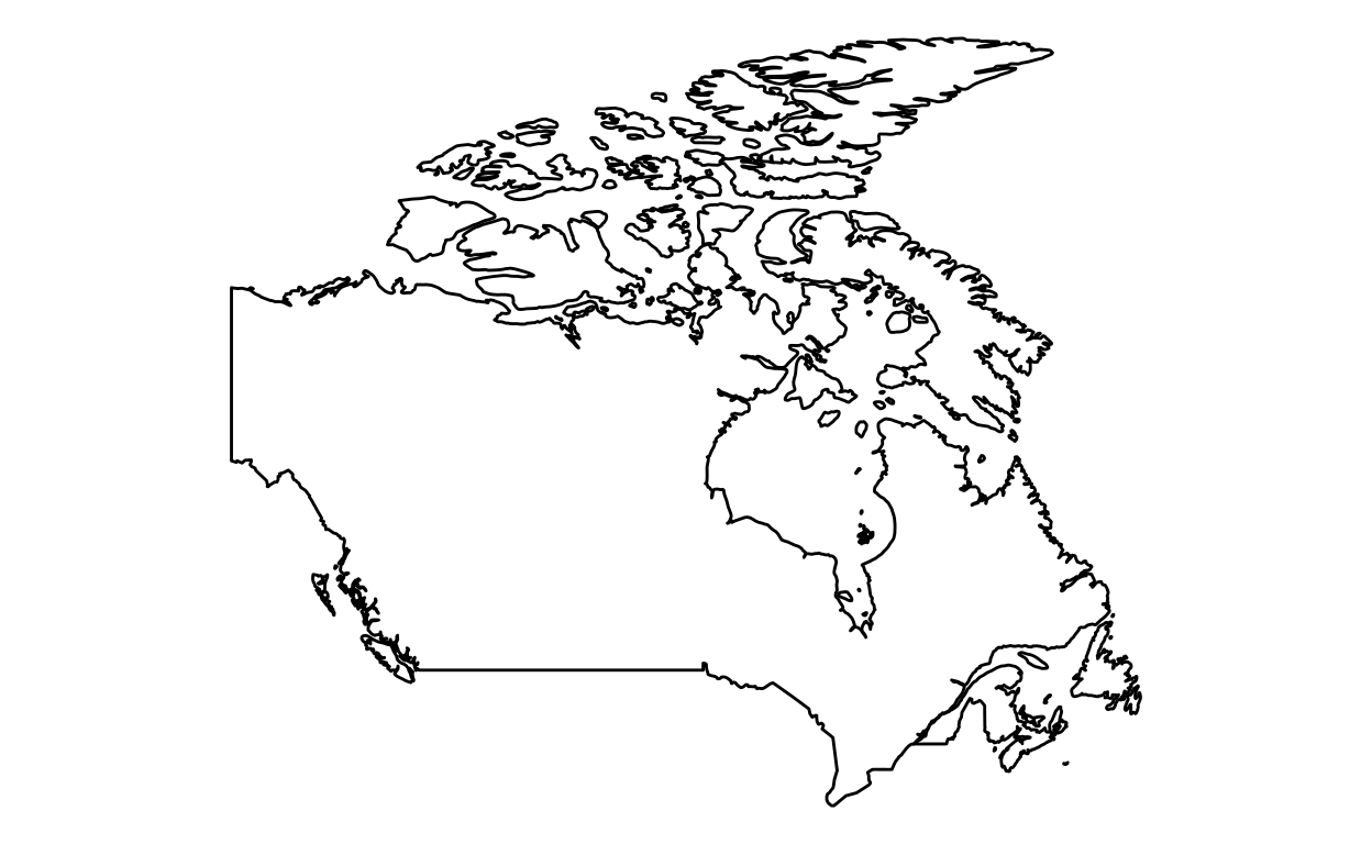
Canada
Step 1: Load packages
Step 2: Retrieve data
canada <- map_data("world", region = "Canada")
Step 3: Create maps
ggplot(data=canada, aes(x = long, y = lat, group = group)) +
  geom_polygon(fill = "white", color="black")+
  coord_fixed(1.8) +
  theme_void()
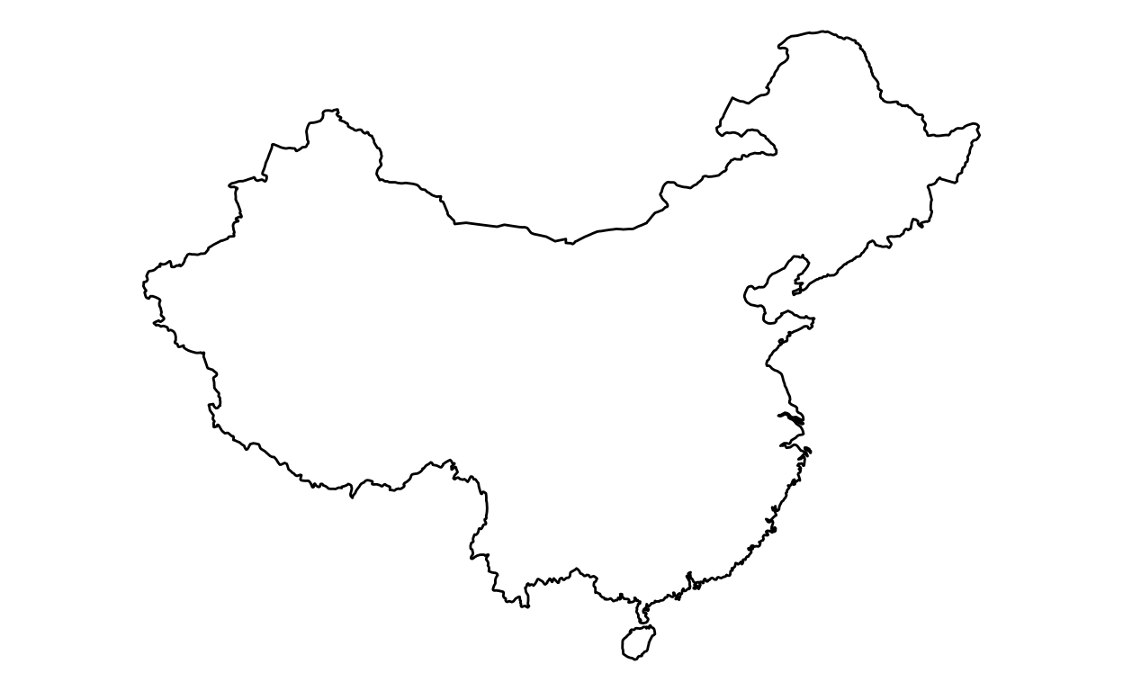
China
Step 1: Load packages
Step 2: Retrieve data
china <- map_data("world", region = "China")
Step 3: Create maps
ggplot(china, aes(x = long, y = lat, group = group)) +
  geom_polygon(fill = "white", color="black")+
  coord_fixed(1.3) +
  theme_void()
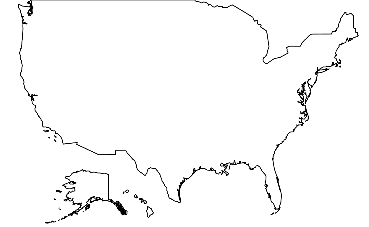
United States
Step 1: Load packages
Step 2: Retrieve data
usa <- map_data("world", region = "USA")
Step 3: Create maps
ggplot(data=usa, aes(x = long, y = lat, group = group)) +
  geom_polygon(fill = "white", color = "black")+
  coord_fixed(1.8, xlim = c(-180,0)) +
  theme_void()
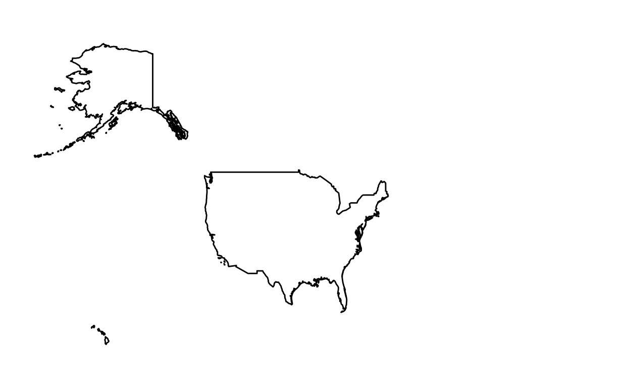
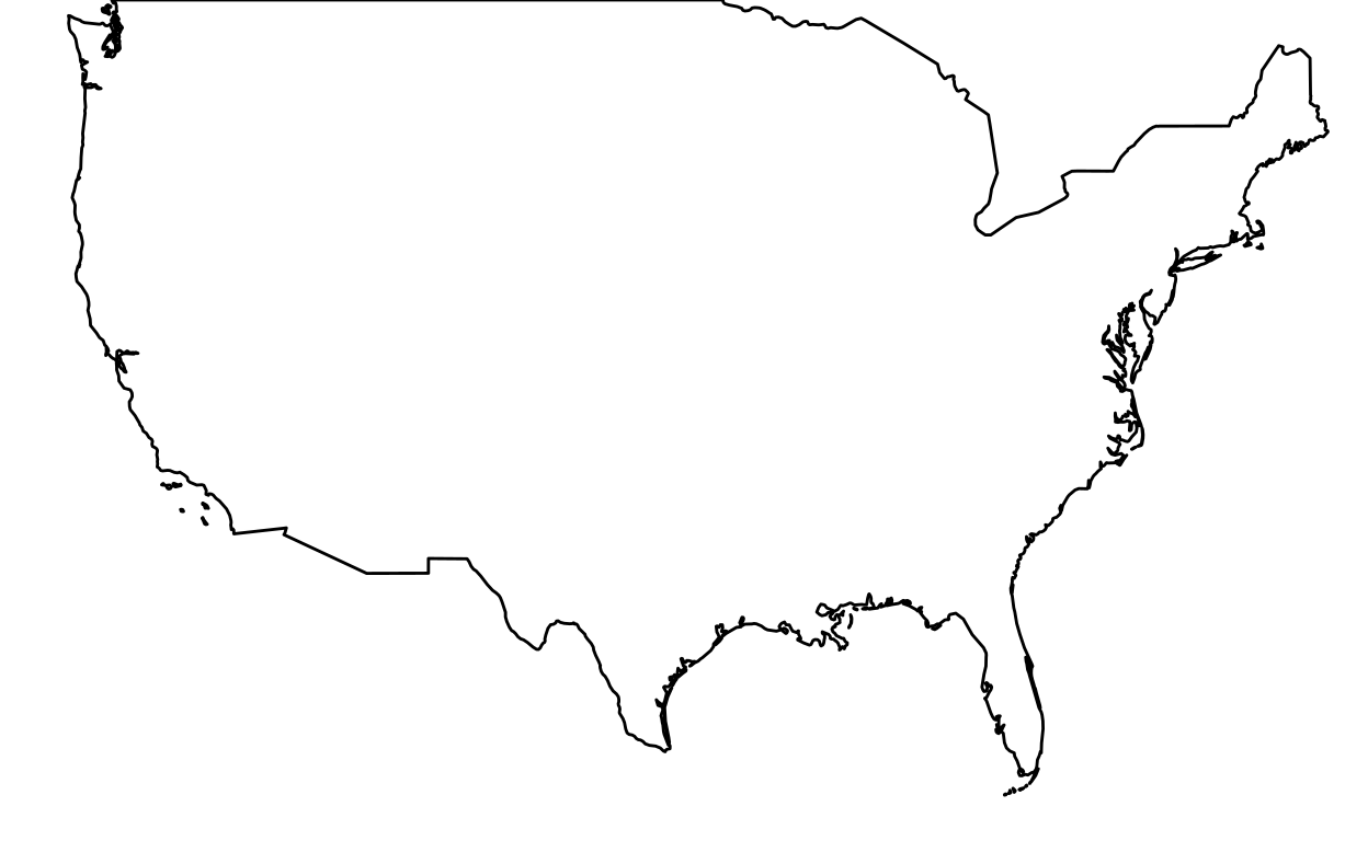
If you don’t like the appearance of the map, here an alternative.
- We only keep the mainland:
(mainland <- ggplot(data=usa, aes(x = long, y = lat, group = group)) +
              geom_polygon(fill = "white", color = "black")+
              coord_fixed(1.5, xlim = c(-125,-68), ylim = c(50,22)) +
              theme_void())
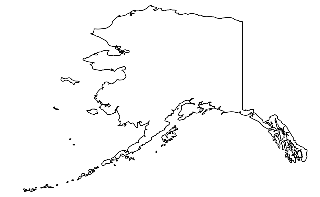
- We keep the Alaska:
(alaska <- ggplot(data = usa, aes(x = long, y = lat, group = group)) +
              geom_polygon(fill = "white", color = "black") +
              coord_fixed(1.6, xlim = c(-178,-132), ylim = c(52,71)) +
              theme_void())
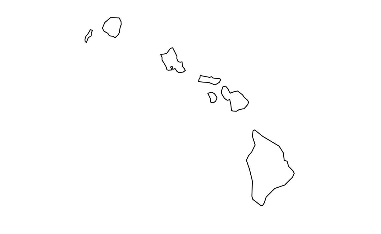
- We keep Hawaii:
(hawaii <- ggplot(data=usa, aes(x = long, y = lat, group = group)) +
            geom_polygon(fill = "white", color = "black") +
            coord_fixed(1.5, xlim = c(-162,-153), ylim = c(23,18)) +
            theme_void())
- We put it together:
ratioAlaska <- (25 - 2) / (16 - (-24))
ratioHawaii  <- (23 - 18) / (-154 - (-161))

ggdraw(mainland) +
  draw_plot(alaska, width = 0.26, height = 0.26 * 10/6 * ratioAlaska, x = 0.1, y = 0.01) +
  draw_plot(hawaii, width = 0.15, height = 0.15 * 10/6 * ratioHawaii, x = 0.3, y = 0.01)
States
All US states
Step 1: Load packages
Step 2: Retrieve data
Step 3: Create maps
ggplot(data = usa_mainland, aes(x = long, y = lat, group = group)) +
  geom_polygon(data = usa_states, fill = "white", color = "black") +
  coord_fixed(1.4) +
  theme_void()
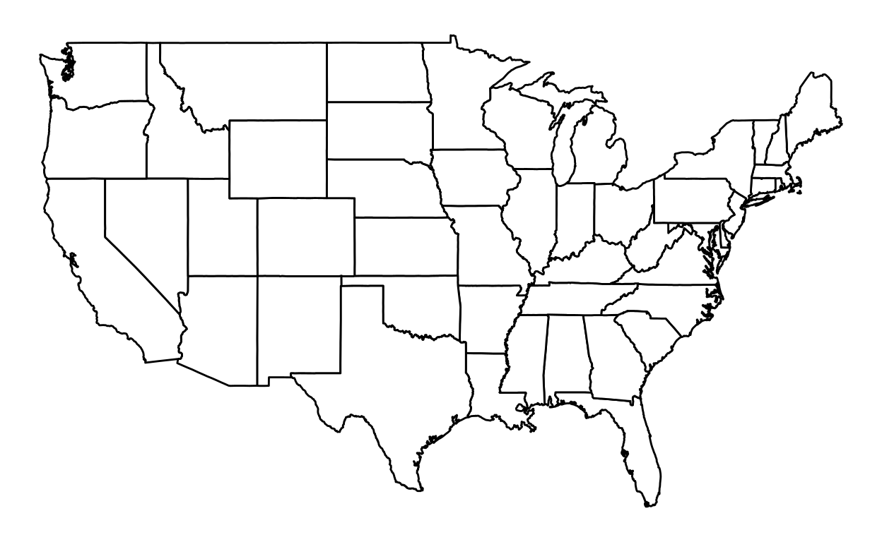
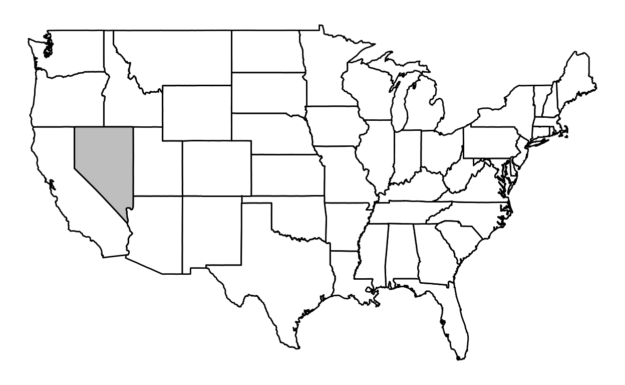
To color a state:
nevada <- subset(usa_states, region == "nevada")
ggplot(data = usa_states, aes(x = long, y = lat, group = group)) +
  geom_polygon(data = usa_states, fill = "white", color = "black") +
  geom_polygon(data = nevada, fill = "gray", color = "black") +
  coord_fixed(1.4) +
  theme_void()
Nevada
Step 1: Load packages
Step 2: Retrieve data
nevada <- subset(usa_states, region == "nevada")
Step 3: Create maps
ggplot(data = nevada, aes(x = long, y = lat, group = group)) +
  geom_polygon(fill = "white", color = "black") +
  coord_fixed(1.4) +
  theme_void()

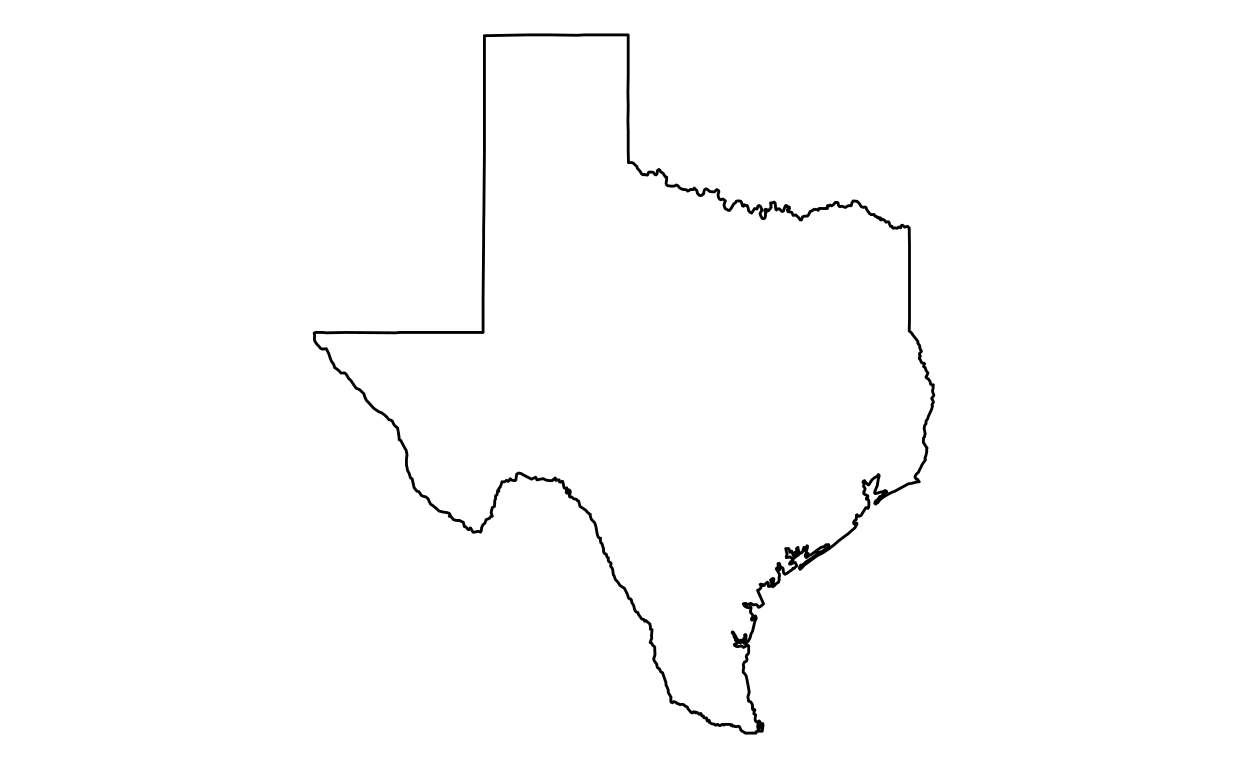
Texas
Step 1: Load packages
Step 2: Retrieve data
texas <- subset(usa_states, region == "texas")
Step 3: Create maps
To only keep a state (in this case Texas):
ggplot(data = texas, aes(x = long, y = lat, group = group)) +
  geom_polygon(fill = "white", color = "black") +
  coord_fixed(1.4) +
  theme_void()
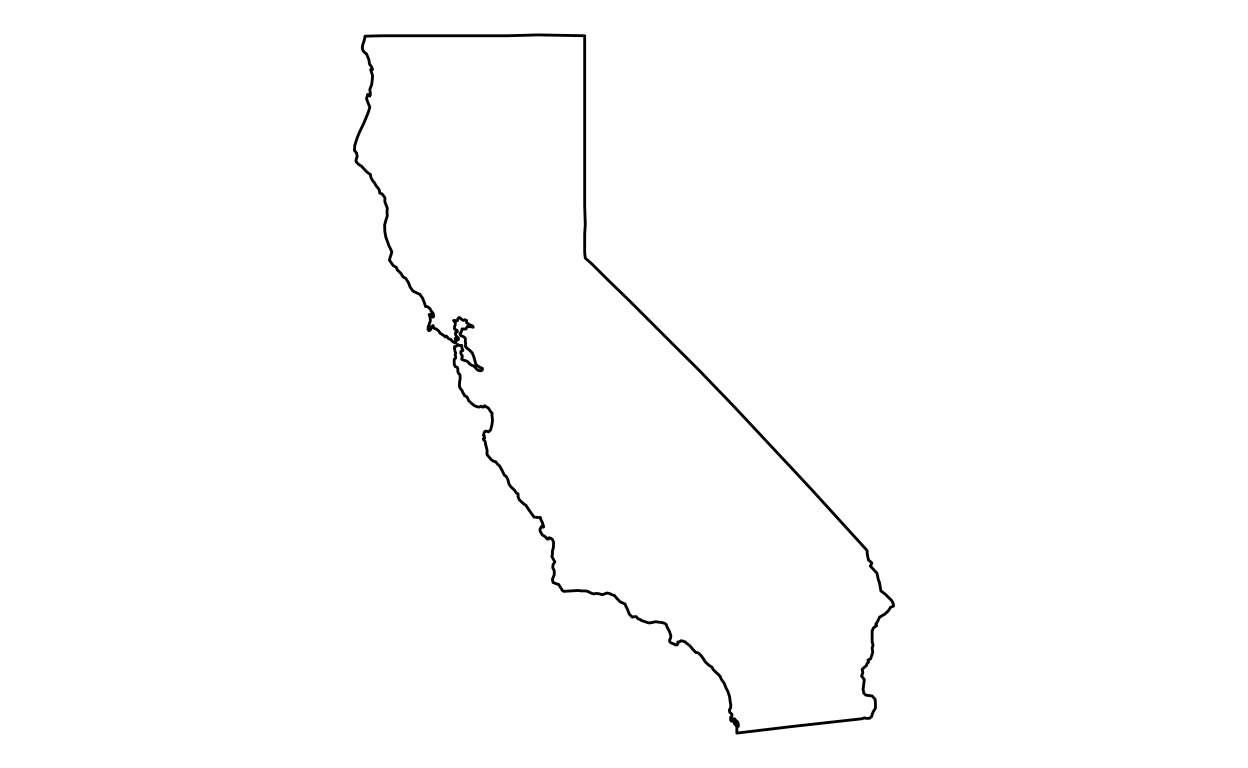
California
Step 1: Load packages
Step 2: Retrieve data
california <- subset(usa_states, region == "california")
Step 3: Create maps
ggplot(data = california, aes(x = long, y = lat, group = group)) +
  geom_polygon(fill = "white", color = "black") +
  coord_fixed(1.4) +
  theme_void()
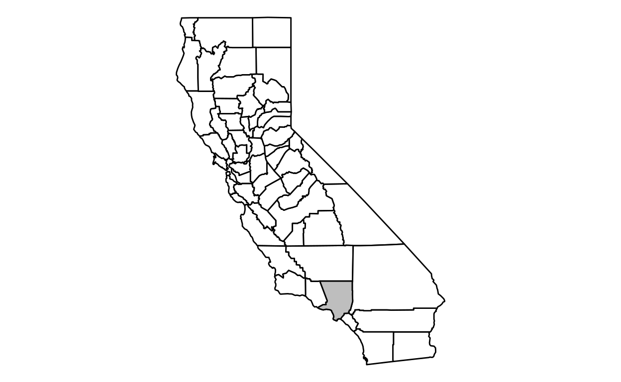
County
Los Angeles
Step 1: Load packages
Step 2: Retrieve data
Step 3: Create maps
ggplot(data = california, aes(x = long, y = lat, group = group)) +
  geom_polygon(data = california_counties, fill = "white", color = "black") +
  geom_polygon(data = losAngeles, fill = "gray", color = "black") +
  coord_fixed(1.4) +
  theme_void()
To only keep the county map:
ggplot(data = losAngeles, aes(x = long, y = lat, group = group)) +
  geom_polygon(fill = "white", color = "black") +
  coord_fixed(1.4) +
  theme_void()
San Francisco
Step 1: Load packages
Step 2: Retrieve data
Step 3: Create maps
ggplot(data = sanFrancisco, aes(x = long, y = lat, group = group)) +
  geom_polygon(fill = "white", color = "black") +
  coord_fixed(1.4) +
  theme_void()

Associations and Agreements
European Union
Step 1: Load packages
Step 2: Retrieve data
world <- map_data("world")

european.union.countries <- c("Bulgaria","Cyprus","Estonia","Finland","Greece","Ireland","Latvia",
                              "Lithuania","Luxembourg","Malta","Romania" ,"Sweden","Portugal",
                              "Spain", "France", "Switzerland", "Germany","Austria", "Belgium",
                              "UK", "Netherlands", "Denmark", "Poland", "Italy", "Croatia",
                              "Slovenia", "Hungary", "Slovakia", "Czech republic")

european.union <- map_data("world", region = european.union.countries)
Step 3: Create maps
ggplot(european.union, aes(x = long, y = lat)) +
  geom_polygon(aes(group = group), fill = "white", color="black") +
  coord_fixed(1.2) +
  theme_void()
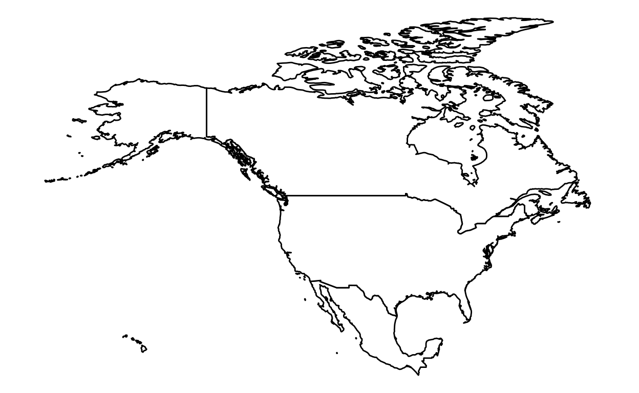
NAFTA
Step 1: Load packages
Step 2: Retrieve data
Step 3: Create maps
ggplot(NAFTA, aes(x = long, y = lat, group = group)) +
  geom_polygon(fill = "white", color="black") +
  coord_fixed(1.2, xlim = c(-175,-55)) +
  theme_void()