Set up
We will work with data from UNIDO and US data from map_data.
Data
You can load UNIDO data stored in a Gsheet by using the following code!
library(gsheet)

dataGraph <- gsheet2tbl("https://docs.google.com/spreadsheets/d/1uLaXke-KPN28-ESPPoihk8TiXVWp5xuNGHW7w7yqLCc/edit?usp=sharing")
We want to create a column with random data from a sample of 1 to 500.
dataGraph$sample <- sample(1:500, 18, replace=F)
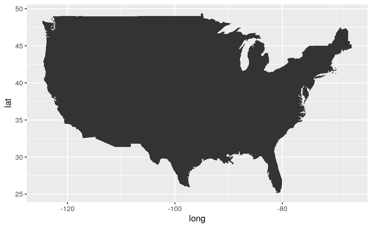
You can load US data from map_data by using the following code!
Package
For the examples to work, we need to load the ggplot2 package.
Themes
Themes control the display of all non-data elements of the plot. You can override all settings with a complete theme like theme_bw(), or choose to tweak individual settings by using theme() and the element_ functions. Use theme_set() to modify the active theme, affecting all future plots.
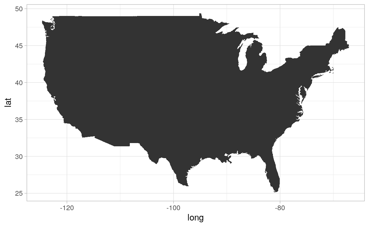
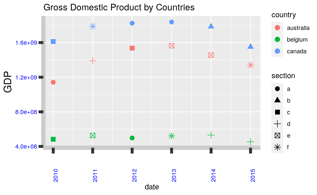
Default
The default themes:
ggplot(usa, aes(x = long, y = lat, group = group)) +
  geom_polygon() +
  theme_grey()
ggplot(usa, aes(x = long, y = lat, group = group)) +
  geom_polygon() +
  theme_gray()
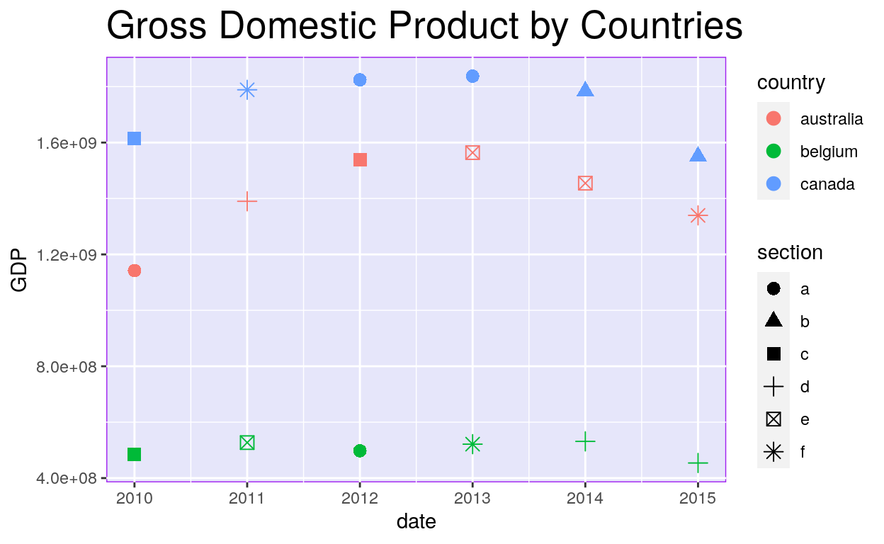
BW
ggplot(usa, aes(x = long, y = lat, group = group)) +
  geom_polygon() +
  theme_bw()

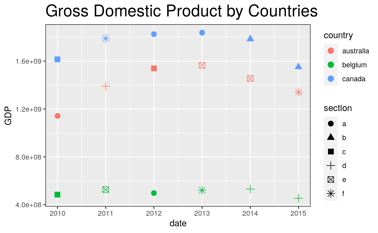
Linedraw
ggplot(usa, aes(x = long, y = lat, group = group)) +
  geom_polygon() +
  theme_linedraw()

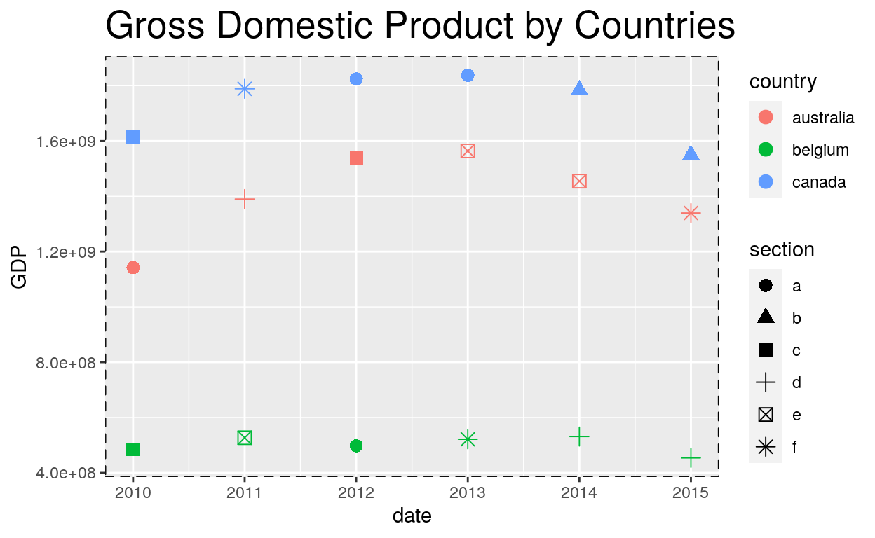
Light
ggplot(usa, aes(x = long, y = lat, group = group)) +
  geom_polygon() +
  theme_light()
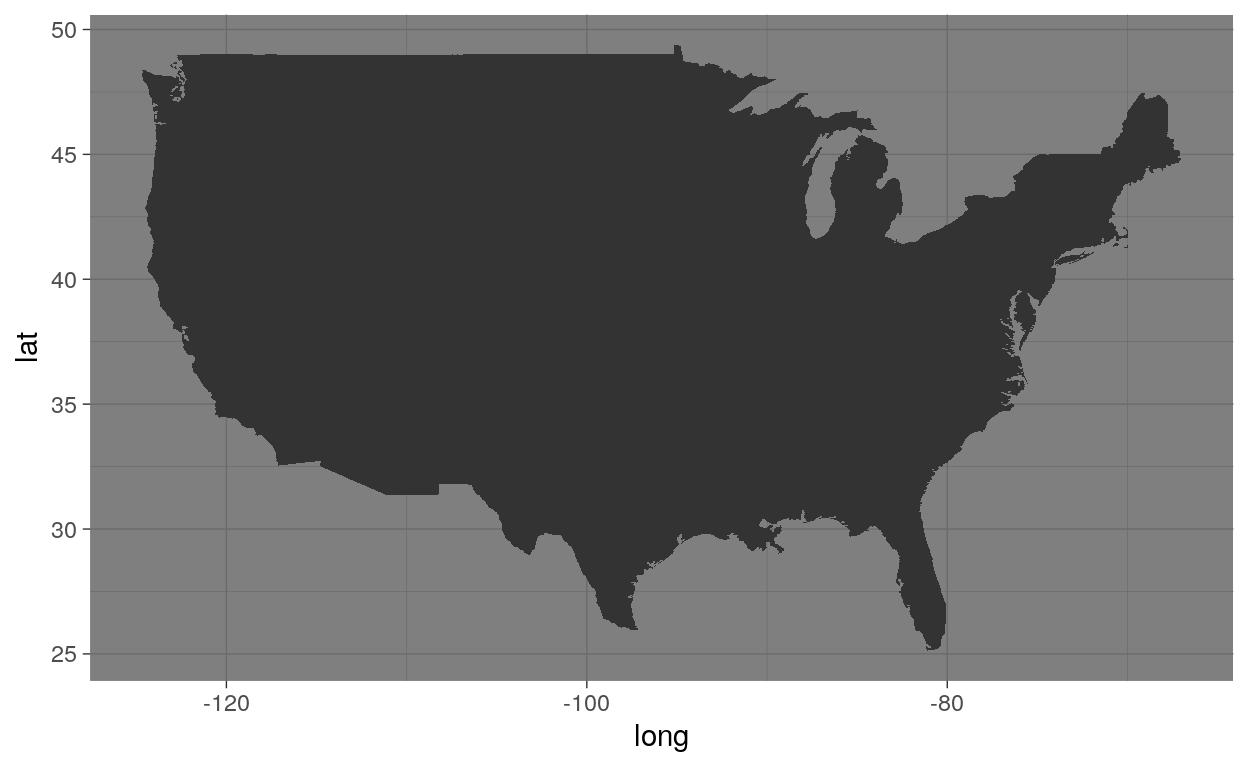
Dark
ggplot(usa, aes(x = long, y = lat, group = group)) +
  geom_polygon() +
  theme_dark()
Minimal
ggplot(usa, aes(x = long, y = lat, group = group)) +
  geom_polygon() +
  theme_minimal()

Classic
ggplot(usa, aes(x = long, y = lat, group = group)) +
  geom_polygon() +
  theme_classic()

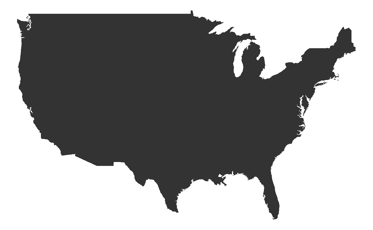
Void
ggplot(usa, aes(x = long, y = lat, group = group)) +
  geom_polygon() +
  theme_void()
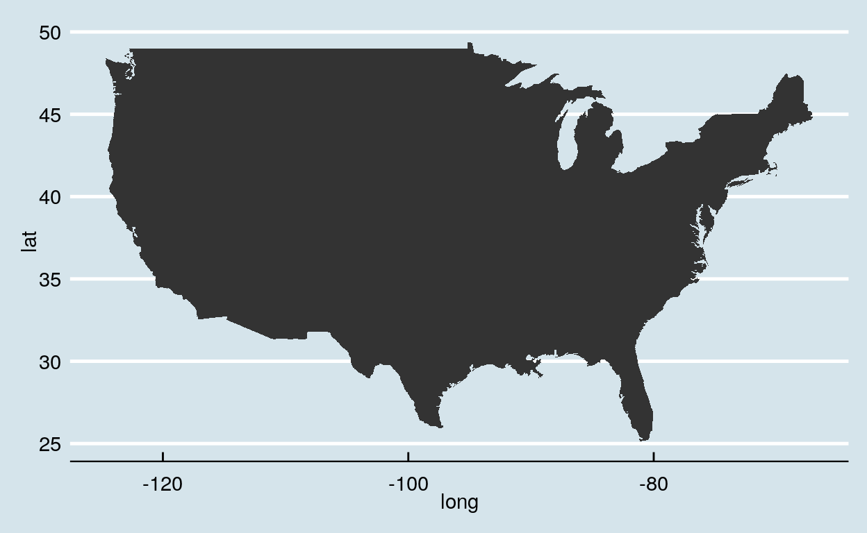
Economist
ggplot(usa, aes(x = long, y = lat, group = group)) +
  geom_polygon() +
  theme_economist()
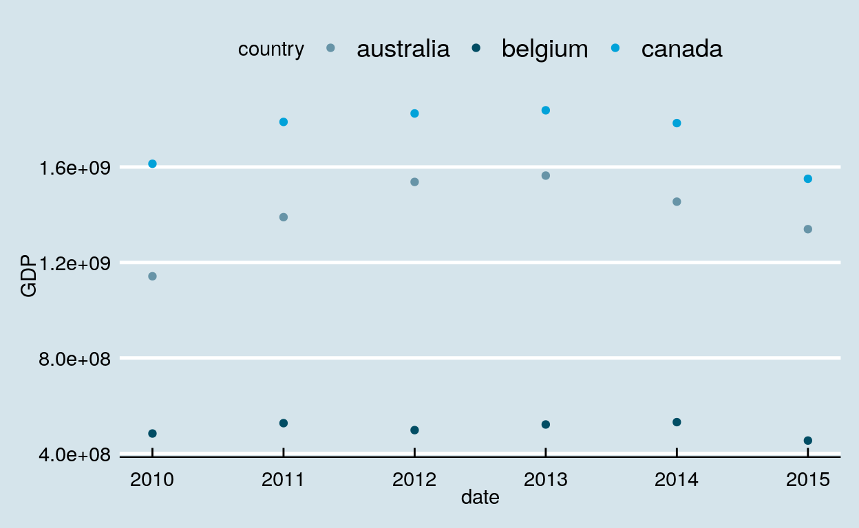
Adding the scale_color_economist() function to color points with the economist theme colors.
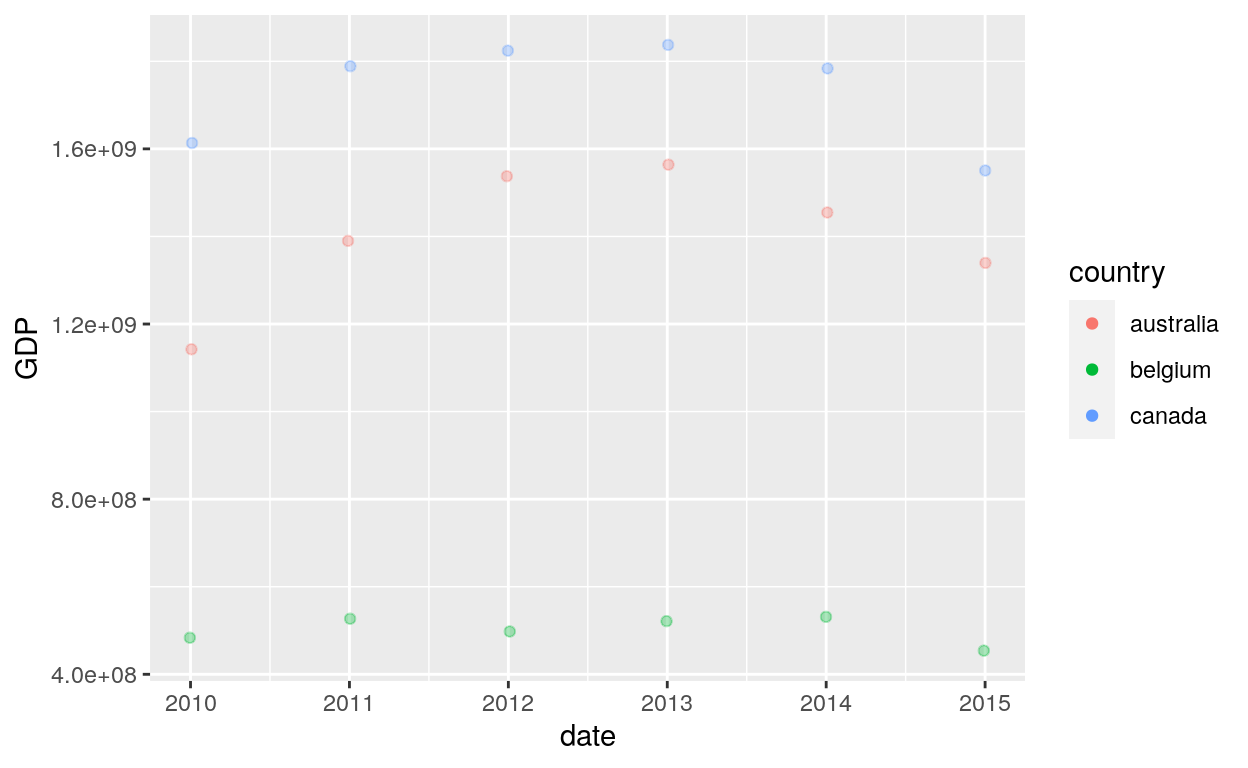
ggplot(dataGraph, aes(date, GDP, color = country)) +
  geom_point() +
  theme_economist() +
  scale_color_economist()
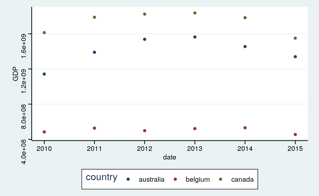
Stata
ggplot(dataGraph, aes(date, GDP, color = country)) +
  geom_point() +
  theme_stata() +
  scale_color_stata()
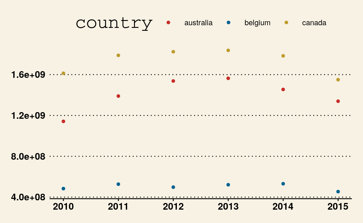
Wall Street Journal
ggplot(dataGraph, aes(date, GDP, color = country)) +
  geom_point() +
  theme_wsj() +
  scale_colour_wsj("colors6")
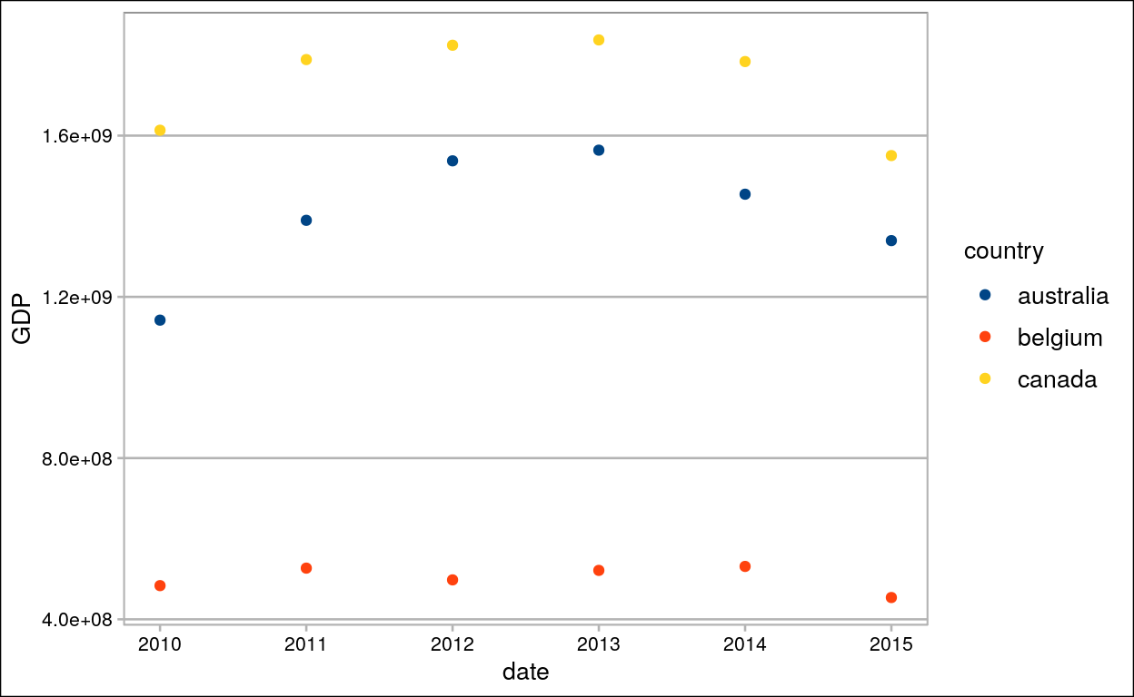
LibreOffice Calc
ggplot(dataGraph, aes(date, GDP, color = country)) +
  geom_point() +
  theme_calc() +
  scale_colour_calc()
Modify components of a theme
Labs
Title, subtitle, x, y, coulour, shape, caption and tag
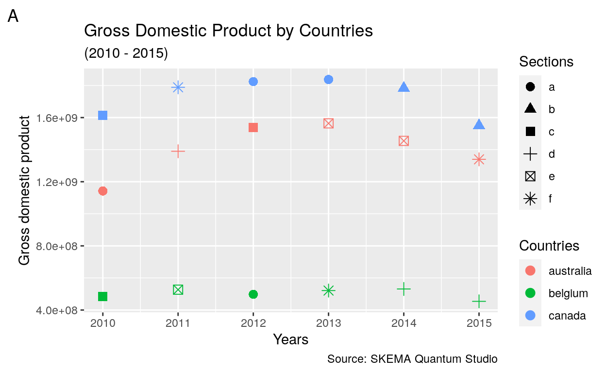
ggplot(dataGraph, aes(date, GDP)) +
  geom_point(aes(colour = country, shape = section), size = 3) +
  labs(title = "Gross Domestic Product by Countries",
       subtitle = "(2010 - 2015)",
       x = "Years",
       y = "Gross domestic product",
       colour = "Countries",
       shape = "Sections",
       caption = "Source: Nüance-R",
       tag = "A")
Theme
Plot
Title
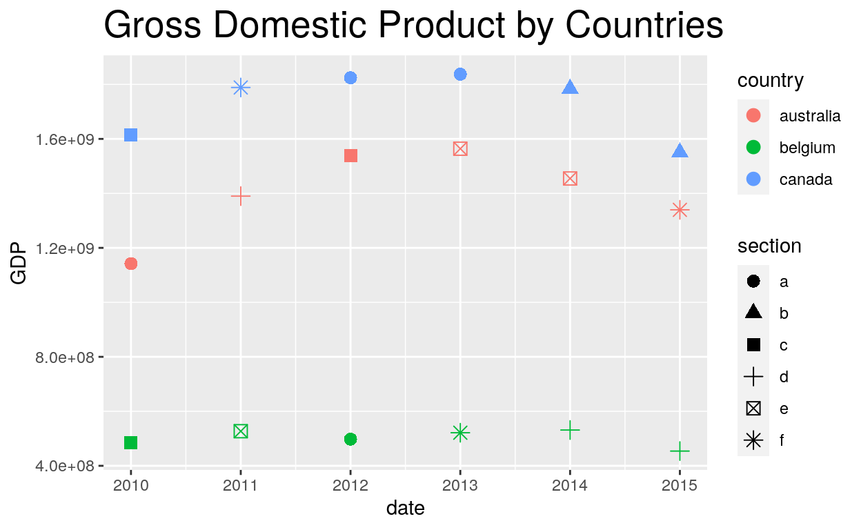
ggplot(dataGraph, aes(date, GDP)) +
  geom_point(aes(colour = country, shape = section), size = 3) +
  labs(title = "Gross Domestic Product by Countries") +
  theme(plot.title = element_text(size = 20))
Background
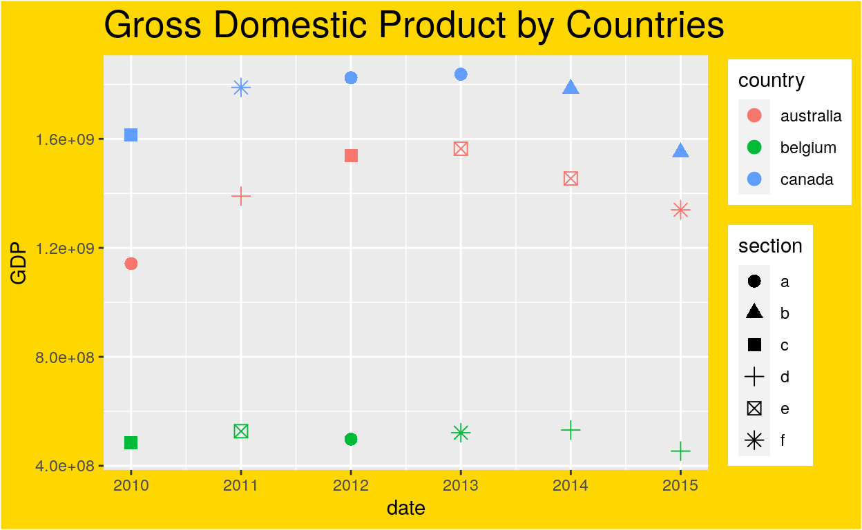
ggplot(dataGraph, aes(date, GDP)) +
  geom_point(aes(colour = country, shape = section), size = 3) +
  labs(title = "Gross Domestic Product by Countries") +
  theme(plot.title = element_text(size = 20),
        plot.background = element_rect(fill = "gold"))
Legend
Position
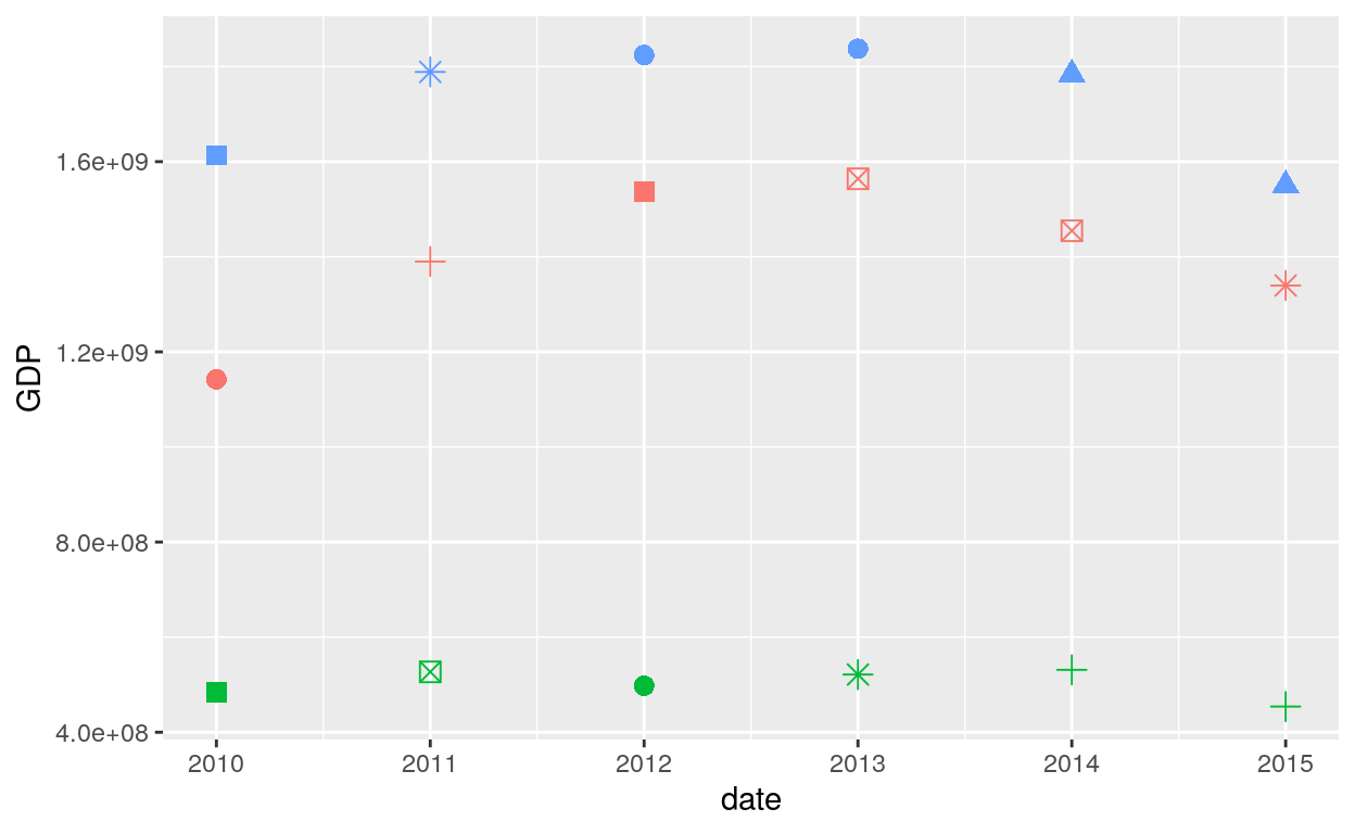
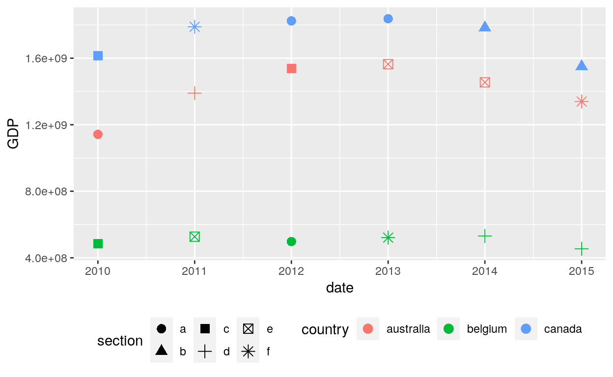
ggplot(dataGraph, aes(date, GDP)) +
  geom_point(aes(colour = country, shape = section), size = 3) +
  theme(legend.position = "none")
ggplot(dataGraph, aes(date, GDP)) +
  geom_point(aes(colour = country, shape = section), size = 3) +
  theme(legend.position = "bottom")
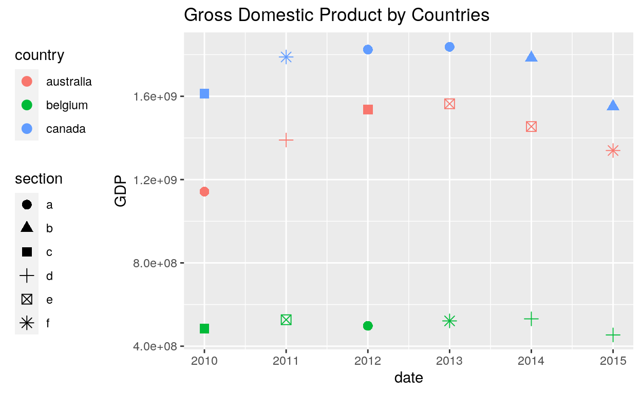
ggplot(dataGraph, aes(date, GDP)) +
  geom_point(aes(colour = country, shape = section), size = 3) +
  labs(title = "Gross Domestic Product by Countries") +
  theme(legend.position = "left")
Justification, Box, Margin
# Or place legends inside the plot using relative coordinates between 0 and 1
# legend.justification sets the corner that the position refers to
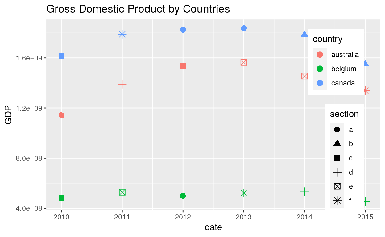
ggplot(dataGraph, aes(date, GDP)) +
geom_point(aes(colour = country, shape = section), size = 3) +
labs(title = "Gross Domestic Product by Countries") +
theme(legend.position = c(.95, .95),
legend.justification = c("right", "top"),
legend.box.just = "right",
legend.margin = margin(6, 6, 6, 6))
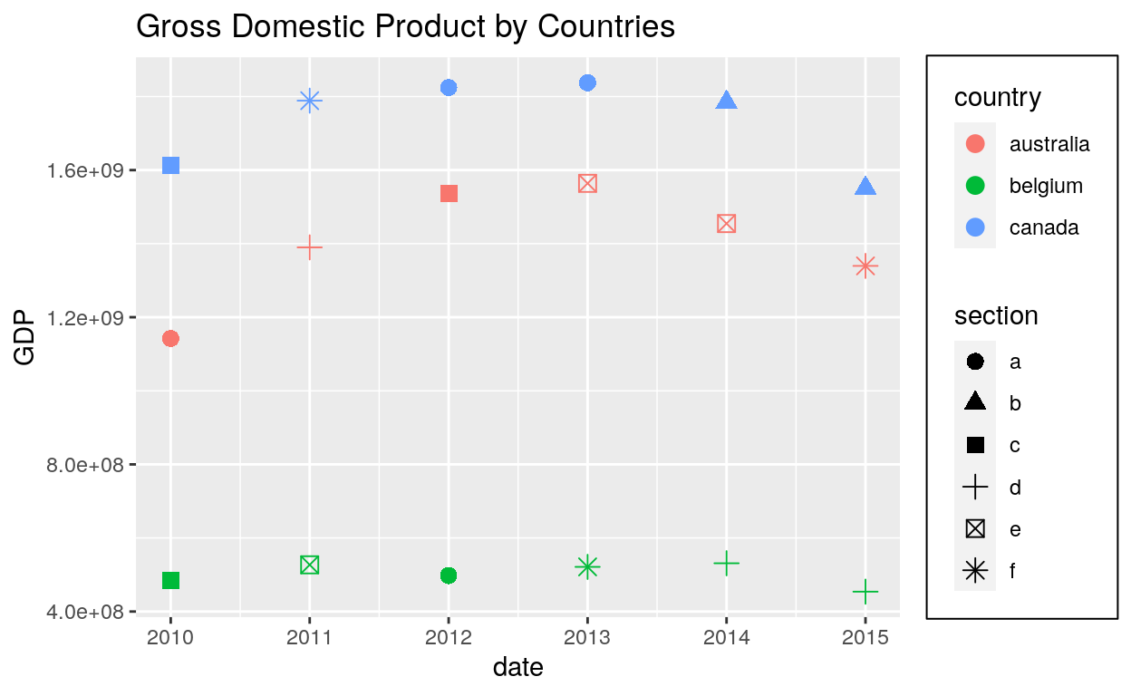
Box background and margin
# The legend.box properties work similarly for the space around all the legends
ggplot(dataGraph, aes(date, GDP)) +
  geom_point(aes(colour = country, shape = section), size = 3) +
  labs(title = "Gross Domestic Product by Countries") +
  theme(legend.box.background = element_rect(),
        legend.box.margin = margin(6, 6, 6, 6))
Key
ggplot(dataGraph, aes(date, GDP)) +
  geom_point(aes(colour = country, shape = section), size = 3) +
  labs(title = "Gross Domestic Product by Countries") +
  theme(legend.key = element_rect(fill = "white", colour = "black"))
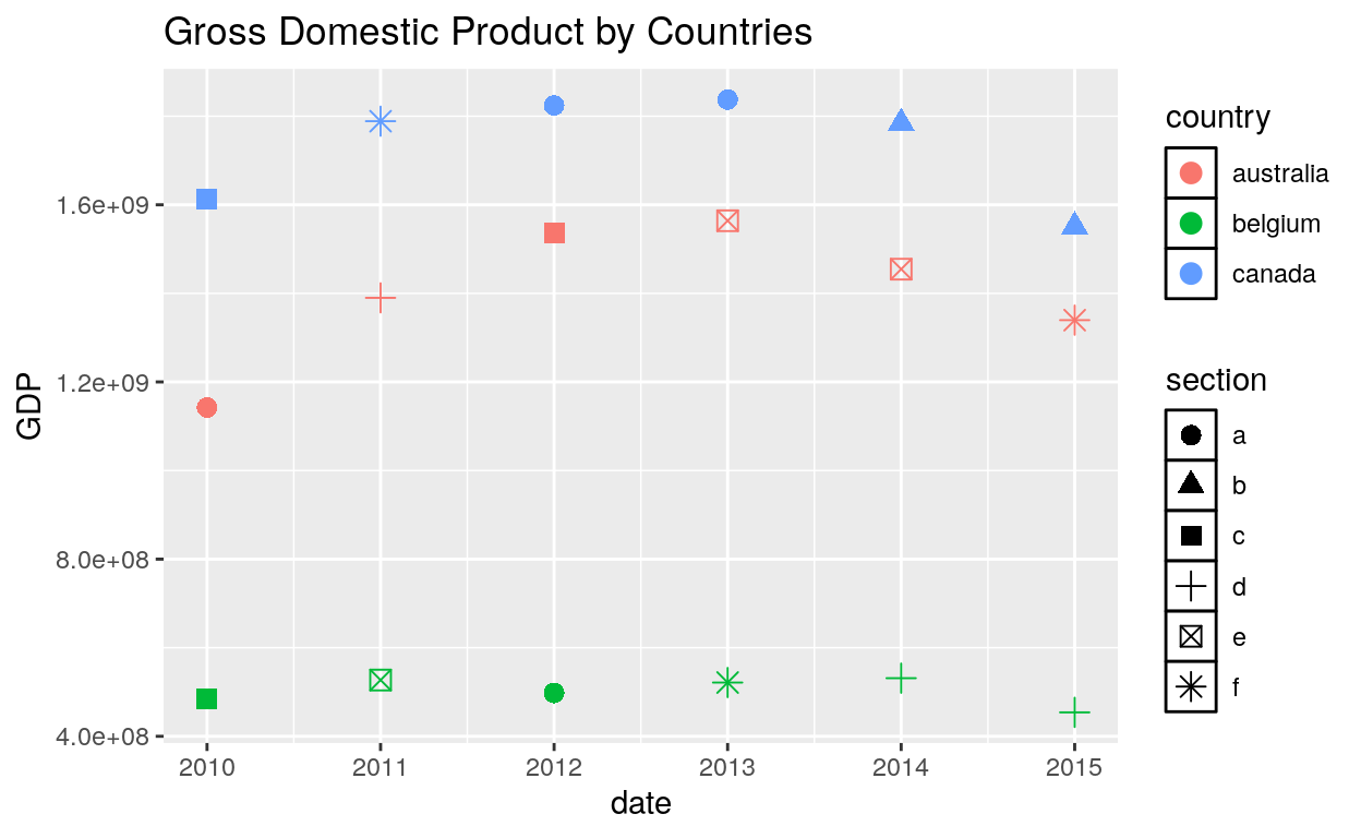
Text and Title
ggplot(dataGraph, aes(date, GDP)) +
  geom_point(aes(colour = country, shape = section), size = 3) +
  labs(title = "Gross Domestic Product by Countries") +
  theme(legend.text = element_text(size = 8, colour = "red"),
        legend.title = element_text(face = "bold"))
Axis
Line
ggplot(dataGraph, aes(date, GDP)) +
  geom_point(aes(colour = country, shape = section), size = 3) +
  labs(title = "Gross Domestic Product by Countries") +
  theme(axis.line = element_line(size = 3, colour = "grey80"))
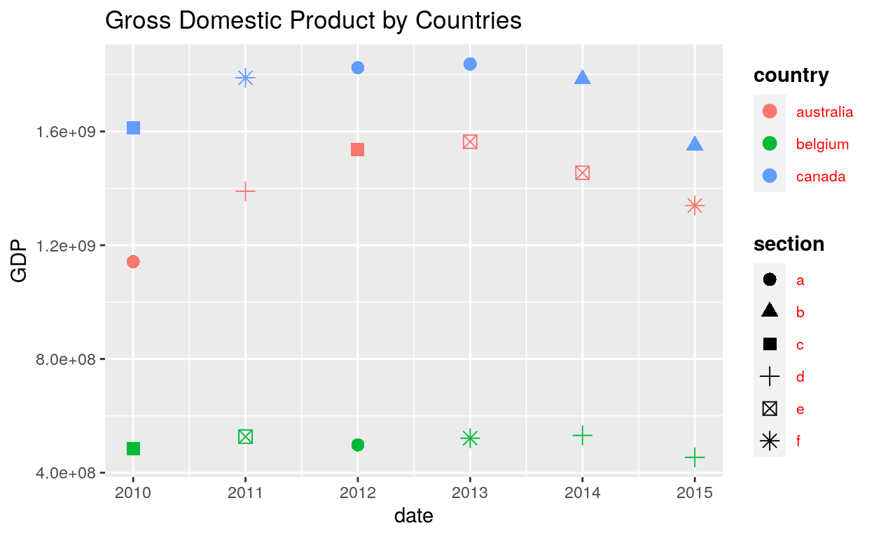
Text
ggplot(dataGraph, aes(date, GDP)) +
  geom_point(aes(colour = country, shape = section), size = 3) +
  labs(title = "Gross Domestic Product by Countries") +
  theme(axis.line = element_line(size = 3, colour = "grey80"),
        axis.text = element_text(colour = "blue"),
        axis.text.x = element_text(margin = margin(t = .8, unit = "cm"), angle = 90))
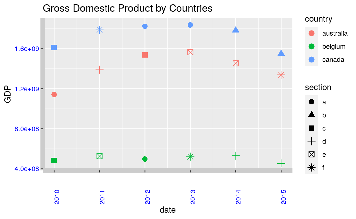
Ticks
ggplot(dataGraph, aes(date, GDP)) +
  geom_point(aes(colour = country, shape = section), size = 3) +
  labs(title = "Gross Domestic Product by Countries") +
  theme(axis.line = element_line(size = 3, colour = "grey80"),
        axis.text = element_text(colour = "blue"),
        axis.text.x = element_text(margin = margin(t = .8, unit = "cm"), angle = 90),
        axis.ticks = element_line(size = 2),
        axis.ticks.length.y = unit(.25, "cm"),
        axis.ticks.length.x = unit(.3, "cm"),
        axis.title.y = element_text(size = 15, angle = 90))
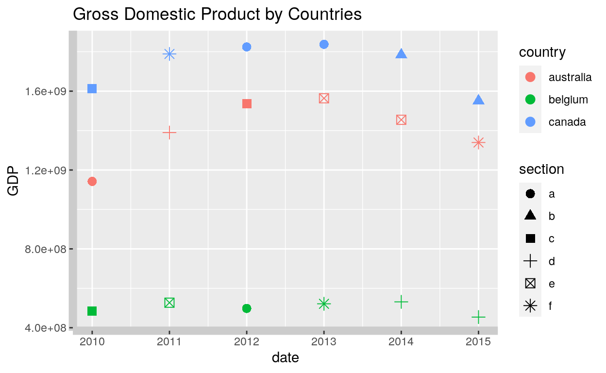
Panel
Background
ggplot(dataGraph, aes(date, GDP)) +
  geom_point(aes(colour = country, shape = section), size = 3) +
  labs(title = "Gross Domestic Product by Countries") +
  theme(plot.title = element_text(size = 20),
        panel.background = element_rect(fill = "lavender", colour = "purple"))
Border
- Default
ggplot(dataGraph, aes(date, GDP)) +
  geom_point(aes(colour = country, shape = section), size = 3) +
  labs(title = "Gross Domestic Product by Countries") +
  theme(plot.title = element_text(size = 20),
        panel.border = element_rect(fill = NA))
- Linetype option
ggplot(dataGraph, aes(date, GDP)) +
  geom_point(aes(colour = country, shape = section), size = 3) +
  labs(title = "Gross Domestic Product by Countries") +
  theme(plot.title = element_text(size = 20),
        panel.border = element_rect(linetype = "dashed", fill = NA))
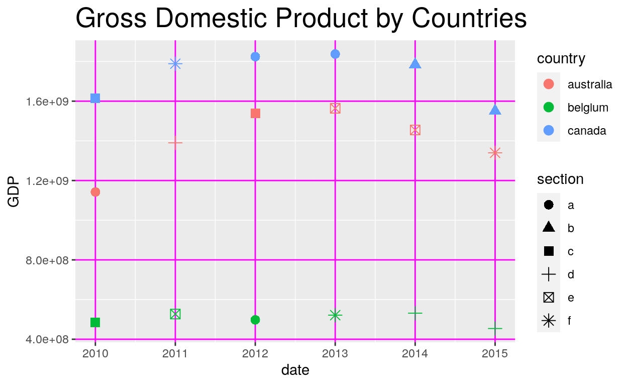
Grid major and minor
ggplot(dataGraph, aes(date, GDP)) +
  geom_point(aes(colour = country, shape = section), size = 3) +
  labs(title = "Gross Domestic Product by Countries") +
  theme(plot.title = element_text(size = 20),
        panel.grid.major = element_line(colour = "magenta"))
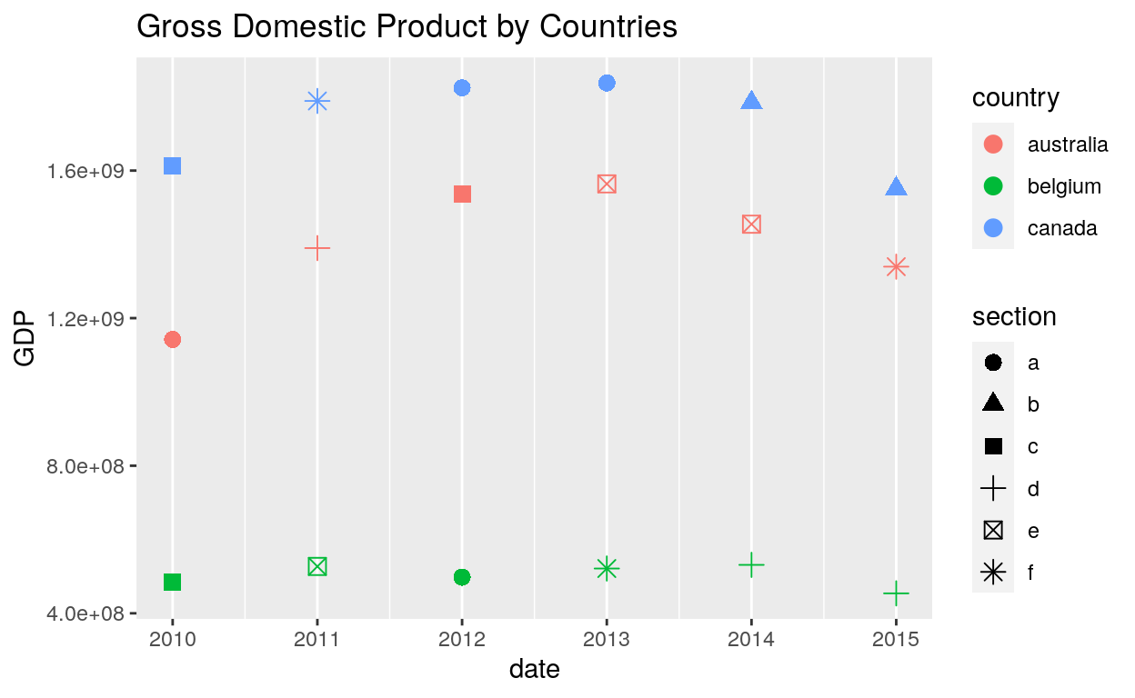
ggplot(dataGraph, aes(date, GDP)) +
  geom_point(aes(colour = country, shape = section), size = 3) +
  labs(title = "Gross Domestic Product by Countries") +
  theme(panel.grid.major.y = element_blank(),
        panel.grid.minor.y = element_blank())
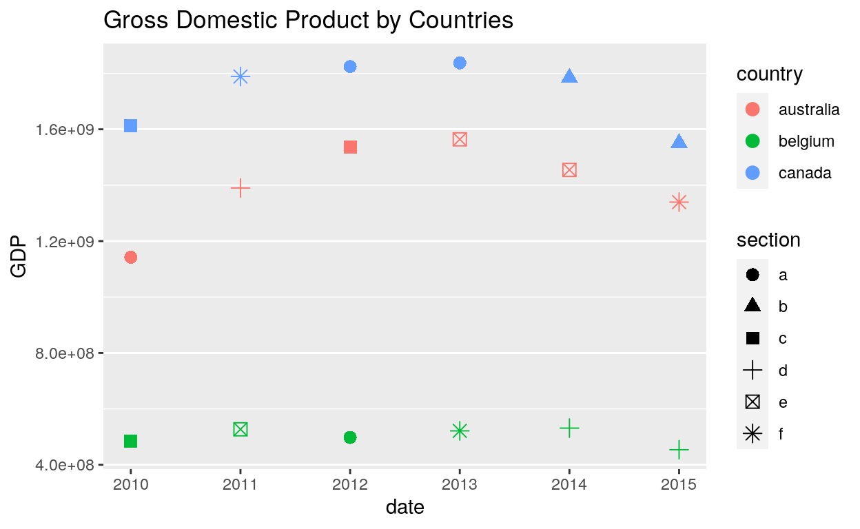
ggplot(dataGraph, aes(date, GDP)) +
  geom_point(aes(colour = country, shape = section), size = 3) +
  labs(title = "Gross Domestic Product by Countries") +
  theme(panel.grid.major.x = element_blank(),
        panel.grid.minor.x = element_blank())
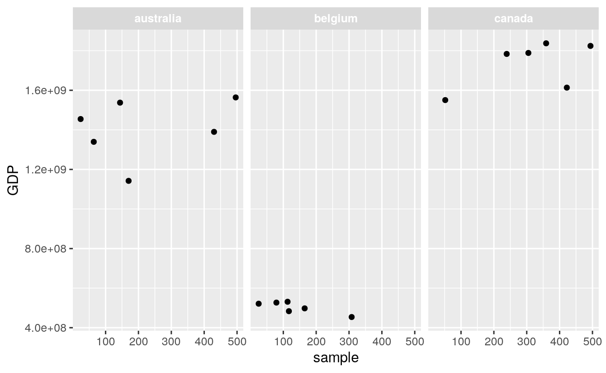
Strip
Background
ggplot(dataGraph, aes(sample, GDP)) +
  geom_point() +
  facet_wrap(~ country) +
  theme(strip.background = element_rect(colour = "black", fill = "white"))
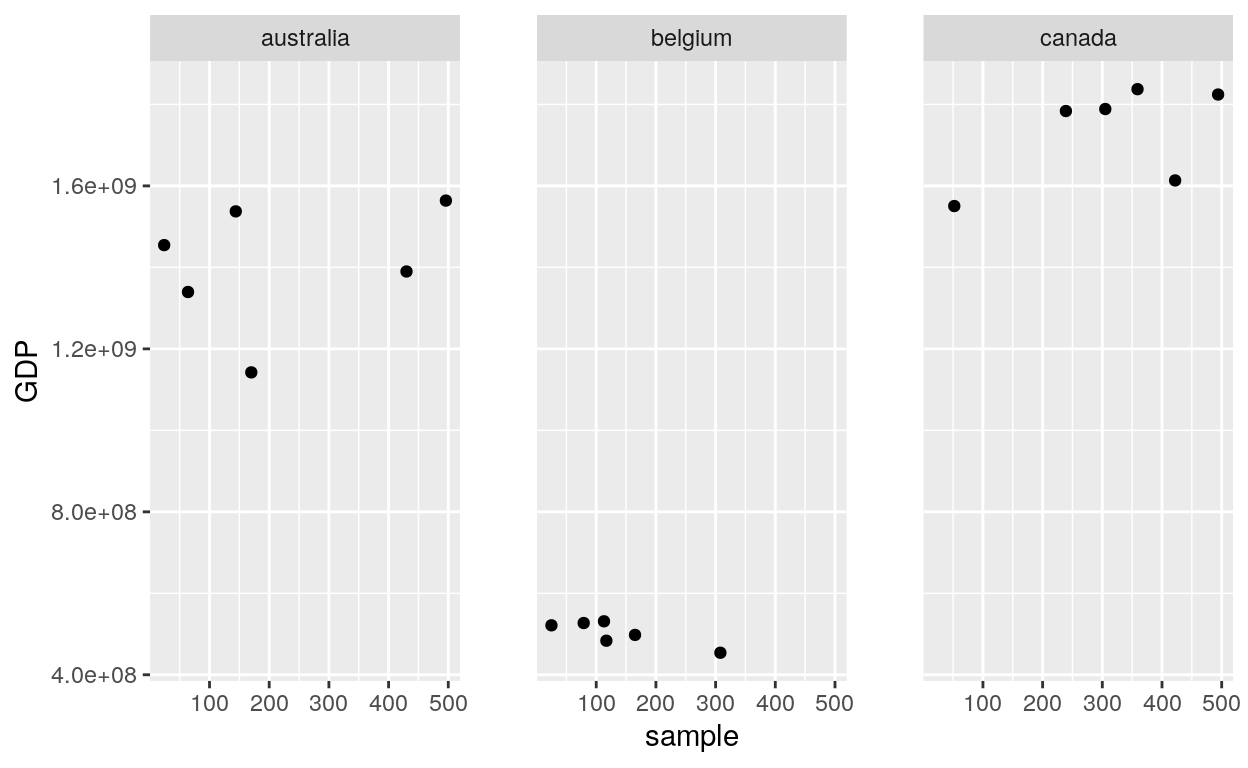
Text
ggplot(dataGraph, aes(sample, GDP)) +
  geom_point() +
  facet_wrap(~ country) +
  theme(strip.text.x = element_text(colour = "white", face = "bold"))
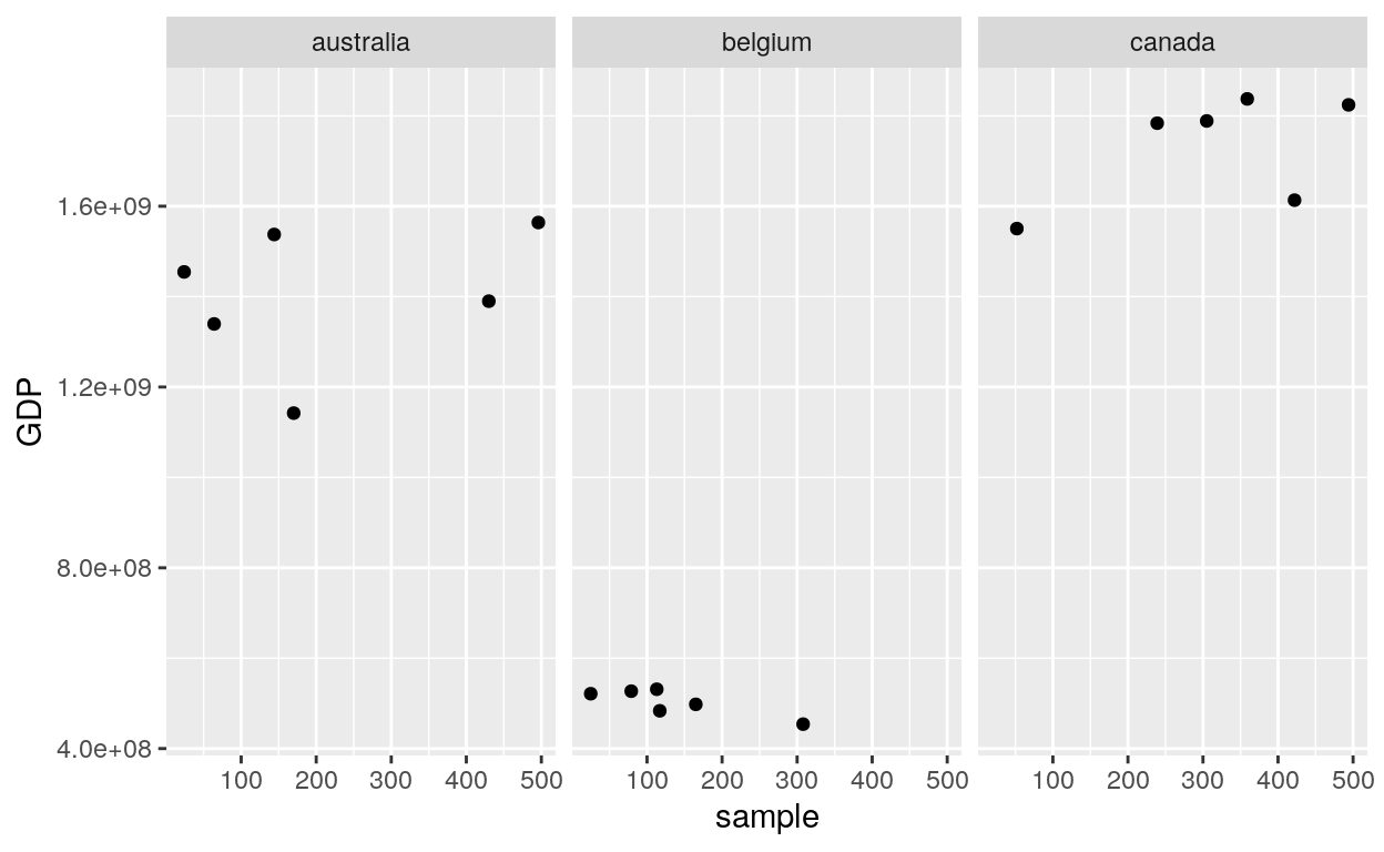
ggplot(dataGraph, aes(sample, GDP)) +
  geom_point() +
  facet_wrap(~ country) +
  theme(panel.spacing = unit(2, "lines"))
Facetting
Facet wrap
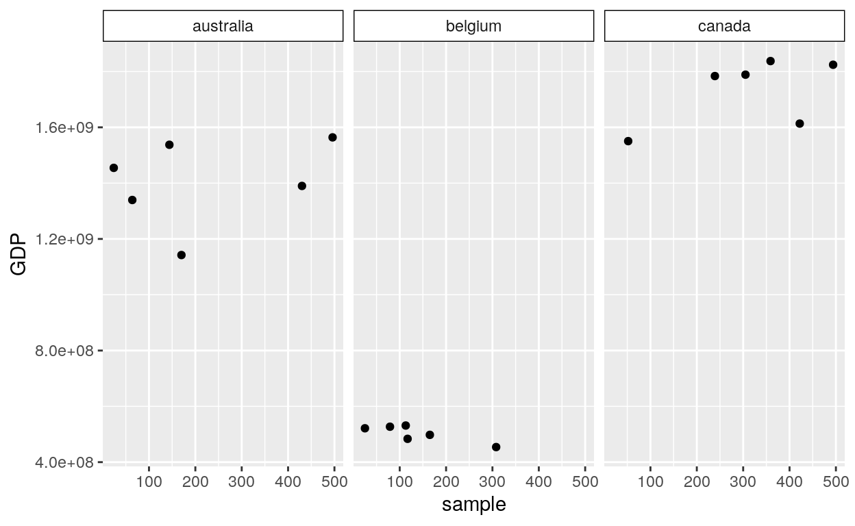
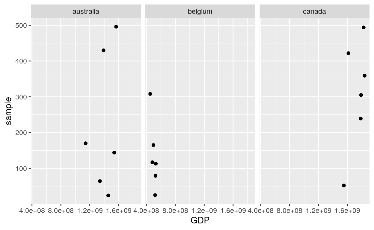
ggplot(dataGraph, aes(sample, GDP)) +
  geom_point() +
  facet_wrap(~ country)
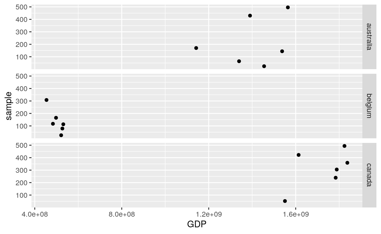
Facet Grid
Rows
ggplot(dataGraph, aes(GDP, sample)) +
  geom_point() +
  facet_grid(rows = vars(country))
Cols
ggplot(dataGraph, aes(GDP, sample)) +
  geom_point() +
  facet_grid(cols = vars(country))
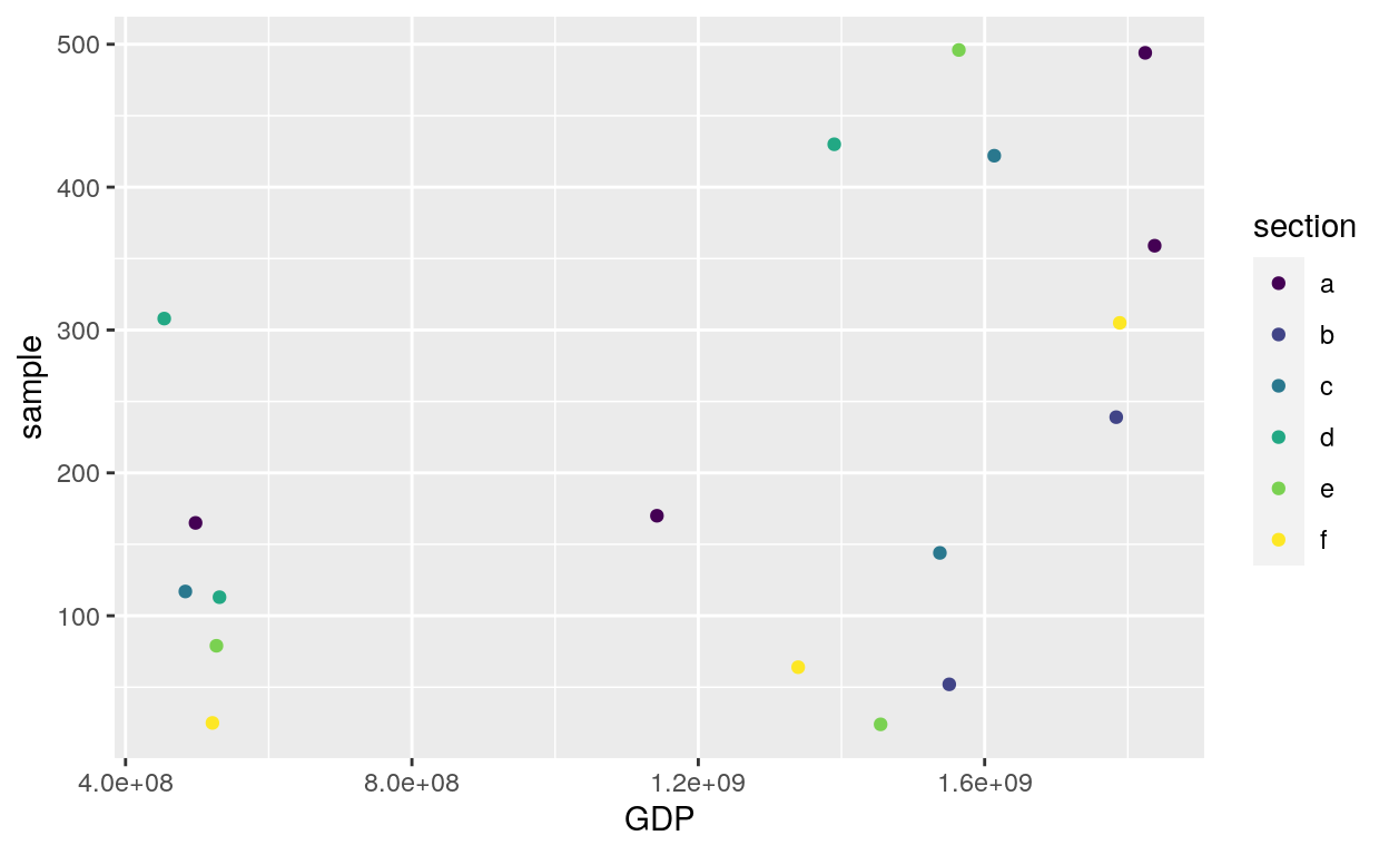
Vars
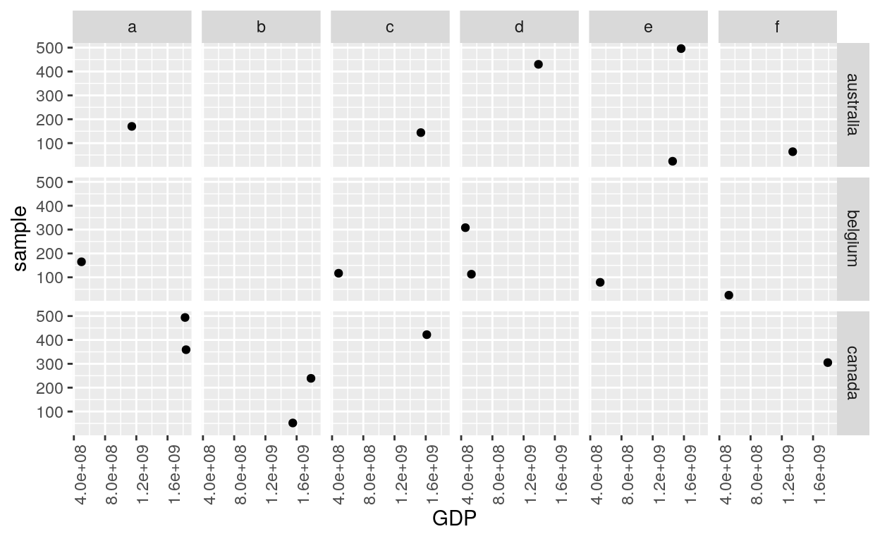
ggplot(dataGraph, aes(GDP, sample)) +
  geom_point() +
  facet_grid(vars(country), vars(section)) +
  theme(axis.text.x = element_text(angle = 90))
# You can also choose whether the scales should be constant across all panels (the default),
# or whether they should be allowed to vary
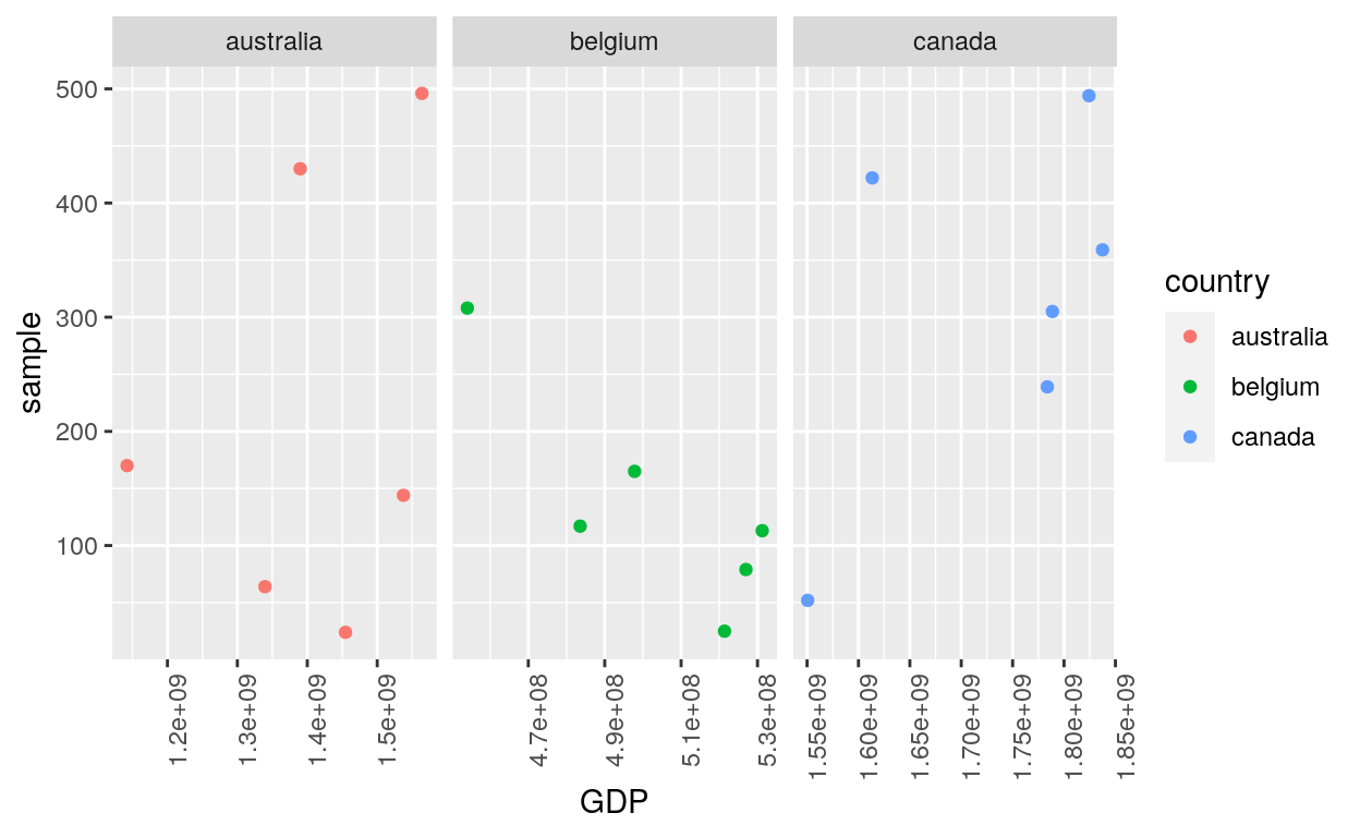
ggplot(dataGraph, aes(GDP, sample, colour = country)) +
geom_point() +
facet_grid(. ~ country, scales = "free") +
theme(axis.text.x = element_text(angle = 90))
Guides
Fill
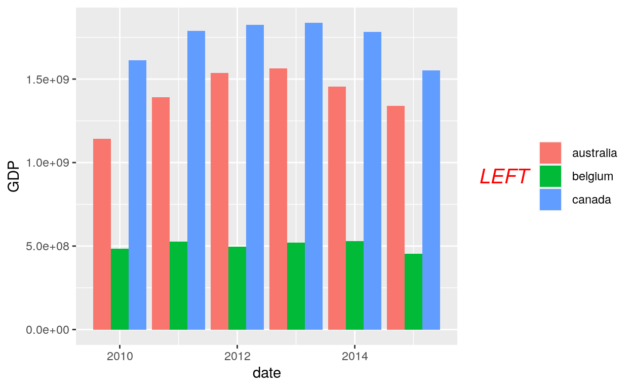
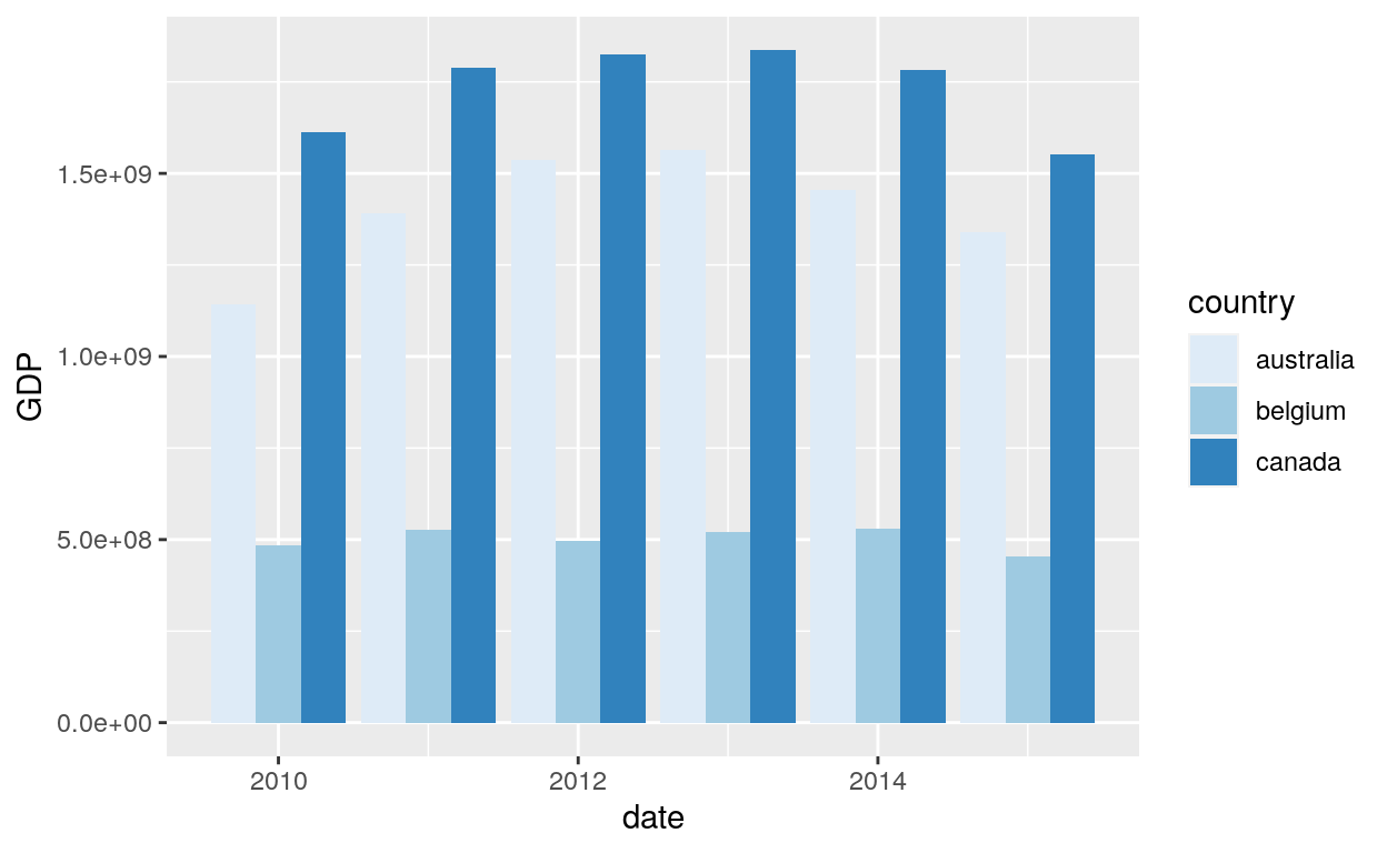
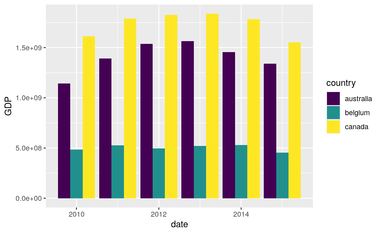
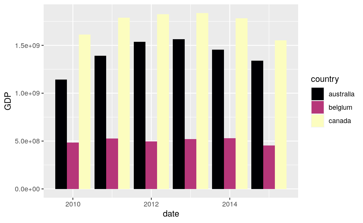
ggplot(dataGraph, aes(date, GDP, fill=country)) +
  geom_bar(stat="identity", position = "dodge") +
  guides(fill = guide_legend(title = "LEFT",
                             title.position = "left",
                             title.theme = element_text(size = 15, face = "italic", colour = "red",angle = 0)))
Colour
ggplot(dataGraph, aes(date, GDP, colour=country)) +
  geom_jitter(alpha = 1/3, width = 0.01, height = 0.01) +
  guides(colour = guide_legend(override.aes = list(alpha = 1)))
Scales
Sequential, diverging and qualitative
The brewer scales provides sequential, diverging and qualitative colour schemes from ColorBrewer. These are particularly well suited to display discrete values on a map. See the colorbrewer2 website for more information.
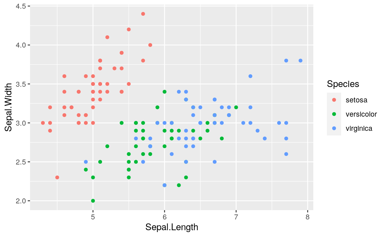
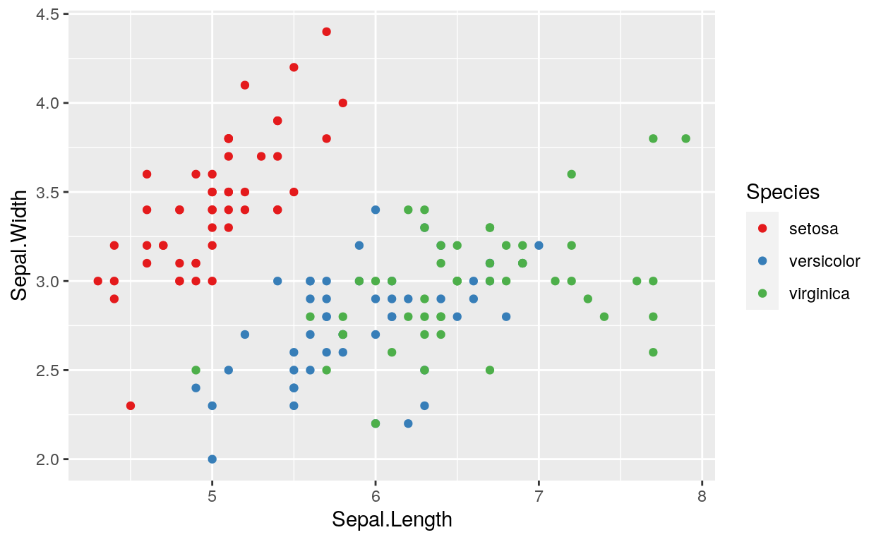
Default
ggplot(iris, aes(Sepal.Length, Sepal.Width)) +
        geom_point(aes(colour = Species))
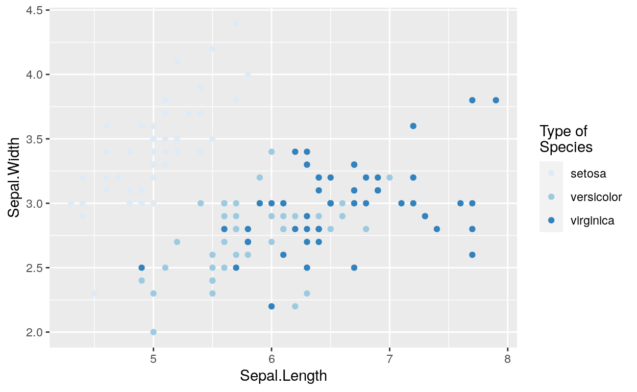
Scale colour brewer
ggplot(iris, aes(Sepal.Length, Sepal.Width)) +
  geom_point(aes(colour = Species)) +
  scale_colour_brewer("Type of\nSpecies")
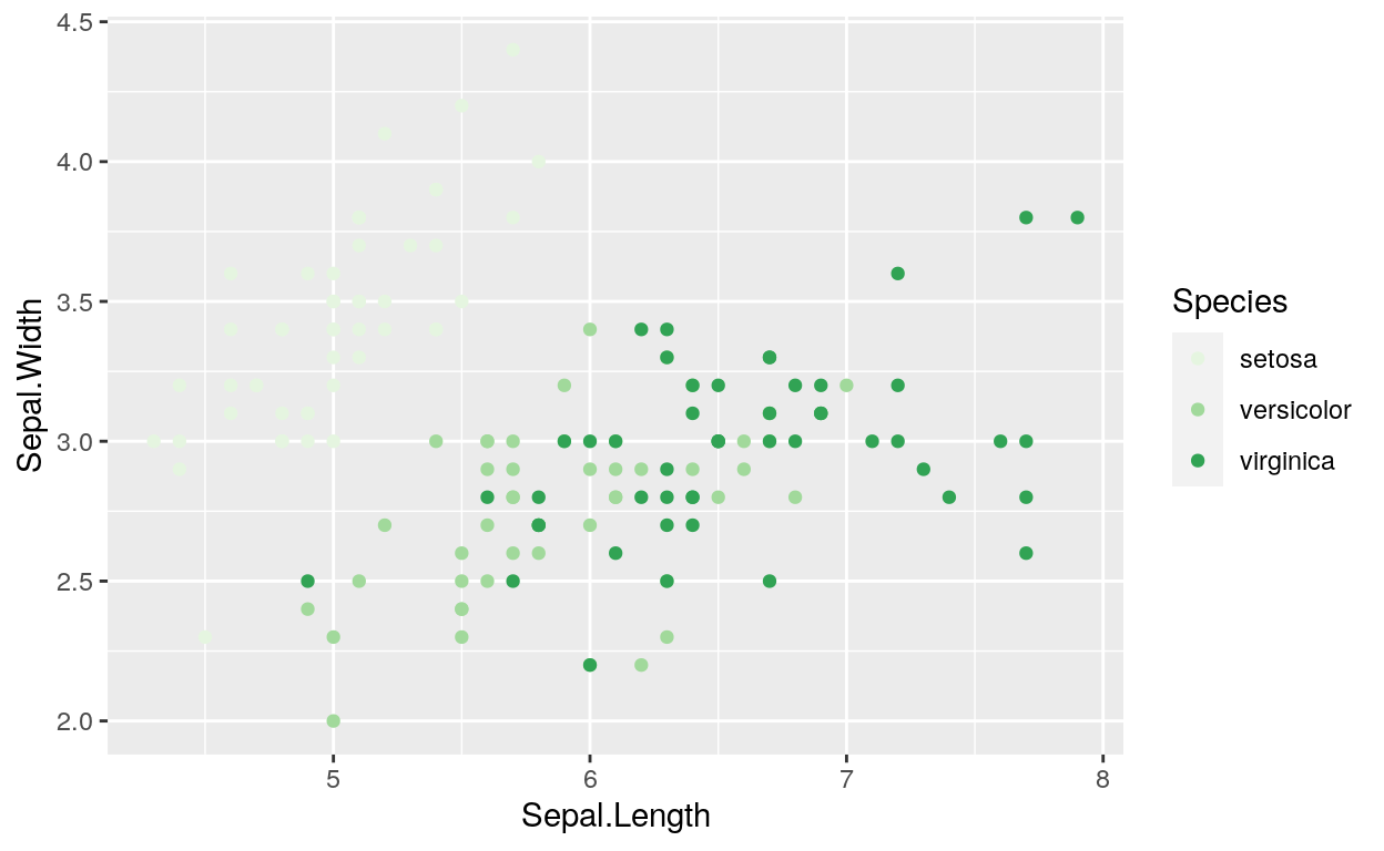
ggplot(iris, aes(Sepal.Length, Sepal.Width)) +
  geom_point(aes(colour = Species)) +
  scale_colour_brewer(palette = "Greens")
ggplot(iris, aes(Sepal.Length, Sepal.Width)) +
  geom_point(aes(colour = Species)) +
  scale_colour_brewer(palette = "Set1")
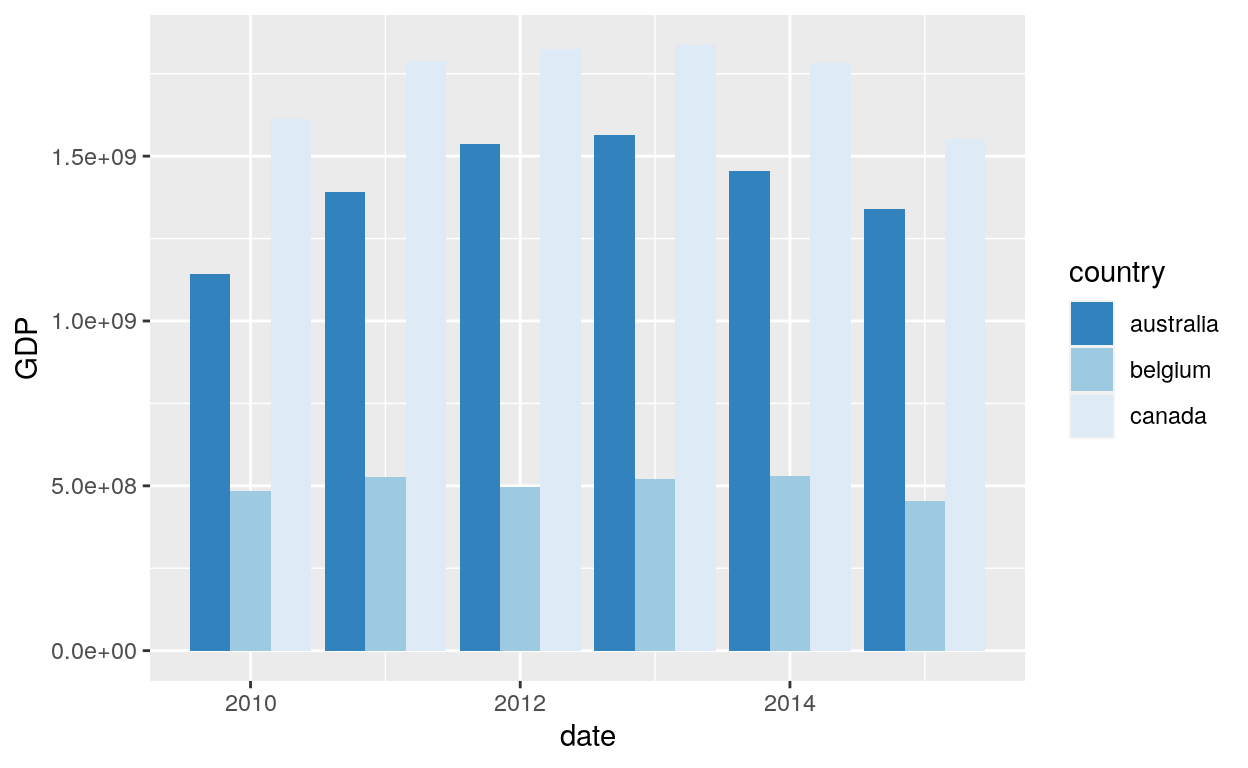
Scale fill brewer
# scale_fill_brewer works just the same as
# scale_colour_brewer but for the fill option
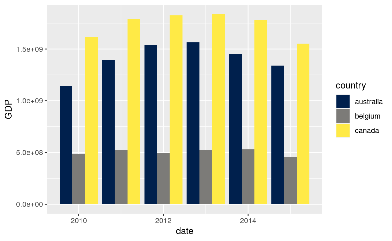
ggplot(dataGraph, aes(date, GDP, fill = country)) +
geom_bar(stat = "identity", position = "dodge") +
scale_fill_brewer()
ggplot(dataGraph, aes(date, GDP, fill = country)) +
  geom_bar(stat = "identity", position = "dodge") +
  scale_fill_brewer(direction = -1)
Viridis colour
The viridis scales provide colour maps that are perceptually uniform in both colour and black-and-white. They are also designed to be perceived by viewers with common forms of colour blindness. See also https://bids.github.io/colormap/.
Ordered factors
ggplot(dataGraph, aes(GDP, sample)) +
  geom_point(aes(colour = section))
Discrete data: Colour
Viridis
# Use viridis_d with discrete data
# Change scale label
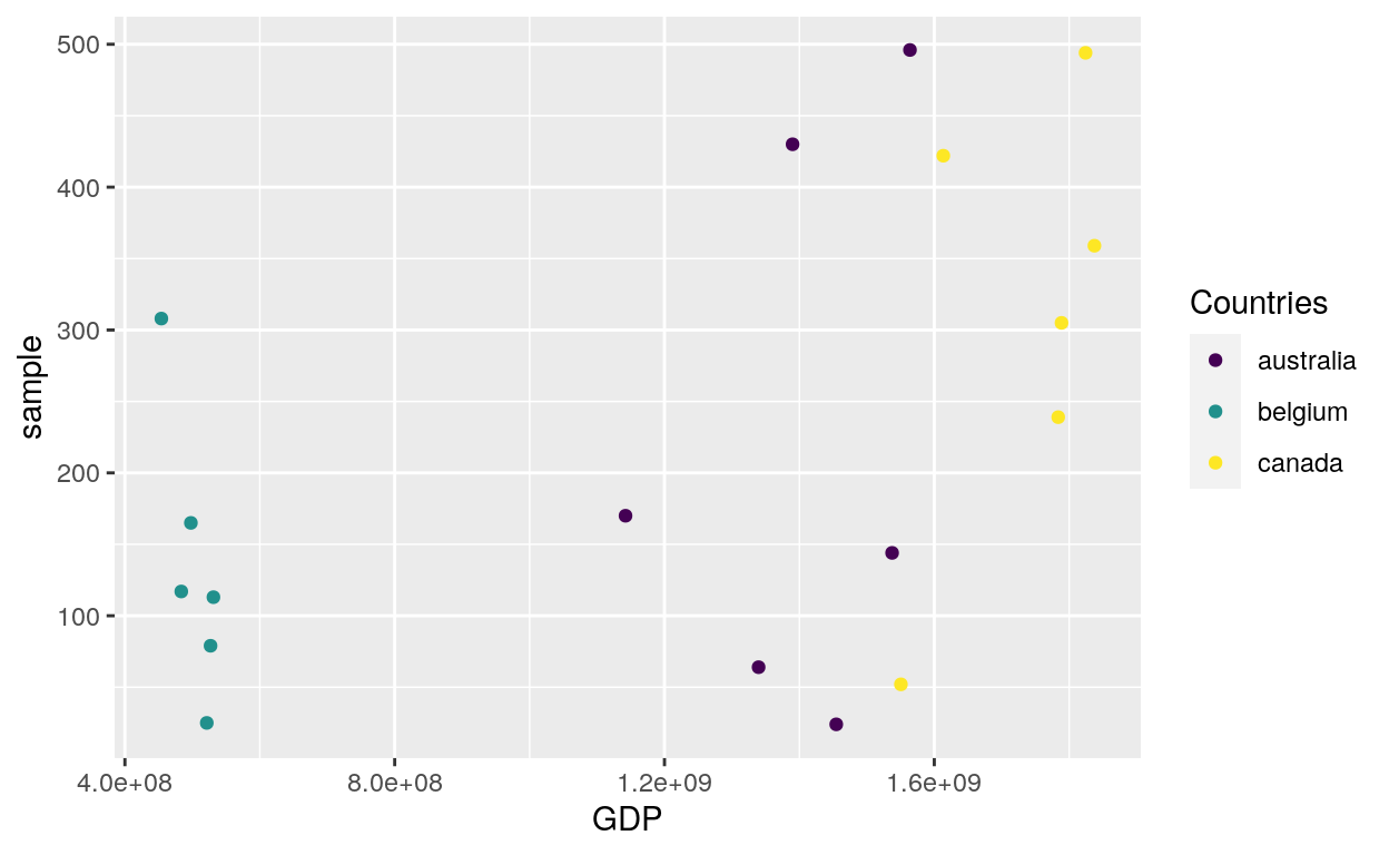
ggplot(dataGraph, aes(GDP, sample)) +
geom_point(aes(colour = country)) +
scale_colour_viridis_d("Countries")
Plasma
# Option plasma
ggplot(dataGraph, aes(GDP, sample)) +
  geom_point(aes(colour = country)) +
  scale_colour_viridis_d(option = "plasma")
Inferno
# Option inferno
ggplot(dataGraph, aes(GDP, sample)) +
  geom_point(aes(colour = country)) +
  scale_colour_viridis_d(option = "inferno")
Discrete data: Fill
Viridis
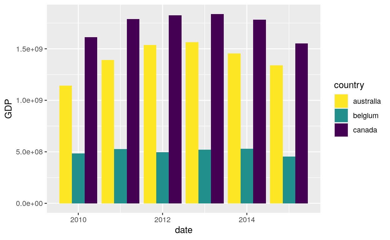
ggplot(dataGraph, aes(date, GDP, fill = country)) +
  geom_bar(stat = "identity", position = "dodge") +
  scale_fill_viridis_d()
Direction
ggplot(dataGraph, aes(date, GDP, fill = country)) +
  geom_bar(stat = "identity", position = "dodge") +
  scale_fill_viridis_d(direction = -1)
Magma
ggplot(dataGraph, aes(date, GDP, fill = country)) +
  geom_bar(stat = "identity", position = "dodge") +
  scale_fill_viridis_d(option = "magma")
Cividis
ggplot(dataGraph, aes(date, GDP, fill = country)) +
  geom_bar(stat = "identity", position = "dodge") +
  scale_fill_viridis_d(option = "cividis")
Line patterns
Default line types based on a set supplied by Richard Pearson, University of Manchester. Continuous values can not be mapped to line types.
Aes linetype
Colored line type
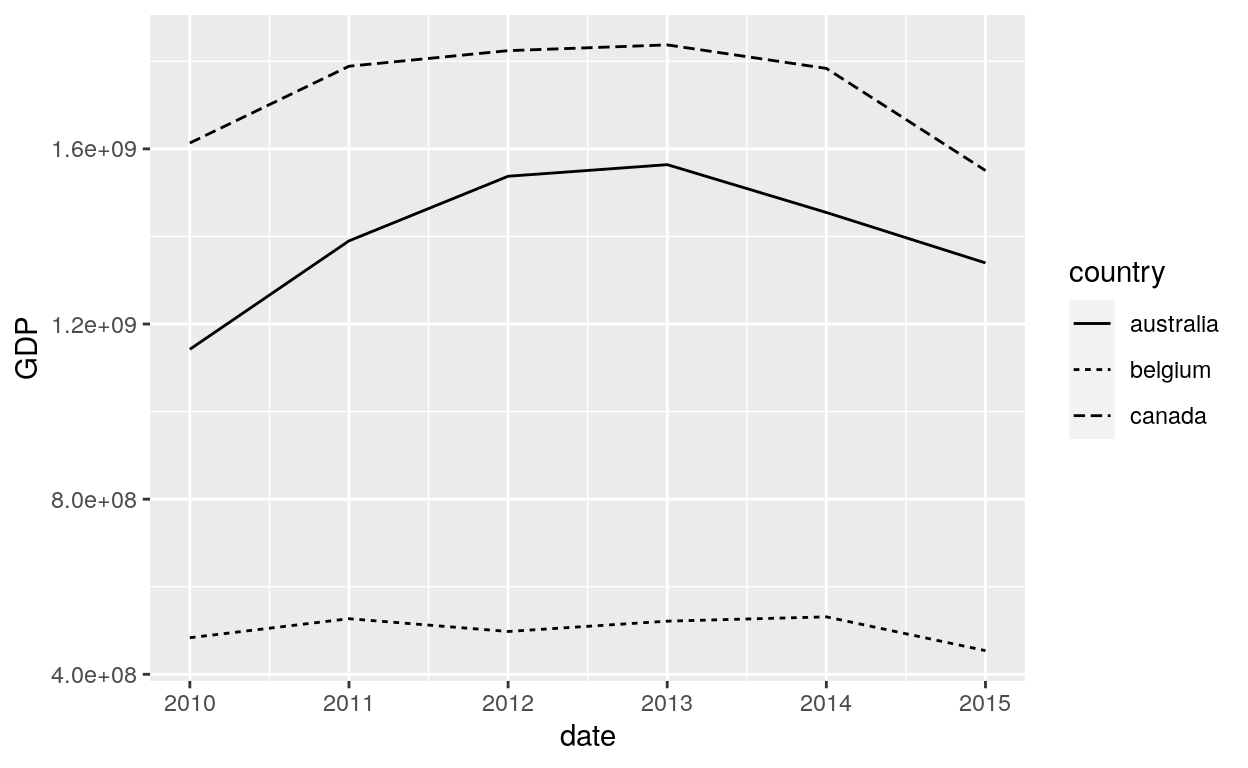
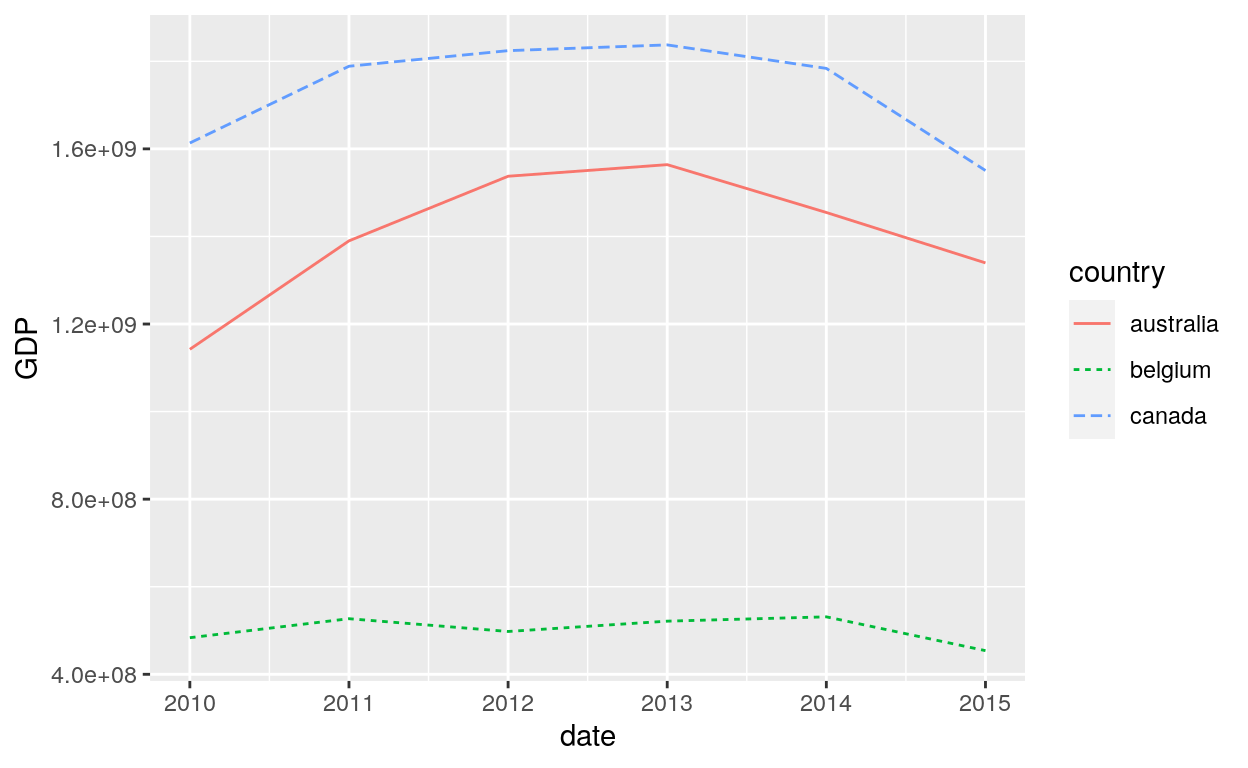
ggplot(dataGraph, aes(date, GDP, colour = country)) +
  geom_line(aes(group = country, linetype = country))
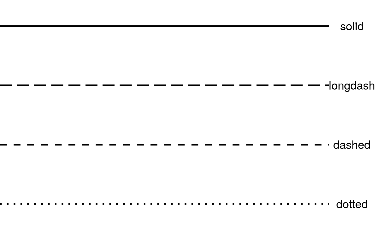
Common line types
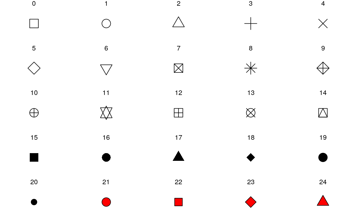
Shapes
scale_shape maps discrete variables to six easily discernible shapes (aka glyphs). If you have more than six levels, you will get a warning message, and the seventh and subsequence levels will not appear on the plot. Use scale_shape_manual() to supply your own values. You can not map a continuous variable to shape.
Shape
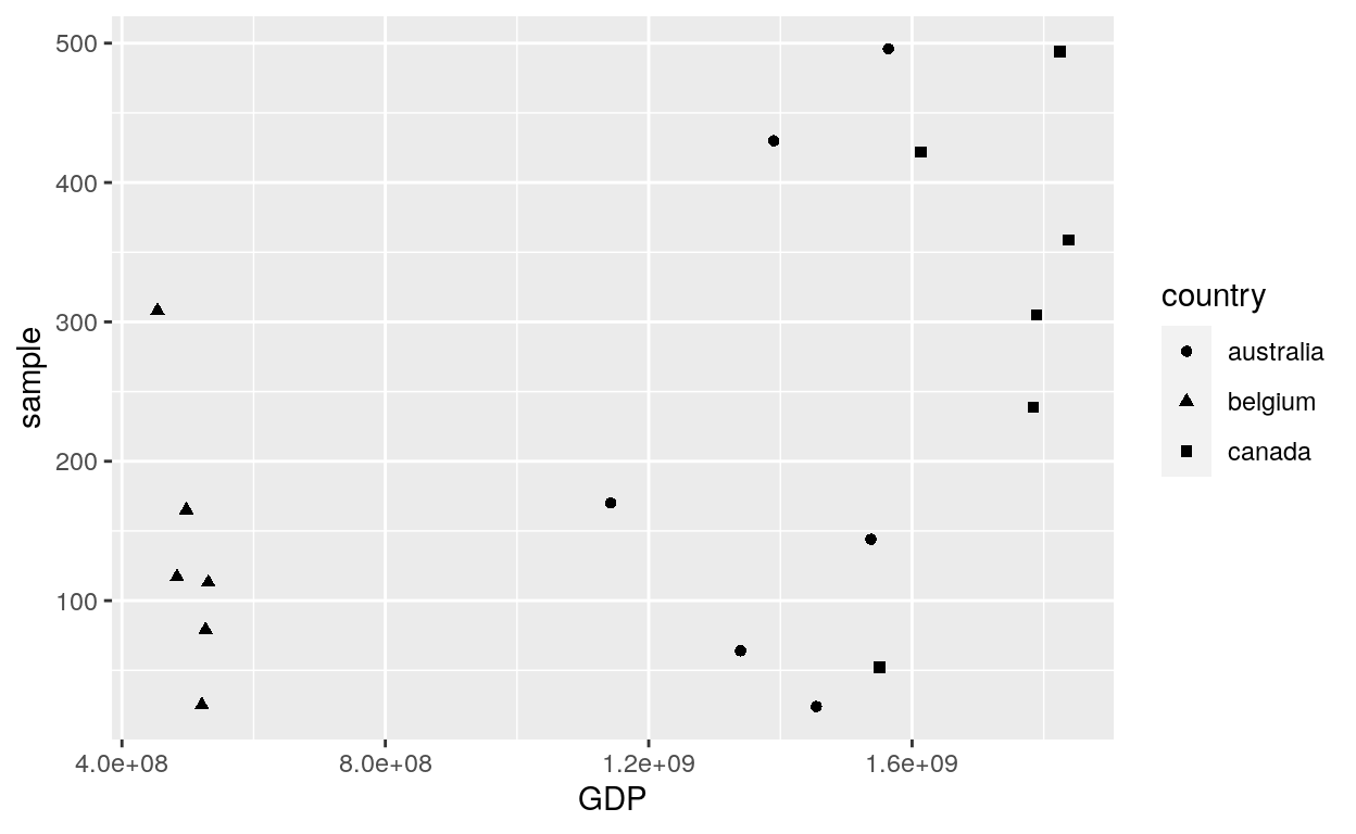
ggplot(dataGraph, aes(GDP, sample)) +
  geom_point(aes(shape = country))
Solid
ggplot(dataGraph, aes(GDP, sample)) +
  geom_point(aes(shape = country)) +
  scale_shape(solid = FALSE)

Legend
# Change the name of the legend
ggplot(dataGraph, aes(GDP, sample)) +
  geom_point(aes(shape = country)) +
  scale_shape(name = "Countries")

Coloured shapes
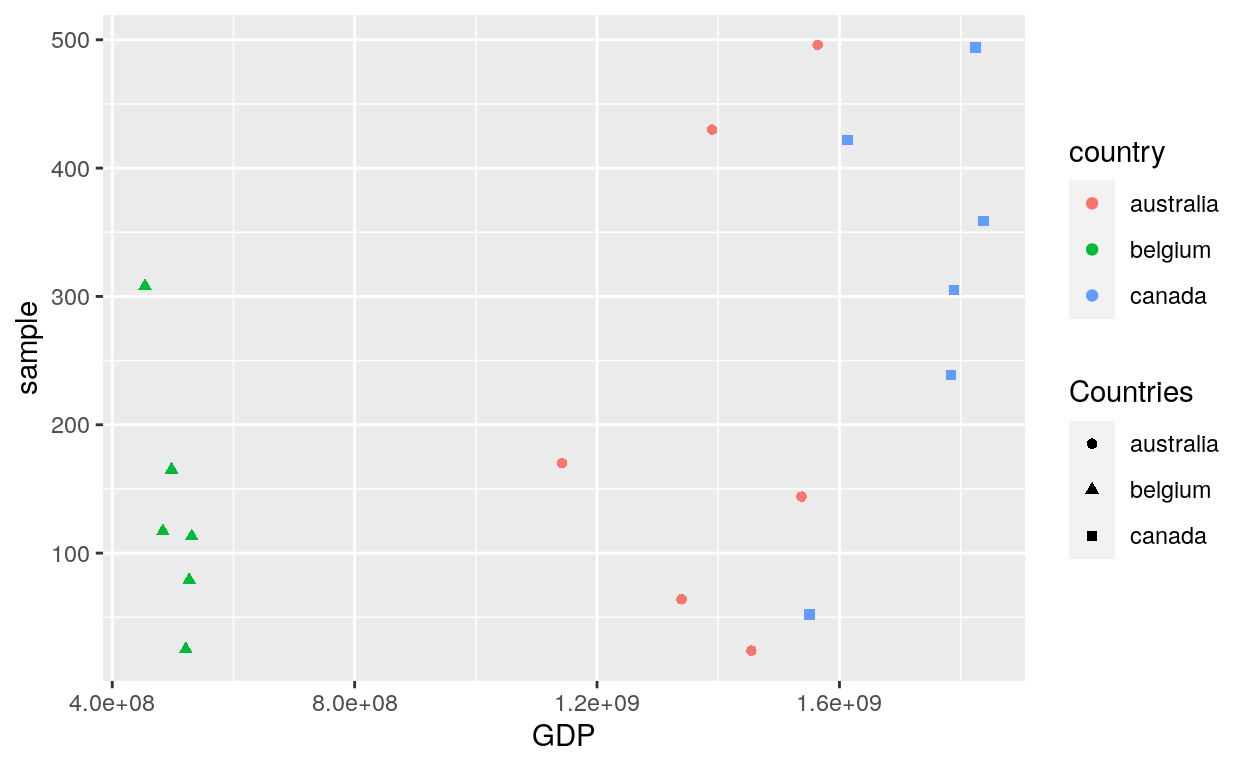
ggplot(dataGraph, aes(GDP, sample)) +
  geom_point(aes(shape = country, colour = country)) +
  scale_shape(name = "Countries")
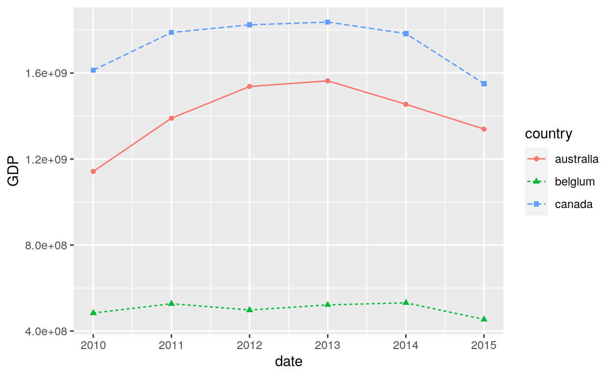
ggplot(dataGraph, aes(date, GDP, colour = country)) +
  geom_line(aes(group = country, linetype = country)) +
  geom_point(aes(colour = country, shape = country))
Size
- Fixed size
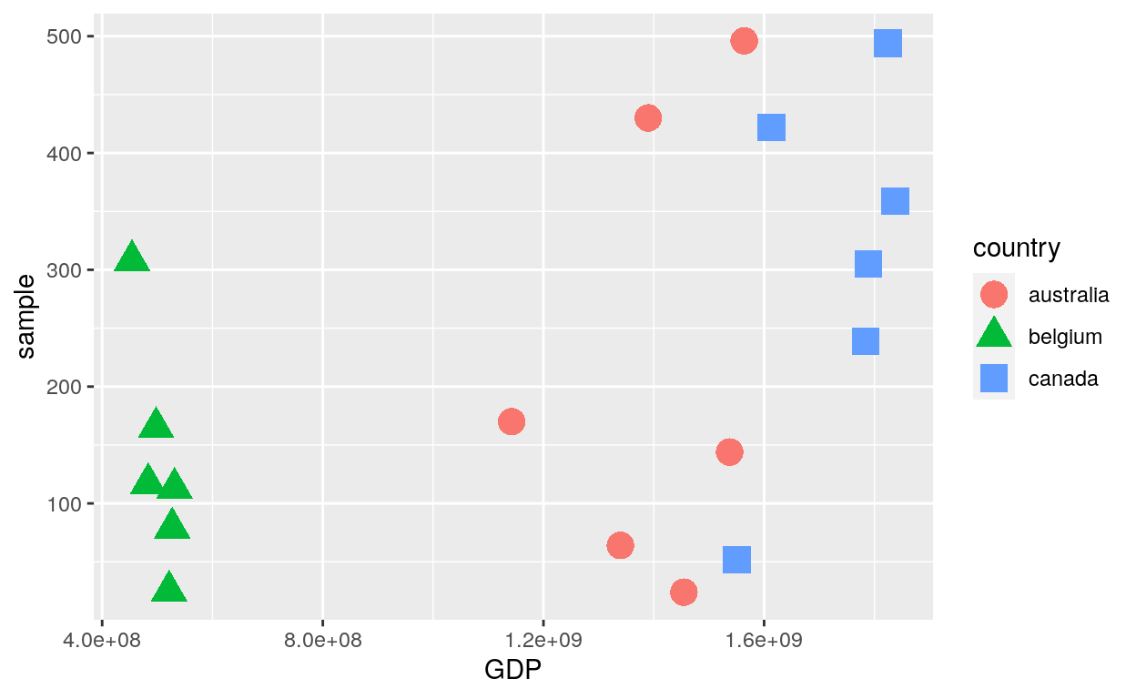
ggplot(dataGraph, aes(GDP, sample)) +
  geom_point(aes(shape = country, colour = country), size = 5)
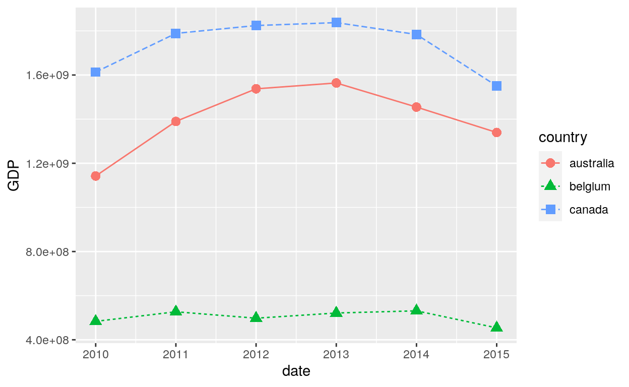
ggplot(dataGraph, aes(date, GDP, colour = country)) +
  geom_line(aes(group = country, linetype = country)) +
  geom_point(aes(colour = country, shape = country), size = 3)
- Aes size
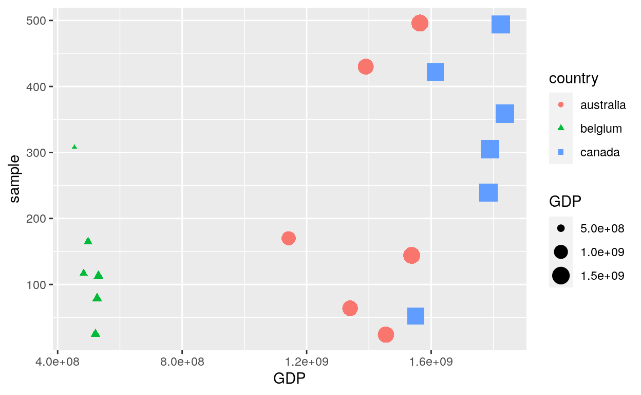
ggplot(dataGraph, aes(GDP, sample)) +
  geom_point(aes(shape = country, colour = country, size = GDP))
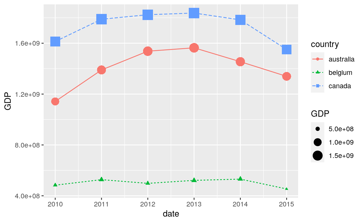
ggplot(dataGraph, aes(date, GDP, colour = country)) +
  geom_line(aes(group = country, linetype = country)) +
  geom_point(aes(colour = country, shape = country, size = GDP))
List of all shapes
df_shapes <- data.frame(shape = 0:24)
ggplot(df_shapes, aes(0, 0, shape = shape)) +
  geom_point(aes(shape = shape), size = 5, fill = 'red') +
  scale_shape_identity() +
  facet_wrap(~shape) +
  theme_void()