Set up
Data
In this course, we will work with data stored in a Gsheet. Use the following code to load them!
library(gsheet)

dataGraph <- gsheet2tbl("https://docs.google.com/spreadsheets/d/1uLaXke-KPN28-ESPPoihk8TiXVWp5xuNGHW7w7yqLCc/edit?usp=sharing")
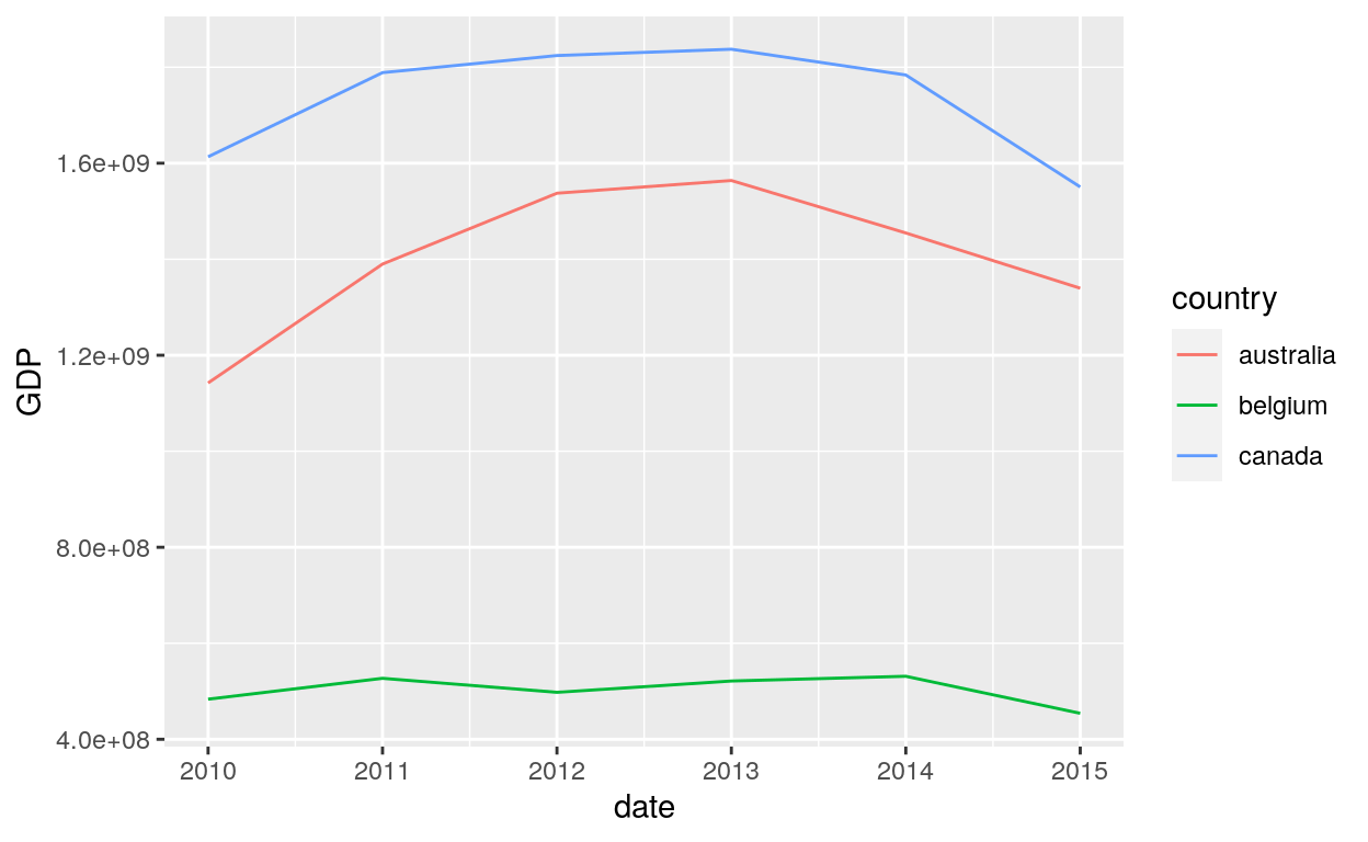
| date | country | GDP | section |
|---|---|---|---|
| 2010 | australia | 1142250506 | a |
| 2011 | australia | 1389919156 | d |
| 2012 | australia | 1537477830 | c |
| 2013 | australia | 1563950959 | e |
| 2014 | australia | 1454675480 | e |
| 2015 | australia | 1339539063 | f |
| 2010 | belgium | 483577483 | c |
| 2011 | belgium | 526975257 | e |
| 2012 | belgium | 497815990 | a |
| 2013 | belgium | 521370528 | f |
| 2014 | belgium | 531234804 | d |
| 2015 | belgium | 454039037 | d |
| 2010 | canada | 1613406135 | c |
| 2011 | canada | 1788703386 | f |
| 2012 | canada | 1824288757 | a |
| 2013 | canada | 1837443487 | a |
| 2014 | canada | 1783775591 | b |
| 2015 | canada | 1550536520 | b |
Package
For the examples to work, we need to load the ggplot2 package.
Ggplot
Create a new ggplot
ggplot() initializes a ggplot object. It can be used to declare the input data frame for a graphic and to specify the set of plot aesthetics intended to be common throughout all subsequent layers unless specifically overridden.
ggplot() alone do not work but is necessary to start a new plot. We need to add functions to produce, bar charts, line charts, etc.
The sections above will teach you how to add these functions.
Bar Chart
There are two functions to create bar charts: geom_bar() and geom_col().
Geom_bar
geom_bar() makes the height of the bar proportional to the number of cases in each group (or if the weight aesthetic is supplied, the sum of the weights). If you want the heights of the bars to represent values in the data, use geom_col() instead. geom_bar() uses stat_count() by default: it counts the number of cases at each x position.
geom_bar(mapping = NULL, data = NULL, stat = "count", position = "stack", ..., width = NULL,
         binwidth = NULL, na.rm = FALSE, show.legend = NA, inherit.aes = TRUE)
Counts
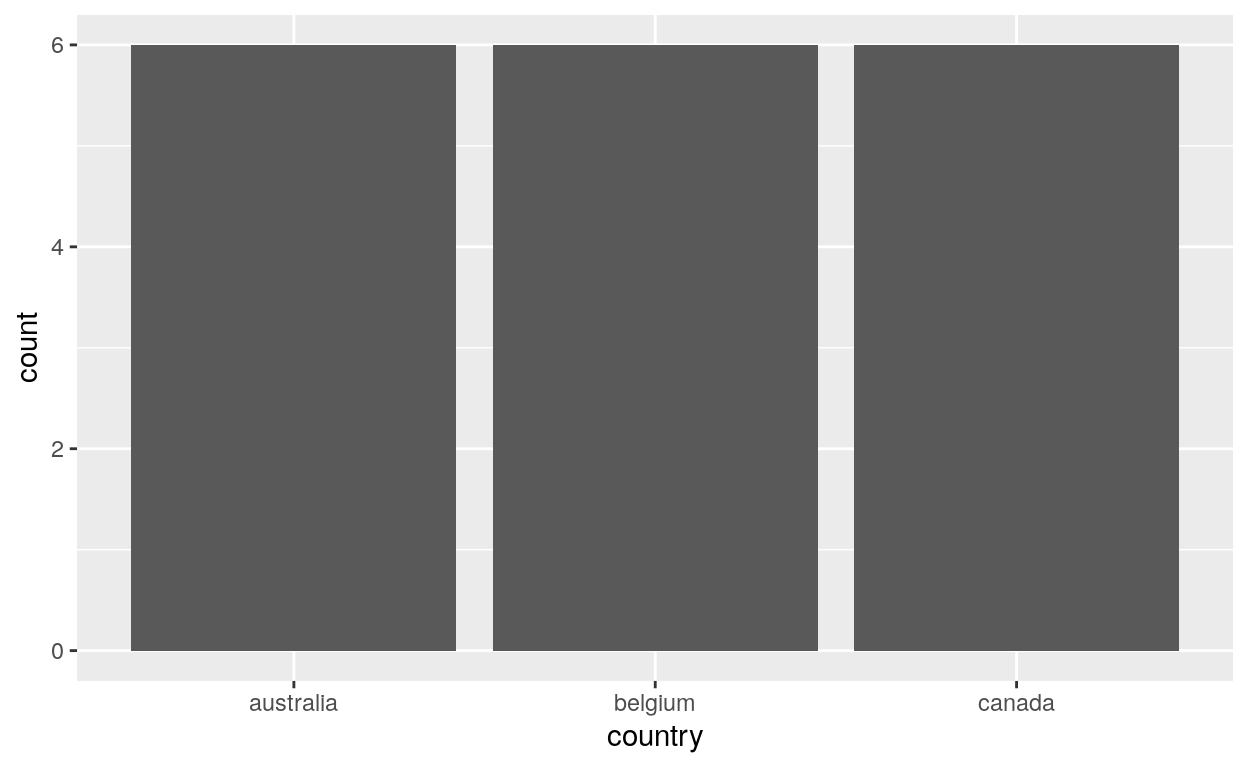
Create bar charts that show counts (or sums of weights):
# Number of times each country is represented in the data frame
# It represents also the number of year for each country
ggplot(dataGraph, aes(country)) +
  geom_bar()
Stat identity
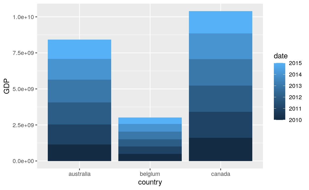
Create bar charts that put columns for the x and y axis using the option stat identity:

It’s the option stat = “identity” that allow the function geom_bar to produce the y axis with the GDP as the value. Without this option, you will receive an error!
Fill
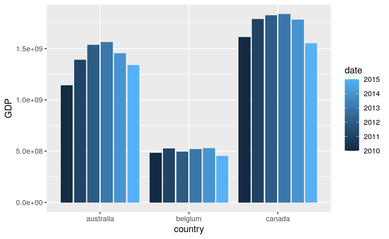
Create bar charts with the fill option:
# Bar charts are automatically stacked when multiple bars are placed at the same location.
# The order of the fill in the graph is designed to match the legend
# We see here that each color correspond to each year
ggplot(dataGraph, aes(x=country, y=GDP, fill = date)) +
  geom_bar(stat = "identity")
Dodge2
Create bar charts with the dodge2 option:
# Adding:
# position = "dodge2": To put each year as separeted column
ggplot(dataGraph, aes(x=country, y=GDP, fill = date)) +
  geom_bar(stat = "identity", position = "dodge2")
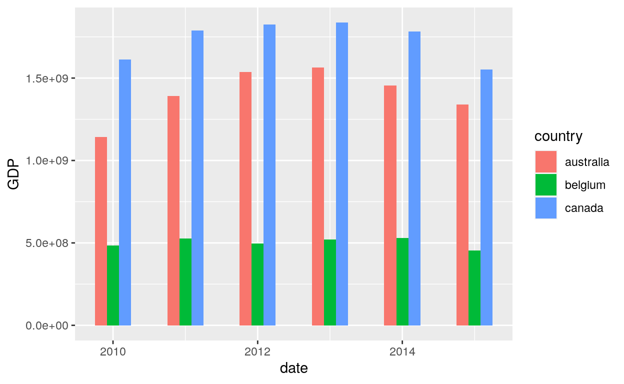
Dodge and Width
Create bar charts with a width option:
# date as the x axis
# GDP as the y axis
# country as fill
# position = dodge
# the width of the bars as 0.5
ggplot(data = dataGraph, aes(x = date, y = GDP, fill = country)) +
  geom_bar(stat = "identity", width = 0.5, position = "dodge")
Geom_col
geom_col() uses the option stat_identity by default to leave the data as is.
geom_col(mapping = NULL, data = NULL, position = "stack", ..., width = NULL,
         na.rm = FALSE, show.legend = NA, inherit.aes = TRUE)
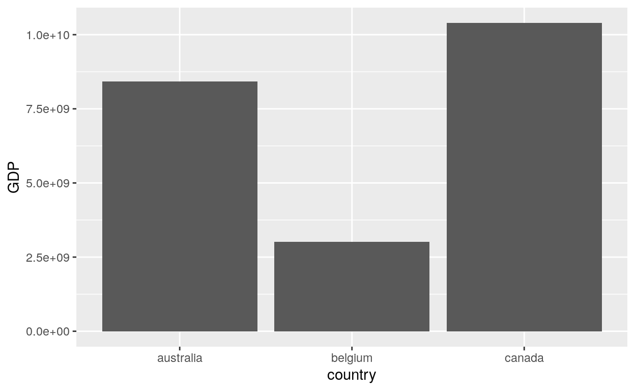
Bars
# Using geom_col with:
# Country as x axis
# GDP as y axis
ggplot(data = dataGraph, aes(x = country, y = GDP)) +
  geom_col()
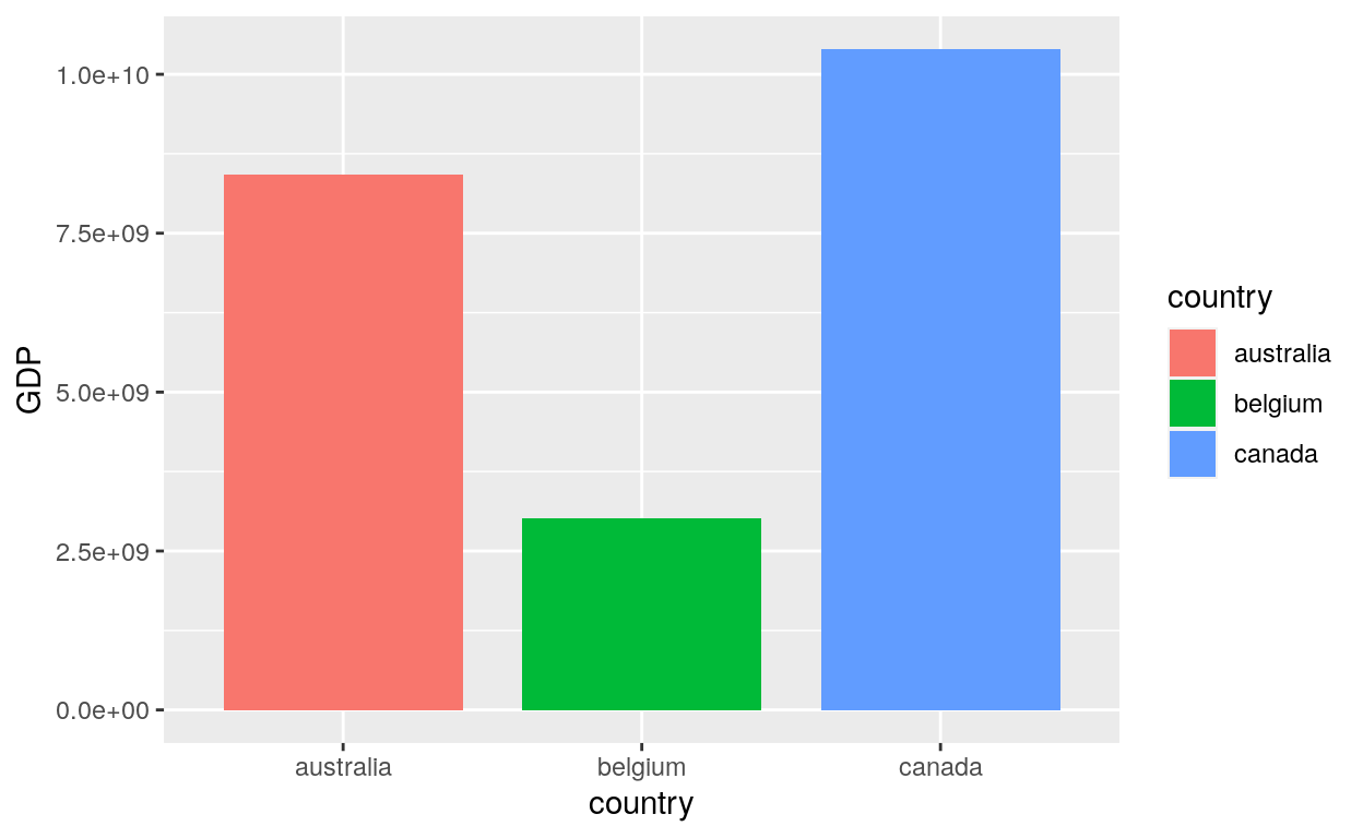
Width
# Adding:
# the fill option:  meaning that each bar (each country) has a different colour
# the width option: change the bar size
ggplot(data = dataGraph, aes(x = country, y = GDP, fill = country)) +
  geom_col(width = 0.8)
Line Chart
Geom_line
geom_line() connects them in order of the variable on the x axis.
geom_line(mapping = NULL, data = NULL, stat = "identity",
  position = "identity", na.rm = FALSE, show.legend = NA,
  inherit.aes = TRUE, ...)
Multiple Lines
geom_line() is suitable for time series:
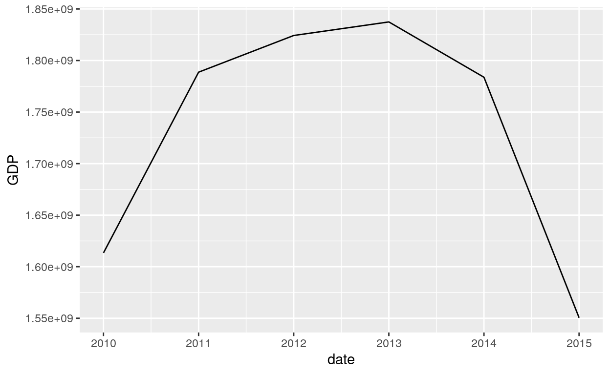
Unique line
If you wish to show the data for the Canada only:
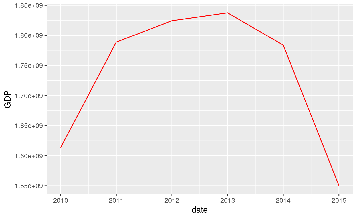
Aes Colour
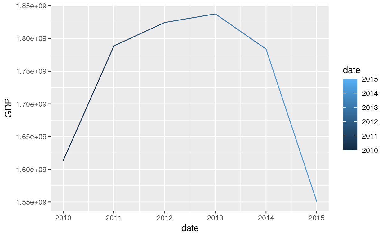
Colour
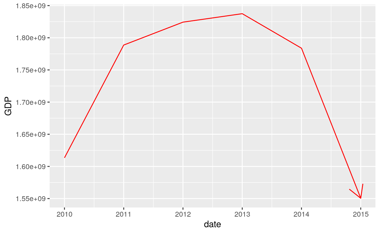
# Changing the colour parameter to red
ggplot(dataGraphCanada, aes(date, GDP)) +
  geom_line(colour = "red")
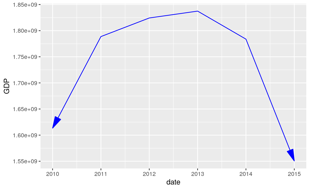
Arrow
# Use the arrow parameter to add an arrow to the line
ggplot(dataGraphCanada, aes(date, GDP)) +
  geom_line(colour = "red", arrow = arrow())
ggplot(dataGraphCanada, aes(date, GDP)) +
  geom_line(colour = "blue", arrow = arrow(angle = 15, ends = "both", type = "closed"))
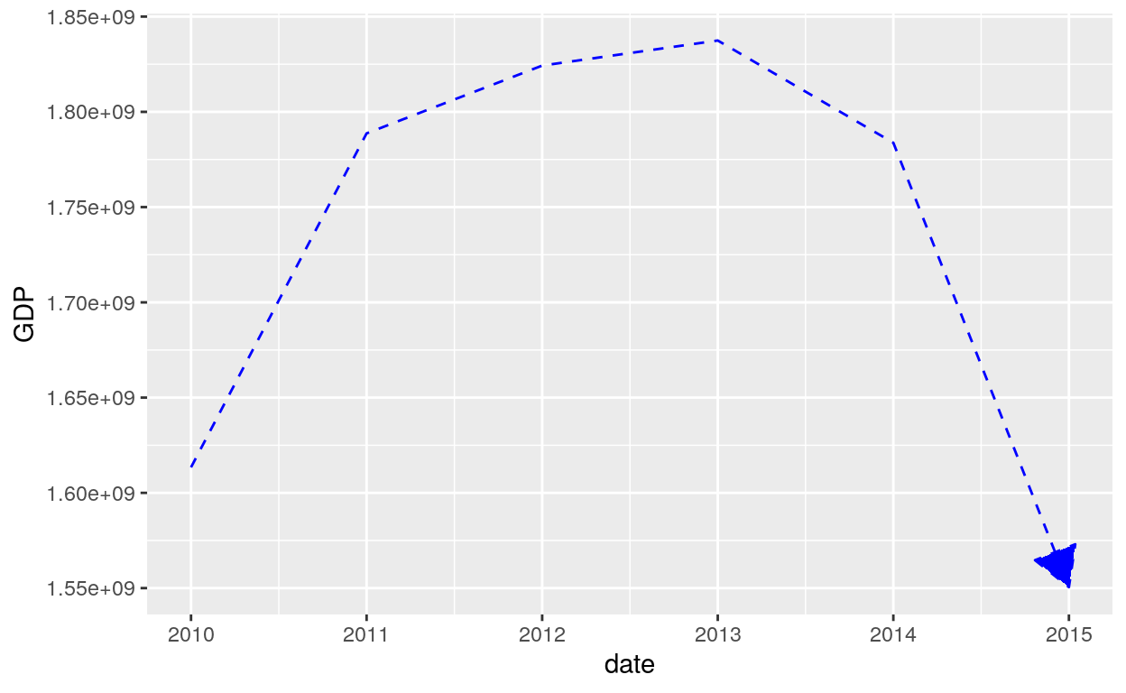
Linetype
# Setting line type
ggplot(dataGraphCanada, aes(date, GDP)) +
  geom_line(colour = "blue", linetype = 2, arrow = arrow(angle = 30, type = "closed"))
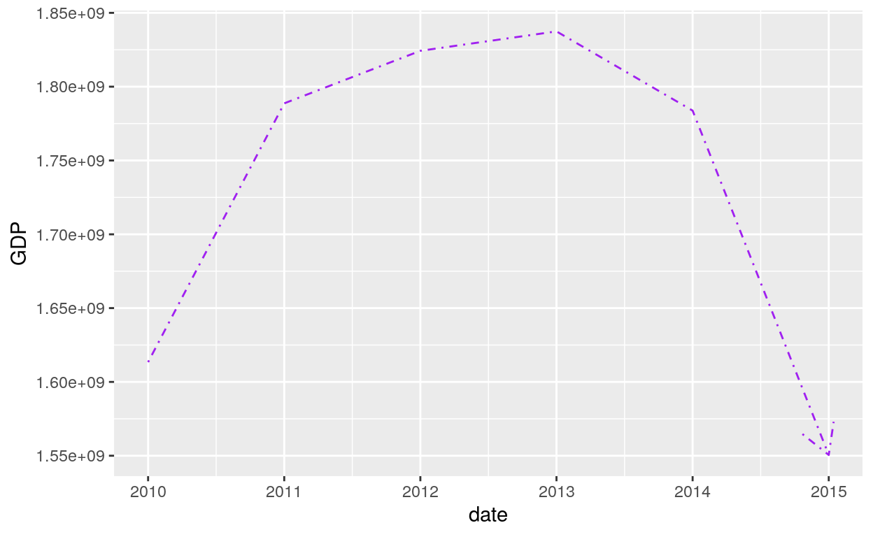
# Setting line type
ggplot(dataGraphCanada, aes(date, GDP)) +
  geom_line(colour = "purple", linetype = 4, arrow = arrow())
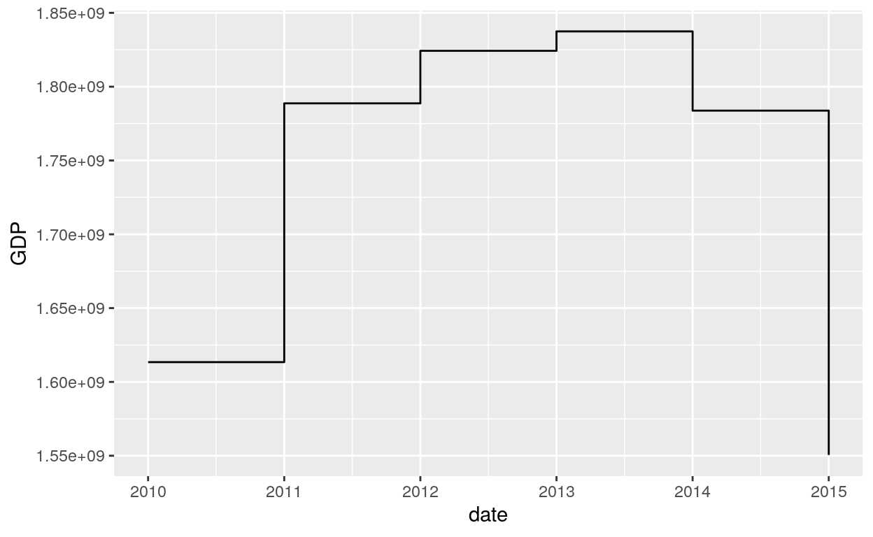
Geom_step
geom_step() creates a stairstep plot, highlighting exactly when changes occur. The group aesthetic determines which cases are connected together.
geom_step(mapping = NULL, data = NULL, stat = "identity",
  position = "identity", direction = "hv", na.rm = FALSE,
  show.legend = NA, inherit.aes = TRUE, ...)
Steps
geom_step() is useful when you want to highlight exactly when the y value changes:
Scatterplot
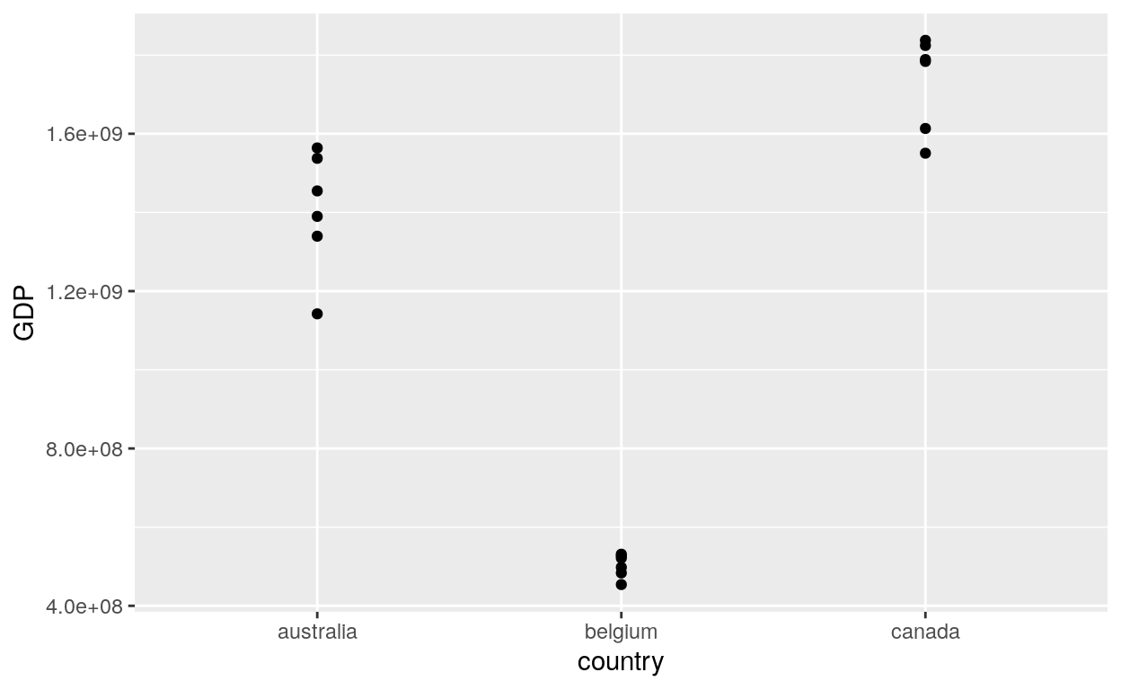
Geom_point
The geom_point() is used to create scatterplots. The scatterplot is most useful for displaying the relationship between two continuous variables. It can be used to compare one continuous and one categorical variable, or two categorical variables, but a variation like geom_jitter(), geom_count(), or geom_bin2d() is usually more appropriate. A bubblechart is a scatterplot with a third variable mapped to the size of points.
geom_point(mapping = NULL, data = NULL, stat = "identity", position = "identity", ...,
           na.rm = FALSE, show.legend = NA, inherit.aes = TRUE)
Points
ggplot(dataGraph, aes(country, GDP)) +
  geom_point()
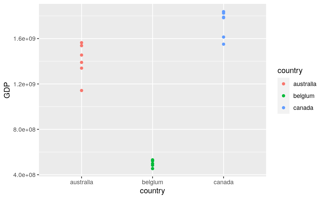
Aes Colour
# Add aesthetic mappings
ggplot(dataGraph, aes(country, GDP, colour = country)) +
  geom_point()
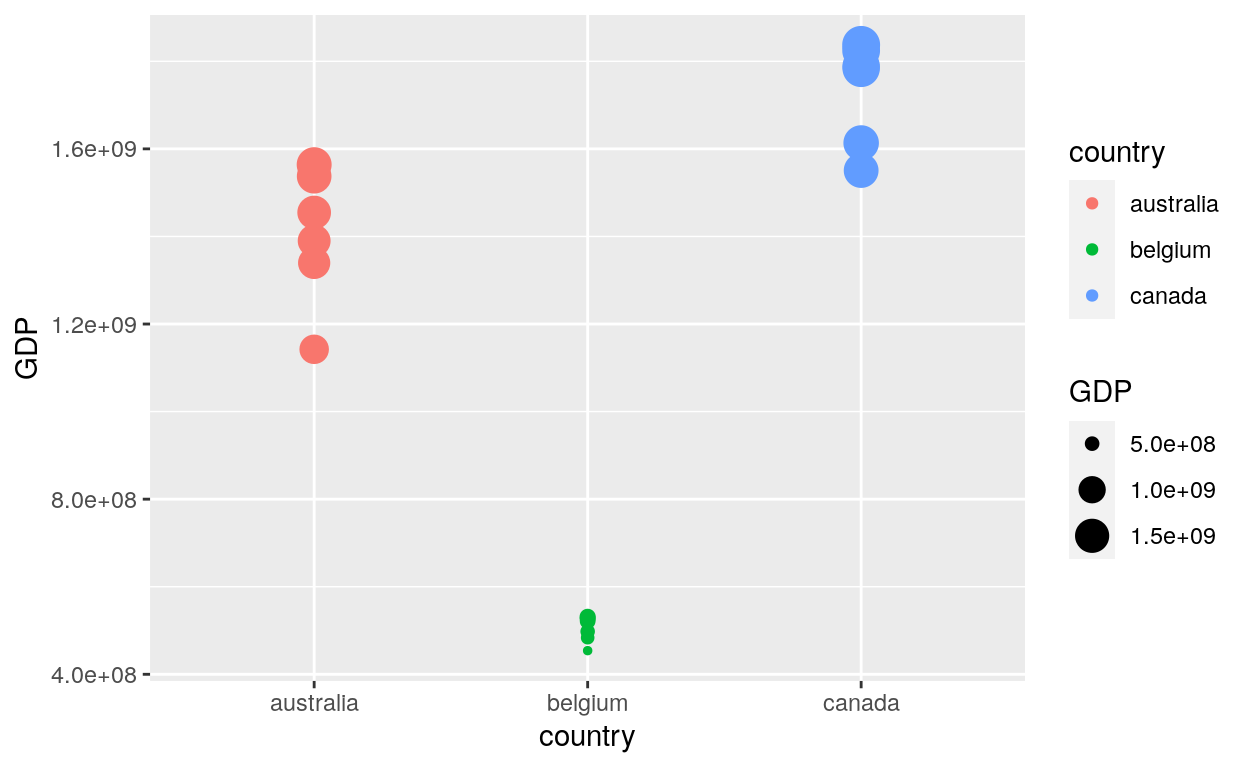
Aes Size
Set points size by using the option size in the aes() function:
ggplot(dataGraph, aes(country, GDP, colour = country, size = GDP)) +
  geom_point()
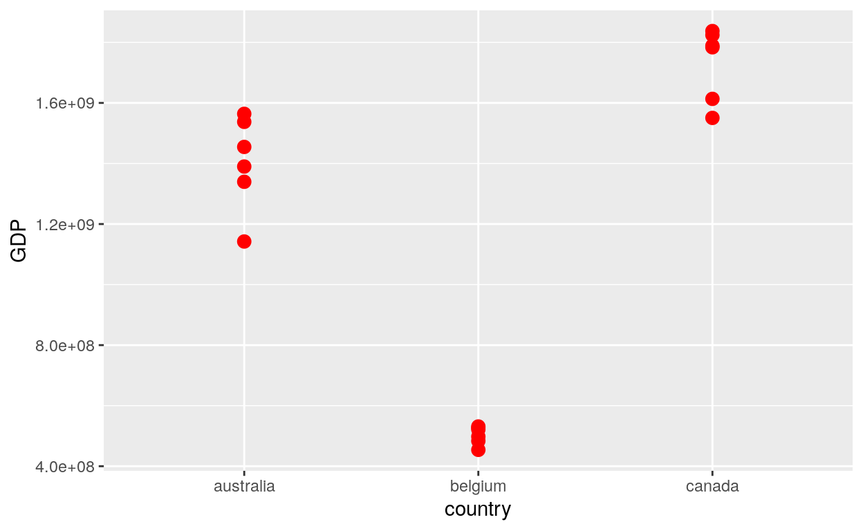
Fixed colour and size
# Set aesthetics to fixed value
ggplot(dataGraph, aes(country, GDP)) +
  geom_point(colour = "red", size = 3)
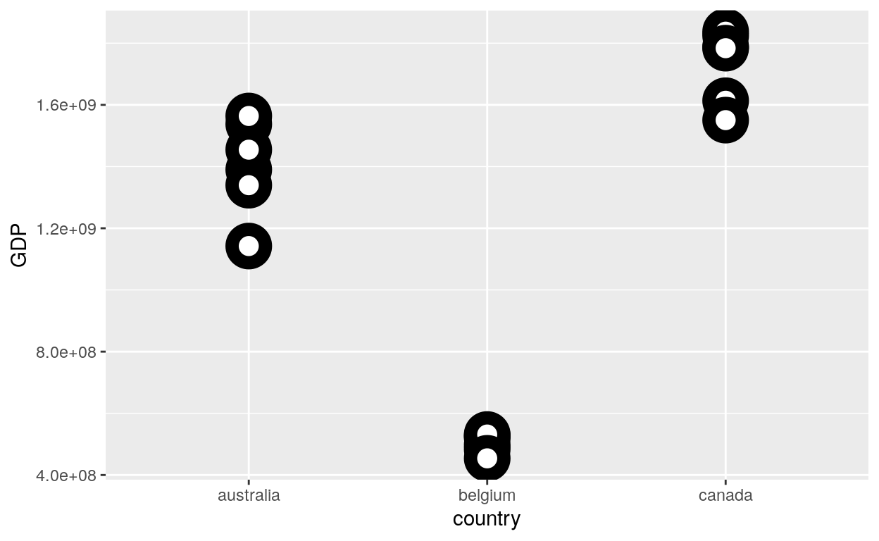
Shape, Fill and Stroke
Set up the shape, fill and stroke
# For shapes that have a border (like 21), you can colour the inside and outside separately.
# Use the stroke aesthetic to modify the width of the border
ggplot(dataGraph, aes(country, GDP)) +
  geom_point(shape = 21, colour = "black", fill = "white", size = 5, stroke = 5)
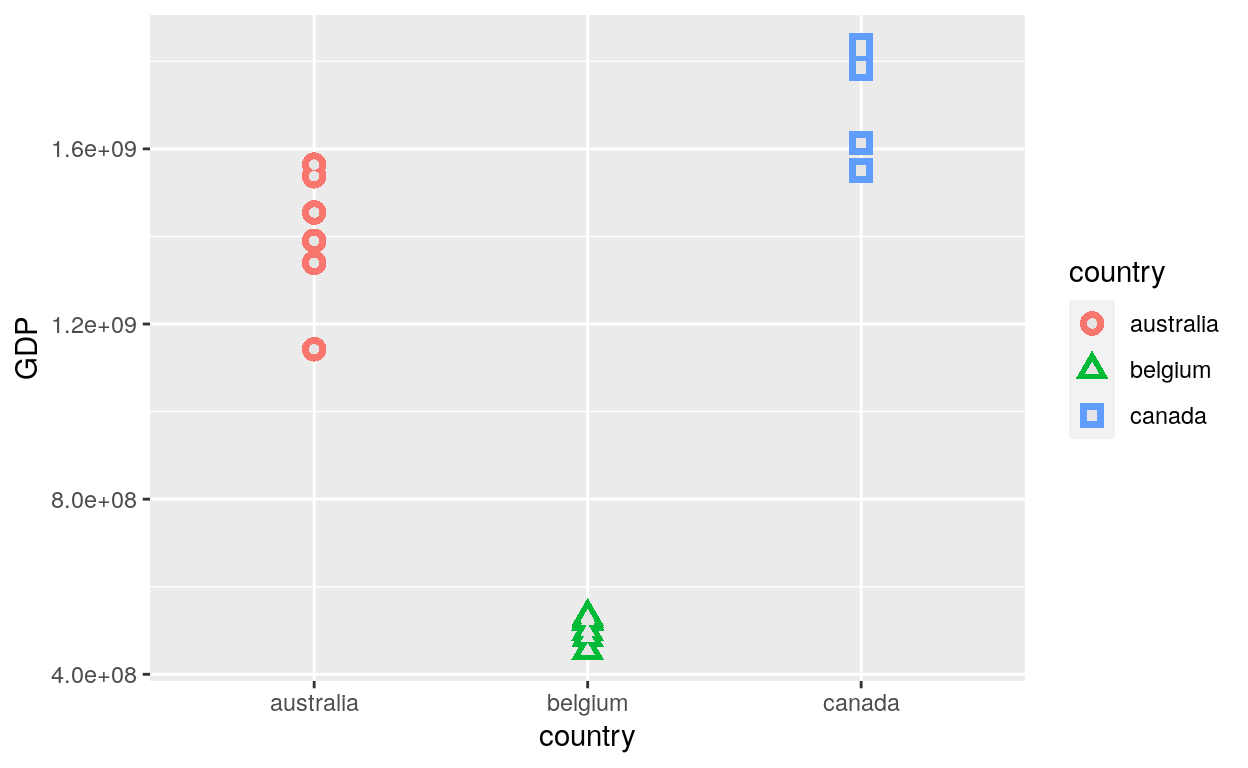
Layering Points
# You can create interesting shapes by layering multiple points of different sizes
ggplot(dataGraph, aes(country, GDP, shape = country)) +
  geom_point(aes(colour = country), size = 4) +
  geom_point(colour = "grey90", size = 1.5)
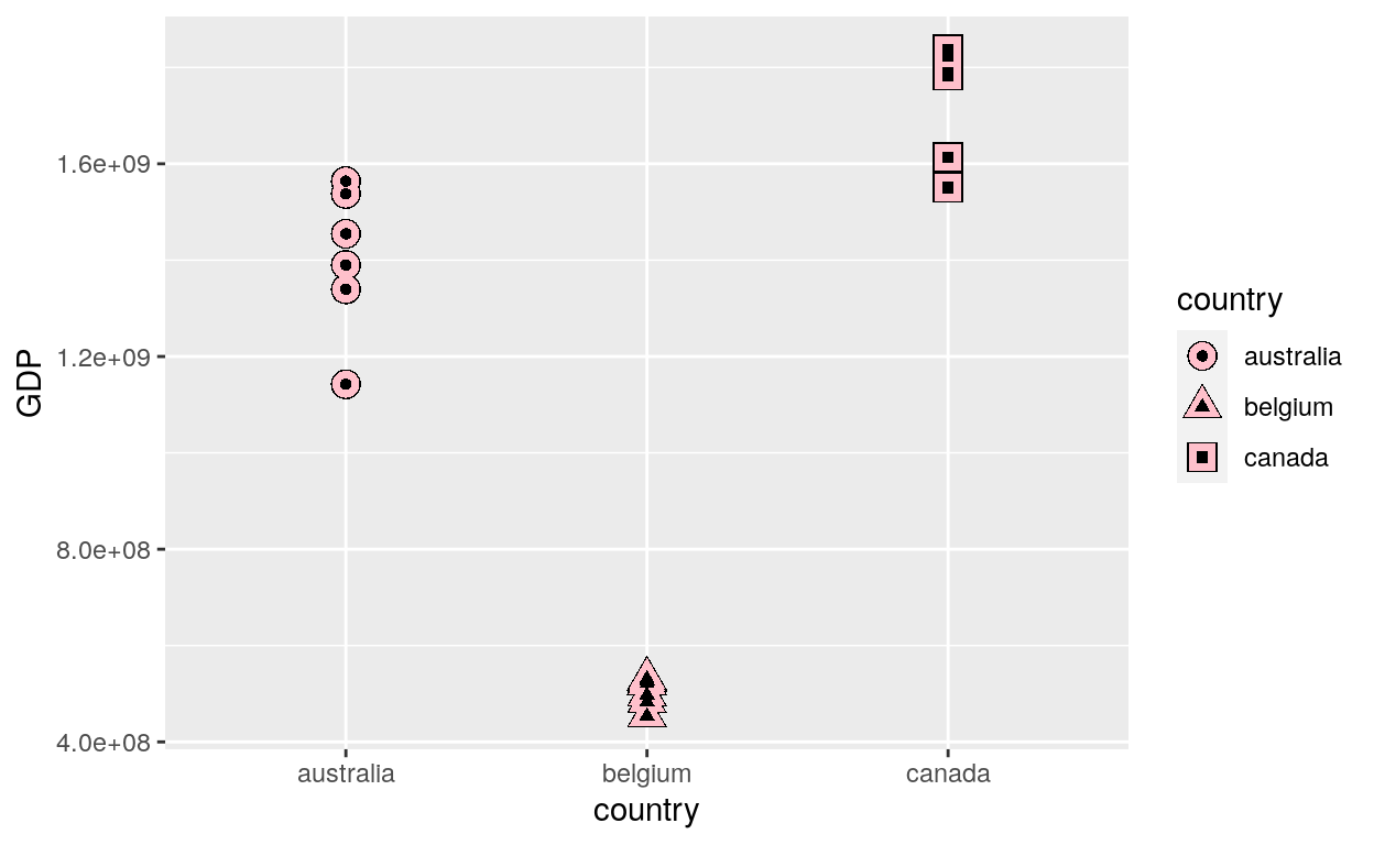
ggplot(dataGraph, aes(country, GDP, shape = country)) +
  geom_point(colour = "black", size = 4.5) +
  geom_point(colour = "pink", size = 4) +
  geom_point(aes(shape = factor(country)))
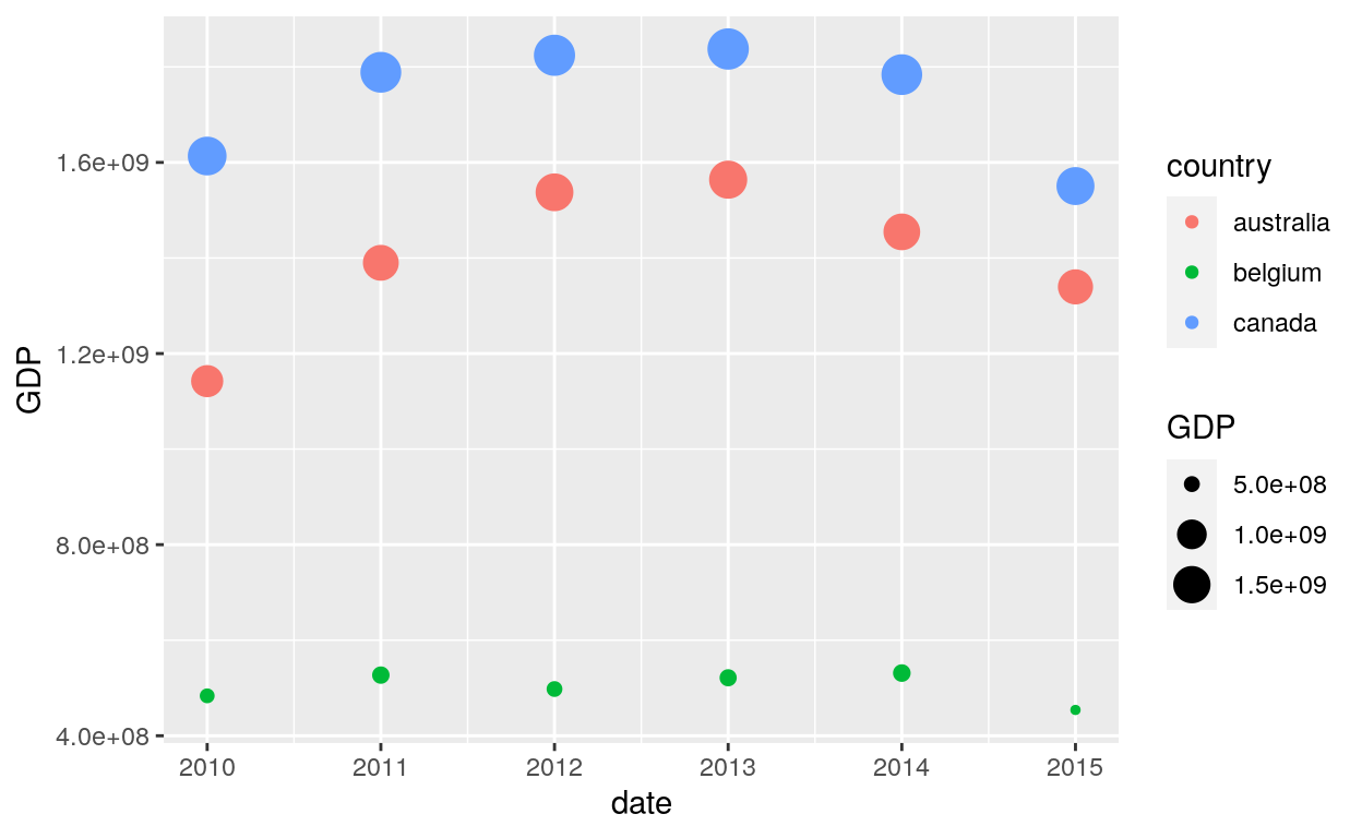
Time series
The use of date as x axis for time series:
# geom_point() works for time series too
ggplot(data = dataGraph, aes(x = date, y = GDP, color = country)) +
  geom_point(aes(size = GDP))
Missing values
Geom_point is capable of handling missing value with the na.rm function:
A warning message is displayed:
# geom_point warns when missing values have been dropped from the data set and not plotted
# you can turn this off by setting na.rm = TRUE
ggplot(dataGraph, aes(GDP, column.na)) +
  geom_point()
Warning: Removed 5 rows containing missing values (geom_point).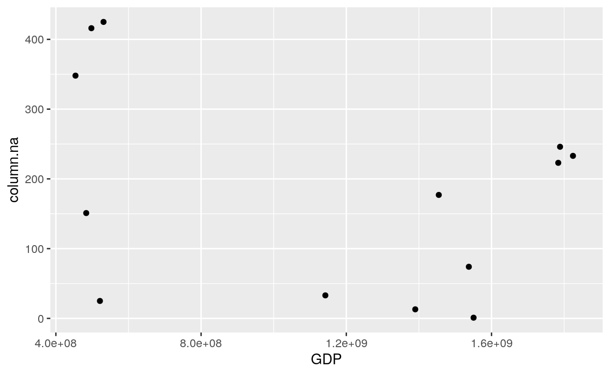
There is no more warning message:
# Add TRUE to na.rm
ggplot(dataGraph, aes(GDP, column.na)) +
  geom_point(na.rm = TRUE)

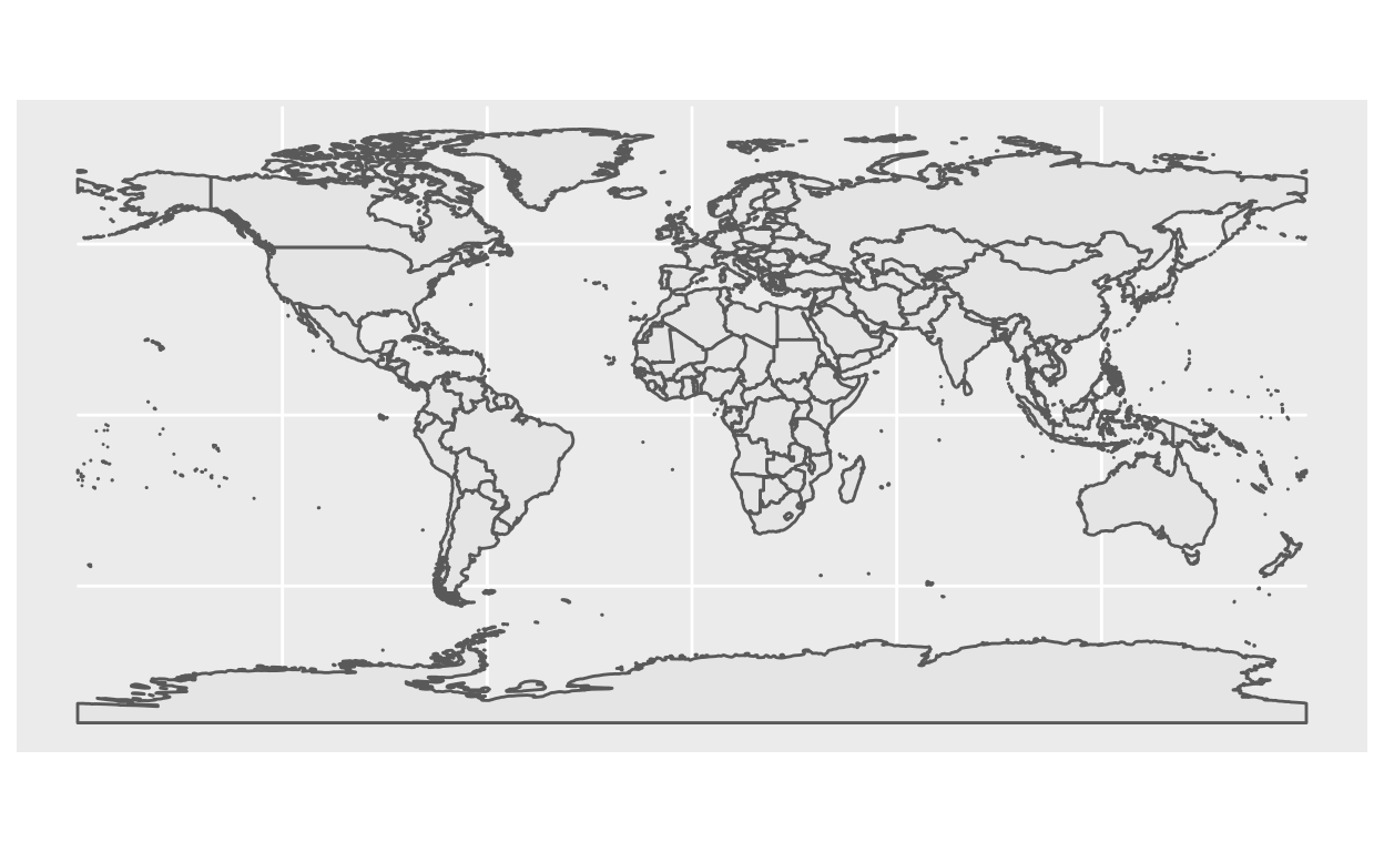
Maps
This set of geom, stat, and coord are used to visualise simple feature (sf) objects. For simple plots, you will only need geom_sf() as it uses stat_sf() and adds coord_sf() for you. geom_sf() is an unusual geom because it will draw different geometric objects depending on what simple features are present in the data: you can get points, lines, or polygons.
Geom_sf
Setting up the data for the map:
# The package rnaturalearth provides data to create a map of the world.
# Use ne_countries to pull country data and choose the scale.
# The function ne_countries return sp classes by default.
# You can choose the sf classe, as defined in the argument returnclass.

library("sf")
library("rnaturalearth")

world <- ne_countries(scale = "medium", returnclass = "sf")
Sf
Color and fill
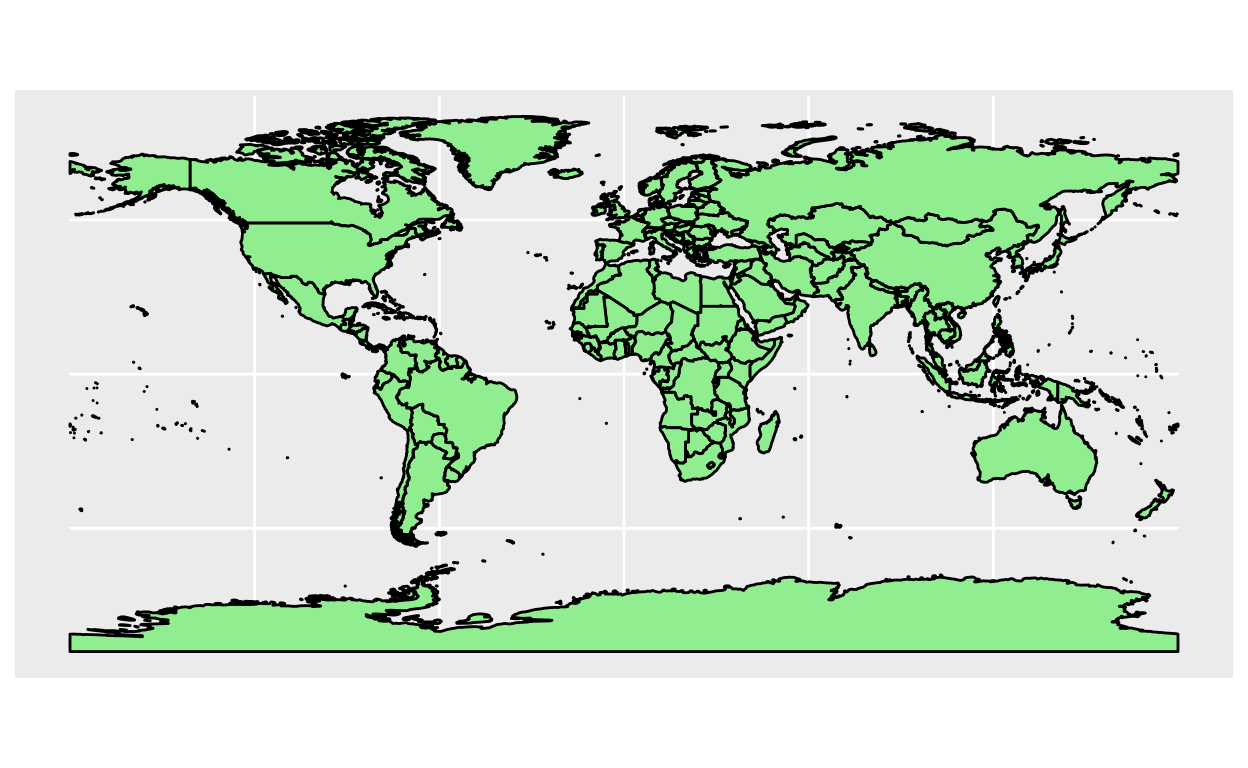
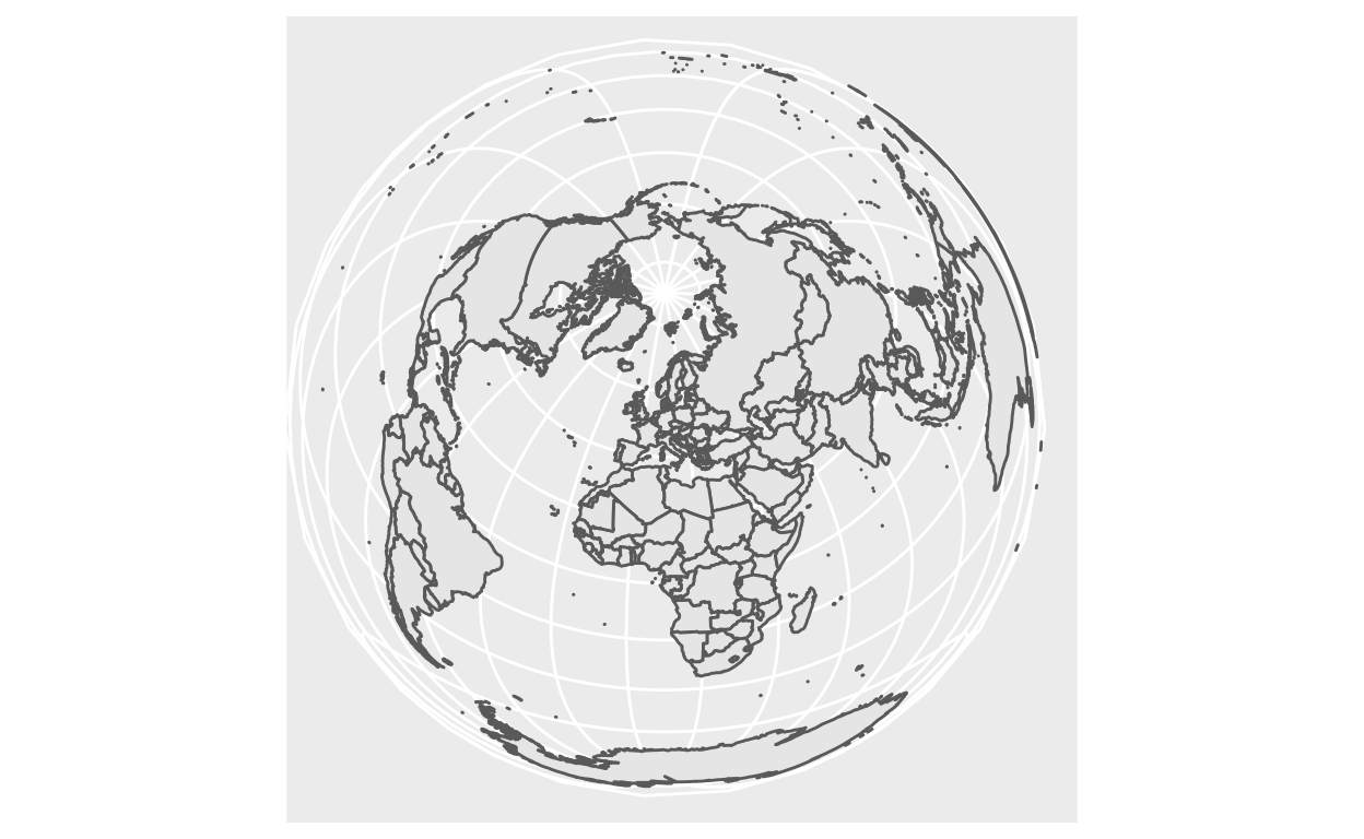
Coord_sf
Crs
ggplot(data = world) +
geom_sf() +
coord_sf(crs = "+proj=laea +lat_0=52 +lon_0=10 +x_0=4321000 +y_0=3210000 +ellps=GRS80 +units=m +no_defs ")
Xlim and Ylim
Geom_map
geom_map(mapping = NULL, data = NULL, stat = "identity", ..., map,
  na.rm = FALSE, show.legend = NA, inherit.aes = TRUE)
Map
       long      lat group order region subregion
1 -69.89912 12.45200     1     1  Aruba      <NA>
2 -69.89571 12.42300     1     2  Aruba      <NA>
3 -69.94219 12.43853     1     3  Aruba      <NA>
4 -70.00415 12.50049     1     4  Aruba      <NA>
5 -70.06612 12.54697     1     5  Aruba      <NA>
6 -70.05088 12.59707     1     6  Aruba      <NA>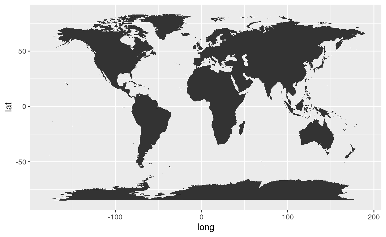
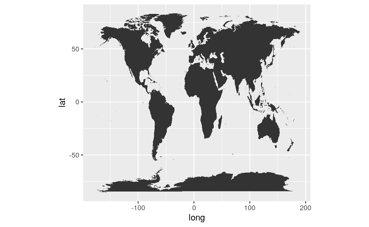
Coord_fixed
A fixed scale coordinate system forces a specified ratio between the physical representation of data units on the axes. The ratio represents the number of units on the y-axis equivalent to one unit on the x-axis. The default, ratio = 1, ensures that one unit on the x-axis is the same length as one unit on the y-axis. Ratios higher than one make units on the y axis longer than units on the x-axis, and vice versa.
coord_fixed(ratio = 1, xlim = NULL, ylim = NULL, expand = TRUE, clip = "on")
Ratio
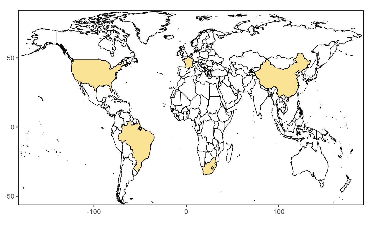
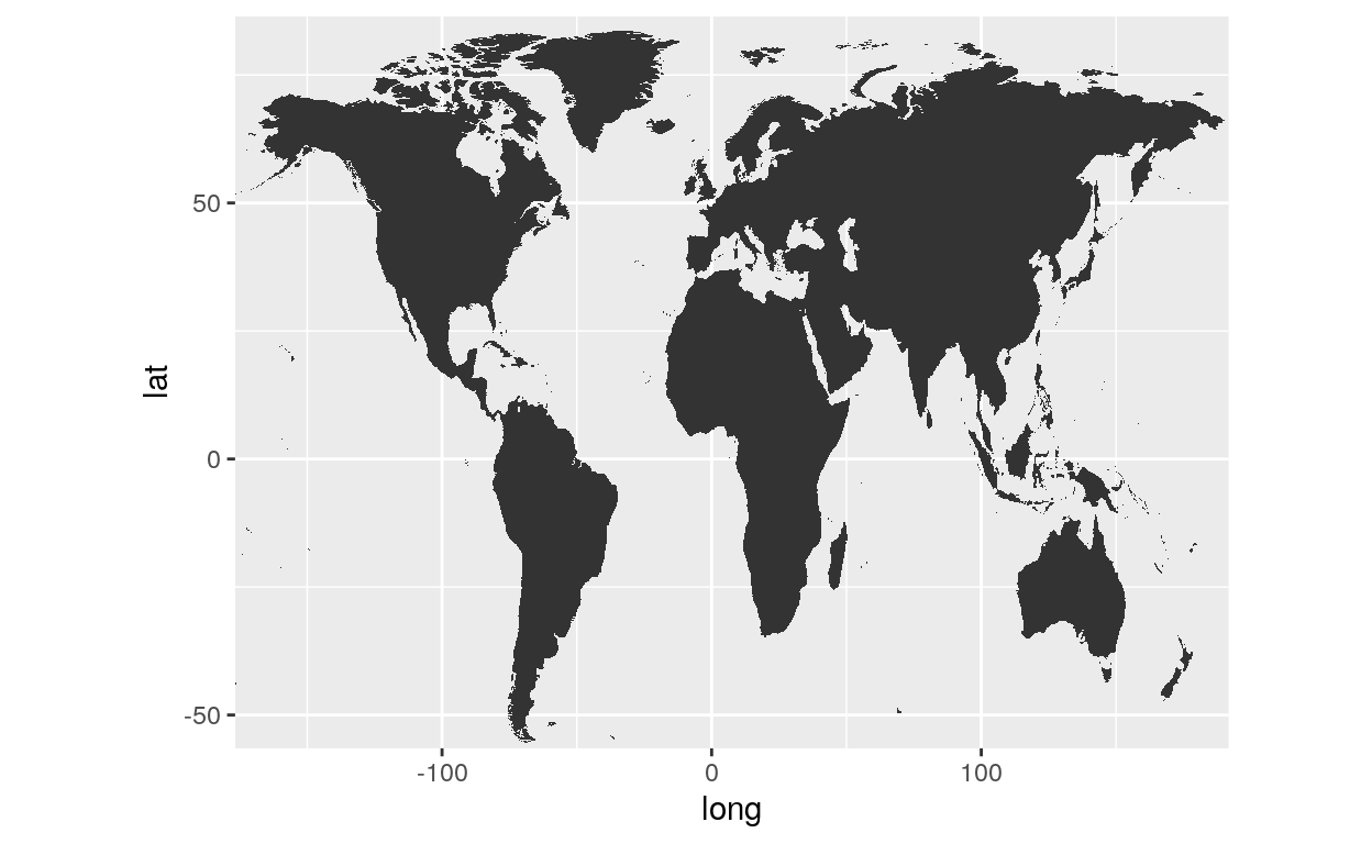
By default the Ration is equal to 1. When using another number the map shrinks.
ggplot() +
geom_map(data=world2, map=world2, aes(x=long, y=lat, group=group, map_id=region)) +
coord_fixed(1.9)
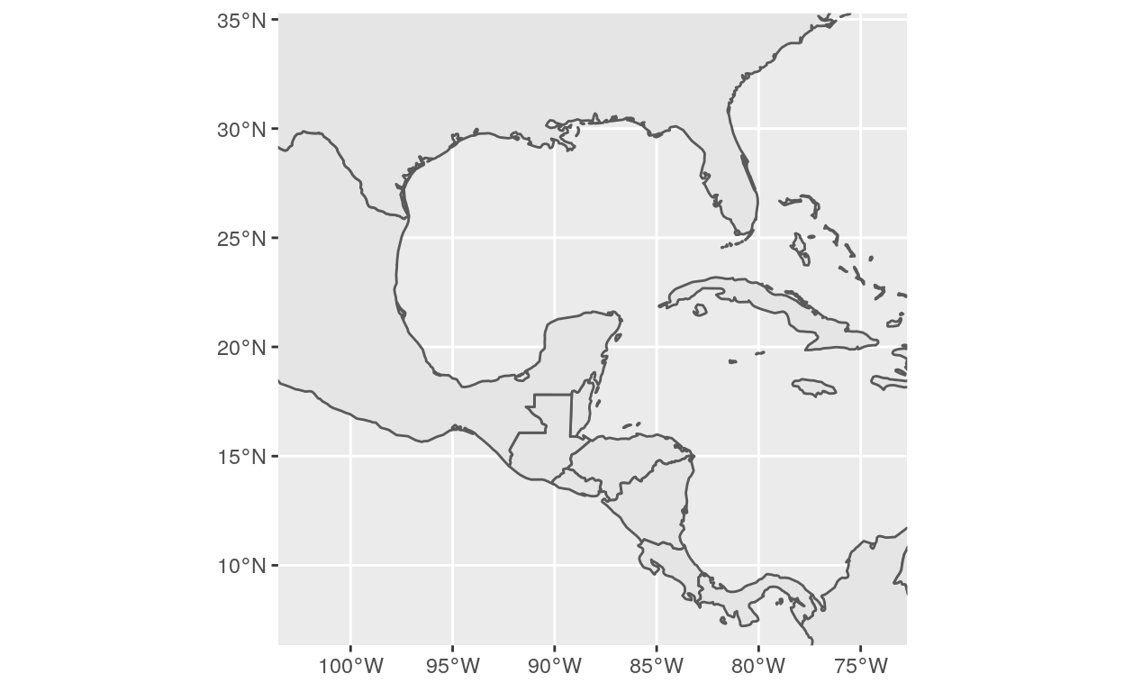
Xlim and Ylim
You can cut the map by using the xlim and ylim option include in the coord_fixed function:
ggplot() +
  geom_map(data=world2, map=world2, aes(x=long, y=lat, group=group, map_id=region)) +
  coord_fixed(1.9, xlim = c(-160,175), ylim = c(-50,80))
Geom_polygon
Polygons are very similar to paths (as drawn by geom_path()) except that the start and end points are connected and the inside is coloured by fill. The group aesthetic determines which cases are connected together into a polygon. From R 3.6 and onwards it is possible to draw polygons with holes by providing a subgroup aesthetic that differentiates the outer ring points from those describing holes in the polygon.
geom_polygon(mapping = NULL, data = NULL, stat = "identity", position = "identity", rule = "evenodd", ...,
             na.rm = FALSE, show.legend = NA, inherit.aes = TRUE)
Polygon
Let’s load US data with the function map_data().
| long | lat | group | order | region | subregion |
|---|---|---|---|---|---|
| -101.4078 | 29.74224 | 1 | 1 | main | NA |
| -101.3906 | 29.74224 | 1 | 2 | main | NA |
| -101.3620 | 29.65056 | 1 | 3 | main | NA |
| -101.3505 | 29.63911 | 1 | 4 | main | NA |
| -101.3219 | 29.63338 | 1 | 5 | main | NA |
| -101.3047 | 29.64484 | 1 | 6 | main | NA |
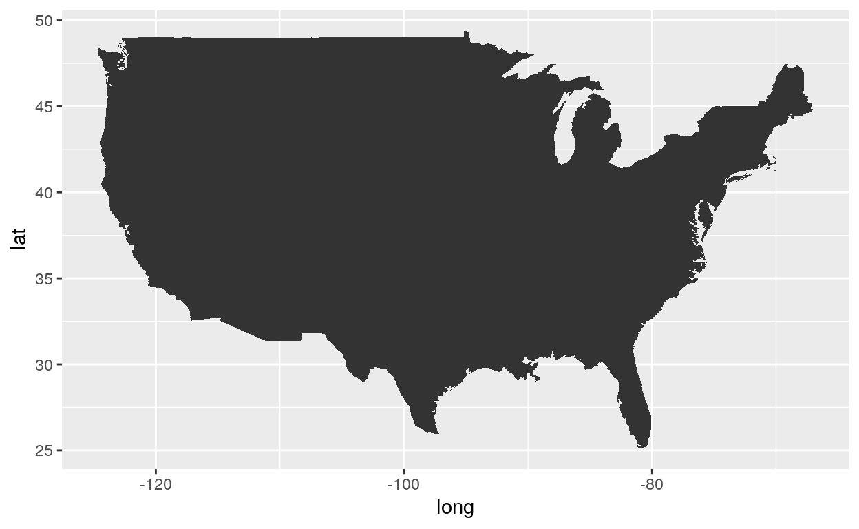
ggplot(usa, aes(x = long, y = lat, group = group)) +
  geom_polygon()
Coord_map
coord_map projects a portion of the earth, which is approximately spherical, onto a flat 2D plane using any projection defined by the mapproj package. Map projections do not, in general, preserve straight lines, so this requires considerable computation.
coord_map(projection = "mercator", ..., parameters = NULL, orientation = NULL,
          xlim = NULL, ylim = NULL, clip = "on")
Coord
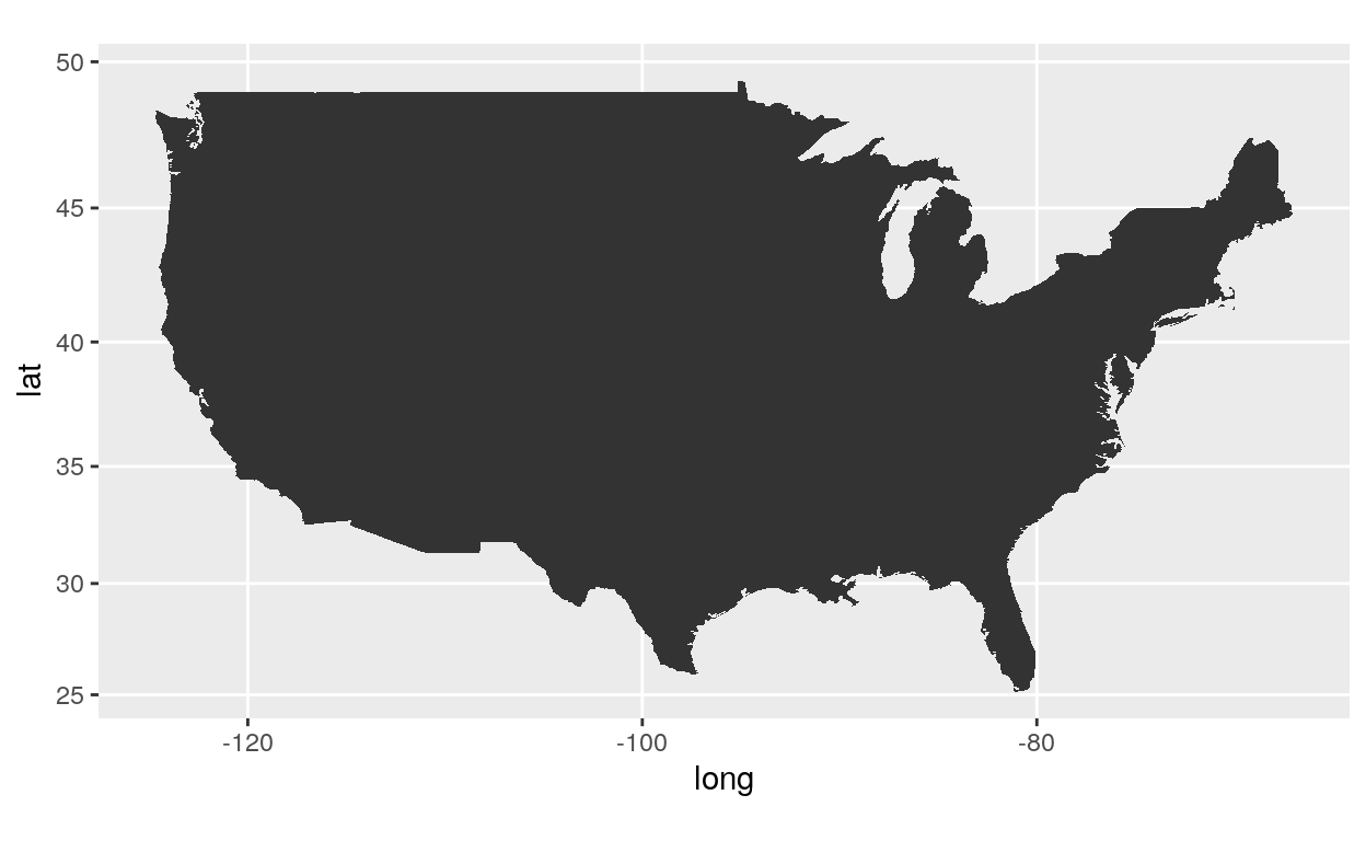
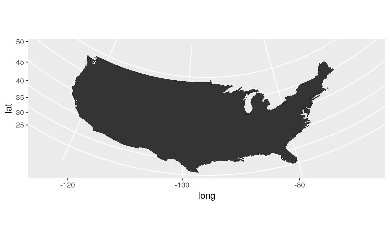
ggplot(usa, aes(x = long, y = lat, group = group)) +
  geom_polygon() +
  coord_map()
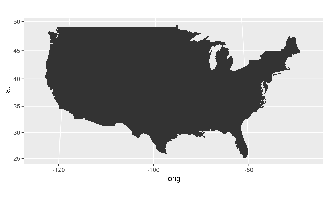
Projection
ggplot(usa, aes(x = long, y = lat, group = group)) +
  geom_polygon() +
  coord_map("gilbert")
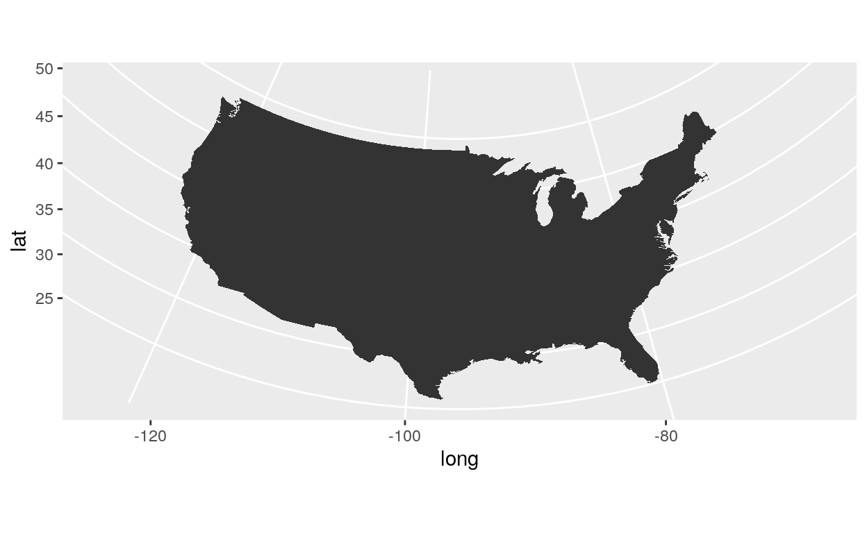
ggplot(usa, aes(x = long, y = lat, group = group)) +
  geom_polygon() +
  coord_map("orthographic")
ggplot(usa, aes(x = long, y = lat, group = group)) +
  geom_polygon() +
  coord_map("azequalarea")
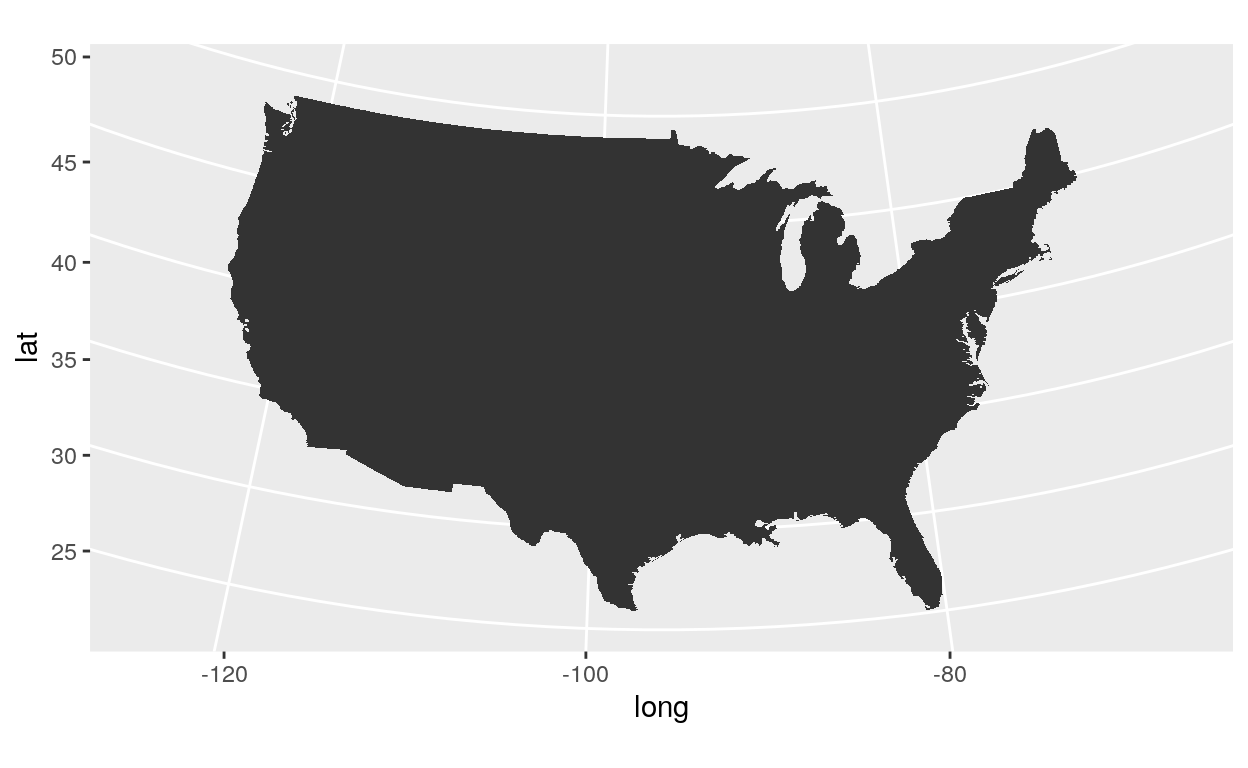
ggplot(usa, aes(x = long, y = lat, group = group)) +
  geom_polygon() +
  coord_map("conic", lat0 = 30)
Now, let’s load the US states data.
state <- map_data("state")
| long | lat | group | order | region | subregion |
|---|---|---|---|---|---|
| -87.46201 | 30.38968 | 1 | 1 | alabama | NA |
| -87.48493 | 30.37249 | 1 | 2 | alabama | NA |
| -87.52503 | 30.37249 | 1 | 3 | alabama | NA |
| -87.53076 | 30.33239 | 1 | 4 | alabama | NA |
| -87.57087 | 30.32665 | 1 | 5 | alabama | NA |
| -87.58806 | 30.32665 | 1 | 6 | alabama | NA |
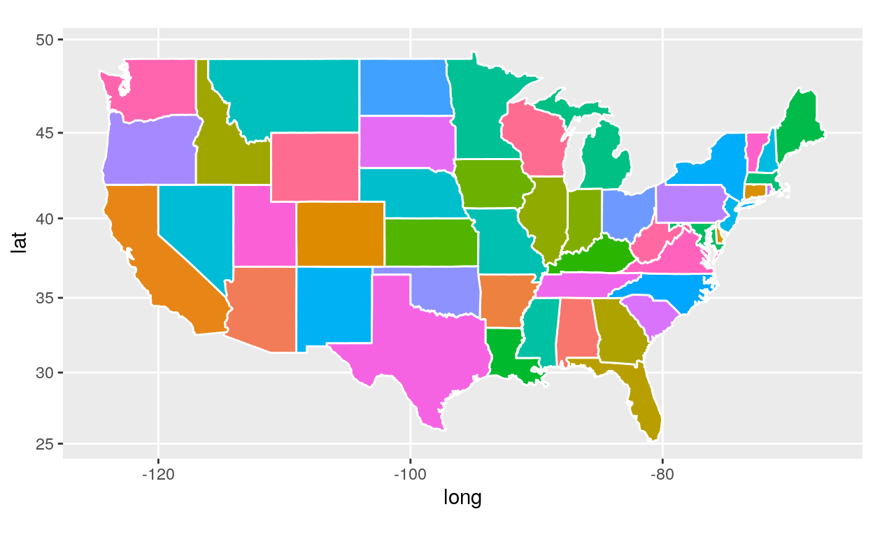
ggplot(state, aes(x = long, y = lat, fill = region, group = group)) +
  geom_polygon(col = "white") +
  coord_map() +
  theme(legend.position = "none")
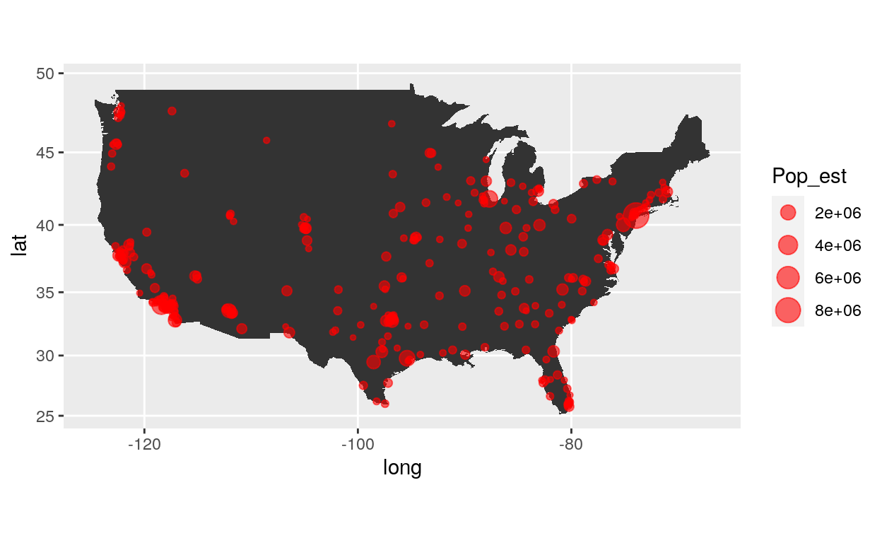
Points
For the following map we need data on cities. Let’s load them!
| City | State | Pop_est | lat | long |
|---|---|---|---|---|
| Eugene | Oregon | 163460 | 44.0567 | -123.1162 |
| Salem | Oregon | 164549 | 44.9237 | -123.0231 |
| Hillsboro | Oregon | 102347 | 45.5167 | -122.9833 |
| Santa Rosa | California | 174972 | 38.4468 | -122.7061 |
| Portland | Oregon | 632309 | 45.5370 | -122.6500 |
| Vancouver | Washington | 172860 | 45.6372 | -122.5965 |
ggplot(data = usa, aes(x = long, y = lat, group = group)) +
  geom_polygon() +
  geom_point(data = cities, aes(group = State, size = Pop_est),
             col = "red", shape = 19, alpha = 0.6) +
  coord_map()
We need to make some data wrangling on cities data.
First, we want the population by states.
pop <- aggregate(Pop_est ~ State, data = cities, sum)
Second, we need to rename the column state by region.
Third, we want to put in lowercase the column region
pop$region <- stringr::str_to_lower(pop$region)
Next, we want to join the dataframe “state” and “pop” by the column “region” into a new dataframe called “state2”.
state2 <- dplyr::left_join(state, pop, by="region")
| long | lat | group | order | region | subregion | Pop_est |
|---|---|---|---|---|---|---|
| -87.46201 | 30.38968 | 1 | 1 | alabama | NA | 797933 |
| -87.48493 | 30.37249 | 1 | 2 | alabama | NA | 797933 |
| -87.52503 | 30.37249 | 1 | 3 | alabama | NA | 797933 |
| -87.53076 | 30.33239 | 1 | 4 | alabama | NA | 797933 |
| -87.57087 | 30.32665 | 1 | 5 | alabama | NA | 797933 |
| -87.58806 | 30.32665 | 1 | 6 | alabama | NA | 797933 |
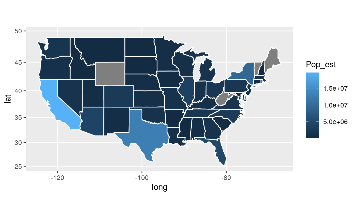
Now, let’s produce a map!
ggplot(state2, aes(x = long, y = lat, fill = Pop_est, group = group)) +
  geom_polygon(col = "white") +
  coord_map()