Nüance-R has made available the flexdashboard output. (Iannone et al. 2018) It will allow you to publish groups of related data visualizations as a dashboard.
Getting Started
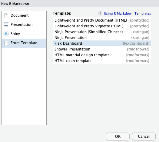
To author a flexdashboard you create an R Markdown document with the flexdashboard::flex_dashboard output format.
You can do this from within Nüance-R using the New R Markdown dialog:
knitr::include_graphics("./images/flexdashboard.png")
Components
You can use flexdashboard to publish groups of related data visualizations as a dashboard. A flexdashboard can either be static (a standard web page) or dynamic (a Shiny interactive document). A wide variety of components can be included in flexdashboard layouts, including:
- Interactive JavaScript data visualizations based on htmlwidgets.
- R graphical output including base, lattice, and grid graphics.
- Tabular data (with optional sorting, filtering, and paging).
- Value boxes for highlighting important summary data.
- Gauges for displaying values on a meter within a specified range.
- Text annotations of various kinds.
Layout
Single Column - Fill
Dashboards are divided into columns and rows, with output components delineated using level 3 markdown headers (###). By default, dashboards are laid out within a single column, with charts stacked vertically within a column and sized to fill available browser height. For example, this layout defines a single column with two charts that fills available browser space:
### Chart 1

```{r}

```

### Chart 2

```{r}

```
Single Column - Scroll
Depending on the nature of your dashboard (number of components, ideal height of components, etc.) you may prefer a scrolling layout where components occupy their natural height and the browser scrolls when additional vertical space is needed. You can specify this behavior via the vertical_layout: scroll option. For example, here is the definition of a single column scrolling layout with three charts:
### Chart 1

```{r}

```

### Chart 2

```{r}

```

### Chart 3

```{r}

```
Multiple Columns
To lay out charts using multiple columns you introduce a level 2 markdown header (————–) for each column. For example, this dashboard displays 3 charts split across two columns:
Column {data-width=600}
-------------------------------------

### Chart 1

```{r}

```

Column {data-width=400}
-------------------------------------

### Chart 2

```{r}

```

### Chart 3

```{r}

```
Row Orientation
You can also choose to orient dashboards row-wise rather than column-wise by specifying the orientation: rows option. For example, this layout defines two rows, the first of which has a single chart and the second of which has two charts:
Row
-------------------------------------

### Chart 1

```{r}

```

Row
-------------------------------------

### Chart 2

```{r}

```

### Chart 3

```{r}

```
Layout, Components and Sizing
Tabsets
If you have several components you’d like to display within a row or column then rather than attempting to fit them all on screen at the same time you can lay them out as a tabset. This is especially appropriate when one component is primary (i.e. should be seen by all readers) and the others provide secondary information that might be of interest to only some readers.
In many cases tabsets are a better solution than vertical_layout: scroll for displaying large numbers of components since they are so straightforward to navigate.
To layout a row or column as a tabset you simply add the {.tabset} attribute to the section heading. For example, the following code lays out the second column in tabset:
Column
-------------------------------------

### Chart 1

```{r}

```

Column {.tabset}
-------------------------------------

### Chart 2

```{r}

```

### Chart 3

```{r}

```
Rows can also be laid out as a tabset as illustrated here:
Row
-------------------------------------

### Chart 1

```{r}

```

Row {.tabset .tabset-fade}
-------------------------------------

### Chart 2

```{r}

```

### Chart 3

```{r}

```
Value Boxes
Sometimes you want to include one or more simple values within a dashboard. You can use the valueBox function to display single values along with a title and optional icon. For example, here are three side-by-side sections each displaying a single value:
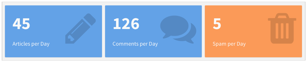
Here is the code which was used to generate these value boxes:
Row
-----------------------------------------------------------------------

### Articles per Day

```{r}
articles <- computeArticles()
valueBox(articles, icon = "fa-pencil")
```

### Comments per Day

```{r}
comments <- computeComments()
valueBox(comments, icon = "fa-comments")
```

### Spam per Day

```{r}
spam <- computeSpam()
valueBox(spam,
         icon = "fa-trash",
         color = ifelse(spam > 10, "warning", "primary"))
```
The valueBox function is called to emit a value and specify an icon. You can specify icons from three different icon sets:
When referring to an icon you should use it’s full name including the icon set prefix (e.g. “fa-github”, “ion-social-twitter”, “glyphicon-time”, etc.).
Gauges
Gauges display values on a meter within a specified range. For example, here is a set of 3 gauges:
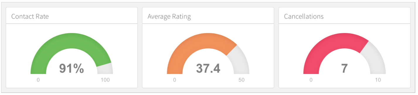
Here is the code used to generate these gauges:
Row
-----------------------------------------------------------------------

### Contact Rate

```{r}
rate <- computeContactRate()
gauge(rate, min = 0, max = 100, symbol = '%', gaugeSectors(
  success = c(80, 100), warning = c(40, 79), danger = c(0, 39)
))
```

### Average Rating

```{r}
rating <- computeAverageRating()
gauge(rating, min = 0, max = 50, gaugeSectors(
  success = c(41, 50), warning = c(21, 40), danger = c(0, 20)
))
```

### Cancellations

```{r}
cancellations <- computeCancellations()
gauge(cancellations, min = 0, max = 10, gaugeSectors(
  success = c(0, 2), warning = c(3, 6), danger = c(7, 10)
))
```
Size Attributes
The nature of the charts within your dashboard (desired emphasis, visualization types, etc.) will often dictate that you’ll want to change the default sizing behavior. If no size attributes are specified then the relative size of each chart will be determined by it’s knitr figure size (this is 6 x 4.8 inches or 576 x 460 pixels by default).
You can modify the default sizing behavior by applying the data-width and data-height attributes to rows, columns, or even individual charts. These attributes establish the relative size between charts laid out in the same dimension (horizontal or vertical).
Examples
This example use the data-height attribute to dictate a larger vertical size for the first row, resulting in a layout that more clearly emphasizes the first chart.
Row {data-height=650}
-------------------------------------

### Chart 1

```{r}

```

Row {data-height=350}
-------------------------------------

### Chart 2

```{r}

```

### Chart 3

```{r}

```
This example is a variation of the single-column layout demonstrated above with a data-height attribute applied to the first chart:
### Chart 1 {data-height=600}

```{r}

```

### Chart 2 {data-height=200}

```{r}

```

### Chart 3 {data-height=200}

```{r}

```
Iannone, Richard, J. J. Allaire, Barbara Borges, RStudio, Keen IO (Dashboard CSS), Abdullah Almsaeed (Dashboard CSS), Jonas Mosbech (StickyTableHeaders), et al. 2018. “Flexdashboard: R Markdown Format for Flexible Dashboards.” https://CRAN.R-project.org/package=flexdashboard.