This course will teach you how to manipulate AI tweets.
Loading data
First, let’s load csv files containing the tweets on AI. We collected 10,000 tweets on Artificial Intelligence between 11 and 12 November 2019 with two specific keywords: “ArtificialIntelligence” and “Artificial Intelligence”.
Merging data
The second step is to merge the two datasets into one.
Cleaning data
After merging the data, it needs to be a little cleaned up. We want to keep unique tweets but we collected the tweets at different time which means that we potentially have the same tweets collected at different time. This results in a change in the likes count, retweets count and replies count. Then the unique() function will not remove the tweet even if it’s the same because the count is not the same. Therefore we need to remove these columns and apply the unique() function.
Now, we want to filter the data to keep only the tweets of November 11, 2019. That leaves us with about 6,000 tweets.
# Filtering the tweets
tweetsAI <- filter(tweetsAI, date == "2019-11-11")
As we have the tweets over a one-day period, we can make a visual to see what time people tweet on AI.
Number of tweets per hour
One way to display the tweets per hour is to separate the column time in three columns: “hour”, “minute” and “second”.
We can use the column “hour” as the x axis to get the count of tweets per hour. Now, let’s make a basic histogram showing the distribution of the tweets per hour.
library(ggplot2)

# Creating an histogram
ggplot(data = tweetsAI, aes(x = hour)) +
  geom_histogram(stat = "count", aes(fill = ..count..)) +
  theme(legend.position = "none") +
  xlab("Hours") + ylab("Number of tweets") +
  ggtitle("Distribution of the tweets per hour") +
  scale_fill_gradient(low = "yellow", high = "red") +
  theme_minimal()
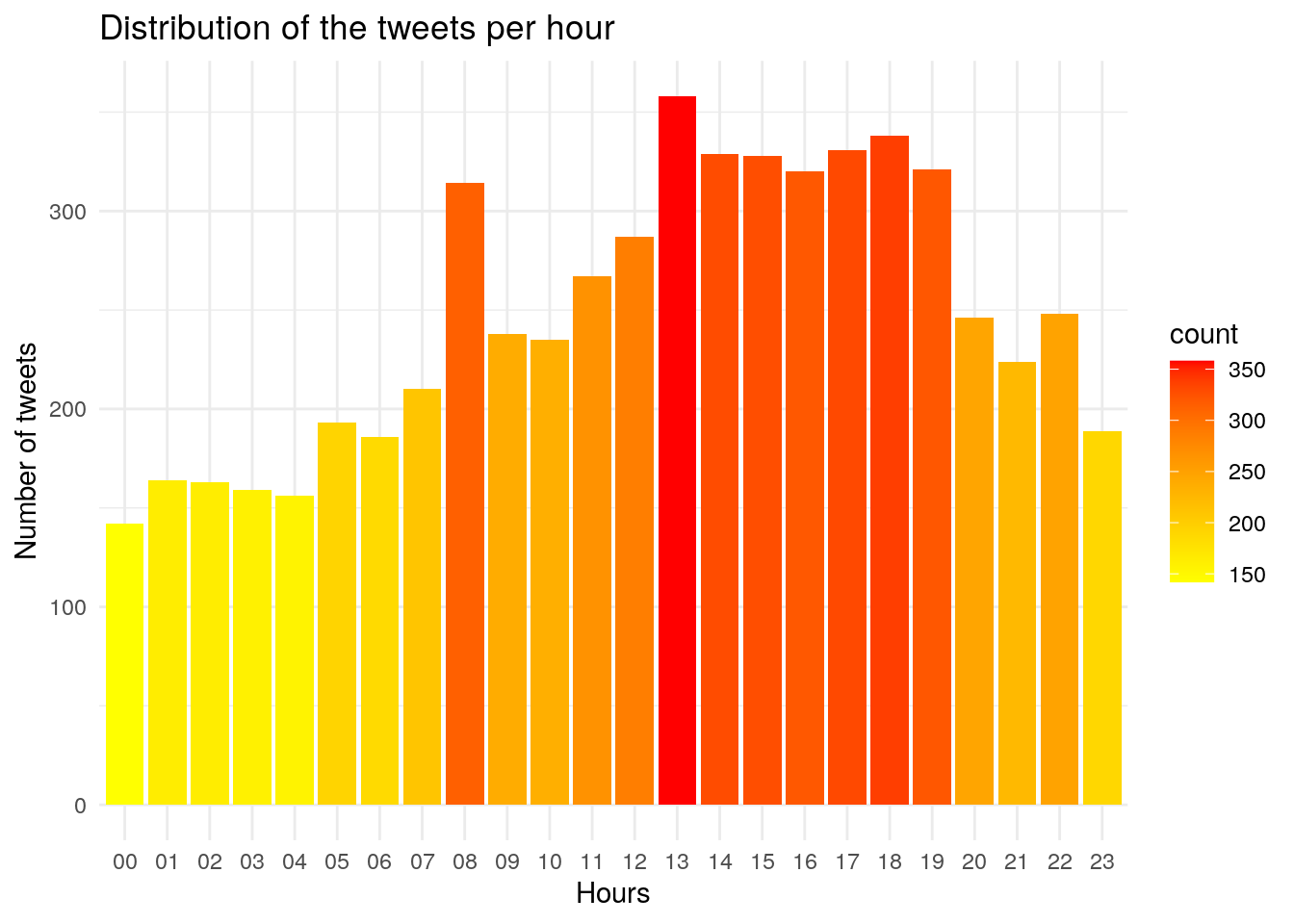
We can see that people are tweeting about AI at 8am then at 1pm until 7pm.