Chapter 11 Dashboards
11.1 Introduction
In this chapter, we learn to create easy interactive dashboards called Flexdashboards. You will use R Markdown, a wide variety of components including htmlwidgets, flexible row and column-based layouts and storyboard layouts to publish a group of related data visualizations as a dashboard.
At the end of the chapter, you should be able to:
- use R Markdown;
- use components;
- use layouts;
- create a flexdashboard;
11.2 Getting Started
Install the flexdashboard package from CRAN as follows:
To author a flexdashboard you create an R Markdown document with the flexdashboard::flex_dashboard output format.
You can do this from Rstudio by using the New R Markdown dialog, then clicking on From Template and finally on Flex Dashboard.
You can use flexdashboard to publish groups of related data visualizations as a dashboard. A flexdashboard can either be static (a standard web page) or dynamic (a Shiny interactive document). A wide variety of components can be included in flexdashboard layouts, including:
- Interactive JavaScript data visualizations based on htmlwidgets.
- R graphical output including base, lattice, and grid graphics.
- Tabular data (with optional sorting, filtering, and paging).
- Value boxes for highlighting important summary data.
- Gauges for displaying values on a meter within a specified range.
- Text annotations of various kinds.
11.3 Layout
Dashboards are divided into columns and rows, with output components delineated using level 3 markdown headers (###). By default, dashboards are laid out within a single column, with charts stacked vertically within a column and sized to fill available browser height. A lot of layouts are available here
11.3.1 Chart Stack Fill
This layout is a simple stack of two charts. Note that one chart or the other could be made vertically taller by specifying the data-height attribute.
### Chart 1

```{r}

```

### Chart 2

```{r}

```
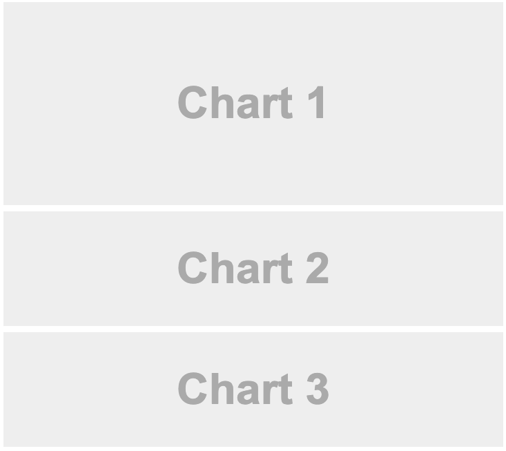
11.3.2 Chart Stack Scrolling
Depending on the nature of your dashboard (number of components, ideal height of components, etc.) you may prefer a scrolling layout where components occupy their natural height and the browser scrolls when additional vertical space is needed. You can specify this behavior via the vertical_layout: scroll option. For example, here is the definition of a single column scrolling layout with three charts:
---
title: "Chart Stack (Scrolling)"
output:
  flexdashboard::flex_dashboard:
    vertical_layout: scroll
---
### Chart 1
```{r}
```
### Chart 2
```{r}
```
### Chart 3
```{r}
```
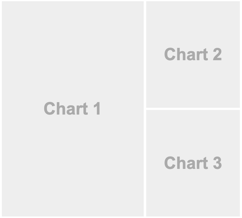
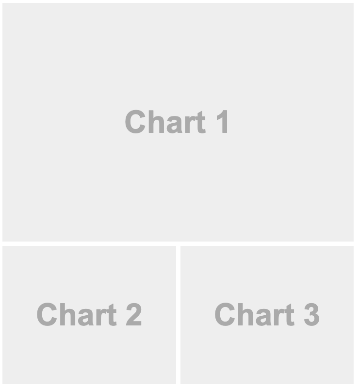
11.3.3 Focal Chart Top
This layout fills the page completely and gives prominence to a single chart at the top (with two secondary charts included below). To achieve this layout it uses orientation: rows and specifies data-height attributes on each row to establish their relative sizes.
Row {data-height=650}
-------------------------------------

### Chart 1

```{r}

```

Row {data-height=350}
-------------------------------------

### Chart 2

```{r}

```

### Chart 3

```{r}

```
11.3.4 Focal Chart Left
To lay out charts using multiple columns you introduce a level 2 markdown header (————–) for each column. For example, this dashboard displays 3 charts split across two columns:
Column {data-width=600}
-------------------------------------

### Chart 1

```{r}

```

Column {data-width=400}
-------------------------------------

### Chart 2

```{r}

```

### Chart 3

```{r}

```
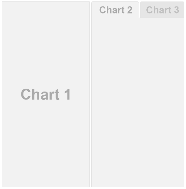
11.3.5 Tabsets
If you have several components you’d like to display within a row or column then rather than attempting to fit them all on screen at the same time you can lay them out as a tabset.
This is especially appropriate when one component is primary (i.e. should be seen by all readers) and the others provide secondary information that might be of interest to only some readers.
To layout a row or column as a tabset you simply add the {.tabset} attribute to the section heading. For example, the following code lays out the second column in tabset:
Column
-------------------------------------

### Chart 1

```{r}

```

Column {.tabset}
-------------------------------------

### Chart 2

```{r}

```

### Chart 3

```{r}

```
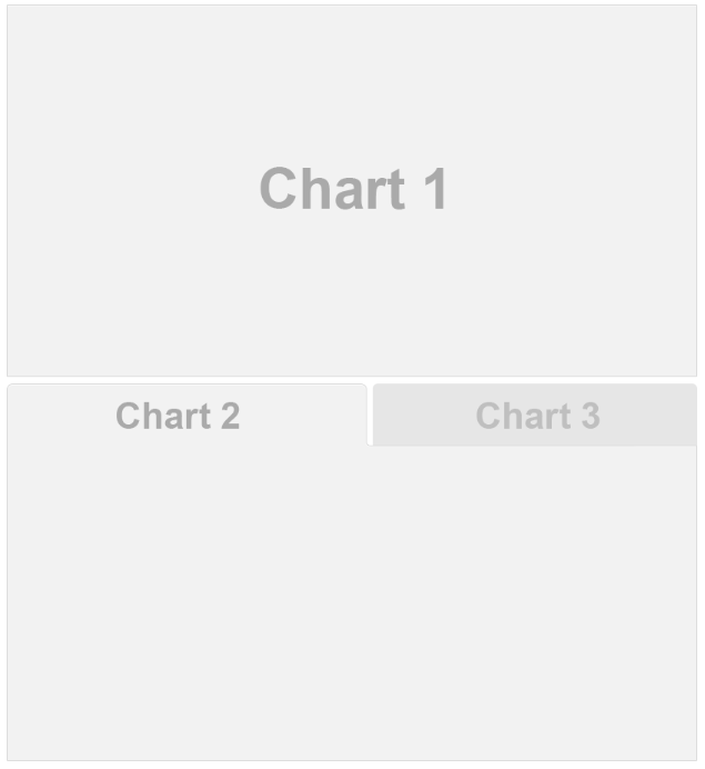
Rows can also be laid out as a tabset as illustrated here:
Row
-------------------------------------

### Chart 1

```{r}

```

Row {.tabset .tabset-fade}
-------------------------------------

### Chart 2

```{r}

```

### Chart 3

```{r}

```
11.4 Components
11.4.1 Value Boxes
Sometimes you want to include one or more simple values within a dashboard. You can use the valueBox function to display single values along with a title and optional icon. For example, here are three side-by-side sections each displaying a single value:
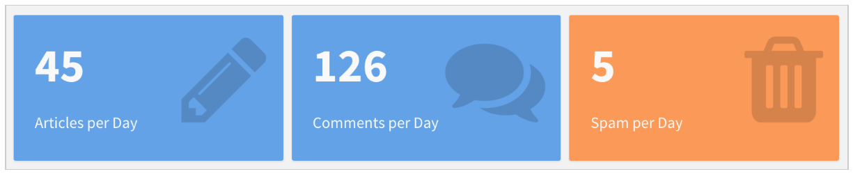
Here is the code which was used to generate these value boxes:
Row
-----------------------------------------------------------------------

### Articles per Day

```{r}
valueBox(45, icon = "fa-pencil")
```

### Comments per Day

```{r}
valueBox(126, icon = "fa-comments")
```

### Spam per Day

```{r}
spam <- 5
valueBox(spam,
         icon = "fa-trash",
         color = ifelse(spam > 10, "warning", "primary"))
```
The valueBox function is called to emit a value and specify an icon. You can specify icons from three different icon sets:
When referring to an icon you should use it’s full name including the icon set prefix (e.g. “fa-github”, “ion-social-twitter”, “glyphicon-time”, etc.).
Note: Please note that not all icons are available for free use in your dashboard. Indeed, sometimes it may not work even if you have written the right icon name.
11.4.1.1 Linking
If a valueBox displays a value for which additional detail is available on another dashboard page you can enable navigation to the other page via the href parameter. For example, if you have a page with the anchor “#details” you could link a value box to it as follows:
```{r}
valueBox(42, icon = "fa-pencil", href="#details")
```
11.4.2 Gauges
Gauges display values on a meter within a specified range. For example, here is a set of 3 gauges:
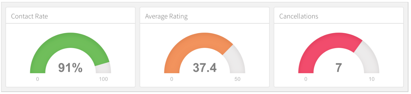
Here is the code used to generate these gauges:
Row
-----------------------------------------------------------------------

### Contact Rate

```{r}
gauge(90, min = 0, max = 100, symbol = '%', gaugeSectors(
  success = c(80, 100), warning = c(40, 79), danger = c(0, 39)
))
```

### Average Rating

```{r}
gauge(37.4, min = 0, max = 50, gaugeSectors(
  success = c(41, 50), warning = c(21, 40), danger = c(0, 20)
))
```

### Cancellations

```{r}
gauge(7, min = 0, max = 10, gaugeSectors(
  success = c(0, 2), warning = c(3, 6), danger = c(7, 10)
))
```
11.5 Sizing
The nature of the charts within your dashboard (desired emphasis, visualization types, etc.) will often dictate that you’ll want to change the default sizing behavior. If no size attributes are specified then the relative size of each chart will be determined by it’s knitr figure size (this is 6 x 4.8 inches or 576 x 460 pixels by default).
You can modify the default sizing behavior by applying the data-width and data-height attributes to rows, columns, or even individual charts. These attributes establish the relative size between charts laid out in the same dimension (horizontal or vertical).
This example use the data-height attribute to dictate a larger vertical size for the first row, resulting in a layout that more clearly emphasizes the first chart.
Row {data-height=650}
-------------------------------------

### Chart 1

```{r}

```

Row {data-height=350}
-------------------------------------

### Chart 2

```{r}

```

### Chart 3

```{r}

```
This example is a variation of the single-column layout demonstrated above with a data-height attribute applied to the first chart:
### Chart 1 {data-height=600}

```{r}

```

### Chart 2 {data-height=200}

```{r}

```

### Chart 3 {data-height=200}

```{r}

```
11.6 Multiple Pages
If you have more than a handful of charts you’d like to include in a dashboard, you may want to consider dividing the dashboard into multiple pages. To define a page just use a level 1 markdown header (==================). Each page you define will have its own top-level navigation tab.
For example, this code creates a dashboard with two pages, each containing two charts:
Page 1
=====================================

### Chart 1

```{r}

```

### Chart 2

```{r}

```

Page 2
=====================================

### Chart 1

```{r}

```

### Chart 2

```{r}

```
Find here a lot of Multiple Pages options.
11.7 Storyboards
Storyboards are an alternative to the row and column based layout schemes described above that are well suited to presenting a sequence of data visualizations and related commentary.
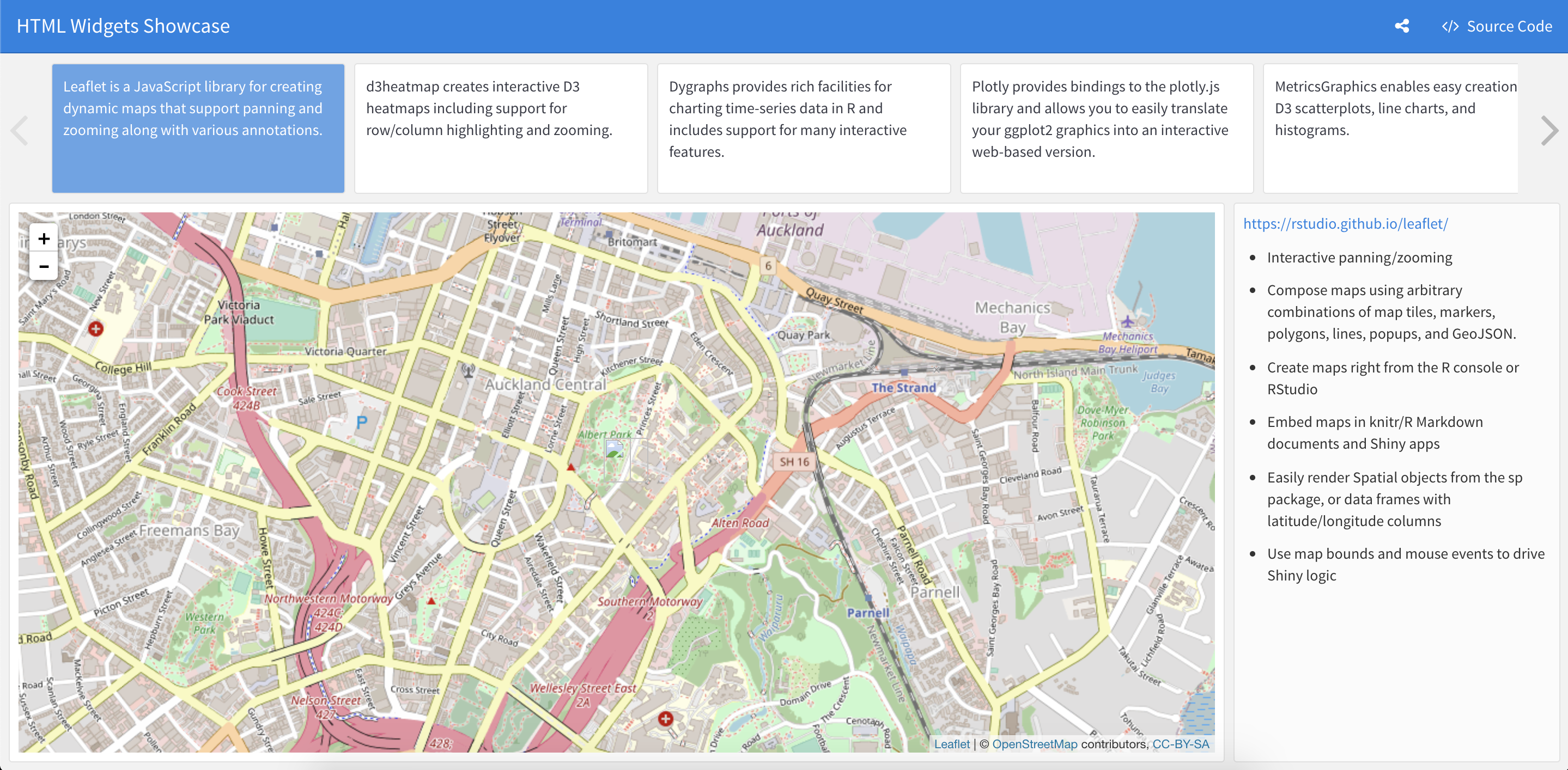
11.7.1 Storyboard Basics
To create a storyboard layout you do the following:
- Add the
storyboard: trueoption to the dashboard. - Include a set of level 3 (
###) dashboard components. Each component will be allocated it’s own frame in the storyboard, with the section title used as the navigation caption.
The basics of creating storyboards are explained below. For a more complete example, see the HTML Widgets Showcase storyboard.
The following code creates a storyboard with 3 frames:
### Frame 1

```{r}

```

### Frame 2

```{r}

```

### Frame 3

```{r}

```
11.7.2 Storyboard Pages
You can layout one or more pages of a dashboard as storyboards and then use traditional row and column layout on the other pages. To do this, you exclude the storyboard: true option and instead add the {.storyboard} class to pages you want laid out as storyboards.
For example, the following dashboard includes a storyboard on the first page (“Analysis”) as well as another page (“Details”) that uses conventional layout:
Analysis {.storyboard}
=========================================

### Frame 1

```{r}

```

### Frame 2

```{r}

```

Details
=========================================

Column
-----------------------------------------
11.7.3 Commentary
You may wish to add commentary alongside the frames in your storyboard. To do this you add a horizontal rule separator (***) after the main body of frame content. Content after the separator will appear in a commentary sidebar to the right. For example:
### Frame 1

```{r}

```

***

Some commentary about Frame 1.

### Frame 2 {data-commentary-width=400}

```{r}

```

***

Some commentary about Frame 2.
TL;DR
Flexdashboard is an easy interactive dashboards for R that allows you to:
- Use R Markdown to publish a group of related data visualizations as a dashboard.
- Support for a wide variety of components including htmlwidgets; base, lattice, and grid graphics; tabular data; gauges and value boxes; and text annotations.
- Specify multiple row and column-based layouts.
- Optionally use Shiny to drive visualizations dynamically.
Getting your hands dirty
You are in charge of organizing a presentation to the board of directors of an international investment firm. They need to decide in which country they want to invest.
We expect you to do: A dynamic presentation using a flexdashboard using for instance GDP and Foreign Direct Investment since at least 1995 using for instance France as a country.
Data is available on Github.
Here is an example of what is expected : Flexdashboard