Chapter 10 Data Visualization
10.1 Introduction
In this chapter, we learn to create three types of visuals: bar, line and bubble charts. Also, we’ll see some options to improve your graphics.
At the end of the chapter, you should be able to:
- create bar charts;
- produce line charts;
- generate bubble charts;
- create maps;
10.2 Foundations
For further reference, please have a look at the www.warin.ca/fqaibr book.
In this chapter, we will help you get your hands dirty while following some of the latest thinking in data visualization. Probably speaking, keep in mind that there are 5 principles:
have graphical integrity
use the right display
keep it simple
use color strategically
tell a story with your data.
I include a wide definition for the term. It is the act of conveying information through graphs.
So firstly, what are the goals of visualisations?
Record. They can either note information down.
You can analyse and explore data using them.
They can also communicate and explain data to others.
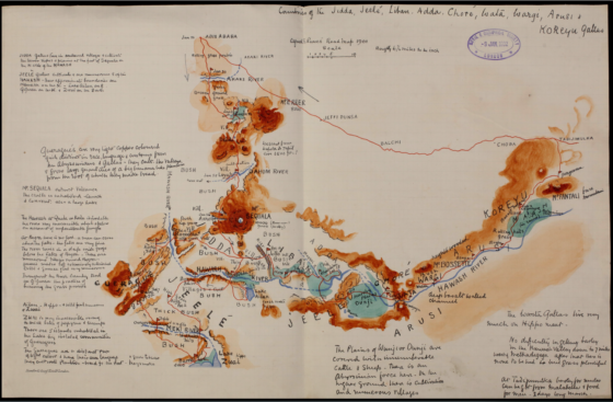
One of my favorite examples is Alfred E. Pease’s Road Map (1901) of the countries of Jidda, Jeelé, Liban, Adda, Choré, Wata, Wargi, Arusi and Koreyu Gallas.
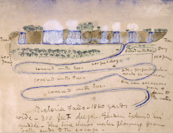
David Livingstone, an explorer of the African continent, was a Christian missionary who sought out information about the sources of the Nile. He found that the source of the Nile River would make him an influential intermediary in ending the slave trade and replace it with legitimate commerce. Livingstone during 1858 made a trip to southern Africa and examined the natural resources and wildlife. The botanical specimens and ethnographical knowledge acquired in the journey proved useful throughout the remainder of the research. Livingstone was a cartographer who created some of the first 19th century African maps.
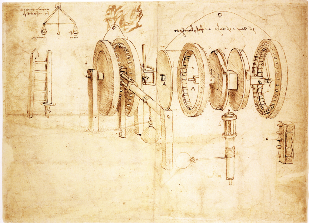
As for recording, another one of my favourite examples is the notebooks of Leonardo da Vinci. And he is a recognised authority on sketches of human anatomy and has created many imaginative machine devices. All of his illustrations have been used by him to achieve the purpose of collecting and recording information from nature and engineering.
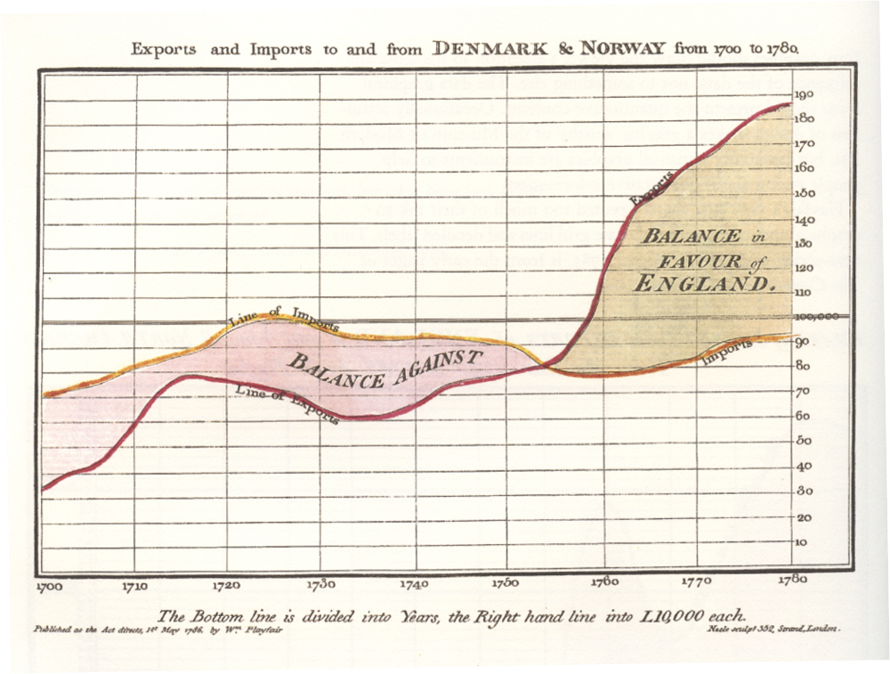
On the other hand, here is an example from William Playfair who in 1820 invented the language of analysing data through statistical graphs. So James made the line chart. He developed the bar chart. He popularised the pie chart. All of those, of course, are very common tools used in today’s analysis tasks.
Visuals are extremely effective at communicating ideas. And one of the masters of this is Hans Rosling, who basically has done many Ted videos on complicated, and maybe sometimes dry, statistical ideas about world populations and poverty, and has had a huge influence in how he changed the world. And you should watch his Ted 2006 presentation, which demonstrates how he uses visualisation and storytelling to communicate profound ideas about the world.
Why is visualisation used? There’s so much data to be analysed that we need to use data analysis, exploratory data analysis, and communication to make sense of all that data.
A quote from a 2018 article in Forbes magazine, where they quote that there are now “2.5 quintillion bytes of data created each day.” And maybe more importantly, that “Over the last two years alone, 90 percent of the data in the world was generated.” 90 percent of the data in the last two years alone. This is a vastly growing volume of data.
The reason why more data is being generated is because of machines. Dr. Hellerstein, at UC Berkeley, introduces the concept of the Industrial Revolution of Data.
It also includes business uses in firms such as RFID tags. The increase in amount of data is making visualisation even more important than ever as a powerful tool for analysing data.
Hal Varian, chief economist at Google stated that “The ability to take data— to be able to understand it, to process it, to extract value from it, to visualise it, to communicate it— that’s going to be a hugely important skill in the next decades. Because now we really do have essentially free and ubiquitous data.”
But fortunately, as Don Norman, a famous computer-human interaction researcher said, “It is things that make us smart.” From the beginning of humanity, we started to use external tools to augment our cognition. First, it was a collection of rock art and pictographs and an ancient cave painting. Finally, we had the typed press. Next, we introduce visualisation. With computers and sophisticated tools, we are able to offload cognition onto external things like this.
A graph may be better than a table or words.
See Stephen M. Kosslyn “Clear and to the point.”
We devote a significant portion of our brainpower to processing visual information. This is an example of how we use this expression. Analyze all instances of all of the letters in this text. I will wait, and will give you a minute (or two) to complete the assigned work.
And Stuart Card, another human-computer interaction researcher, said, “Visualization is about external cognition, that is, how the resources outside of the mind can be used to boost the cognitive capabilities of the mind.” That’s why we use visualisations— both for exploratory data analysis, but also for communication.
10.2.1 What makes an effective visualization?
Effective visualizations reveal patterns and communicate ideas using the power of perception to offload cognition.
Effective visualisation tasks follow certain steps. They have superior graphic appeal. They keep things simple. They use the correct display. They use colour effectively. The data is used to tell the story.

https://www.mediamatters.org/fox-news/updated-worst-chart-ive-seen-all-day
Edward Tufte, a visual communication specialist, is a master of showing visually how many great examples of visual communications are executed effectively in his books. Here are two of his three books. I think the Visual Display of Quantitative Information is especially awesome because it provides practical advice for creating visually appealing and informative data graphics.
So Tuft has several concepts. And phrases his opinions in slightly witty statements. One is striving to maximise the data-ink ratio. Explain the data-ink ratio. In our example, the data in the table is a relatively small fraction of the pixels used in the chart. You want to maximise this value. You want to have as many pixels as necessary displaying the data and nothing more.
Tufte also says to avoid chartjunks. And chartjunk is any extraneous visual elements that distract from the message.
You could say this is sort of a zen philosophy of visualization, sort of bring a graph to its minimal form that still displays the data accurately.
Aesthetics: attractive things are perceived as more useful than unattractive ones
Style: communicates brand, process, who the designer is
Playfulness: encourages experimentation and exploration
Vividness: can make a visualization more memorable
https://www.jobvine.co.za/what-does-it-take-to-get-a-job-at-google/
versus
https://junkcharts.typepad.com/.a/6a00d8341e992c53ef014e8c55224e970d-pi
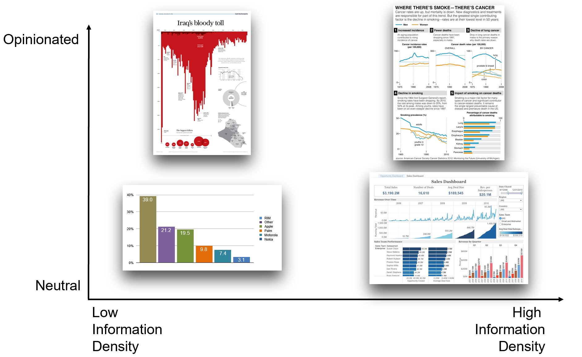
Telling a story: opiniated versus neutral
https://gravyanecdote.com/uncategorized/should-you-trust-a-data-visualisation/
Adapt to your audience:
The question of the story climax: “A story is not an accumulation of information strung into a narrative, but a design of events to carry us to a meaningful climax.”
- Robert McKee, Story: Substance, Structure, Style, and the Principles of Screenwriting
Krzywinski, M., Cairo, A. Storytelling. Nat Methods 10, 687 (2013). https://doi.org/10.1038/nmeth.2571
10.3 Bar chart
As you remembered, we produced at the end of the lab 2 a dataset called dataCanadaFull. We can visualize the data by using the ggplot2 package. We don’t need to transform the data into a long format as we already did that last time.
Let’s load the data.
dataCanadaFullLong <- readr::read_csv("./data/dataCanadaFullLong.csv")We need to change the format of the column isicCode from numeric to character to produce the charts.
dataCanadaFullLong$isicCode <- as.character(dataCanadaFullLong$isicCode)First, we produce a bar chart with the following code.
# Produce a bar chart
library(ggplot2)
library(ggthemes)
ggplot(data = dataCanadaFullLong, aes(x = year, y = value, fill = isicCode)) +
  geom_bar(stat = "identity", width = 0.5, position = "dodge") +
  xlab("") +
  ylab("Number of employees")  +
  labs(fill = "Isic Code")  +
  theme_minimal() +
  scale_fill_brewer(direction = -1)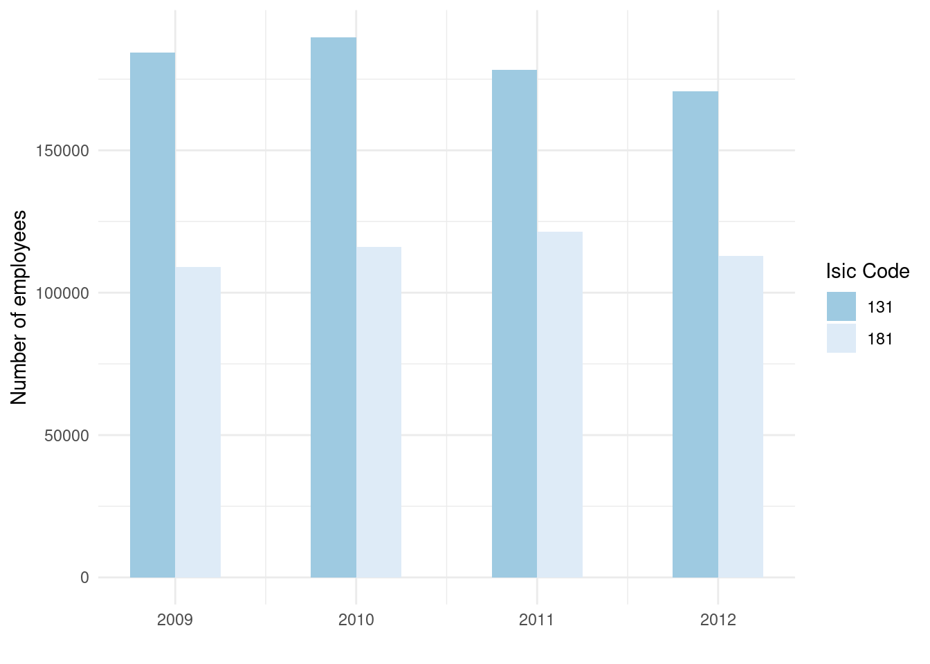
10.4 Line chart
Now, we produce a line chart.
# Line chart elements
library(ggplot2)
library(ggthemes)
ggplot(data = dataCanadaFullLong, aes(x = year, y = value, color = isicCode)) +
  geom_line(size = 1.5) +
  xlab("") +
  ylab("Number of employees")  +
  labs(fill = "Isic Code")  +
  theme_minimal() +
  scale_color_brewer(direction = -1)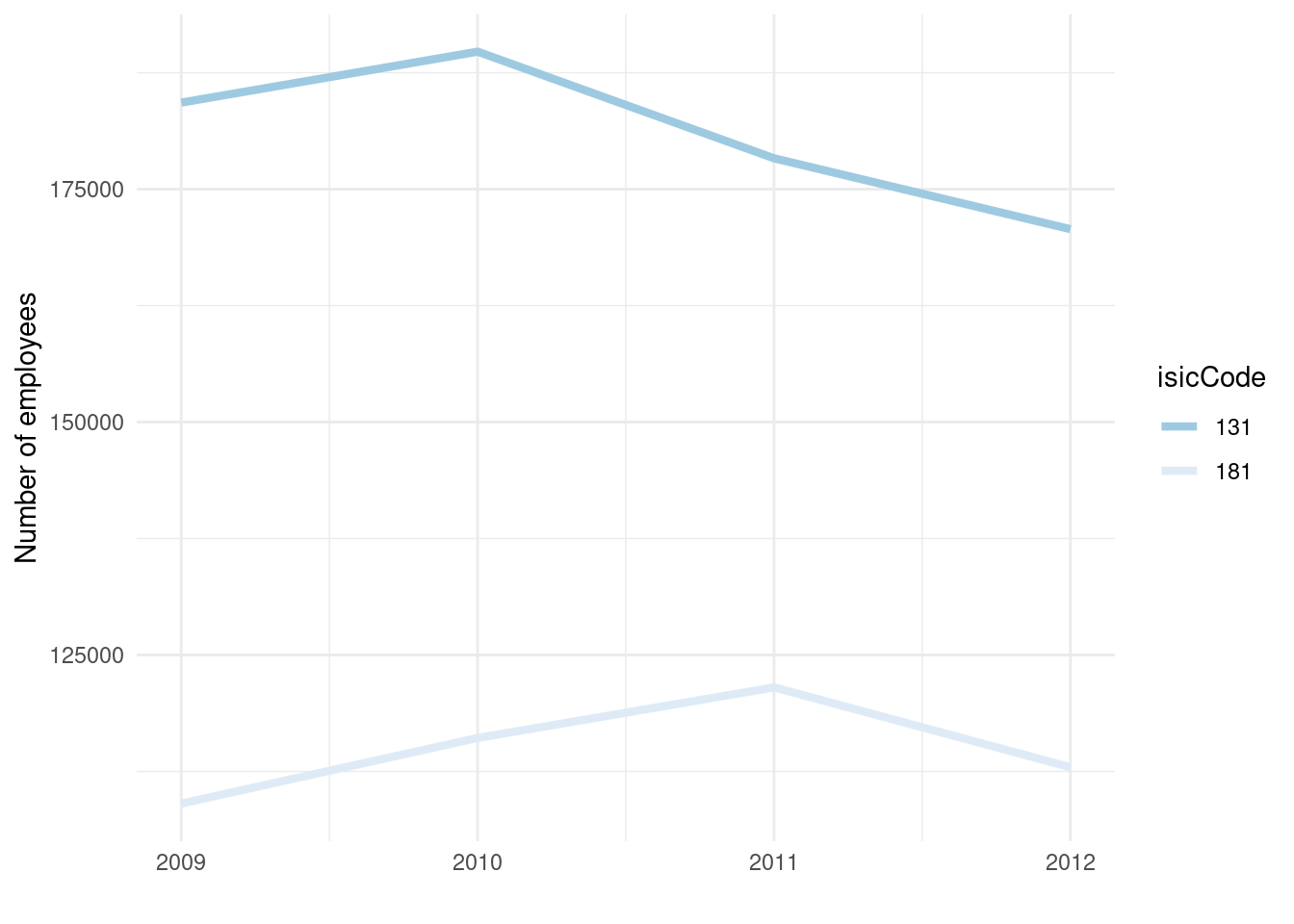
We can add point to the line like this.
ggplot(data = dataCanadaFullLong, aes(x = year, y = value, color = isicCode)) +
  geom_line(size = 1.5) +
  xlab("") +
  ylab("Number of employees")  +
  labs(fill = "Isic Code")  +
  theme_minimal() +
  scale_color_brewer(direction = -1) +
geom_point(size = 2.5) 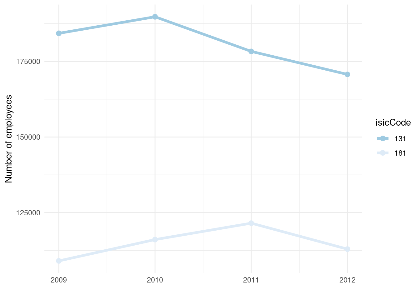
10.5 Bubble chart
Finally, we produce a bubble chart.
# Bubble chart elements
library(ggplot2)
library(ggthemes)
ggplot(data = dataCanadaFullLong, aes(x = year, y = value, color = isicCode)) +
  geom_point(aes(size = value)) +
  xlab("") +
  ylab("Number of employees")  +
  theme_minimal() +
  scale_color_brewer(direction = -1) +
  scale_size_continuous(range = c(3,11)) +
  guides(size = FALSE)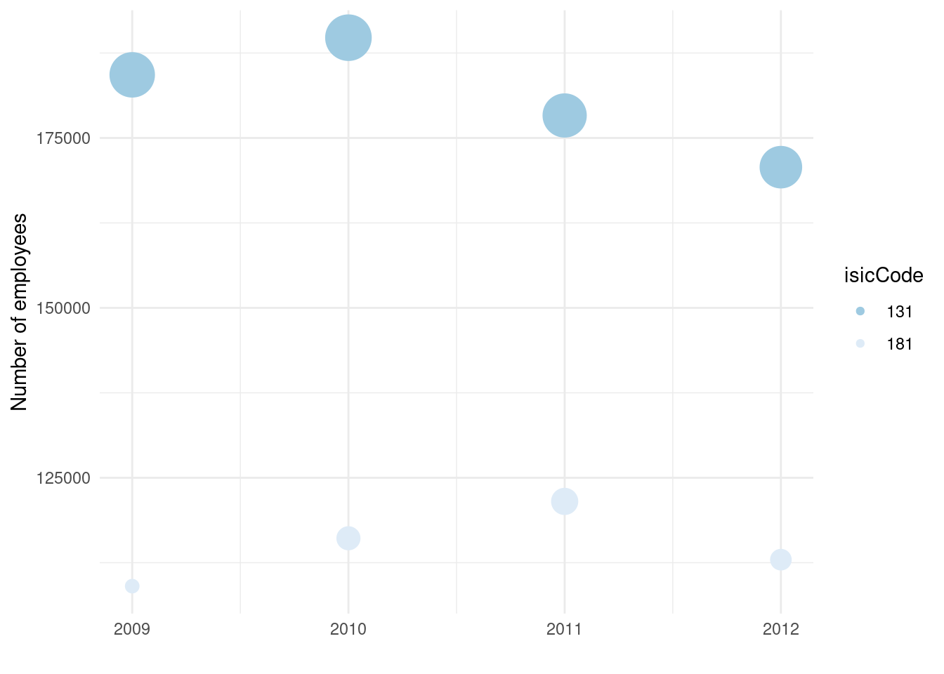
Now, you are able to:
- load any data from a .csv file;
- visualize your data in a simple and efficient manner.
10.6 Maps
Let’s start with a basic map of the world. First you have to load the ggplot2 package.
library(ggplot2)For now, we only use the data of the world to create a map of the world. Later, we’ll see maps for particular region of the world like continents, countries, states or even county!
world <- map_data("world")Finally we can create the map.
ggplot(data = world, aes(x = long, y = lat, group = group)) +
  geom_polygon(fill = "white", color = "black") +
  theme_void()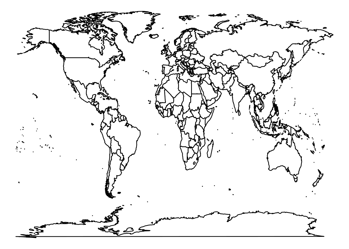
The argument fill = "white" is choosing the color of the countries background and color = "black" is choosing the color of the countries border lines. theme_void() is a theme provided by the ggplot2 package. You can find all ggplot2 themes here.
To create a map of a specific region you can do it like follow:
# Load packages
library(ggplot2)

# Retrieve data
world <- map_data("world")
americas <- subset(world, region %in% c("USA","Brazil","Mexico", "Colombia", "Argentina", "Canada",
                                      "Peru","Venezuela","Chile","Guatemala","Ecuador", "Bolivia", "Cuba",
                                      "Honduras", "Paraguay", "Nicaragua","El Salvador", "Costa Rica", "Panama",
                                      "Uruguay",  "Jamaica",  "Trinidad and Tobago", "Guyana", "Suriname", "Belize",
                                      "Barbados", "Saint Lucia", "Grenada", "Saint Vincent and the Grenadines",
                                      "Antigua and Barbuda", "Saint Kitts and Nevis"))
# Create map
ggplot(data = americas, aes(x = long, y = lat, group = group)) +
  geom_polygon(fill = "white", color = "black") +
  coord_fixed(ratio=1.1, xlim = c(-180, -35))  +
theme_void() 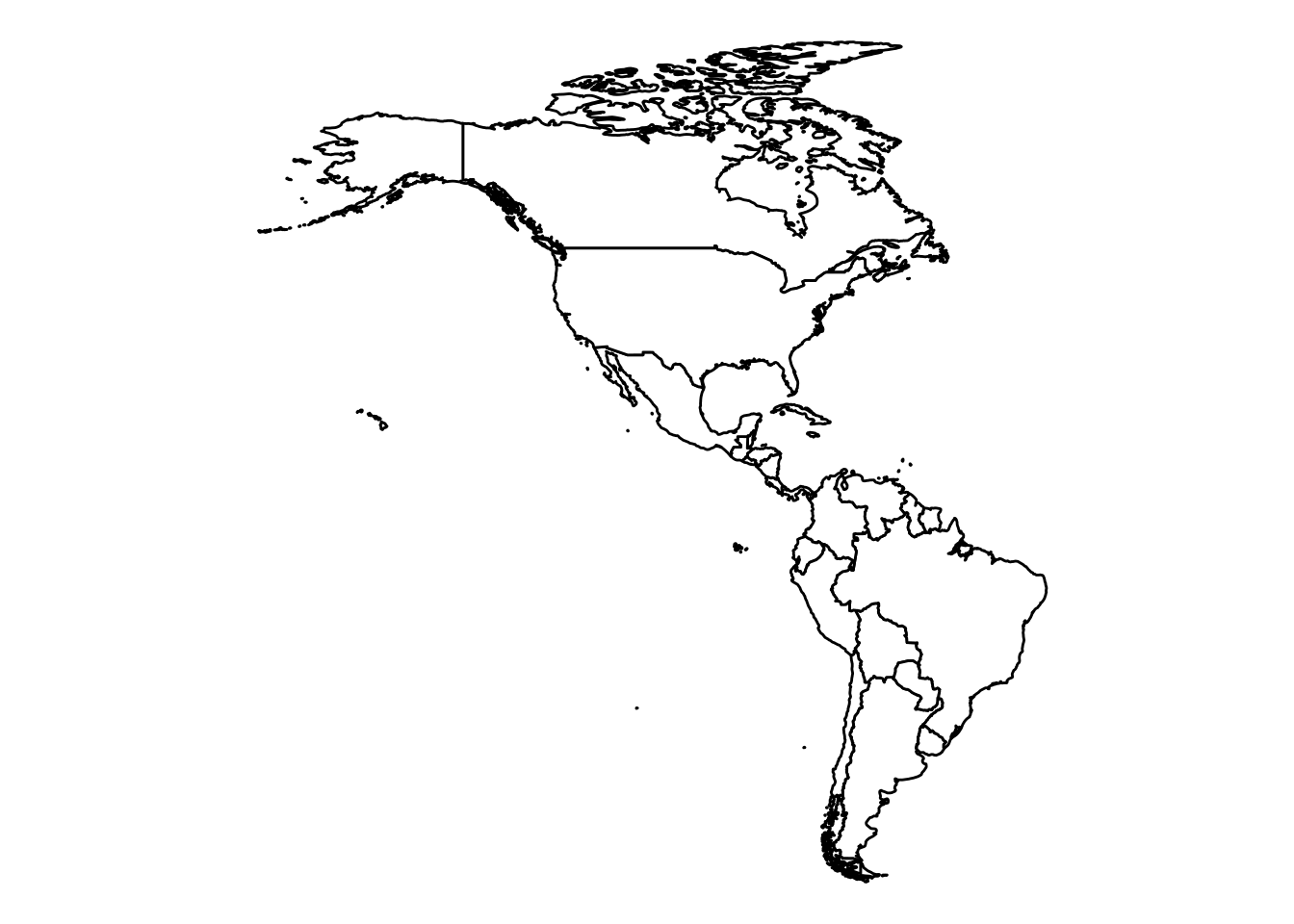
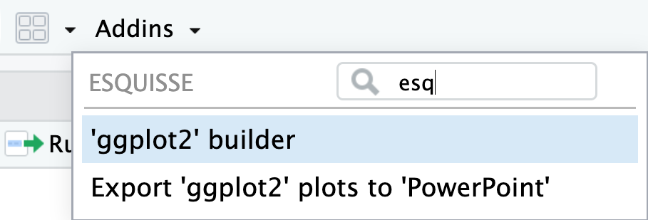
10.7 Esquisse
Now that you know the grammar of graphics, you can use the package esquisse.
Step 1
Click on the Addins button and look for the esquisse application. Click on the name ‘ggplot2’ builder.
Step 2
A window will open.
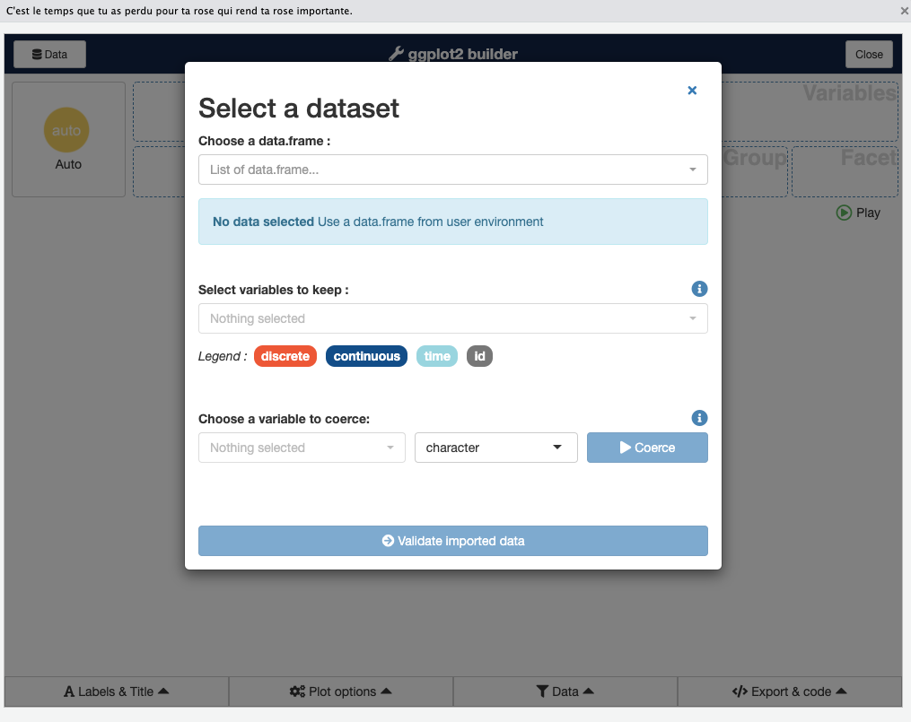
Step 3
Click on the bar named list of dataframes… and choose one of the data frames loaded into your current working session.
Step 4
If you click the Validate Chosen Variable dropdown, you see all the available columns and can choose which ones you want. To keep them all, click Choose.
Step 5
You should see a drag-and-drop interface. You should be able to drag one variable into the X box and another into the Y box, as well as choose others for fill or size (depending on the visualization type).
The Data panel at the bottom gives you the option to filter your data. You can change axis titles with the Labels & Title option. Plot options let you change color palette and theme, and also move or remove the legend.
Even if you’re really comfortable creating your graphs by writing ggplot code, this is a great way to see how different color palettes and themes look on your graph.
TL;DR
dataCanadaFullLong <- readr::read_csv("./data/lab3/dataCanadaFullLong.csv")

dataCanadaFullLong$isicCode <- as.character(dataCanadaFullLong$isicCode)

# Produce a bar chart
library(ggplot2)
library(ggthemes)
ggplot(data = dataCanadaFullLong, aes(x = year, y = value, fill = isicCode)) +
  geom_bar(stat = "identity", width = 0.5, position = "dodge") +
  xlab("") +
  ylab("Number of employees")  +
  labs(fill = "Isic Code")  +
  theme_minimal() +
  scale_fill_brewer(direction = -1)

# Line chart elements
library(ggplot2)
library(ggthemes)
ggplot(data = dataCanadaFullLong, aes(x = year, y = value, color = isicCode)) +
  geom_line(size = 1.5) +
  xlab("") +
  ylab("Number of employees")  +
  labs(fill = "Isic Code")  +
  theme_minimal() +
  scale_color_brewer(direction = -1)

ggplot(data = dataCanadaFullLong, aes(x = year, y = value, color = isicCode)) +
  geom_line(size = 1.5) +
  xlab("") +
  ylab("Number of employees")  +
  labs(fill = "Isic Code")  +
  theme_minimal() +
  scale_color_brewer(direction = -1) +
  geom_point(size = 2.5)

# Bubble chart elements
library(ggplot2)
library(ggthemes)
ggplot(data = dataCanadaFullLong, aes(x = year, y = value, color = isicCode)) +
  geom_point(aes(size = value)) +
  xlab("") +
  ylab("Number of employees")  +
  theme_minimal() +
  scale_color_brewer(direction = -1) +
  scale_size_continuous(range = c(3,11)) +
  guides(size = FALSE)

# Maps
library(ggplot2)
world <- map_data("world")
ggplot(data = world, aes(x = long, y = lat, group = group)) +
  geom_polygon(fill = "white", color = "black") +
  theme_void()

library(ggplot2)
world <- map_data("world")
americas <- subset(world, region %in% c("USA","Brazil","Mexico", "Colombia", "Argentina", "Canada",
                                      "Peru","Venezuela","Chile","Guatemala","Ecuador", "Bolivia", "Cuba",
                                      "Honduras", "Paraguay", "Nicaragua","El Salvador", "Costa Rica", "Panama",
                                      "Uruguay",  "Jamaica",  "Trinidad and Tobago", "Guyana", "Suriname", "Belize",
                                      "Barbados", "Saint Lucia", "Grenada", "Saint Vincent and the Grenadines",
                                      "Antigua and Barbuda", "Saint Kitts and Nevis"))
ggplot(data = americas, aes(x = long, y = lat, group = group)) +
  geom_polygon(fill = "white", color = "black") +
  coord_fixed(ratio=1.1, xlim = c(-180, -35))  +
  theme_void()
Code learned in this chapter
| Command | Detail |
|---|---|
| read_csv() | Read comma separated values (csv) |
| as.character() | Transform data in character |
| ggplot() | Initialize a ggplot object |
| geom_bar() | Produce a bar chart |
| geom_line() | Produce a line chart |
| geom_point() | Produce a bubble chart |
| xlab() | Modify x axis label |
| ylab() | Modify x axis label |
| labs() | Modify axis, legend and plot labels |
| theme_minimal() | Set up the minimal theme |
| scale_fill_brewer() | Provide sequential, diverging and qualitative colour schemes from ColorBrewer |
| scale_color_brewer() | Provide sequential, diverging and qualitative colour schemes from ColorBrewer |
| scale_size_continuous() | Size Scale |
| guides() | Set guides for each scale |
| map_data() | Create a data frame of map data |
| subset() | Subsetting vectors, matrices and data frames |
| geom_polygon() | Polygon, a filled path |
| coord_fixed() | Force a specified ratio between the physical representation of data units on the axes |
| theme_void() | Set up the void theme |
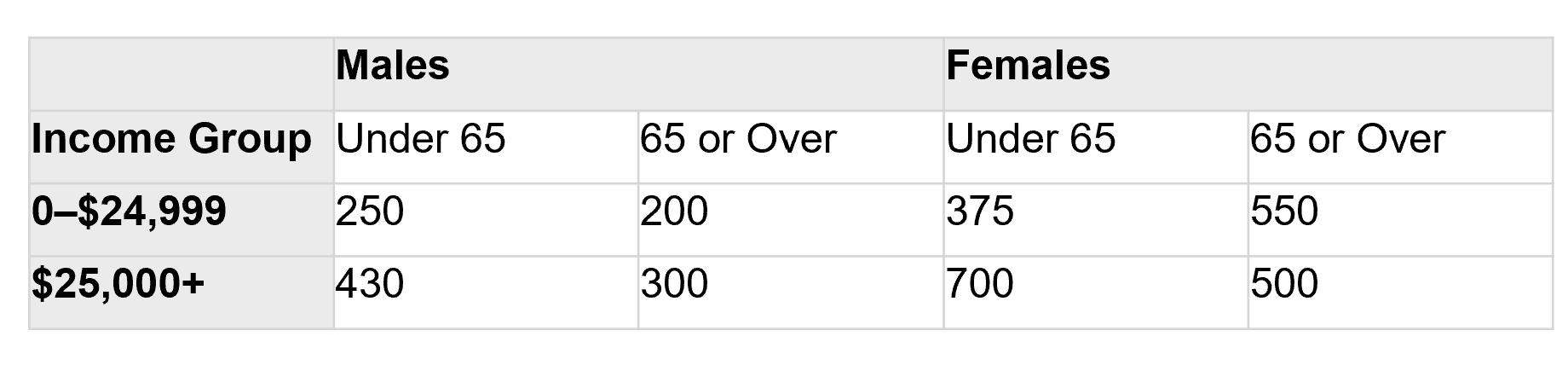
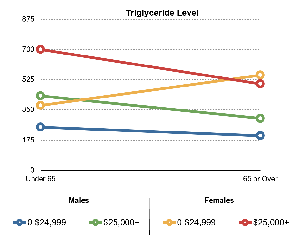
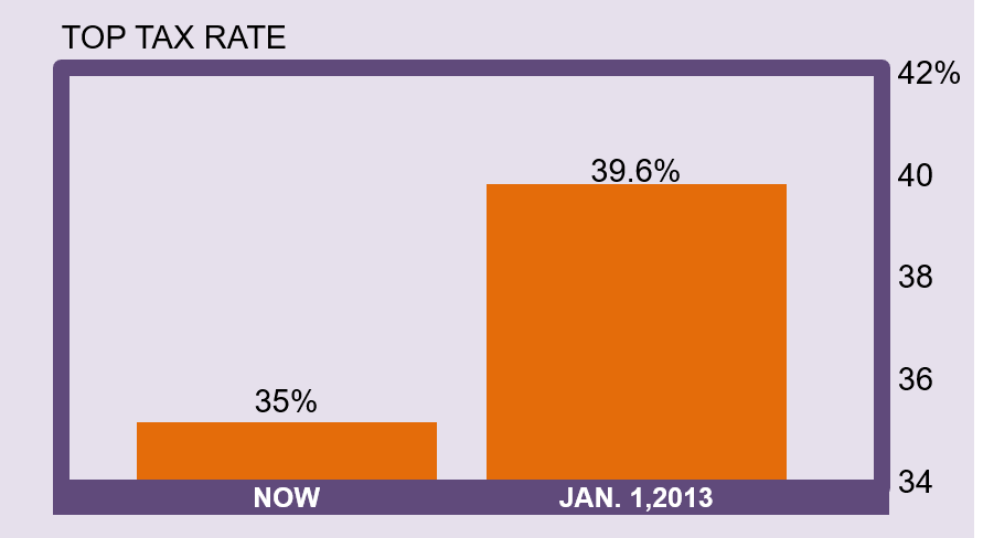
Getting your hands dirty
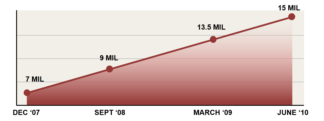
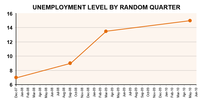
You must use the data available on Github in Chapter 10 and reproduce the following line and bar chart.
- Step1 : Import data
You need to import chapter10data.csv to do this exercise.
library(readr)
gdp5 <- - Step 2 : Create a line chart
Recreate the following line chart.
library(ggplot2)
...- Step 3 : Subset the data
Filter the data to only keep the year 2017.
library(dplyr)
gdp6 <- - Step 4 : Create a bar chart
Recreate the following bar chart.
library(ggplot2)
...